How to supersize your designs, for billboards and beyond
Our pros offer expert advice on how to nail billboard designs.
Sign up to Creative Bloq's daily newsletter, which brings you the latest news and inspiration from the worlds of art, design and technology.
You are now subscribed
Your newsletter sign-up was successful
Want to add more newsletters?
Sometimes going big is better, but what governs the decision to supersize? And how do you make that happen effectively from a design, technical, and marketing point of view?
Large-scale branding can make an impact when you want to break into new markets, launch a new product, or convey important information, but what do you need to think about before you order that billboard? Location and demographics are important, and timing can have a big role to play. Seasonal trends, big movie releases, or local events are common marketing tie-ins. Among the challenges associated with supersizing is set-up and maintenance of the branding materials. Upkeep is as much a part of the process as the design and creative side.
Supersized branding can be an expensive exercise, so we spoke to the pros for tips to help you decide on whether to supersize your branding, and ensure the results make as much impact as these brilliant billboard ads.
Article continues below01. Get the right resolution
What’s on your screen needs to be scaled up for printing, without losing the quality, so the resolution needs to be right. This involves formatting your text and graphics into the correct format and knowing the difference between how each is used, as Dan Summers of DSD Essex explains. “Graphics and text need to originate in vector format (a mixture of points and paths), rather than pixels which make up photographic images," he says. "A vector-based artwork can be scaled infinitely, so whether you are printing onto a pen or an aeroplane, the quality will remain the same.”
02. Consider the perfect typography

Supersizing is all about presence and impact (see these display fonts). It is conveying a message in a way that is clear and easy to understand in an instant. “It’s not just the size that stands out, it's the implicity," says Karim Salama from e-innovate digital marketing agency. "People are only seeing this advertisement for a couple of seconds, maybe less. You need to convey what your product or service does instantly. The message must be clear at a glance.”
This means that typography will play a very important role in your supersized branding materials, but how? Dan says viewing distance and colour choices will come into play. “Typically, on large signage or promotional materials, the consumer will not be ‘up close’ to the artwork and so a highly legible typeface is required with good contrasting colour to provide maximum legibility," he says.
"A good example of this is the bright orange gazebos used at Le Mans which are picked up on television coverage. Here a bright orange background and single colour white logo and text give great contrast."
Sign up to Creative Bloq's daily newsletter, which brings you the latest news and inspiration from the worlds of art, design and technology.
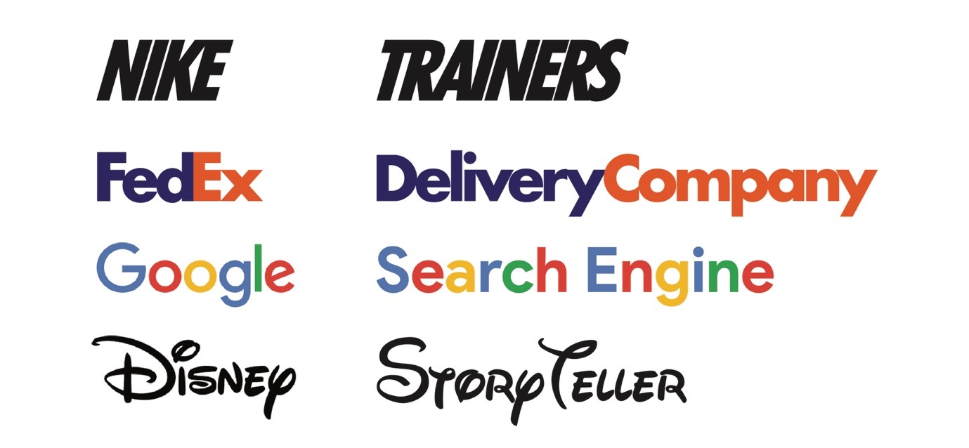
Typography and colour can over time become highly recognisable parts of a brand identity, and while you can’t predict what life a colour choice or typeface design will take, thinking about both aspects early on can only help make your branding a success. “Many brands can be instantly recognisable by colour, think Coca-Cola red, McDonald's yellow or Cadbury’s purple," Dan comments. "It’s the same with typography. Take Nike, Google, Disney or FedEx, if you saw any of these companies’ logos written as another word, you would still be able to recognise the brand.”
03. Know how colour models affect printing
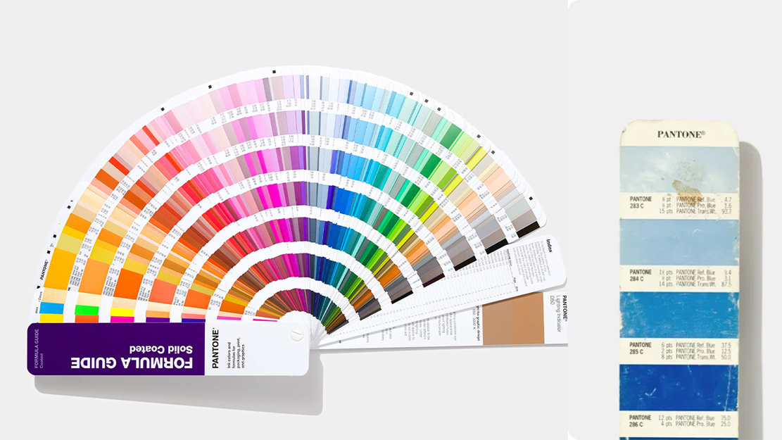
An understanding of colour modes is vital to ensure that your printed materials come out meeting expectations, and will be effective in attracting attention to your brand. With supersized branding often coming at a higher price point, getting the colour details right will help ensure your project goes as planned.
What this means in practice is first understanding the two different colour models. CMYK (cyan, magenta, yellow and black) is the standard for printing in Ink, while RGB (red, green, blue) is used for digital images you see on screens.
Sending materials to printers in the correct colour mode will help avoid issues further down the line as Nicola Wordsworth from Whybrow Studio explains. “If you use an RGB image on something that is going to be printed in CMYK it has to be converted and that might not go as planned. CYMK tends to be not as bright or ‘punchy’ as your images on screen, and can look a little dull because RGB images are bright because they are effectively created by light.”
There are also universal standard colour references that designers and printers use as reference to ensure colour matches. These are typically Pantone colour references or RAL colours for outdoor signage. Nicola adds that while companies will normally have colour references in their brand pack for consistency “it is also important to note that different printing methods and substrates can change the colour, even if it is a Pantone reference match."
"Also, your computer screen is very unlikely to be calibrated and therefore won't match the colours that get printed, so it’s always best to get a proof of the final product to ensure you will get exactly what you are expecting.”
04. Choose the right substrates and printing methods
When you’re printing a paper product the decisions might revolve around matt or gloss, size of paper, and black and white or colour. Supersize your branding to involve billboards, large-scale posters, and signage, and the decisions become more involved. For Nicola, as an environmental and wayfinding graphic designer, it's all about “starting at the end to know what to do at the beginning. What is the purpose of your design and where is it going to be located.” When you have firmed up your design ideas and purpose, Nicola suggests looking at these key points to decide printing method and materials:
Where will the branding be: does it need to be lightfast for long-term display, waterproof and vandal proof, what will the instal method be?
Viewing distance of materials: Billboards viewed from greater distances can be printed at lower resolution, while closer up will need higher resolution. The rule of thumb is that the closer it is being viewed, the higher the resolution, which will affect the print time, price, and quality of print materials needed.
Print Runs: Lower quantities involve digital printing, while larger quantities could involve lithographic presses. Larger quantities also attract lower print costs per item.
Printing on materials: This could mean printing directly on a substrate, printing on materials to adhere to a base, or reverse printing to adhere to the inside of glass.
Formatting: Thinking about file format, resolution, colour models, and how much bleed is required.
Eco-friendliness: Vegetable inks, recycled or non-plastic materials.
05. Printing materials and large-scale designs
There is a wide choice of materials you could print branding materials on, from different types of paper and cardstock to vinyl and PVC choices. It’s worth looking into which materials are suitable for which printing methods, and also how they might affect a large-scale design. Dan highlights one example of a type of vinyl. “When printing onto Contra Vision one-way vision window vinyl, due to the hundreds of holes within the material, colours can become slightly muted. To reduce an obvious colour difference, a predominately white background could be used with the brands' colours used in smaller areas such as text."
Dan also advises to drill into the technical details of your printing project, and how they will be used and displayed. “It’s important to think about the limitations of the material you are working on," he says. "Is there a maximum width that you can print at before a join is needed in a material, as this may affect text running across the join? How far away will the materials be seen from, as this will affect the minimum size of type. Will there be any items obstructing the artwork, this will need to be allowed, such as presentation tables etc."
Some examples of super-sized branding

We asked our experts for their thoughts on large-scale branding campaigns that they’d either worked on, or they felt had made an impact.
For Nicolas De Resbeq from digital offline marketing firm Oppizi, it was a project Oppizi worked on for an eco-friendly fashion brand trying to make an impact in New York. He says “They wanted to launch a new line of sustainable streetwear. We strategically placed massive murals in high-traffic areas, using eco-friendly substrates to align with their brand ethos. Launching just before New York Fashion Week the timing was perfect to capture the attention of fashion enthusiasts.”
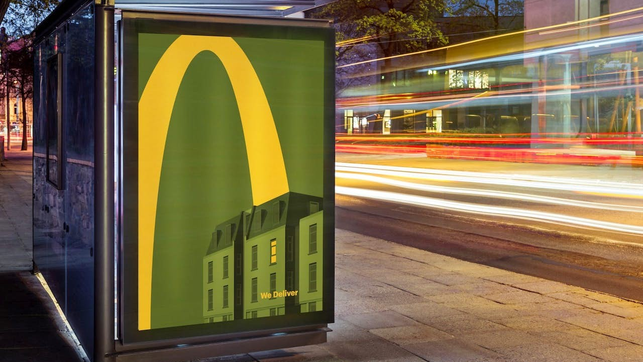
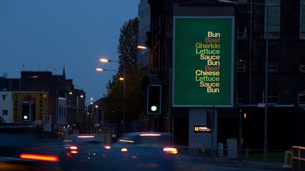
For Dan, it was a past McDonald’s that captured his attention, and the way through these two campaigns, a brand is instantly recognisable without using a logo. “Firstly ‘Iconic Stack’ from 2020 which simply shows a stacked list of ingredients in the relevant colour which forms a Big Mac (at the top). Simply typography and colour, without even the famous golden ‘M’. Secondly was the ‘We Deliver’ campaign in 2021 which has a minimalist style showing the golden arches bouncing their way into people’s homes. Again, no logo but instantly recognisable and relatable.”
Want to keep things small scale? See our list of brilliant print ads.

Lauren John is a journalist, copywriter and creative, with a background in craft, and a growing list of creative hobbies. She’s had art and craft content published in an RSPB children’s magazine and on the Prima Website, also writing on outdoor photography for Reader’s Digest. Lauren enjoys working on content from all creative industries, flying the flag for musicians, bands, artists and authors, and shining a light on some of the issues they face. Freelancing for Creative Bloq has given her the opportunity to write about branding, stop motion animation, typography, and various how-to guides to inspire artists and designers.
