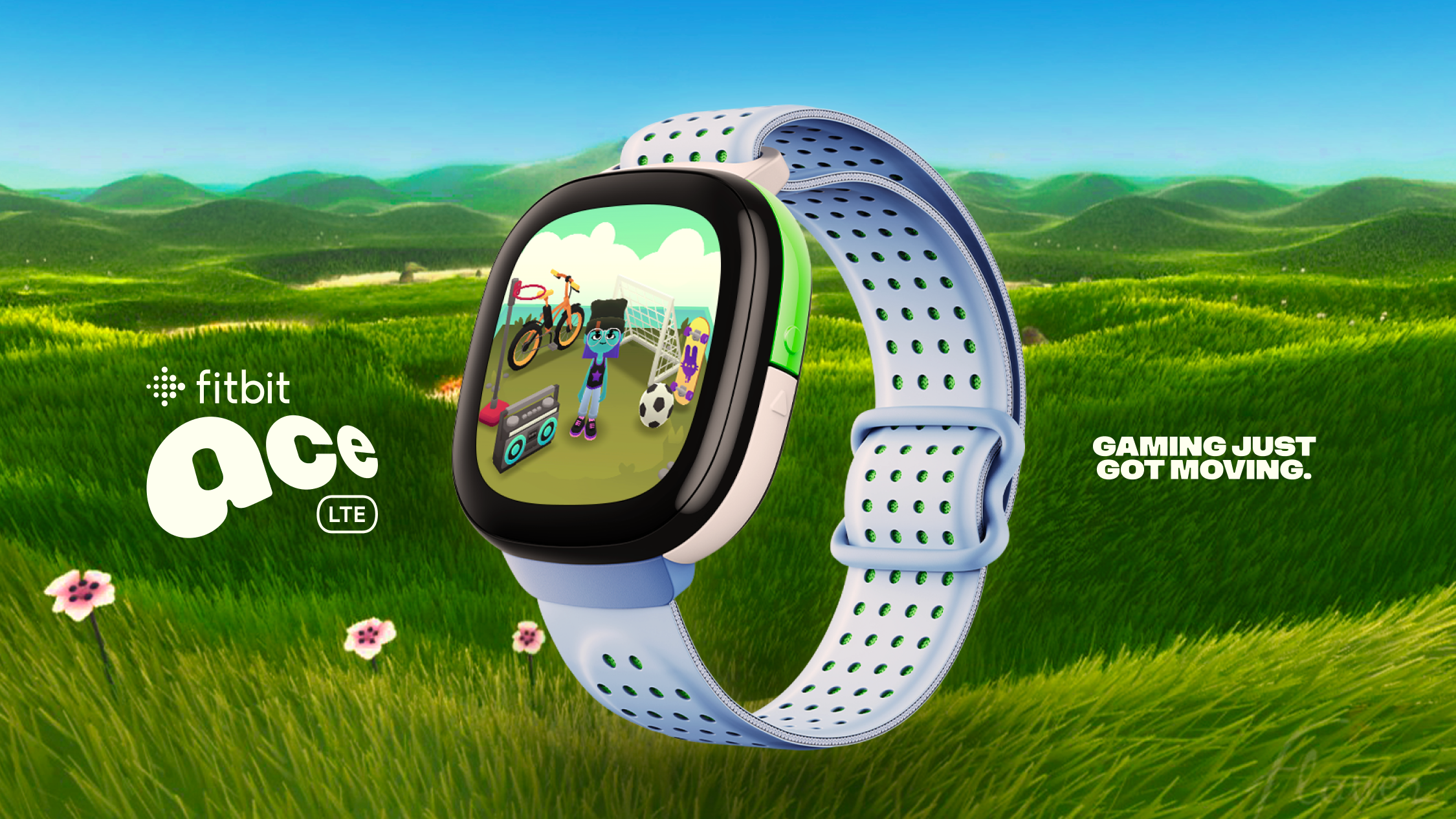
This kids' smartwatch branding is wonderfully weird
Why? Because it’s fun.

For many of us, smartwatches have become an everyday essential – whether you're tracking your steps or taking calls – but for the younger generation, wearable tech doesn't typically have the same appeal. Rewriting the narrative, Google has introduced the Fitbit Ace LTE, a playful wearable aiming to "move a generation of gamers" with its immersive gameplay and vibrant design.
When it comes to Apple Watch alternatives, Fitbit is a firm crowd favourite, so it's no surprise that Google has expanded its reach to the next generation. With a focus on fun, energised and dynamic design, the Ace embodies a playful spirit, proving that thoughtful, creative design makes all the difference when appealing to Gen Alpha.

Created by digital studio Koto, the new brand identity was shaped by one simple mission – get kids moving. "We landed on the idea ‘Because it’s fun,’ a sentiment that summed up the brashness of play for play’s sake," Caroline Fox (Creative Director at Koto) and Carolyn Rush (Senior Strategy Director at Koto) told Creative Bloq. "Paired with our mission, ‘To move a generation of gamers,’ we secured a foundation for showing movement in a bold, childlike, and playful way, while also building for a world where gaming is good for you," they add.
Across the brand identity, there's boundless playfulness created by the vivid colours and dynamic visuals of the design – "everything ladders back to the idea of ‘fun’," Caroline and Carolyn share. Shaped by the traits "Bold", "Playful", "Weird", and "Loveable", the design is rooted in a sense of youthfulness, capturing a vibrant and welcoming nonchalance. Unified by an amorphous 'squircle' motif inspired by the devices' watch face, the design has a "flexible, modular framework allowing brand elements to adapt to a wide range of contexts" while enhancing "storytelling capabilities."

When asked what element of the design process was most fun to create, Caroline and Carolyn shared that the brand's dynamic wordmark was particularly rewarding. "We did hundreds of iterations, some quieter, some wackier. But ultimately, the thing that drove us to this zippy perspective was the realization that this mark needs to feel like it has a childlike buzz to it."
Alongside the wordmark is a characterful peace sign motif referred to as 'Vi'. "The peace sign was initially born as an internal ‘team logo’ for the Ace team. It served as a temporary code for this very special, very secret project within Google. The more we saw it, the more we used it, the more we loved it," said Caroline and Carolyn. "It represented a carefree state of play, how it feels to wear the product, and a ‘peace out’ to the current sedentary world of gaming," they add.

Enriching the visual experience with lively motion graphics, the design's communications "range in tone from ‘cruise mode’ to ‘warp speed’." While they give the new brand identity a delightful range of dynamism and energy, they also serve to bring a sense of youthfulness that feels lively and candid without becoming overstimulating.
Get the Creative Bloq Newsletter
Daily design news, reviews, how-tos and more, as picked by the editors.
When asked what they were most proud of throughout the creative process, Caroline and Carolyn shared: "We’re so proud of the partnership we built with the Ace team. It was clear they came to us for a reason and that they trusted our expertise wholeheartedly. I can honestly say we looked forward to every meeting with that crew—the energy they brought, the insights they offered—it was clear they wanted to build something special and they were willing to put in the effort to get it right."

For more from Koto, check out the Fluz finance app rebrand that's delightfully Gen Z. If you're looking for design advice, take a look at how brands can appeal to Gen Z – from taking risks to hopping on TikTok trends.

Thank you for reading 5 articles this month* Join now for unlimited access
Enjoy your first month for just £1 / $1 / €1
*Read 5 free articles per month without a subscription

Join now for unlimited access
Try first month for just £1 / $1 / €1

Natalie Fear is Creative Bloq's staff writer. With an eye for trending topics and a passion for internet culture, she brings you the latest in art and design news. Natalie also runs Creative Bloq’s Day in the Life series, spotlighting diverse talent across the creative industries. Outside of work, she loves all things literature and music (although she’s partial to a spot of TikTok brain rot).
