Envato’s vibrant new logo gets a sonic branding twist
It’s a celebration of the creative community.
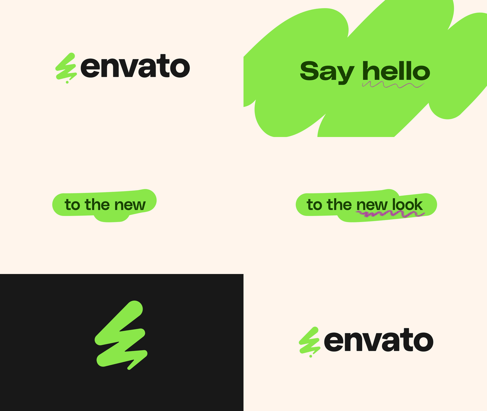
Digital asset marketplace Envato has unveiled a re-energised new brand identity complete with a stylish website facelift, new logo and immersive sonic branding. We've seen our fair share of rebrands in recent years, but Envato's is a masterclass in delivering a playful refresh that doesn't rely on fleeting design trends.
As a platform centred around creatives, Envato's new identity is rooted in a passion for empowering its users. The clean identity embodies innovation, sparking a fine balance between modern playfulness and timeless design, inviting us into a vibrant new era.
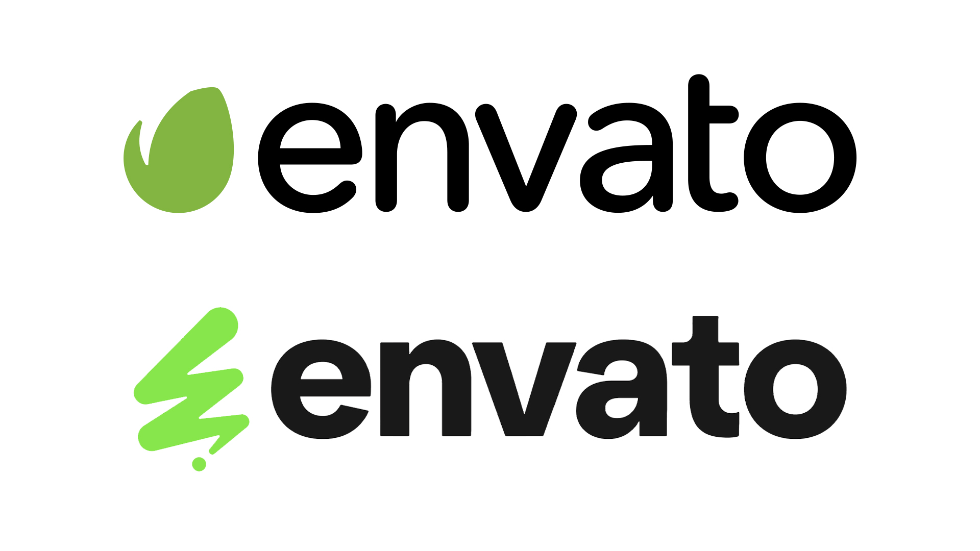
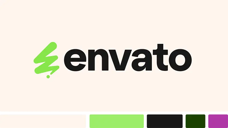
The star of the show is Envato's new logo design, featuring a bold new typeface and reimagined emblem. Created by Norwegian-based designer Milos Mitrovic in collaboration with Envato's in-house design team, the wordmark carries a confident contemporary feel, complementing the peppy new logo design.
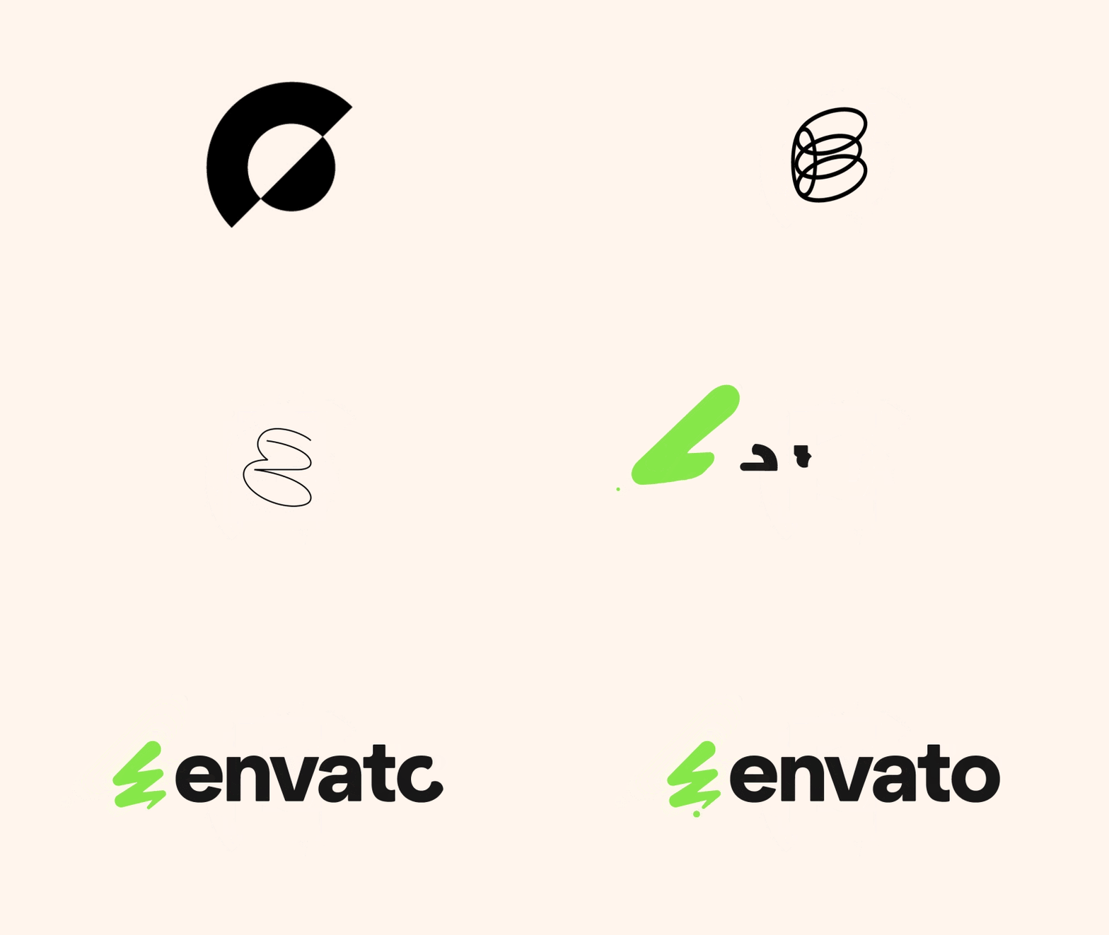
Inspired by the humble exclamation mark, the logo features a 'Creative Spark’ motif comprised of a fluid marker pen-style line embellished with a ‘Dynamic Dot’. A symbol of creatives making their mark (quite literally) Envato's logo is a vibrant emblem representing the unique, innovative spirit of its community.
The new logo is brought to life thanks to the new immersive sonic branding created by NYC-based composer K. Sparks. "At its core, we wanted our sonic branding to capture the spirit of the Envato brand: authentic, passionate, dynamic, and, of course, creative," Envato says in its case study. You can find out more about K. Spark's creative process below.
In a refreshing revamp of its old identity, Envato traded in its old green colour palette for a vivid new shade of Envato Green (unintentionally in line with Charli XCX's Brat Girl Summer branding). The energetic new shade brings a dose of character and freshness to the rebrand, while the addition of three new shades (including a dark green, cream and purple) brings an added depth to the new identity.
Alongside the new visuals come improvements to the site's UX, as well as a modernised UI experience for a well-rounded aesthetic and functional glow-up. “This rebrand is not just about a new look—it’s about living and breathing our brand values into everything we do and supporting our creative community to do the same,” says Envato’s CEO Hichame Assi.
Get the Creative Bloq Newsletter
Daily design news, reviews, how-tos and more, as picked by the editors.
If you're after more design inspiration, check out this wonderfully weird kids' smartwatch branding that embraces colour and childlike creativity. For more logo news, check out the new Goldman Sachs logo that's giving us serious déjà vu.

Thank you for reading 5 articles this month* Join now for unlimited access
Enjoy your first month for just £1 / $1 / €1
*Read 5 free articles per month without a subscription

Join now for unlimited access
Try first month for just £1 / $1 / €1

Natalie Fear is Creative Bloq's staff writer. With an eye for trending topics and a passion for internet culture, she brings you the latest in art and design news. Natalie also runs Creative Bloq’s Day in the Life series, spotlighting diverse talent across the creative industries. Outside of work, she loves all things literature and music (although she’s partial to a spot of TikTok brain rot).

