Cursive logos were all but declared dead in 2024 after even Johnson & Johnson ditched its iconic script logotype, controversially followed by Washington College. Gen Z just can't read joined up letters, we were told. But the oldest retailer in the US begs to differ.
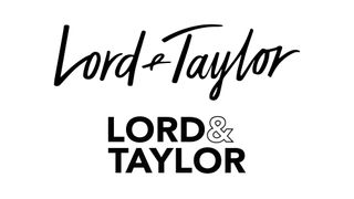
The Lord & Taylor logo has changed as often as the legacy department store brand has changed hands in recent years, going from a sweeping cursive logo to a more legible cursive that looked like it was written in a Sharpie marker to, finally, a clean and modern Helvetica-based design. Now it's come full circle, and the new owner sees those logo redesigns as part of the reason the last comeback failed.

Established in 1826, Lord & Taylor is the oldest-surviving department store brand in the United States. I say surviving.... It's gone out of business twice in recent years. It closed its physical stores in 2021 after filing for bankruptcy and relaunched as an online-only affair under Saadia Group soon after. In March 2024, that operation also closed.
Now the legacy brand is to be relaunched once more, again as an online-only store. And the new owner Regal Brands Global has decided the way forward is to tap into the nostalgia value of a brand that it says has been "a symbol of elegance and style since its inception."

"We are delighted to bring back our beloved logo and are dedicated to restoring Lord & Taylor’s reputation for exceptional customer service and quality," the Lord & Taylor website says. "Our focus will be on introducing new products under the iconic Lord & Taylor signature logo."
In an interview with Retail Drive, Sina Yenel, chief strategy officer at Regal Brands Global, called the Helvetica-based 2022 logo redesign "the biggest betrayal of the brand".
"I understand going after young customers, but this is not a startup," Yenel said. "This is a brand that’s been out here for 198 years. Lord & Taylor has such a huge profile, among different generations and different cultures."
Get the Creative Bloq Newsletter
Daily design news, reviews, how-tos and more, as picked by the editors.
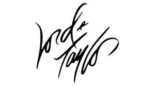
The new old Lord & Taylor logo was handwritten by the architect and graphic designer Andrew Geller. It was used pre 2015 and then again during the Le Tote ownership of the brand. With its wild, free-flowing script It's visually very distinct, but it's not exactly the most legible design.
The use of such a cryptic-looking signature also makes the brand feel rather aloof and snooty to me, but that could be part of what the brand's going for. I agree that the idea younger generations don't dig script logos is probably wrong, and it probably makes more sense for the new comeback to stand out from all the generic-looking sans serif logos out there in the fashion world (also see our pick of the best fashion logos)
For more branding news, don't miss the controversy around the new Westchester County logo. Also see our take on the brand fails of 2024.

Thank you for reading 5 articles this month* Join now for unlimited access
Enjoy your first month for just £1 / $1 / €1
*Read 5 free articles per month without a subscription

Join now for unlimited access
Try first month for just £1 / $1 / €1
Joe is a regular freelance journalist and editor at Creative Bloq. He writes news, features and buying guides and keeps track of the best equipment and software for creatives, from video editing programs to monitors and accessories. A veteran news writer and photographer, he now works as a project manager at the London and Buenos Aires-based design, production and branding agency Hermana Creatives. There he manages a team of designers, photographers and video editors who specialise in producing visual content and design assets for the hospitality sector. He also dances Argentine tango.


