China Now's rebrand is a masterclass in elegant design.
(Image credit: Saboteur)
One project that caught my eye this week is the design for The China Now Musical Festival, an annual series of events produced by the Bard College US-China Institute in partnership with the Central Conservatory of Music in Bejing. Bard College is a very classy bohemian arts-based college in New York, and its festival now has a classy design to match, courtesy of London agency Saboteur (who just won three Brand Impact Awards).
The goal of the project was to bring Chinese music to life for new audiences and the visual identity, which is called Musical Characters of China, uses calligraphy to showcase the expressive nature of Chinese music. "Words like 乐 ("music"), 连 (“link”), 聚 (“together”), and 动 (“movement”) emerge from the performers, making each word an integral part of the performance," reads Saboteur's project page.
(Image credit: Saboteur Studio)
"Calligraphy was the natural choice. Calligraphy is all about movement – the sweep of the brush is captured in the line. Calligraphy is a frozen moment," says Paul Cardwell, co-founder of Saboteur.
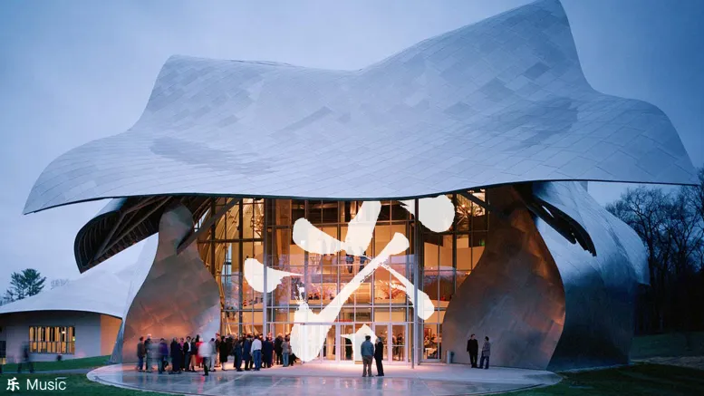
The typography is Granville for English and Noto Serif SC Light for Chinese and the colour palette is black and white, with imagery used to introduce colour.
(Image credit: Saboteur)
The concept applies well to the festival's website, as well as across social and via animation.
(Image credit: Saboteur)
Saboteur created the identity for last year's festival, and this year's work builds upon that. What were the challenges in this project? "We had to indicate two cultures without resorting to clichés. And create a sense of dynamism and excitement in a static medium," explains Paul.
Get the Creative Bloq Newsletter
Daily design news, reviews, how-tos and more, as picked by the editors.
(Image credit: Saboteur)
Paul's favourite touchpoint is the poster outside Carnegie Hall. "Just graphically the contrast between the the gold Beaux Arts frame and the B&W poster is so beautiful and tells the whole story without any need for elaboration. And when you think who else has appeared in these actual physical frames….everybody from Stravinsky to Sinatra, from Duke Ellington to Lady Gaga. Not bad company to keep."
(Image credit: Saboteur)
Overall I think this is a strong and striking idea that has been delivered beautifully. The feeling of movement really comes through and the work extends well across different touchpoints.
Rosie Hilder is Creative Bloq's Deputy Editor. After beginning her career in journalism in Argentina – where she worked as Deputy Editor of Time Out Buenos Aires – she moved back to the UK and joined Future Plc in 2016. Since then, she's worked as Operations Editor on magazines including Computer Arts, 3D World and Paint & Draw and Mac|Life. In 2018, she joined Creative Bloq, where she now assists with the daily management of the site, including growing the site's reach, getting involved in events, such as judging the Brand Impact Awards, and helping make sure our content serves the reader as best it can.