Boring brand manuals and design libraries are a dime a dozen, but every so often we come across a brand style guide that looks a million bucks. And Cash App's new brand design portal is on the money.
The Dropbox brand website set the standard high recently. Now Digital wallet provider Cash App has risen to the challenge with an engagingly dynamic presentation of its brand assets and guidelines that puts staid style guides to shame.
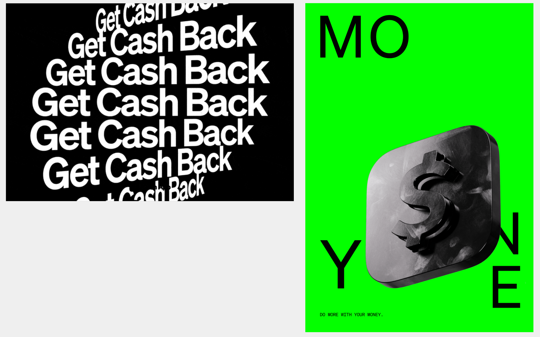
Image 1 of 3
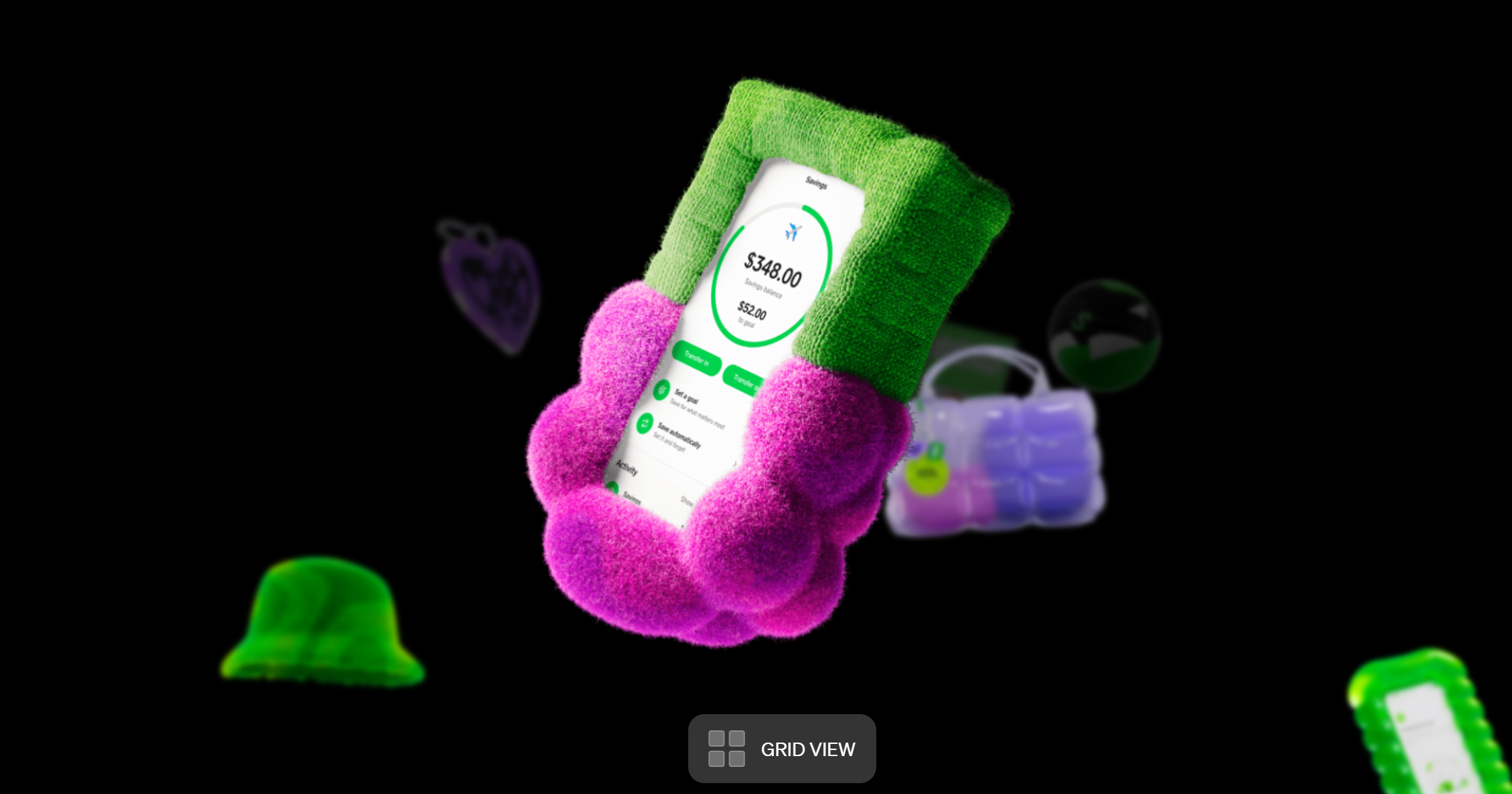
3D icons are part of Cash App's brand assets(Image credit: Cash App)
Icons make strong use of the brand's colour palette(Image credit: Cash App)
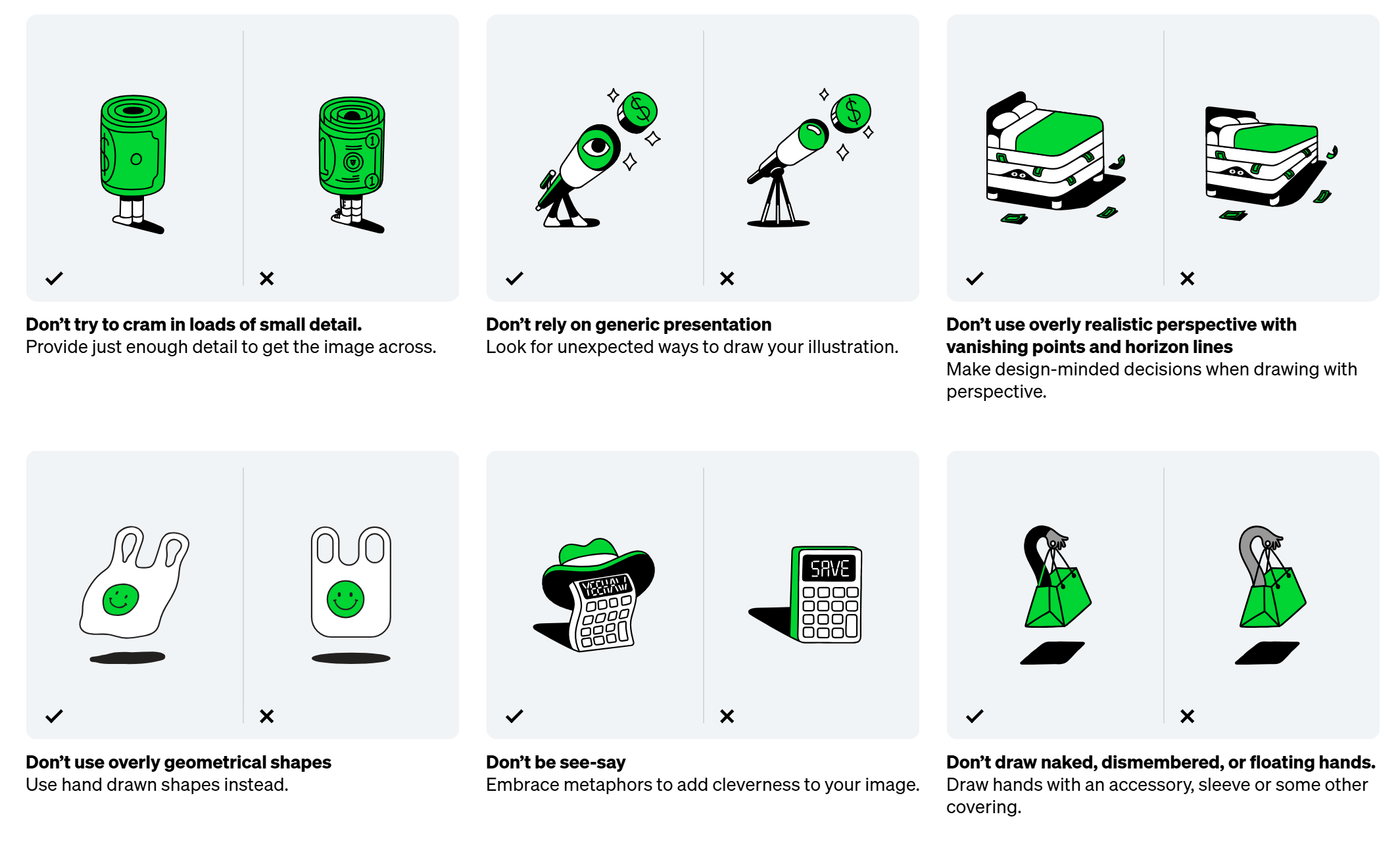
Dos and don'ts from Cash App's brand guidelines website(Image credit: Cash App)
Cash App's been responsible for some inelegant branding in the past. The rebrand of the Visa Cash App RB Formula One Team was hard to swallow. But its new brand guidelines websiteis a delight. Really. Rarely have I seen a brand portal that's actually fun to read and explore.
Latest Videos From Creative Bloq
As you'd expect, the sites sets out all the information designers and partners need in terms of logos, color palettes, typography, illustration style and even motion principles. The specifications are as precise as they need to be but they're presented in an engaging way, and designer are left a lot of room to... well, design.
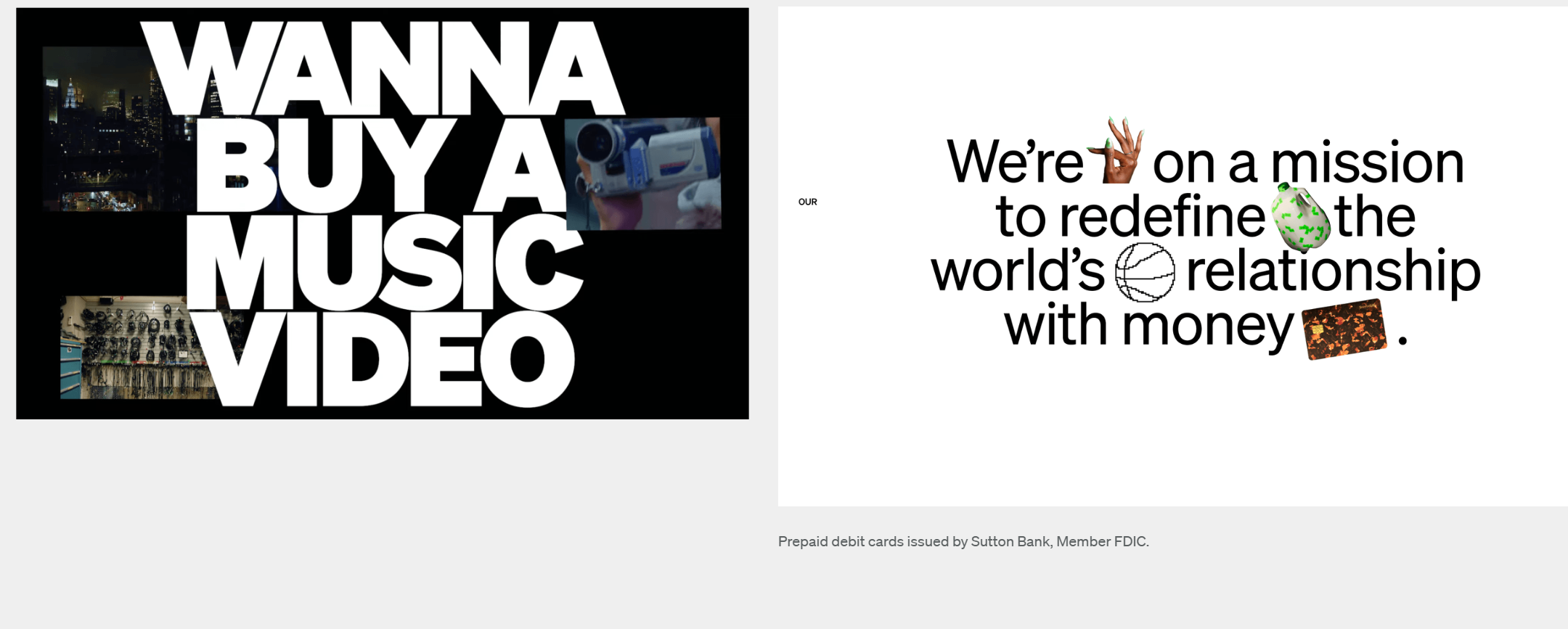
Image 1 of 3
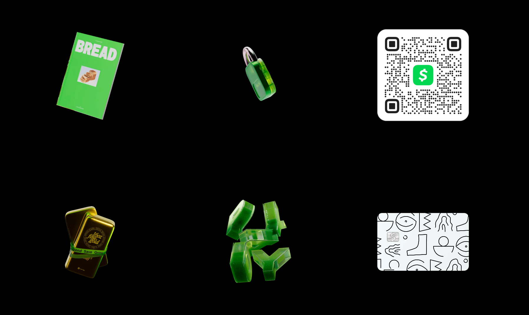
The brand colour palette, 'Cash App Green' features prominently across everything(Image credit: Cash App)
Designers are encouraged to experiment with typography(Image credit: Cash App)
It's a rare brand style guide that encourages designers to try things out(Image credit: Cash App)
Cash App is accompanying the recent trend for brands to break the rules a little. It allows some freedom in the application of its typeface Cash Sans and even encourages experimentation and novelty. Illustration features prominently in the portal’s guidelines, with so many 2D and 3D icons that they look like collectible assets in a video game. Designers are encouraged to create icons that use metaphor and charm rather than literal representations.
Excited to unveil my latest project with @indexstd & Cash App 🔥➡️ https://t.co/tf1zttNTjrI had the opportunity to develop 6 custom, draggable and scrollable navigation systems to showcase Cash App's visual assets and an infinite grid with physics-based interactions 🥵 pic.twitter.com/cQM5cmAEn0February 25, 2025
See more
Motion design is also an important element of the brand identity. The portal uses motion a lot itself, allowing the user to explore icons by zooming in and out of a grid where they float and turn. The guidelines note that the brand's motion style blends “bold confidence” with “playful levity". Presumably aiming at the latter, it appears that the brand has buried a very retro icon in there as an Easter Egg.
I found the easter egg 😆 pic.twitter.com/HTzkQBnVK4February 26, 2025
See more
For more branding news, don't miss the debate about the new Facebook Messenger logo (or rather the old logo).
Get the Creative Bloq Newsletter
Daily design news, reviews, how-tos and more, as picked by the editors.
Thank you for reading 5 articles this month* Join now for unlimited access
Joe is a regular freelance journalist and editor at Creative Bloq. He writes news, features and buying guides and keeps track of the best equipment and software for creatives, from video editing programs to monitors and accessories. A veteran news writer and photographer, he now works as a project manager at the London and Buenos Aires-based design, production and branding agency Hermana Creatives. There he manages a team of designers, photographers and video editors who specialise in producing visual content and design assets for the hospitality sector. He also dances Argentine tango.
You must confirm your public display name before commenting
Please logout and then login again, you will then be prompted to enter your display name.