British Airways turns the hidden beauty of flight paths into a clever new logo design

Sign up to Creative Bloq's daily newsletter, which brings you the latest news and inspiration from the worlds of art, design and technology.
You are now subscribed
Your newsletter sign-up was successful
Want to add more newsletters?
Airline loyalty programmes don't tend to have the most exciting branding, if any at all, but the British Airways Club is now flying above the rest in terms of looks.
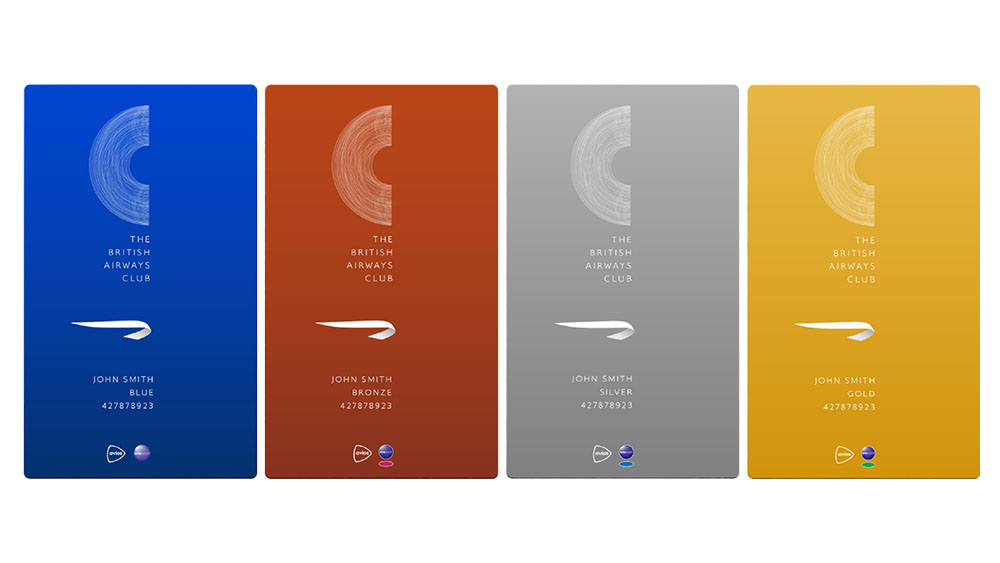
Alongside a new name and structure, the program has a new colour palette and a surprising logo design with an interesting inspiration. The logo looks both minimalist and intricately complex contributing to a much sleeker visual identity (also see our pick of the best logos).

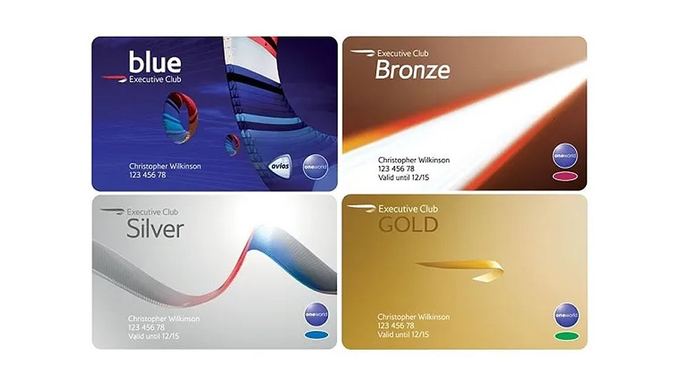
The previous (and slightly pompous) title of Executive Club has been dropped for the simpler British Airways Club, and the new visual identity follows the same path with a cleaner and simpler look.
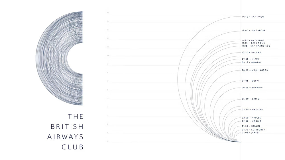
Article continues belowContrasting with the minimalism, the new logo is a web of crossing curved lines inspired by great circle flight paths. Reminding us that the shortest flight paths from A to B are curved, not straight, the intricate lines form a 'C' for Club while also capturing the invisible geometry of the many flights made by frequent flyers, making it an effective visual representation for an airline loyalty programme.

Beyond the visual design, there are changes to how passengers earn points too. Under the new system, club members will earn Tier Points based on the cost of their flight plus ancillary spending including seat selection and excess baggage and by making a contribution to sustainable aviation fuels. Customers will also be able to use Avios as a form of payment when a new dedicated landing page launches on April 1.
For more branding news, see the new old Lord & Taylor logo and our take on the big brand fails of 2024.
Sign up to Creative Bloq's daily newsletter, which brings you the latest news and inspiration from the worlds of art, design and technology.

Joe is a regular freelance journalist and editor at Creative Bloq. He writes news, features and buying guides and keeps track of the best equipment and software for creatives, from video editing programs to monitors and accessories. A veteran news writer and photographer, he now works as a project manager at the London and Buenos Aires-based design, production and branding agency Hermana Creatives. There he manages a team of designers, photographers and video editors who specialise in producing visual content and design assets for the hospitality sector. He also dances Argentine tango.
