Bose's new rebrand showcases its hand drawn heritage logo
A subtle design tweak makes a big impact.

Bose has unveiled a harmonious new brand identity celebrating its heritage while carrying its innovative legacy into the modern age. Steeped in a rich history of audio engineering excellence, the rebrand has a revitalised appeal that captures the brand's dynamic spirit while reinforcing its timeless elegance.
Looking back at some of the best rebrands of all time it's clear that mastering the fine balance between heritage and contemporary elevation is no easy task. With an energetic new colour palette, sleek typography and an authoritative brand voice, Bose's new identity is a refined homage to its design legacy and a powerful projection of its innovative future.
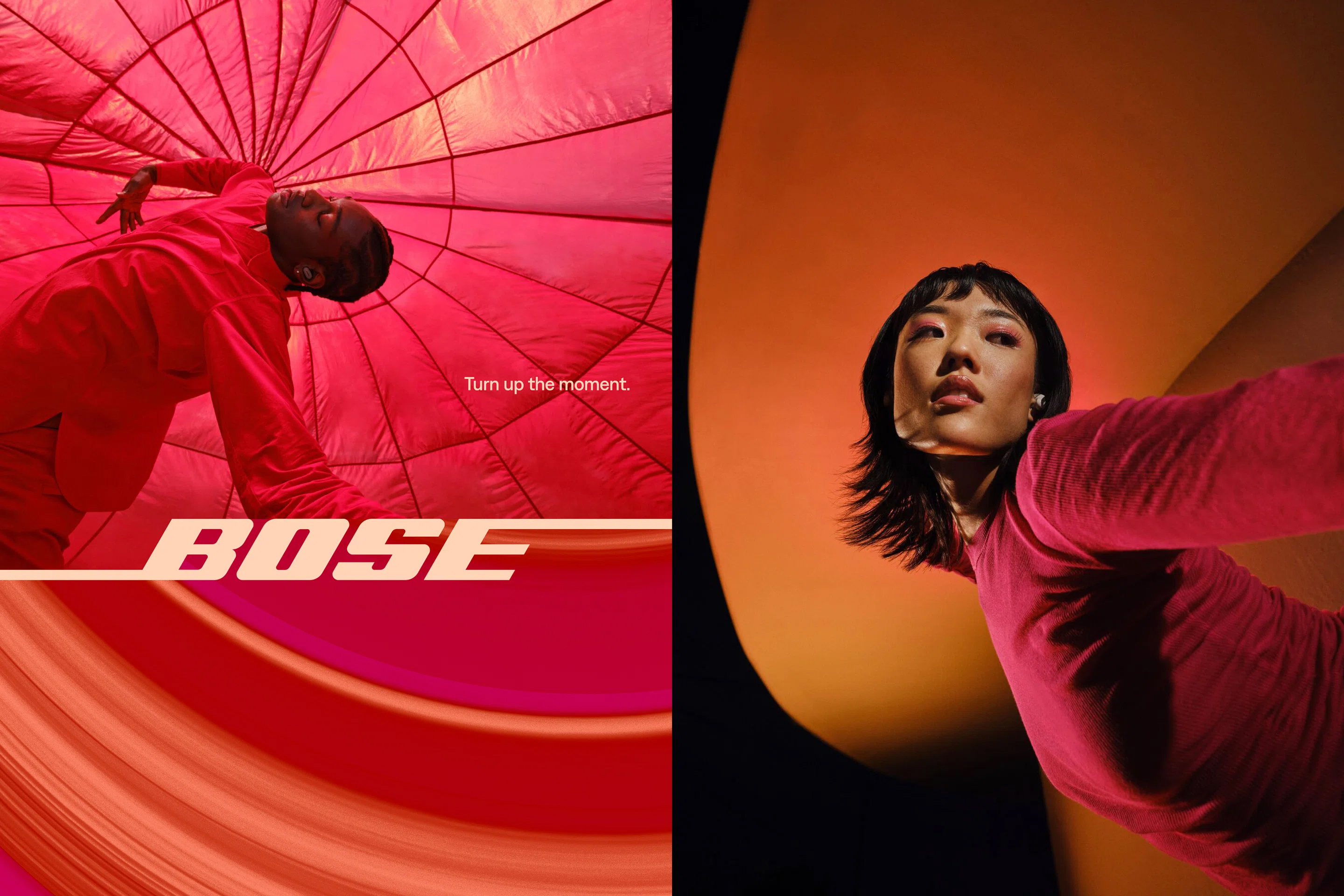
Created by brand consultancy Collins, the Bose rebrand was shaped by the simple element of sound. With a rich history of creating elite audio equipment, Bose's "sound is power” positioning was a strong catalyst in refining the brand's new value centred around “Immersive Audio.” In a case study Collins claims "We amplified and freed up their identity to take on its most expansive form – aiming to reassert Bose with a revitalized, declarative voice that invites people into an unparalleled world of immersive sound."

While there's an undeniable contemporary quality to the rebrand, Bose's original wordmark remains mostly unchanged, reinforcing its strong heritage and maintaining brand consistency. Despite being created in the 1960s the logo has a timeless quality, with only the bars at the base of the ‘B’s and the top of the ‘E’ receiving a minor design tweak.
Inspired by the original hand-drawn logo's italicised form, the new typeface developed in collaboration with Tekio, brings flexibility and dynamism to the new branding. The expanded colour palette takes a sonic-inspired approach, with each dynamic shade coinciding with the eight core chromatic tones. An immersive suite of motion graphics gives the rebrand a contemporary fluidity, building upon the power of music to inspire movement.

Bose's rebrand is exactly what I love to see from a heritage brand – a pitch-perfect blend of authority and identity embellished with a contemporary freshness to inspire a new generation. As we've seen with the recent Kleenex rebrand, sometimes a brand refresh benefits from simple yet thoughtful design evolutions that reinforce rather than replace an identity. For more design inspiration check out the best rebrands of the 2020s (so far).
Get the Creative Bloq Newsletter
Daily design news, reviews, how-tos and more, as picked by the editors.

Thank you for reading 5 articles this month* Join now for unlimited access
Enjoy your first month for just £1 / $1 / €1
*Read 5 free articles per month without a subscription

Join now for unlimited access
Try first month for just £1 / $1 / €1

Natalie Fear is Creative Bloq's staff writer. With an eye for trending topics and a passion for internet culture, she brings you the latest in art and design news. Natalie also runs Creative Bloq’s Day in the Life series, spotlighting diverse talent across the creative industries. Outside of work, she loves all things literature and music (although she’s partial to a spot of TikTok brain rot).
