The vowels may be back, but the vibes are still off.
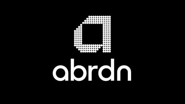
(Image credit: Wollf Olins/Abrdn)
Ah, Abrdn. You might remember the investment company for removing its vowels in 2021, provoking widespread amusement amongst design fans and consumers alike – I certainly do. Sure, the rebrand may have come with a lovely graphic 'a' for its logo, but it was hard to look past the fact that the wordmark rendered the name totally unpronounceable – a flex that isn't ideal for a relatively unknown brand (McDonald's could definitely get away with it).
Well, that rebrand (created by Wolf Ollins) has just been undone. Yes, folks, the vowels are back – ending a spell of four years in which new customers couldn't quite manage to decipher the name of the brand (certainly not a contender for one of the best rebrands ever). It lasted a lot longer than I thought it would at the time. However, there's still an annoying quirk I can't get on board with.
The group has previously been named both Aberdeen Asset Management and Aberdeen Standard Life (you can see why they wanted to depart from that big yawn, amirite?) – but it hasn't gone back to being completely straight-laced. From now on it'll be known as aberdeen group. Without a capital A. Very cool and relaxed Dad vibes. Potentially an ideal approach for an investment advice firm...? I don't mind seeing this sort of style decision in a logo or wordmark, but I can't abide it when written as part of standard text. It feels try hard – but maybe I'm being a grammar pedant.
Latest Videos From Creative Bloq
The widespread mockery obviously cut deep at the time, with one of the company's senior employees asserting that the memes, articles and jokes amounted to 'corporate bullying'. According to Chief Executive Jason Windsor, the name change is to help remove the "distraction" of the chat around the vowel-less name. At least everyone can actually read that lower case a, I guess.
The logo has remained the same, but the wordmark has changed to reflect the whole name, 'e's and all. See it below.
(Image credit: aberdeen group)
It's a move welcomed by branding experts, including Josh Dickins, Head of Consulting at agency Modern Citizens. "Poor old Abrdn. I fear it was always going to come to this. A rebrand and renaming with no doubt the best of intentions – to bring technology to the fore, to feel modern and progressive, to diminish potentially unhelpful associations with the granite city. But ultimately, one where the rebrand ended up becoming the story, rather than telling the story it was designed to," he says.
"What Abrdn failed to do, was pass what we sometimes call the “pub test”. Put very simply, the test is this: when all the theory is in place, and the brand rationale is worked out, how would it sound coming from a financial advisor, or an employee, or an investor in an everyday conversation (pub setting optional)?
Get the Creative Bloq Newsletter
Daily design news, reviews, how-tos and more, as picked by the editors.
"Apply the pub test, and you quickly realise that in a category that needs to convey trust, confidence and expertise, anyone stumbling or giggling over the name becomes a major strategic hurdle. The logic was no doubt there; the practical foresight was not. Scotland is not Silicon Valley, asset management is not app development, and Abrdn is not Tumblr.
"Above all, it’s a timely reminder that brands don’t exist in PowerPoint decks, brand guidelines, nor even in logos. They exist in the minds of customers. Fail to appreciate the mind of the customer, and you end up in their conversations for all the wrong reasons.”
Georgia is lucky enough to be Creative Bloq's Editor. She has been working for Creative Bloq since 2018, starting out as a freelancer writing about all things branding, design, art, tech and creativity – as well as sniffing out genuinely good deals on creative technology. Since becoming Editor, she has been managing the site and its long term strategy, helping to shape the diverse content streams CB is known for and leading the team in their own creativity.
You must confirm your public display name before commenting
Please logout and then login again, you will then be prompted to enter your display name.