7 brands with brilliant typographic identities, and why they work
Typography plays a pivotal role in shaping brand perception.

The silent power of typography often goes unnoticed, yet it plays a pivotal role in shaping a brand’s perception. Beyond mere readability, a thoughtfully chosen typeface becomes a visual ambassador, conveying the brand’s personality and values with every curve and stroke. A strong typographic identity transcends the simple selection of a font – it’s a strategic design decision that influences how consumers connect with a brand or service, fostering recognition and loyalty.
This article showcases brands that have masterfully leveraged typography to carve out a unique space in the market. We will examine real-world examples to understand how these companies have used custom or carefully selected typefaces to communicate their brand story. Just like having one of the best logos or an ownable colour palette, a typeface can become a powerful brand asset. A distinctive and well-chosen typeface can convey brand personality – think about a playful script font that suits a children’s brand, while a bold sans-serif could convey strength and modernity for a tech company.
The brands we will explore in this article have chosen fonts that align with their aesthetic and integrated them across various platforms, ensuring a consistent and recognisable visual language that strengthens their brand presence.
01. Mailchimp
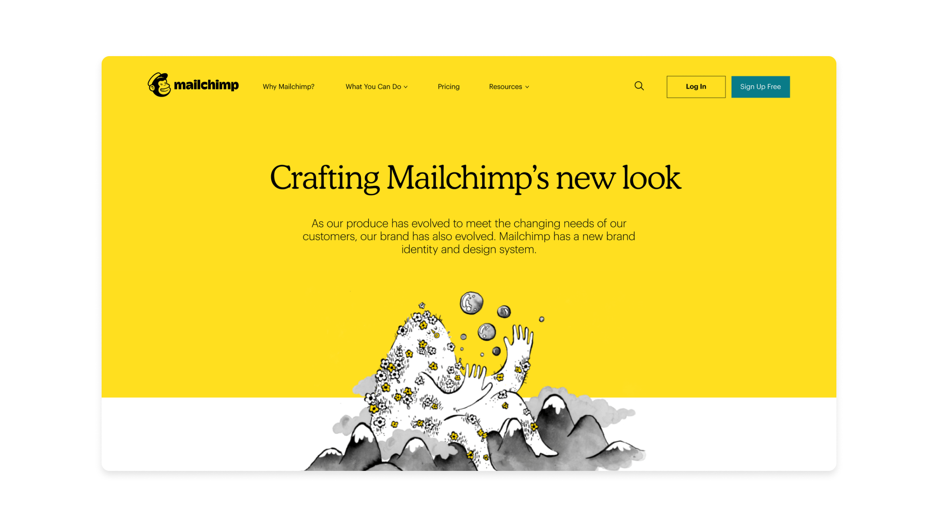
Mailchimp is an all-in-one marketing platform primarily known for its email marketing services. Its typeface is Means (primary) and Graphik (secondary).
Why it works: An elegant serif infused with a quirky warmth, the primary brand typeface for Mailchimp, Means, projects trustworthiness, optimism and sincerity. Graphik adds a touch of personality for headlines and accents.
This combination creates a welcoming and engaging experience for users. The difference lies in their purpose: the heading typeface injects a sense of whimsy and memorability, drawing attention and reinforcing Mailchimp’s distinctive branding, while the body text typeface prioritizes clarity, allowing users to easily digest information.
02. The New York Times
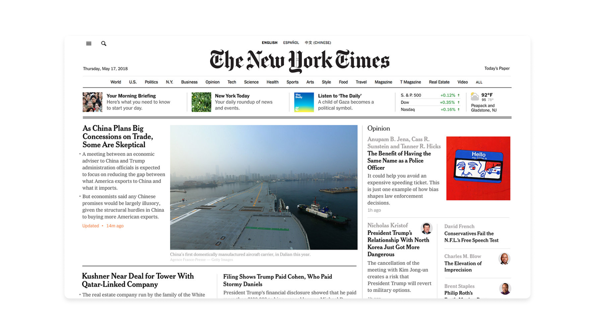
The New York Times website serves as the online presence of the renowned The New York Times newspaper and its typeface is Cheltenham (primary) and Franklin Gothic (secondary).
Why it works: The New York Times maintains its classic newspaper heritage with Cheltenham, conveying authority and trustworthiness. The addition of Franklin Gothic for headlines and digital interfaces provides a modern edge and improves readability on screens. This contrast serves to establish a clear visual hierarchy: the serif headings command attention and signal the importance of the content, while the sans-serif body text ensures a comfortable and efficient reading experience for the extensive articles.
03. Uber
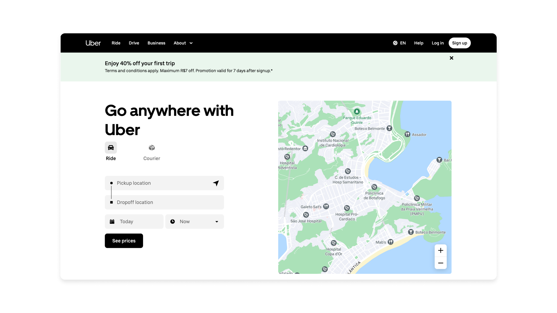
Uber is a technology platform that connects riders with drivers for transportation services. The mobile app is also an important artifact in the drivers and riders' user journey and is used as the main digital touchpoint between the brand and the customers. It uses Uber Move, a custom typeface.
Why it works: Uber Move is a geometric sans-serif typeface designed specifically for the brand. Its clean lines and simple forms reflect efficiency and modernity, which are key aspects of the Uber brand. It's optimised for legibility across various devices and supports multiple languages.
This typeface was designed specifically for the brand and is crucial for establishing a consistent and recognisable brand identity across all platforms and touchpoints. By owning their typeface, Uber ensures a unique visual language that distinguishes them from competitors and reinforces their brand’s global presence, creating a cohesive user experience regardless of location or device.
04. Medium
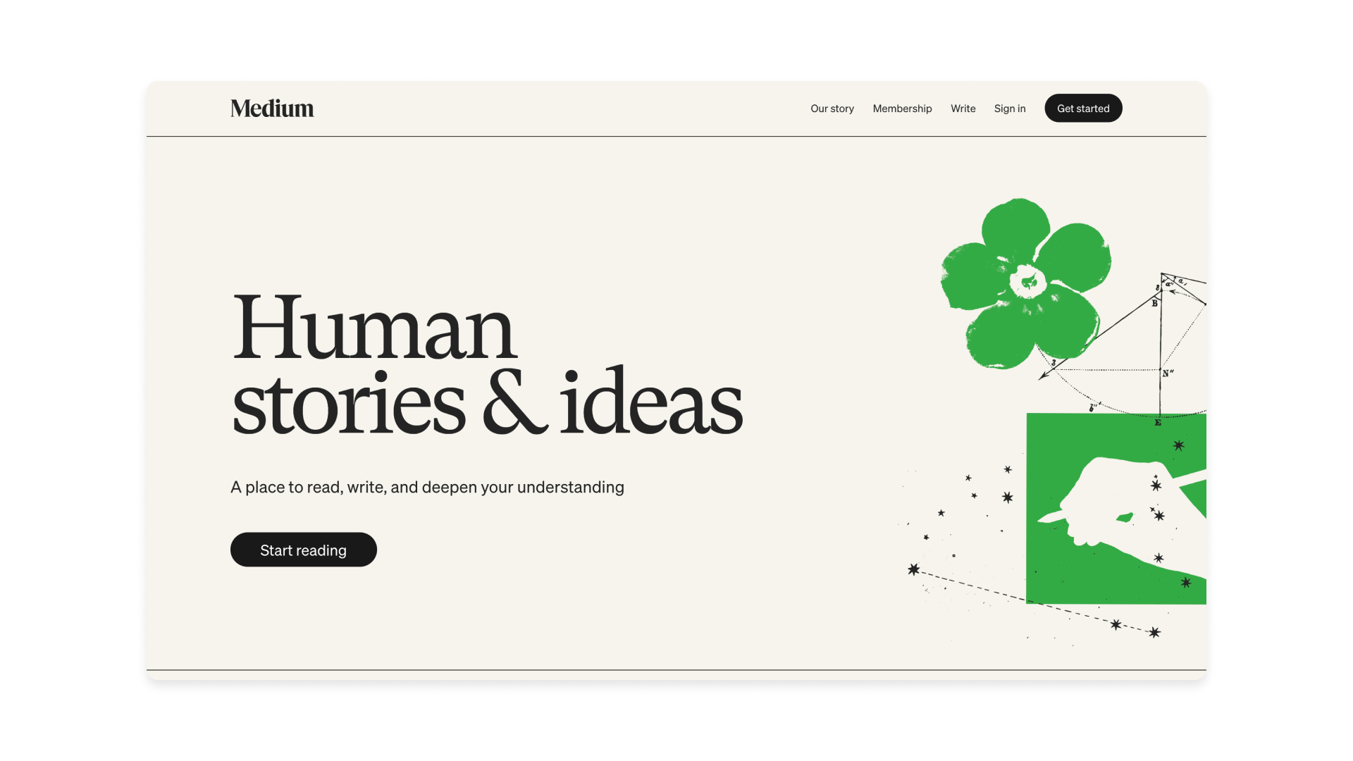
Medium is an online publishing platform where people can write and publish articles, and readers can discover and engage with content. Its typefaces are Charter (primary) and Sohne (secondary).
Why it works: Charter's readability and slightly informal feel make it ideal for long-form reading, which is central to Medium's platform. It creates a comfortable and inviting reading experience, encouraging users to engage with the content. This choice is paramount for a platform dedicated to in-depth articles and essays.
Complementing this is Sohne, a sans-serif font used for UI elements, headings, and metadata, providing a clear visual hierarchy and a modern contrast. The primary serif font ensures immersive reading for articles, while the secondary sans-serif provides clarity for interface elements, balancing content consumption with functional navigation.
05. Resend
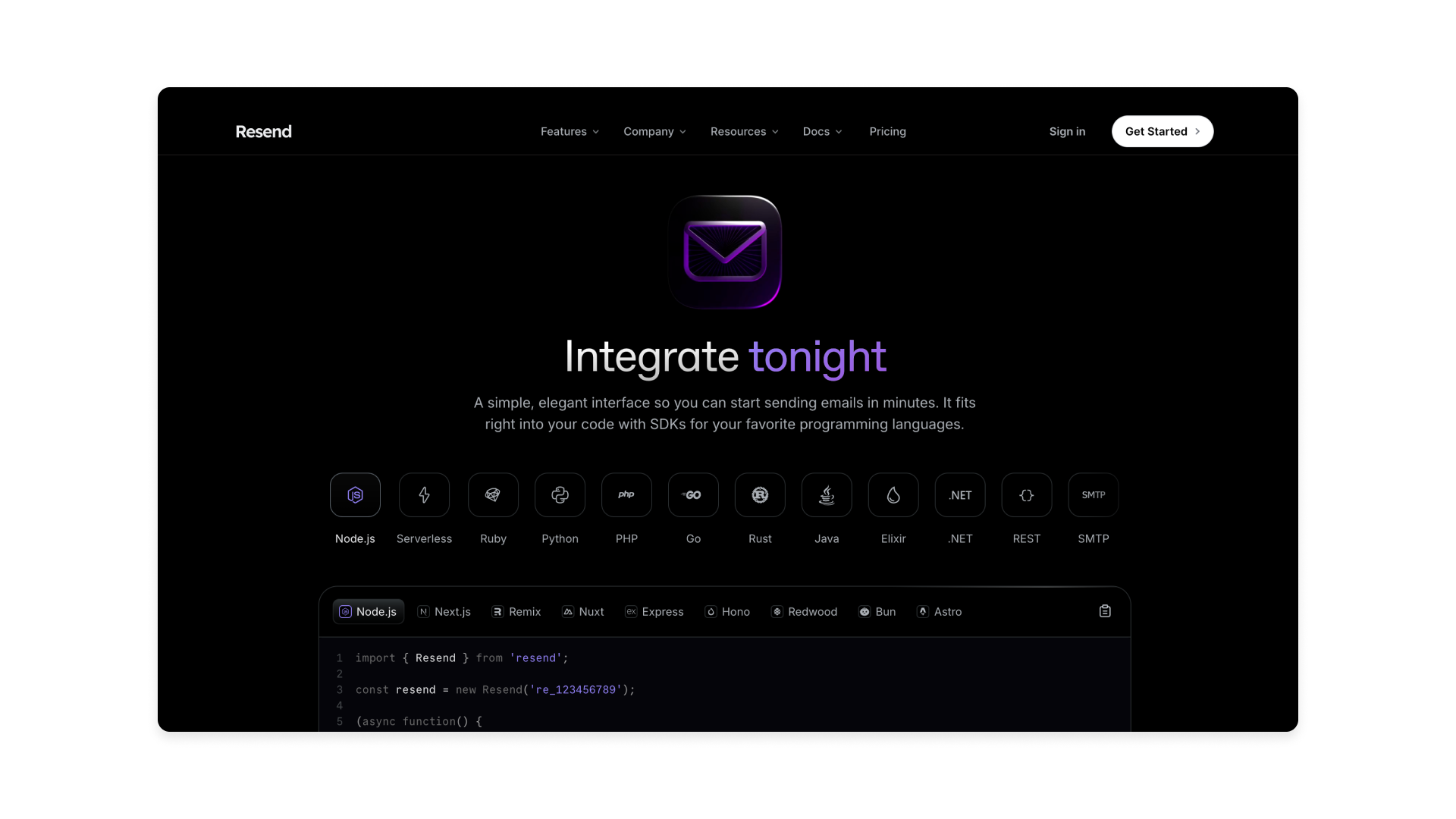
Resend provides an email API and platform that allows developers and businesses to reliably send transactional emails, such as password resets, order confirmations, and welcome messages, with a focus on ease of integrations. Its typeface is aBCFavorit (primary) and Inter (secondary).
Why it works: Resend.com utilises clean, readable sans-serif typography, including monospaced fonts for code and Inter for body texts, to project a modern, reliable, and technically proficient brand image. This deliberate choice reinforces their core values of efficiency and trust. The typeface aBCFavorit, a grotesque sans-serif by Dinamo, offers a balance of geometric clarity and unique, slightly humorous details, making it versatile for titles and primary texts.
06. Oura
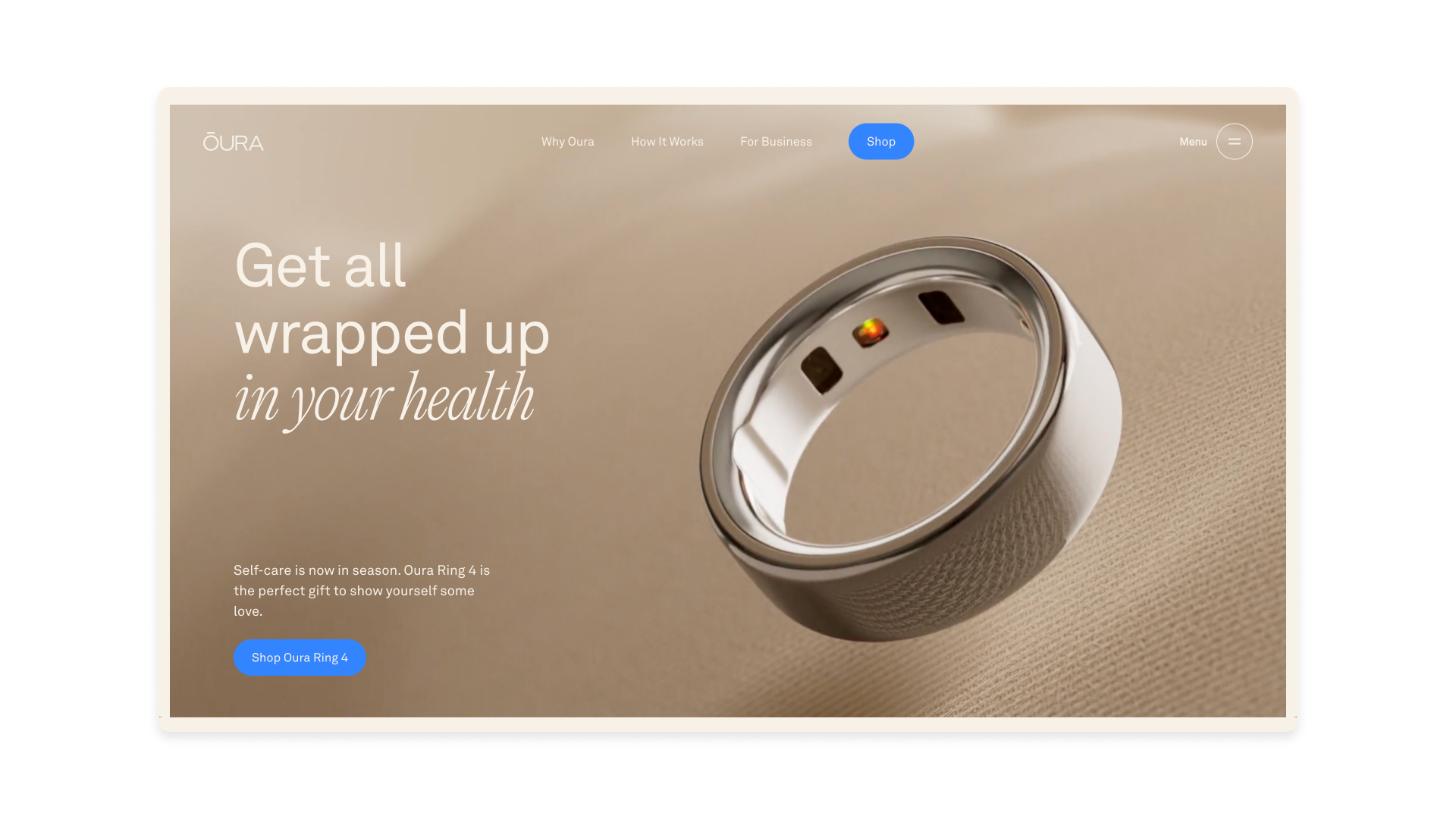
Oura has a smart ring and accompanying app that tracks various aspects of your health and sleep. It uses AkkuratLL and Editorial News as its typefaces.
Why it works: Oura primarily employs the clean and modern AkkuratLL sans-serif typeface for body text and headings, ensuring readability and a sleek aesthetic, complemented by a bolder, slightly more stylised sans-serif called Editorial News for key elements only. This pairing creates a great visual hierarchy, guiding the user’s eye and adding a touch of sophistication.
07. Inne

Inne.io provides a hormone tracking device and app that allows women to monitor their fertility and hormonal health at home by analysing saliva samples. In terms of typefaces, it uses Oceanic Text (primary) and GT America Inne (secondary).
Why it works: Inne.io utilises Oceanic Text for headings, a typeface with a condensed and technical feel, conveying precision and innovation. This contrasts with GT America Inne for body text, a variation from the classic and readable GT America font that prioritises clarity and accessibility.
The difference lies in their purpose: Oceanic Text adds a distinctive, almost futuristic flair to headings, drawing attention and emphasising key messages, while GT America Inne ensures a smooth and comfortable reading experience for longer blocks of text, balancing visual interest with functional legibility.
For more explorations of typography, see our typography of the decade series.

Thank you for reading 5 articles this month* Join now for unlimited access
Enjoy your first month for just £1 / $1 / €1
*Read 5 free articles per month without a subscription

Join now for unlimited access
Try first month for just £1 / $1 / €1
Get the Creative Bloq Newsletter
Daily design news, reviews, how-tos and more, as picked by the editors.

Rodolpho is a multidisciplinary digital designer working at the intersection of product, brand, and technology. Currently, at Google, he designs digital products used by more than 3 billion people worldwide. Before that, he was a Design Director at McKinsey & Company. Over the past 13 years, he has been transforming ideas into first-class digital experiences for startups and big leaders.
You must confirm your public display name before commenting
Please logout and then login again, you will then be prompted to enter your display name.
