Ask.com: how we built
Jeeves might have gone, but Ask.com is still a serious player in the search market. Tony Macklin tells us about the new site
.net: Why did Ask.com need a revamp?
TM: In February 2006, more than ten years after Ask first appeared on the internet, Ask Jeeves became Ask.com. The process was certainly a challenge, but one we felt was necessary to help users get the most from their search experience. Ask has always had great search technology underpinning the site, but from research it became clear that users’ perception of the Ask Jeeves brand was getting in the way.
For this reason and others, we knew that things had to change. Firstly, we had to change the way users perceived us and change their search behaviour. We wanted to give them a better, cleaner experience, with our advanced functions made much more accessible. With the global reach of the internet, we also knew that any redesign would have to be implemented on a coordinated, worldwide scale, with consideration given to the needs of our users not just in the UK, but in the US and all over Europe.

.net: What sort of process did you go through before actually redesigning?
TM: Before starting on any redesign work, we carried out extensive concept research looking at the views of our current users and other internet users in general. The research pointed toward the emergence of a new, sought-after search market target audience that desired sophisticated internet search tools. This user is typically aged between 18-35, often male with a high level of technological literacy.
In blind tests, though, the quality of our search results and content-linked tools such as Smart Searches were both met with surprise because the user experience was far better than expected. More general investigation into search and the wider internet also revealed a growing dissatisfaction with the prevalence of adverts on the web. The research left us with three key tasks: to retire Jeeves and fill the void left by his departure, to reduce the level of advertising, and the seamless integration of content into our results.
After the initial research we created two prototype sites to gauge users’ reaction, one was an evolution of the existing design, and the other a complete revolution. The first thing we learned was that we would have to maintain some continuity with the old site. One of the strengths of the Ask Jeeves home page was its warmth, symbolised by Jeeves as well as through the colouring of the pages and the easy-touse interface. Moving to a very sophisticated approach immediately lost this warmth and began to alienate users. The prototype phase also enabled us to bring our advanced search tools to the fore, and present them on the home page for visibility and ease of use. The reduction of sponsored links also proved very popular with our trial users.
.net: Why did Jeeves have to go?
TM: For many users Jeeves still embodied the idea of a Q&A and was, therefore, seen as something for beginners. Once the prototype trials were completed, we had a clear view of what the relaunch had to achieve, and how. To change the perceptions of the site, the first step was to retire Jeeves, and with him the notion that Ask.com is for beginners. It was vitally important to engage existing users in Jeeves’ exit, and reassure them the site was changing for the better. With this in mind we created a microsite that enabled Jeeves’ fans to visit his office and vote for a retirement plan, with options ranging from going into space, to running a monkey sanctuary in Borneo (Jeeves is currently enjoying a round-the-world cruise). Over 80,000 users cast their vote at the microsite, which also included blueprints for the new site design and a board to leave farewell messages for Jeeves.

.net: What about the more serious design changes.
TM: Reducing the level of advertising was next. Although it posed a risk in terms of reduced revenue, we were confident that the move would result in more users. When our US colleagues made a similar move in 2005 the number of users grew substantially, which gave us confidence to make the change on a global scale. Ask.com now has the least ads on the first screen of results of any major search engine.
Get the Creative Bloq Newsletter
Daily design news, reviews, how-tos and more, as picked by the editors.
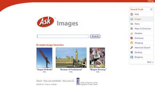
Another key part of changing perceptions and user behaviour was to refresh the site’s appearance and give it a cleaner, more professional look. Today’s typical internet user is very different to a user ten years ago. “Help me find it” has become “Help me get it faster”. With this in mind, we now provide direct links to search tools designed for common queries. They’re all presented in the Search Toolbox, a new addition to the home page with customisable links to Image Search, News Search, Maps, Desktop Search, Weather and more. The new AJAX-based interface enables users to drag and drop these tools into whatever order they prefer and gives immediate access to advanced searches. By enabling users to personalise their home page Ask.com is at the forefront of integrated search and content on the web.
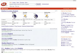
The reply page has also had an overhaul, with a number of features designed to provide the desired information, content or web page more quickly than ever before. We’ve added more categories of Smart Search, giving users better direct access to content in response to queries in popular areas such as music, films, or celebrities. The Zoom feature uses our relevancy-based technology to suggest other searches related to the original query, and the Binoculars icon shows users a thumbnail preview of a website without leaving the results page. With savvier internet users and richer content than ever before, the personalisation options have also been enhanced, to enable users to store their favourite links. Called MyStuff, the service will save selected search results to a personal portfolio of sites with justp one click.
.net: Are you pleased with the results?
TM: Yes, Ask.com has now been launched and initial results show that the site is proving popular. User figures have grown, perceptions are changing and new product launches, such as Blog Search, will continue to drive popularity. These new innovations coupled with the sleek design and improved quality of results, show that Ask.com is leading the way in a highly competitive marketplace.

Thank you for reading 5 articles this month* Join now for unlimited access
Enjoy your first month for just £1 / $1 / €1
*Read 5 free articles per month without a subscription

Join now for unlimited access
Try first month for just £1 / $1 / €1
The Creative Bloq team is made up of a group of design fans, and has changed and evolved since Creative Bloq began back in 2012. The current website team consists of eight full-time members of staff: Editor Georgia Coggan, Deputy Editor Rosie Hilder, Ecommerce Editor Beren Neale, Senior News Editor Daniel Piper, Editor, Digital Art and 3D Ian Dean, Tech Reviews Editor Erlingur Einarsson, Ecommerce Writer Beth Nicholls and Staff Writer Natalie Fear, as well as a roster of freelancers from around the world. The ImagineFX magazine team also pitch in, ensuring that content from leading digital art publication ImagineFX is represented on Creative Bloq.
