10 steps to improving your designs
Top designer Anton Repponen reveals his personal checklist for better designs.
06. Question yourself
Being confident in your work is important. However, it only matters if the end result is an outstanding design. During the work process, question yourself, rethink, and question again. Are you on the right track? Is this innovative enough? Is the execution strong?
Think of it as if you were the user, or if you were your own client: would you find what you have produced new or inspiring? Questioning yourself will help you go through the design process more quickly, and will yield better results in the end.
07. Check with other departments
Designers often end up working in silos. This is limiting. Everyone around can have a valuable creative input into a project: developers, producers, and even clients. There are so many things you might not know about, and one idea can prompt another. Maybe some of the latest tech solutions can inspire you to come up with something new and interesting.
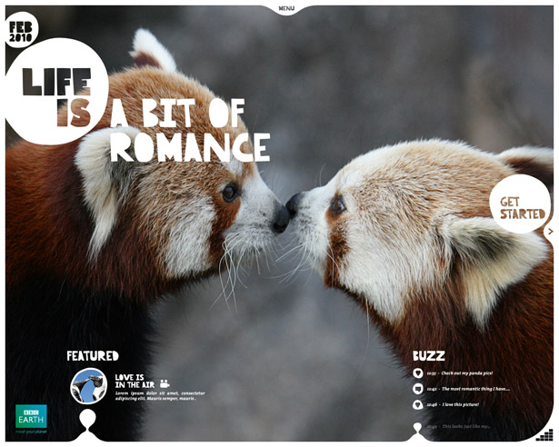
While working on UX for the BBC's 'Life Is' project, our entire team came up with ideas, with designers trying out different approaches on the go, multiple developer tests and client input. It enabled us to create a very interesting look and feel with fluid UI elements that avoid standard, safe solutions. It looks like nature designed the experience.
08. Organise your work
Working at an agency can be a collaborative process where multiple designers work on the same project. This makes it very important to keep your work organised, from having an intuitive folder structure and naming files consistently, all the way down to the way you label layers in a PSD file.
When passing your PSD to another designer, that person should not have to spend any precious time understanding what is where.
Layers should be named logically, and organised from top to bottom, with the top Layer Group being the one that contains the navigation elements (if navigation is at the top of the screen), and the bottom Layer Group being the one that has all the footer items.
Get the Creative Bloq Newsletter
Daily design news, reviews, how-tos and more, as picked by the editors.
Unused layers should be removed. This will also look more professional when a designer delivers source PSD files to the client.
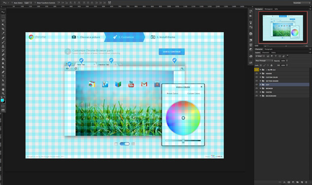
On top of that, use the grid. Be very precise with it and stay consistent. Having a grid will enable you to create templates faster and more accurately, as well as showing designers the limits of components.
When you drag all the elements into the final layout, everything comes together as a puzzle. Using a grid will enable you to design more dynamic layouts in which individual components can be replaced with one other.
09. Make everything consistent
The very last step in the design process is creating a style guide based on the completed project. Essentially, a style guide is set of PSDs illustrating every little interaction: every state of every button and link, all the icons and fonts, and so on.
It should contain possible case of every single component, so developers can export graphics from the file as sprites.

This will also enable you to see whether your project and its elements are consistent enough. Are the buttons the same height as input fields? And are you using too many assets, or could you get away with half the number?
Don't be afraid to go into detail. Some of the style guides created for larger projects at Fi are over 100 pages in length.
10. Be proud of your work
I know so many designers who aren't happy with their work at the end of a project. "It might have been so much cooler," they say. "If only I'd known that this would be the final result".
And to be honest, I'm one of them.
But it's important to be proud of your work, and make a statement with it. This is how we came up with the case studies we do at Fi for the key projects we complete.
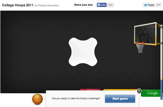
A couple of years ago we completed a nice HTML5 basketball game for Google. We struggled with it, not knowing how to showcase it properly. Small images in our portfolio wouldn't be enough, but video wasn't an option either: we wanted to keep it interactive.
Instead, we came up with a special promo page where we embedded the HTML5 piece, wrote up the story behind the project and highlighted design elements that were hard for users to see.
In later case studies, staff started to show designs that were rejected by the client, just to show how the final piece evolved. Then we started to show the UX process that led up to the design.
At some point we even began to highlight the original pitch we did for the client, to draw a full circle around the process.
Nowadays, these Fi case studies are projects in their own right. They're statements that showcase the thinking and energy we put into the work we do, all the way from idea to launch.
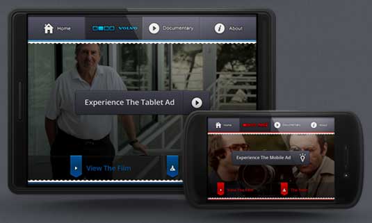
Hopefully, this list will help you in the same way that it has helped me. Though this approach may not suit every designer, I am sure at least a few of these points will prove relevant.
If you are starting out, keep them in mind and focus on improving over time, so that one day you can create your own checklist: one that suits your own personal process.
Thank you. And stay amazing designers.
Words: Anton Repponen
Anton Repponen has been creative director at Anton & Irene since October 2014.

Thank you for reading 5 articles this month* Join now for unlimited access
Enjoy your first month for just £1 / $1 / €1
*Read 5 free articles per month without a subscription

Join now for unlimited access
Try first month for just £1 / $1 / €1
The Creative Bloq team is made up of a group of design fans, and has changed and evolved since Creative Bloq began back in 2012. The current website team consists of eight full-time members of staff: Editor Georgia Coggan, Deputy Editor Rosie Hilder, Ecommerce Editor Beren Neale, Senior News Editor Daniel Piper, Editor, Digital Art and 3D Ian Dean, Tech Reviews Editor Erlingur Einarsson, Ecommerce Writer Beth Nicholls and Staff Writer Natalie Fear, as well as a roster of freelancers from around the world. The ImagineFX magazine team also pitch in, ensuring that content from leading digital art publication ImagineFX is represented on Creative Bloq.
