10 steps to improving your designs
Top designer Anton Repponen reveals his personal checklist for better designs.
This design checklist is a guide that I created for myself over time – it allows me to find the balance between the two extremes I face daily as a designer.
At times I can get carried away and only focus on all the little details without seeing the project from a bird's-eye view, while at other times I only think of the project from a holistic perspective, without really focusing on the important details. Following these 10 steps allows me to stay on track with multiple projects simultaneously, and allows for a healthier design process overall.
01. Understand the project
Before starting design work, understand what the project is really about, what function it has and what the end user should get out of it. Don't let design overrule functionality.
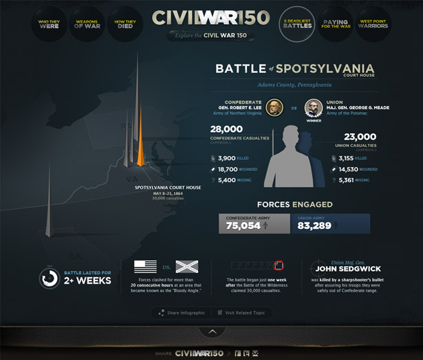
Often, designers 'jump' on a project not understanding and not seeing the goal. Sure, they may eventually reach that goal, but only via a much longer route: one that will involve a lot of changes. Understanding – almost imagining the final piece in your head – will let you go through a healthier process. The resulting design might surprise you.
02. Communicate your idea right
You cannot underestimate the power of presentation, both internally and in front of the client. As a designer, communicating ideas clearly and concisely eliminates a lot of questions and feedback sessions, saving time for actual work. The client will immediately feel that you have everything under control, and will trust your opinion much more.
Present your work step by step. First, show the individual components. Explain the thinking behind each one and how it works. Then show the framework of a site and the main user interactions. Make a story out of it: almost build the entire project in front of the client piece by piece. Finally, show the entire page with all components coming together.
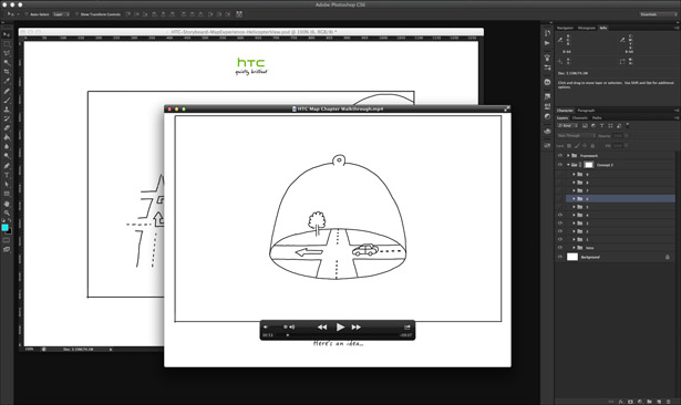
When I worked at Fantasy Interactive (Fi), designers rarely sent JPEGs of designs to the client. Instead, we recorded very short videos.
Get the Creative Bloq Newsletter
Daily design news, reviews, how-tos and more, as picked by the editors.
At the end of the day, or before the delivery, the designer opened up their work files in Photoshop and recorded a 10-minute screencast talking about how everything worked, turning layers on and off to show different interactions, and demonstrates how certain drop-downs will work and how the navigation will expand – all the way down to mimicking some of the transitions, creating multiple frames of components moving left and right, complete with motion blur.
03. Think about the framework
Whether you design for web, mobile or TV, think about the framework and the main user interaction first when you kick off a project. Consider how the user interacts with a device, how much space you have to design for, how the user will go from one view to another, and how the navigation will be used.
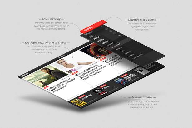
Even if you design for the web, take cues from apps: maybe your site can consist only of five templates instead of 20, and the rest of the information will appear dynamically using fly-outs, interactive drawers and so on.
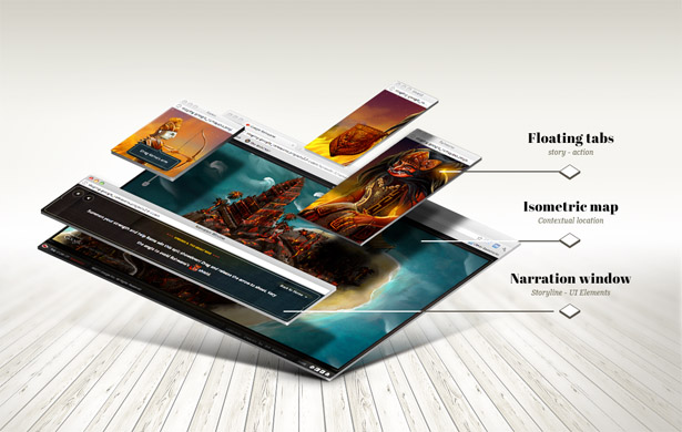
All those things are part of the design (or UX) framework. Try to innovate there first, then start designing each individual component piece by piece, knowing what the final outcome will be.
04. Keep finding work exciting
No matter how excited you are at the start of the project, it's easy to lose your enthusiasm along the way, especially the work lasts a few months and there are constant revisions.
On projects like this, it's important to identify areas no one is really paying attention to and innovate there, balancing this with regular work on parts of the site that require lots of attention.
If you're bored working on the homepage, go ahead and come up with the most innovative Terms and Conditions ever designed. This may seem a silly example, but innovation is equally important as good design. Believe it or not, those innovative ideas often make their way up to 'important' sections of the site later, even if the client doesn't notice them at first.

Let's look at a real example. We had been trying to nail down HTC homepage for quite a while. We were following all the product requirements, but it always ended up very simple. It needed that one little thing that would make it special.
At the same time, we'd been working on an interactive wizard to help people select the right HTC phone. The problem was that wizard had lots of components and was making the entire page really heavy. It distracted from the actual products.
As a solution, we created a folded paper marquee the user could drag open and find the wizard inside. That functionality – dragging/peeling the paper – was executed so smoothly that it was quickly implemented elsewhere on the site, including the homepage.
05. Work on individual pixels
Getting your idea right is only 50% of the work: the rest is pure execution. So many projects have great ideas but fail to make an impact because those ideas are implemented poorly.
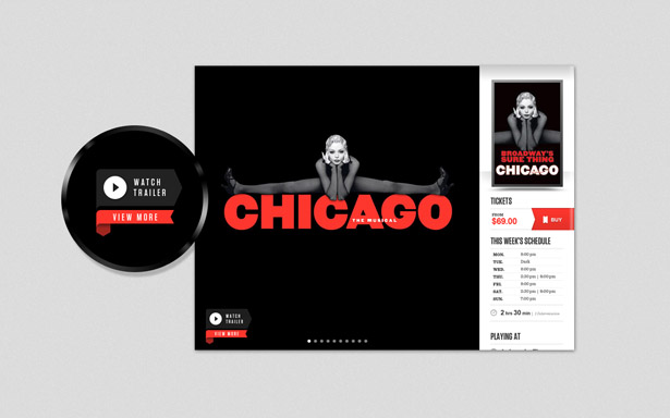
Since the bar has been set so high by leading brands, most users can easily distinguish between a poorly executed design and a well-executed one. They might not spot the actual pixels that are off, but they will catch the overall look and feel.
So aim for with pixel-perfect design. Work on the smallest details, even if you think they will never be noticed. It's these little details that will help your design stand out.
See Anton speak at Generate: buy your ticket today!
Next page: the next five steps to better designs

Thank you for reading 5 articles this month* Join now for unlimited access
Enjoy your first month for just £1 / $1 / €1
*Read 5 free articles per month without a subscription

Join now for unlimited access
Try first month for just £1 / $1 / €1

The Creative Bloq team is made up of a group of art and design enthusiasts, and has changed and evolved since Creative Bloq began back in 2012. The current website team consists of eight full-time members of staff: Editor Georgia Coggan, Deputy Editor Rosie Hilder, Ecommerce Editor Beren Neale, Senior News Editor Daniel Piper, Editor, Digital Art and 3D Ian Dean, Tech Reviews Editor Erlingur Einarsson, Ecommerce Writer Beth Nicholls and Staff Writer Natalie Fear, as well as a roster of freelancers from around the world. The ImagineFX magazine team also pitch in, ensuring that content from leading digital art publication ImagineFX is represented on Creative Bloq.
