5 killer ways to use overlays
Use overlays well and they can boost focus and minimise server calls. Matthew Smith explains.
Overlays are a great solution for giving a user a moment of focused interaction, or in the case of modals, asking the user to make a decision about an action or alerting them to a response or error. Designers have co-opted this tool for all kinds of other scenarios including portfolios, contact forms, advertising, shopping cart details and more.
Speed bump
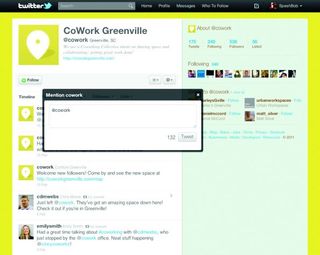
Overlays take a user out of the regular flow. They're akin to a speed bump. Using one for an action in a web application can be a great way to keep users centred on the page and reduce server calls. New Twitter does a great job of this with its implementation of the tweet window, which overlays content but can be easily moved so that the content below can still be accessed.
Then there's a modal overlay, which is more of a stop light than a speed bump. These are used when it's important to help the user focus on an action that needs to be taken before they can move forward or go deeper into the site. They might come in the form of a log-in box, an error alert or something global such as a preference handler. The concept behind overlays and modals is well explained at www.patternry.com/p=overlay.
Modals are often overused because they can be so easily implemented, and they can sometimes be obstacles for users. Ask yourself why the content shouldn't be on a page of its own. Will it help the user to see the content behind the modal? If not then why have a modal? Some alternatives to consider are drawers or slide-ins. As with any interactive element, think before you implement.
Five examples to check out
01. Relay Foods

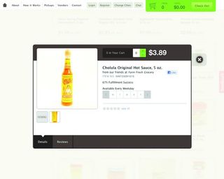
Relayfoods.com provides an ecommerce usage for a modal overlay that helps users access product details, reviews and other product thumbnails.
02. Apple

The ever-clever folks at Apple have designed a great modal delivery for their trailer videos. If you hover over the video, you see controls and thumbnail options to view other videos. If you're not hovering, it's all video focus.
03. WPcoder

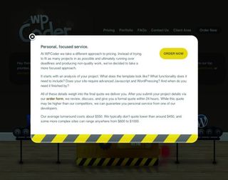
The site of WPcoder, a “small group of developers who love WordPress”, places its FAQ content inside a modal overlay. This is a great example of when a small amount of content is more appropriate in an overlay than a separate page.
Get the Creative Bloq Newsletter
Daily design news, reviews, how-tos and more, as picked by the editors.
04. Twitter

Twitter.com uses an overlay for its new tweet function while letting users move the tweet window to access the content on the page.
05. Art Version

This overlay from Chicago design company Art Version helps users to see that their new Versions App has started downloading: a great example of a notice-oriented modal.
Use with care
Hopefully these examples can help you choose the best way to implement overlays on your projects, and ultimately decide whether overlays are even neccessary. Used well, overlays can add extra functionality and focus to an app or site, but use them with care. They can bite!
Words: Matthew Smith
This article originally featured on net magazine's website.

Thank you for reading 5 articles this month* Join now for unlimited access
Enjoy your first month for just £1 / $1 / €1
*Read 5 free articles per month without a subscription

Join now for unlimited access
Try first month for just £1 / $1 / €1
The Creative Bloq team is made up of a group of design fans, and has changed and evolved since Creative Bloq began back in 2012. The current website team consists of eight full-time members of staff: Editor Georgia Coggan, Deputy Editor Rosie Hilder, Ecommerce Editor Beren Neale, Senior News Editor Daniel Piper, Editor, Digital Art and 3D Ian Dean, Tech Reviews Editor Erlingur Einarsson, Ecommerce Writer Beth Nicholls and Staff Writer Natalie Fear, as well as a roster of freelancers from around the world. The ImagineFX magazine team also pitch in, ensuring that content from leading digital art publication ImagineFX is represented on Creative Bloq.
