5 killer ways to tell a story with your design
Letting users know who you are and what your site is for is important – and is often overlooked, reckons Gene Crawford.
I see a lot of websites that look great, have content that's worth reading and are generally impressive with some type of interaction or feature. But what I don't tend to see are sites that tell the story of the people or business behind them. By 'tell the story' I mean teach me what it is you're about, what you're selling or what your app or service can do for me. Oh and do it quickly, like almost immediately - or do it in a really interesting visually pleasing way. Delight me! That's a tall order, but there are several ways it can be accomplished.
You can utilise a screen capture and visually show me your app. You can have a great illustration that shows me your process. You could even do a quick video (though videos can be problematic on their own). Sometimes you can just have a great introductory statement, something that isn't too long but is descriptive. Be careful with the introductory statement in your designs though: you can wind up being too clever or too witty which can turn people off. The key is to be descriptive and engaging. Often it's going to be a combination of little things that help explain what you're all about.
The point is, you can't just stop at having a great design. This is even more important when you're designing a website for an app or a web service. Yes, ease of use, a clear navigation and consistently good copy are all part of the equation. But those are things that happen after a person lands on your site and decides to act. I've talked about having a clear call to action before, but I think having a clear explanation of what you're all about is equally vital. Most of the time a great call to action also involves explanation elsewhere on the page. Don't forget about telling your story - it's important.
Five examples to check out
01. Square

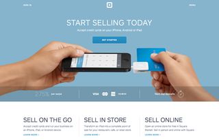
The website for the Square credit card reader device shows a picture of someone using the device to tell the story of what it's all about. This is an effective way to inform first-time site visitors what it is, and how to use it.
02. Shape

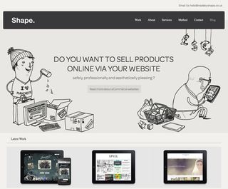
Web design firm Shape uses clever illustrations to support the story of what services it provides. This also sets the tone for what Shape is as a company.
03. Disqus

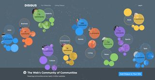
On the blog comment system app Disqus, a live working version is placed on the home page. Enabling people to actively use it as soon as they land on the home page tells the story while experiencing it.
04. Workfu

Talent finding site Workfu simply places multiple views from inside its application for you to see. This clearly explains what the app is without needing much copy.
Get the Creative Bloq Newsletter
Daily design news, reviews, how-tos and more, as picked by the editors.
05. Apple

The folks at Apple are master storytellers. On the iPad page, embedded video and other pictures of people using the device immerse you in the iPad experience.
Words: Gene Crawford
This article was originally published in net magazine.

Thank you for reading 5 articles this month* Join now for unlimited access
Enjoy your first month for just £1 / $1 / €1
*Read 5 free articles per month without a subscription

Join now for unlimited access
Try first month for just £1 / $1 / €1
The Creative Bloq team is made up of a group of design fans, and has changed and evolved since Creative Bloq began back in 2012. The current website team consists of eight full-time members of staff: Editor Georgia Coggan, Deputy Editor Rosie Hilder, Ecommerce Editor Beren Neale, Senior News Editor Daniel Piper, Editor, Digital Art and 3D Ian Dean, Tech Reviews Editor Erlingur Einarsson and Ecommerce Writer Beth Nicholls and Staff Writer Natalie Fear, as well as a roster of freelancers from around the world. The 3D World and ImagineFX magazine teams also pitch in, ensuring that content from 3D World and ImagineFX is represented on Creative Bloq.
