10 tips for better book designs
Thomas Bohm of User Design presents ten top tips for improving book designs from his own practical experience and observations.
There are many tasks, processes and people involved in the production of a book. Decisions are usually not down to one person alone, but a group of people each with their own requirements and style preferences, so a successful and open minded editorial/designer/client relationship is essential for high quality results. Here are 10 tips for ensuring that your book design is as good as it can be.
01. Make the gutter wide enough
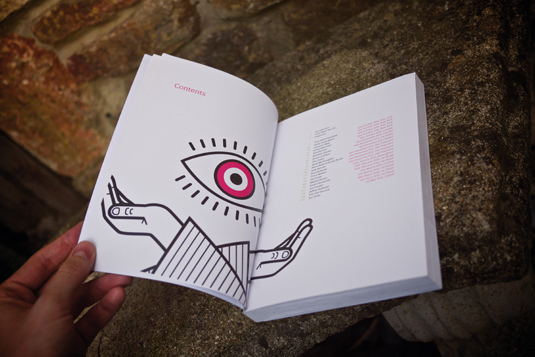
Text in books is often hampered by the arch of the open book making it hard to read, because the text on the inner right side of a left hand page ('verso') or inner left side of a right hand page ('recto') bends into the gutter.

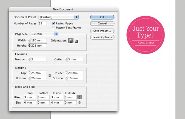
This normally means that the designer has failed to make the gutter wide enough. Typically for a perfect bound book, the left and right inner gutters should be no less than 25mm each side. However, much depends on how way the book is produced.
For instance, when books are perfect bound using hot melt glue, this often dries very stiff and does not allow the book to lay flat. In contrast, cold melt glue is more flexible when dry and allows books to be flatter.
If you've had books produced by the same printer/binder before, it's a good start to measure to see how much the text in previous books arches into the gutter. This will help you ensure your gutters are wide enough to make the text readable.
02. Add running heads
Normal practice in creating books is to add a 'running head' on the left-hand page containing the book title and another on the right page with the chapter title.
This will greatly aid the reader's ability to navigate around the book. Furthermore, if the book gets photocopied or split up into electronic documents, it will be easy to find the source of the book. For these reasons, it's usually a good idea to include chapter numbers in the running heads as well as chapter titles.
Get the Creative Bloq Newsletter
Daily design news, reviews, how-tos and more, as picked by the editors.
03. Make numbering clear and simple

Some books use Roman numerals (I–X) for prelim pages to distinguish between the introductory and main sections - but is this a device that's had its day? I'd argue it's clearer and usable to use Arabic numbers (0–9) instead, and explain the section division in other ways.
04. Word spacing for better typography
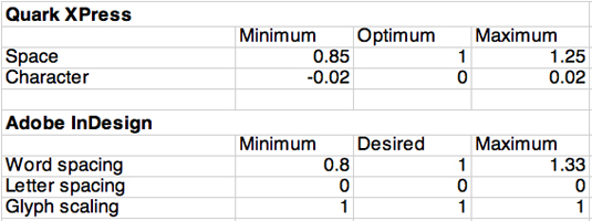
Word spacing is very important is making your text look its best. The default word spacing (also know as justification) values for justified text in QuarkXPress and Adobe InDesign CC are as follows:

Every typeface is different so it's difficult to create a hard and fast rule. But in general decreasing the word spacing to around 90 per cent usually creates a smoother and tighter line, reducing the amount of harsh word space 'holes' and improving the reading experience.
Book designer Jost Hochuli believes that "the word spacing required by a lowercase e is sufficient" for the average word space size.
05. Character spacing
To get an even smoother fit of letters and words on a justified line of text you should adjust the character or letter spacing. Again, the amount will vary, but in general a value of -3% (Adobe InDesign) or -0.6 (QuarkXPress) for minimum and 3% (Adobe InDesign) or 0.6 (QuarkXPress) for maximum is sufficient (Adobe InDesign is measured in 1/1000 em space and QuarkXPress is measured in 1/200 em space).
06. Choice of paper
Choice of paper is an important choice in the design of a book and can contribute much to its overall feel.
The amount of high bright white paper being used for books has rapidly increased in recent years. However, I'd argue it offers too much contrast between the colour of the text and paper, and that off-white or cream paper is not only more aesthetically pleasing but less stressful on the eyes.
That said, industry trends mean it's often now quite a challenge to find uncoated off-white or cream paper stocks and even more of a challenge to find coated stocks in off-white or cream paper.
07. Issues surrounding contrast
Bright white paper is of course preferable when you're targeting your book at people with visual impairments, for whom maximum contrast is clearly desirable.
However be warned that people with dyslexia - believed to be around 10 per cent of the world's total population - complain that the contrast of bright white paper and text causes an unstable and blurry reading experience and that the letters move around on the page (see this Bupa page). For this reason, people with dyslexia will often use coloured acetate overlays on top of printed information.
08. Make tables easy to read
One way designers often position columns in a table is to space them out to fill the width of the table or main body text width. But this is not advisable because you will increase the space between columns, which can make it harder for readers to read the table in a horizontal way.
Best practice is to space columns horizontally with as least space between them but no less than 5mm. Creating tables that have columns horizontally spaced, close together, makes it much easier to read the table horizontally and also to link possible table headings to the left of table (in the first column) to other data to the right.
09. Encourage feedback
So often books are published in a very linear fashion, going through the editorial, design and production stages without getting feedback from those who will read them - they are rarely tested with people.
One way to make the process more circular and user-centered would be to put details on the back cover or elsewhere, which would allow people to submit their thoughts and feedback.

You could provide a special email address, a web page with a form, or a paper tear-away form. You never know what feedback you might get: someone may point something that can help improve the design, or spot an error somewhere that can be corrected in the next print run.
10. Manage the client process
Where a book is a collaborative effort, you have to judge and sense when it is the right time to suggest improvements and agree or disagree to make certain changes from feedback. Some clients are open and welcome suggestions and feedback, other will reject your every suggestion claiming that they know better.
Jennifer Rowsell perhaps sums up the relationship best: "Textbooks (in the case of my study, reading textbooks) and other educational schemes are the product of a long collaborative process between actors whose roles in the company are sometimes complementary and sometimes in conflict. The resulting artifact, smooth as it may seem, cannot fail to be the result of numerous transformations and compromises, not only of differing points of view, but of differing intended functions for the text."
Words: Thomas Bohm
Thomas Bohm works for book publishers and businesses, and runs User Design, a graphic communication design, illustration and production service.
Now read these!
- Web design training: the top online tools
- Check out these underrated web design tools
- The top designer resumé tips

Thank you for reading 5 articles this month* Join now for unlimited access
Enjoy your first month for just £1 / $1 / €1
*Read 5 free articles per month without a subscription

Join now for unlimited access
Try first month for just £1 / $1 / €1

The Creative Bloq team is made up of a group of art and design enthusiasts, and has changed and evolved since Creative Bloq began back in 2012. The current website team consists of eight full-time members of staff: Editor Georgia Coggan, Deputy Editor Rosie Hilder, Ecommerce Editor Beren Neale, Senior News Editor Daniel Piper, Editor, Digital Art and 3D Ian Dean, Tech Reviews Editor Erlingur Einarsson, Ecommerce Writer Beth Nicholls and Staff Writer Natalie Fear, as well as a roster of freelancers from around the world. The ImagineFX magazine team also pitch in, ensuring that content from leading digital art publication ImagineFX is represented on Creative Bloq.
