10 things your clients need to know
Clients sometimes need a little push in the right direction and be taught about the mysteries of web design. Paddy Donnelly and Jack Osborne, the brains behind Wee Nudge, address 10 touchy subjects to show you how to do it
An inherent problem with our profession is that all too often we are willing to pass the buck and blame things on anyone other than ourselves and unfortunately, nine times out of 10 it'll be one person in particular. The client.
When we launched Wee Nudge we positioned it as an educational platform, not only for clients but also for us, the design and development community. Lack of trust, communication and understanding cause the great rift in the client-designer relationship. Web design may seem like a complete mystery to many clients and if we want to smooth out the wrinkles then it's up to us to clearly explain some of the basic concepts.
Sure, we've got the industry leaders with the gift of the gab who are experts at communicating some of the sticky issues that crop up again and again, but what about those of us who don't posses that same level of diction? Are we using 10 words to explain something when really four would suffice? Are we unknowingly making our clients confused when we're thinking the exact opposite?
The usual suspects crop up in every project. Whitespace, making the logo bigger and of course, 'The Fold'. We're going to touch on a few of these topics and give you some pointers and links to help communicate effectively with your client for a more peaceful project.
1. Contract
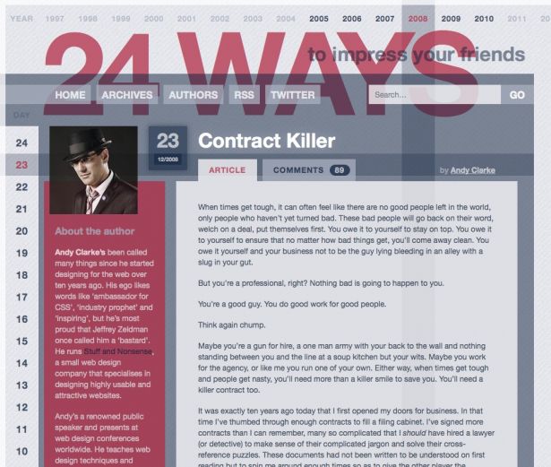
It's vital to have a contract that you can use before you enter into negotiations with a client. Having a contract will immediately highlight troublesome areas that you might not have noticed until a later date. Andy Clarke kindly offers up a good start with his Contract Killer.
2. Value
Putting a price on your work is more than about getting paid. Think of each estimation you make as a contribution to the value of our industry. This might sound obvious but price at what you think your time is worth and how long you believe this project will take, accounting for iterations and any issues that you think may arise. It's that simple. So many young designers don't embrace their true worth and undercharge time and time again for their services.
Bringing down your initial estimate just because you think it will help you land the job, will only result in you having to scramble to complete the project in time and making it clear to this client that your time, and the time of other web designers, isn't worth that much. Instead, be honest with the client. Charge a reasonable price, and don't be afraid to pass on a job that claims a very undervalued budget. The number of clients who appreciate professional web design is growing each day and if you start charging a reasonable price for your services then you'll be contributing to the industry as a whole.
Jessica Hische has provided an excellent in-depth article on The Dark Art of Pricing.
3. Content
You will no doubt have heard the phrase 'content is king' and as Oliver Reichenstein pointed out several years ago – 'Web Design is 95% Typography'.
Designers often create design mock-ups full to the brim with lorem ipsum, and unfortunately don't realise how backwards that is. Content should always come first. We need to design FOR the content, not squeezing the square content into the nice circular design we've created. By placing this dummy text within our designs it also gives the client an unrealistic expectation. Their final content may look nothing like what you have suggested and you will have supplied them with lots of ammunition for a 'this doesn't look like the designs you sent me' discussion further down the line.
One of the reasons we just make do with dummy text is because it's often quite difficult to acquire from the client, and strangely enough, content is something that's frequently added in at the end of the project. Thankfully we now have tools such as Acquire at our disposal which will help make the task of harvesting and organising content much easier.
4. Wireframes
Wireframes have been around since the invention of fire, they've become part and parcel of web design and as our industry grows we've started to see different methods and platforms crop up for creating our wireframes.
Sketches and wireframes can be one of the first major sign off moments within a project, allowing the client to get a decent grasp of where the project is going and foresee any pitfalls early.
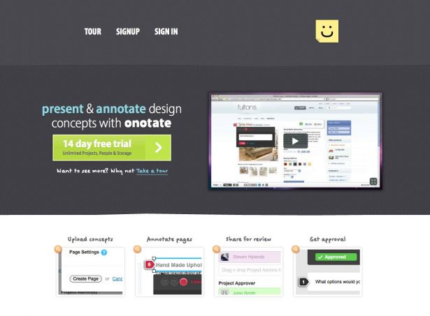
Tools like Onotate now also help take wireframes to the next level as they let you annotate particular parts of your sketches and allow your client to reply back with their own comments. With the introduction of applications such as this, the wireframing stage of a project is becoming more involved and appreciated, helping us achieve better end results.
A failure to plan will ultimately make the project costs spiral out of control. No client wants that so you need to communicate the importance of wireframing.
5. Delivering your files
It's been weeks since your first contact with the client and you finally get a zipped folder sent to you with the imagery needed to really kick on with the project. You download said folder, unzip and your jaw drops in horror as you realise that it's either a flat file or images contained within a Powerpoint presentation, the client's favourite feedback and delivery tool.
It's imperative to communicate clearly the type of files you require during the initial contact, as this will ultimately save you less time constantly chasing after your client. Delivering the right type of file from the start is in your client's interests as it will save them paying you to touch up or recreate imagery.
It's worth introducing your client to services like Dropbox to help them share files easily with you. Plus everyone loves an extra little bit of referral space.
6. Colour
Colour theory can sometimes be a difficult subject to explain to clients. Many of them will think that they are a designer and important decisions can be made on a whim. It's your job to educate the clients by telling them why you've decided to make a certain area of the page blue (does it compliment/contrast) instead of their suggested colour of fushcia. Always have a reason.
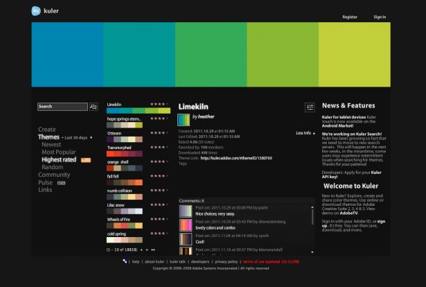
Websites like Adobe's Kuler can help show the client how a colour palette works and why you've overruled their colour suggestions.
Get the Creative Bloq Newsletter
Daily design news, reviews, how-tos and more, as picked by the editors.
7. The Fold™
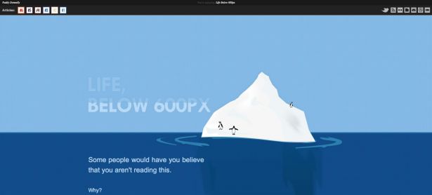
Let's face it, endless discussions on the importance/unimportance of The Fold™ shall continue to happen for years whether we like it or not. Although many in the web design community correctly interpret the concept of The Fold™, it will be a long time before this trickles down into the minds of clients. Educate yourself on The Fold™ so you can bring solid arguments to the battle.
8. Whitespace
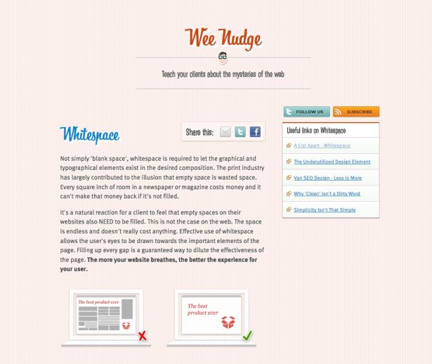
As we highlighted in our article on whitespace, "The print industry has largely contributed to the illusion that empty space is wasted space."
Don't forget that the web has an almost unlimited amount of space and we should be availing of this extra room, not squishing everything so close together. Letting content breathe can often highlight its importance much better than text set in bright red uppercase letters.
If you emphasise everything, you emphasise nothing.
Watch A List Apart dive into the topic of whitespace.
9. SEO
Like it or not, most clients will at one stage mention Search Engine Optimisation and how they want to direct more traffic to their site.
While SEO may have a bad reputation these days with people trying to 'game' Google with various tricks and scams, it's an important part of designing for the web. SEO is rather simple too. All you have to do is create great, valuable content on your site and after a bit of time it will gravitate to the top of the results page. That's it. Teach your clients to avoid SEO snake oil and shortcuts and instead spend time putting some effort into the content and having it grow organically. This will achieve far better results in the long run than any tricks.
For a more detailed look at SEO, check out the free SEO ebook, an excellent beginners guide.
10. Feedback
This is a topic that both parties need to concentrate on improving. If you ever want to grow as a designer or a developer then you must be able to accept criticism. At points throughout and after the project, you should ask the clients how they felt things went. Ask them where they think you could improve on and areas where they thought you were strong in. Basically, ask for any sort of information which will inevitably make your next project easier and more enjoyable.
Communication is key throughout a project. Simply talking with your client and viewing them as a team player, not an enemy will make everything go a lot smoother, resulting in a far better end product. Most clients are very receptive to your opinions if they can grasp what's going on in a project. Frustration causes a lot of friction between clients and designers. Effective communication relieves this tension.

Thank you for reading 5 articles this month* Join now for unlimited access
Enjoy your first month for just £1 / $1 / €1
*Read 5 free articles per month without a subscription

Join now for unlimited access
Try first month for just £1 / $1 / €1
The Creative Bloq team is made up of a group of design fans, and has changed and evolved since Creative Bloq began back in 2012. The current website team consists of eight full-time members of staff: Editor Georgia Coggan, Deputy Editor Rosie Hilder, Ecommerce Editor Beren Neale, Senior News Editor Daniel Piper, Editor, Digital Art and 3D Ian Dean, Tech Reviews Editor Erlingur Einarsson, Ecommerce Writer Beth Nicholls and Staff Writer Natalie Fear, as well as a roster of freelancers from around the world. The ImagineFX magazine team also pitch in, ensuring that content from leading digital art publication ImagineFX is represented on Creative Bloq.
