10 steps to creating the perfect infographic
JESS3's Tiffany Farrant-Gonzalez and Jarred Romley take you through 10 key steps in the creation of informative and beautiful infographics.
While the term 'infographic' is a relatively new one, the concept of displaying information in a graphical format has been around for a long, long time. For thousands of years humans have attempted to explain the world around them through visual means - from 30,000-year-old cave paintings, the striking use of simple iconography to tell complex stories in ancient Egyptian hieroglyphs, or the evolution of Chinese script, to the very first examples of cartography and the bar chart. We are visual creatures by nature, and we tend to learn and explain best when information is presented in a visual format.
The modern day infographic has taken on a slightly different form to that of its predecessors. However, the fundamentals remain the same. The combination of visual storytelling with data presentation is the key driver behind the popularity of infographics and, in an age where data is everywhere, they have become genuinely indispensable. In this article we're going to walk through 10 essential steps you can take to ensure the infographics that you create are both informative and beautiful.
01. Let the data tell its story
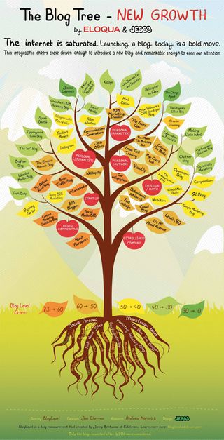
The best storytellers in any generation are natural communicators who command attention. Whether huddled around a campfire, on stage in front of thousands or displayed on a computer screen, storytellers know how to engage and inspire an audience. And in the era of big data, telling a story is no different. Big data is no longer just a number on a screen, but a story to be discovered.
For data to communicate effectively with its intended target audience it must be three things: compelling, competent and controversial. To grab attention it must be compelling and stand apart from all other available data. Ask yourself: "Will the intended audience find this interesting?" The data also must come from a competent, credible source. This is crucial to developing the trust of your readers, and will also play a major role in determining whether they share it via online social circles. Finally, controversy is always good. If the data you choose can elicit a response from your readers, you've won. Debate is good and controversial data can foster great discussions and expand your influence beyond the realm and reach of the infographic.
02. Determine purpose and audience
Given a topic and a set of data to work from, it's easy to let your mind flood with great ideas for your narrative and visuals - but the first step should actually be backward, not forward. Who will you be talking to? How can you add valuable information to your reader's busy life? And, once your reader reaches the bottom line of your infographic, what do you want them to walk away thinking or doing?
Knowing your audience should be the overriding factor in directing and determining the purpose of the graphic you're aiming to produce. To succeed you'll need to research the client, market and media landscape to decide opportunity areas to connect with the pre-determined receptive audience. After you've identified your audience, it's time to determine the purpose and tailor the graphic's call to action. Whether the purpose is to sell a product or to position a brand as a thought leader, the way you communicate its call to action is paramount to the success of the infographic. Its purpose should be to engage readers on the level of shared values rather than being a typical product pitch.
03. Construct an engaging narrative
When building a narrative around data, remember: it's not the size of your numbers, it's how you use them. Your narrative is only as good as your ability to empathise with your readers, so bear in mind who they are, what beliefs they hold about your topic, what they already know about it, where they're reading your infographic, how easily they could be distracted, and how they want to be seen in their social circles based on content they share.
Get the Creative Bloq Newsletter
Daily design news, reviews, how-tos and more, as picked by the editors.

With your readers' perspective in mind, and an understanding that there may be hundreds of other bits of content flying across their radars, think about how much they'll be able to digest in those precious few moments when you have their attention, and what you can say in that timespan that will shift their perspective. You want to create a jolt, but there are several ways to do so: enlightenment (you might not know XYZ exists, but here's how it does), opportunity (you might think XYZ isn't possible, but here's why it is), fear (you might think XYZ is OK, but here's why it's not), soothing (you might think XYZ is not OK, but here's why it is), and, of course, humour (you might think penguins would make terrible quarterbacks - and you're absolutely right).
The magic of data is that it can show us trends and patterns lurking under the surface that the naked eye can't see, and others that exist on such a massive scale that we can't even fathom until they're put into numerical perspective. Ultimately, the goal of your narrative is to put those patterns into perspective.
04. Make complex understandable
Once you have analysed your data and know the story you want to tell, you'll need to start thinking of ways to present the data visually. Ultimately, your graphic's primary purpose is to make the data comprehensible to a wide audience, and it's pretty likely that the original format of your data wasn't all that accessible.

Presenting data in a visual manner can aid the viewer's understanding of the subject matter in a way that a spreadsheet or a paragraph of text cannot. Your graphic should aim to free the data from the constraints of a table and present it in a format that reveals hidden trends, highlights key points and also looks great.
Your visual representation of the data should always strive to be:
- Accurate: Use reliable sources, and be as transparent as possible
- Clear: Aim for optimum clarity
- Accessible: Reveal the hidden trends, and highlight the key points
- Informative: Distil, teach and empower
- Valuable: The graphic should drive conversation in the subject matter
- Optimised: Present the data in a way that's conducive to the medium in which it will primarily live (via the web, mobile, video, dashboard and so on)
- Beautiful: Use typography, colour, size and shape to help guide the narrative
As a data designer, your job is not to simply make the data look beautiful. More importantly your task is to make the data easier to understand. An information graphic can be both visually appealing and informative, but the key is to strike a balance between creating something helpful and creating a stunning piece of artwork.
05. Focus on the structure first
A successfully informative graphic relies upon a strong, clear structure. The underlying structure determines the organisation of the data, controls the flow of the narrative and ensures the integrity of the data remains intact. By concentrating on the structure first, the data controls the graphic rather than the visual design.
Key considerations that will have an impact on the comprehensibility of a structure are:
- The amount of data you have (too much, or too little?)
- The categorisation of the data - different categorisations require different visual formats. Richard Saul Wurman identified five ways in which information can be organised: by location, alphabetically, chronologically, categorically and hierarchically
- The medium (static, interactive or animation)
- Where it will primarily live (online, in print, on a television screen)
- Its dimensions
As you're developing structural concepts, keep asking yourself: is this structure making the data any easier to understand? This may seem obvious but, because the graphic's primary purpose is to inform, its success hinges on this factor. Sometimes it can be tempting to put design over function. You may create a visualisation that looks beautiful enough to hang on your wall, but that makes the data inaccessible to the viewer. If the data is presented in a way that aids the audience in its comprehension, then the graphic is successful. If, however, the structure is too complex and makes the audience work hard to discover and ascertain what the data is showing, then your graphic has failed.
Fundamentally, a good structure:
- Provides clarification
- Aids comprehension
- Reveals trends
- Highlights key findings
However, a poor structure:
- Masks data
- Obscures facts
- Skews interpretations
06. Wireframe, explore and iterate
As with web design, wireframing at this early stage encourages the designer to focus solely on the structure of the piece, free from visual design considerations such as fonts and colours. The practice of wireframing the structure first strips away the colourful graphics, the bold fonts and the colour schemes to bring the focus back to the data. Working with a limited colour palette and a set of simple shapes forces designers to think about the data, and gives them the time to explore many different options.
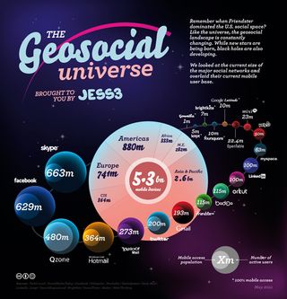
The opportunity that wireframing provides is the time to explore. Exploration of concepts is so important in data presentation. Like a painting, the data designer's visual representation of the data is open to interpretation by the viewer. What may be a logical flow and structure to the designer may not necessarily be the case for others, so it's important to get as many eyes on these low-fidelity mockups as you can. Feedback at this early stage is crucial in determining the clearest way of presenting the data to your audience, and wireframing is remarkably conducive to the iterative process.
07. Select the right tool for the job
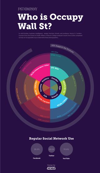
Data designers have an arsenal of different charts at their disposal. Pie, bar, line, area and other such chart types are part of their go-to toolkit when creating information graphics. But knowing when to use which is important, because they're not always interchangeable. It's a matter of selecting the one that presents the data in its most comprehensible form, and this will often be determined by how the data is organised and categorised. It may be tempting to choose a chart based on shape rather than functionality, but when attempting to visually represent information, ease of communication should always trump visual design choices.
Don't be scared to use a bar chart if a bar chart presents the data in its most accessible format. These common charts provide some of the most efficient ways of displaying data accurately, and they often form the foundation of some of the most beautiful visualisations out there. They can be adapted and utilised in many unique ways while still being informative and useful.
08. Choose the right visual approach
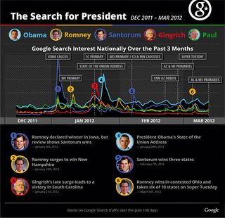
There tend to be two clear approaches when it comes to information graphics' visual design. On one hand you have those who truly let the data do the talking. They create stunning artworks from the data itself utilising a combination of colour, shape and clean typography, with the narrative being expressed solely through the presentation of the data. This is seen most prominently in the works of people like Nicholas Felton and David McCandless.
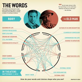
Then on the other hand, there are those who will use illustrations and clever visual metaphors to help drive the narrative and guide the viewer through the data.
There is definitely a time and a place for either (or even a combination of the two), but the approach you take will normally be determined by:
- The audience
- Intended tone
- Branding
- Purpose
- Medium
Illustrations can really help to visually represent your intended narrative, but they ought be used with caution. The data and information should still be the star of the show, and illustrative elements should not hamper the viewer's comprehension, or obstruct the data in any way. Used correctly, the metaphorical visual representation of data can be both impactful and insightful. Used incorrectly, and the data is lost.
09. Distribution and PR
Once your graphic is created, it's time to distribute it to the masses. The fact is, you can create the most gorgeous and insightful infographic the world has ever known, but if you do not have a distribution plan in mind from the beginning, no one is ever going to see it.
The obvious first step in distribution should be sharing it through social media. As you well know, there are organic means of social media distribution and paid means, and it is important to utilise both. Next, it is important to identify exactly where your readers spend time online and what sites are they reading when they have down time. Once you have identified those places online, reach out to those sites and pitch them on why your infographic adds value to their readers.
10. Treat infographics as moral acts
We would like to leave you with some wise words from Beautiful Evidence by the godfather of infographics, Edward Tufte: "Making an evidence presentation is a moral act as well as an intellectual activity. To maintain standards of quality, relevance, and integrity for evidence, consumers of presentations should insist that presenters be held intellectually and ethically responsible for what they show and tell. Thus consuming a presentation is also an intellectual and moral activity."
Words: Tiffany Farrant-Gonzalez and Jarred Romley
This article first appeared in issue 236 of .net magazine - the world's best-selling magazine for web designers and developers.

Thank you for reading 5 articles this month* Join now for unlimited access
Enjoy your first month for just £1 / $1 / €1
*Read 5 free articles per month without a subscription

Join now for unlimited access
Try first month for just £1 / $1 / €1
The Creative Bloq team is made up of a group of design fans, and has changed and evolved since Creative Bloq began back in 2012. The current website team consists of eight full-time members of staff: Editor Georgia Coggan, Deputy Editor Rosie Hilder, Ecommerce Editor Beren Neale, Senior News Editor Daniel Piper, Editor, Digital Art and 3D Ian Dean, Tech Reviews Editor Erlingur Einarsson and Ecommerce Writer Beth Nicholls and Staff Writer Natalie Fear, as well as a roster of freelancers from around the world. The 3D World and ImagineFX magazine teams also pitch in, ensuring that content from 3D World and ImagineFX is represented on Creative Bloq.

