10 pro tips for updating your web designs
Interaction designers are being faced with multiple new challenges in keeping their designs fresh. Matthew Smith of Squared Eye offers his advice in how to meet them
For a long time web design was really similar to print layouts. A site might be filled with dynamic content populated from a database, but the basic typographic systems of the grid ruled the way sites were designed. Much of our navigation was based on emulating physical systems such as folder tabs or pages. These conventions allowed us to make sites quickly and we all seemed to think everything was working just fine – and it probably was for the most part.

In the last few years everything has grown more interesting, complicated and interactive. From relatively small site designs to multi-layered applications, any interactive design now requires a new level of rapid testing, prototyping, and redesigning before building and launching a solid final product. The need for a designer to be well versed in the constraints and powers of the platform for which they are designing has never been more important. These are new challenges for any designer diving into the waters of interaction, but this is just where things get fun.
1. Prototyping is essential

Prototyping is not an option. As Hemingway was famous for saying, “The first draft of anything is shit.” If testing or prototyping isn’t a formal part of your process, then in essence your final product is the prototype – and it's probably shit. Timelines and budgets can squeeze copywriting, IA, and prototyping from the fray of must-have’s. In that case, find a way of scaling everything so that you can keep some amount of testing and prototyping in your project. Your client, your team, or your investors will thank you when the return on investment soars.
The opportunity for great returns is an outcome of testing internal, iterating, and making necessary and smart changes to a site or a product before shipping to the public. If you’re not prototyping, then you're showing that you’re willing to let your audience use your product as though it were a prototype – an experience that has the potential to be damaging to your brand and long-term goals.
2. Prototyping on a shoestring is possible
Budget and time are always a constraint, but if you’re working on a shoestring you still have options. A simple pen and paper sketch prototype followed by a good question and answer period will go far in helping you understand how the tool should be designed for your audience.
3. Tools to make your job easier
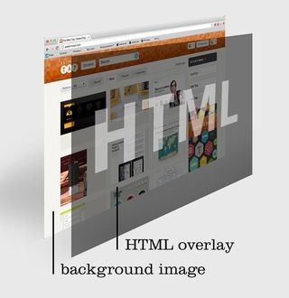
A powerfully versatile and efficient tool for prototyping is Rapid Prototyping – something I picked up from Dan Rubin. Create a set of flat visual compositions (JPGs or PNGs) of the views you want to test. Place these views as the background of the <body> element. You then place anchor links with fixed heights and widths over the action areas of the design using absolute positioning.

Ask a user to complete a certain task like “Find a book, add it to your cart, then check out”, then watch to see if they do what you expect them to do. The only behaviour any link areas will show is the default cursor:pointer on :hover, but it's enough to help the user move from page to page.
Get the Creative Bloq Newsletter
Daily design news, reviews, how-tos and more, as picked by the editors.
The value of this technique is that you can make extremely fast changes in a Photoshop document and export it again as a JPG, and equally fast changes to absolutely positioned links in the HTML. It’s pretty freaking rapid.
Similar to Mr Rubin’s example above, Invision App gives you the option of using a design of any fidelity from basic boxes and arrows all the way through ultra-hawt pixel-perfect layouts. The app gives you a clean and clear interface to upload these views, name them, order them and then draw and map links to any of the views you’ve uploaded. In essence, InVision takes the interactive coding off your hands and gives you an organised space to keep track of versions of prototypes along the way.
The simplicity of the system has been a big win for us at Zaarly and we use it regularly, particularly when prototyping for our iPhone app. It’s been particularly important for us to prototype for our mobile platforms. The interactions inherent in a new kind of market demand that we explore what’s available within the conventions of iOS and in some cases create new interactions. We’re able to actually test and simulate those experiences before we ship product to half a million users – which allows us to continue shipping often, but with great care.
InVision has free and paid accounts to match your needs, and they aren’t alone on the block.
4. Build it out on a framework
If your tool or product is complex and could stand to be built out more extensively, you can really do a lot of damage with Sencha Touch, or jQuery Mobile for hand held devices, or Twitter Bootstrap on the web. These can actually be great tools to build out an app just to see if it has sway and strength in the community before you go crazy creating your own custom HTML and styling. A great example of this is @howell’s 52Network which is a wonderful use of Bootstrap hacked.
5. Test your assumptions

Get analytics and event listeners attached to your application. This allows you to watch and test your assumptions and see if users are acting as you suspected they would or if your UX needs adjustment. Google Analytics is fine, but something that tracks use cases per user more adeptly would be better. KISSmetrics is a great tool funnel and conversion tracking in this area.
Another healthy option is to simply put your designs in front of people with simple questions. A favourite tool of mine is VerifyApp from Zurb.
6. Get feedback or go home
Prototyping on any level is a powerful addition to your toolset and often an absolute must in designing for the interactive web and mobile spaces. But prototyping isn’t an end in itself. We prototype to test. Proper usability testing is an art and a science, but can be done with a little common sense as well.
- Choose people that resemble your audience.
- Guide people loosely with giving them overall tasks, not specific actions on the site.
- Take extensive and helpful notes.
- Revise and test again.
7. Transitioning to interactive and mobile: know the terms of engagement
As a long time web designer it was always standard practice to write my own frontend code and then when project sizes grew or the coding were more rigorous than my skillset could accommodate, I relied on my coding knowledge to keep steady communication with the developers on the project. This always proved helpful to keeping the vision of the design intact through till the end.
Designing for mobile web, iOS, and Android platforms has been far more challenging. The hurdle of the programming languages necessary to write for these platforms is arguably significantly more complex than HTML/CSS and JavaScript. It’s no longer a reasonable expectation for a designer to be versatile in both visual design and code at this level.
There’s a great need for the designer to translate their work using language that’s common between designer and developer. For iOS for instance, this means understanding the nomenclature that Apple has laid out in their Human Interface Guidelines. It also entails knowing the constraints and powers available to the platform and how a developer is likely to want to work out an interaction solution that fits well within the platform.
Communication becomes the most important tool in a designer-developer relationship. What things are easy to implement on mobile? What things are much more difficult (like line-height/leading in native iOS views for instance)? The key here is that the systems of developing for iOS or android are significantly different than the systems for modern web design.
Ultimately both these craftsman should be design-minded whether working it out visually or in code. This creates a bond that makes for great teams and products that are worth their salt.
8. Know your tool
Full scale web, mobile web, Android, iPhone, iPad, and other devices each have their own environment and culture that effects how the interaction design should be considered. There are conventions that each platform or device have embedded both programmatically and culturally that depend on the internet speed, portability, touch-ability, utility and play.
If you endeavour to take on interaction design, copying the styles of other designers' work is not a worthy way to enter. Take the necessary time to research and know how users are engaging the tool you’re designing for and as I’ve mentioned above, don’t just rely on research or intuition – test and prototype!
9. No product is finished
I most recently ran a small web shop producing work for clients who had the budget and the foresight to pay us for one go at a project. The best we could do for those clients, or so I thought at the time, was to engage them with the best research and pre-launch testing we could get the budget for, use great design intuition, and then launch and pray for great ROI.
As I begin venturing into designing products I realise more each day that the product is never complete. There is always testing to be done, people to get feedback from, and new and better ways to prototype and design.
If you’re not on a product team, there are still ways of engaging your clients with these tools. Consider addressing a testing schedule with your clients every three months for a year after launch. Set specific goals with your clients and then help tweak the site or product to meet those goals and improve their ROI. Given the opportunity to increase their revenue, I can’t think of a client who wouldn’t consider it.
10. You’re not off the hook
If you’re walking away from this thinking that your sites don’t require prototyping or a more rigorous understanding of the platforms you’re designing for then you’re poorly mistaken. The world of content on the web is going versatile. It will be mobile, tablet, and dynamically free and interactive content that wins out over the static site.

Thank you for reading 5 articles this month* Join now for unlimited access
Enjoy your first month for just £1 / $1 / €1
*Read 5 free articles per month without a subscription

Join now for unlimited access
Try first month for just £1 / $1 / €1
The Creative Bloq team is made up of a group of design fans, and has changed and evolved since Creative Bloq began back in 2012. The current website team consists of eight full-time members of staff: Editor Georgia Coggan, Deputy Editor Rosie Hilder, Ecommerce Editor Beren Neale, Senior News Editor Daniel Piper, Editor, Digital Art and 3D Ian Dean, Tech Reviews Editor Erlingur Einarsson, Ecommerce Writer Beth Nicholls and Staff Writer Natalie Fear, as well as a roster of freelancers from around the world. The ImagineFX magazine team also pitch in, ensuring that content from leading digital art publication ImagineFX is represented on Creative Bloq.
