The human brain is a wonderful device. When there's something missing in a scene, it tries to fill in what's not there and make sense of it. And if you're clever, that's something you can exploit as a designer.
When used right, negative space – the space around and between the subject of an image – can be a wonderful tool in grabbing attention and getting people to form a stronger psychological connection with your design. By making the absence of something as important as the object itself, negative space helps to bring balance to a composition in a way that can be delightful to look at, and get people to take a second, and third look too.
Here we've picked 10 great examples of negative space in logo design. Have you spotted any more out in the wild? Let us know!
01. Landfit
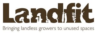
Landfit was a scheme launched in the London Borough of Lewisham to match keen horticulturalists who had no garden of their own with people who had gardens but no time to tend them. They commissioned Designed by Good People to brand this metaphorically and literally groundbreaking project. The agency reasoned: "If it's about getting people to use unused spaces, why not grow vegetables in the unused spaces in the logo?".
02. MyFonts
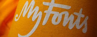
One of the most popular ways of using double space in logos is to provoke the viewer to do a double take, by creating alternative ways of perceiving an image. And here's a great example. In 2009 the world's largest reseller of fonts, MyFonts, completely redesigned their corporate identity, and graphic designer Nick Sherman commissioned Dutch agency Underware to develop a new logotype.
To Underware, MyFonts represented not just a collection of fonts, but a place where the creative spirit thrives. Borne from this notion came a creatively conceptual logo, which has two possible visual interpretations. (Not spotted it yet? The M's a hand.)
03. Guild of Food Writers
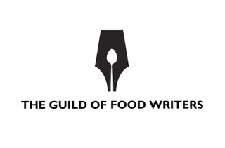
Sadly no longer with us, the consultancy 300 Million won a D&AD Award for their logo for The Guild of Food Writers, an organisation dedicated to excellence in food writing and culinary education that counts Hugh Fearnley-Whittingstall and Nigella Lawson among its members.
Get the Creative Bloq Newsletter
Daily design news, reviews, how-tos and more, as picked by the editors.
Combining a pen nib and a spoon to convey the purpose of the Guild, it uses negative space to make its point with brilliant visual efficiency.
04. ED (Elettro Domestici)
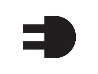
Italian graphic designer Gianni Bortolotti created this wonderfully minimalist logo design for the company ED (Elettro Domestici), combining its two initials side by side to form the shape of an electric plug. Whilst witty lateral thinking can be overdone in logo design, this is great example of how form and function can coexist harmoniously; whether your brain first registers the letters or the plug, the meaning is clear.
05. NBC

TV network NBC has featured a peacock in its logo since 1956, when it was introduced to highlight the network's colour programming. With a series of redesigns over the years, that bird has gradually faded into the background as the logo has become more streamlined. Created in 1986 by Steff Geissbuhler while at Chermayeff & Geismar, this version (with a few tweaks) has lasted until the present day. By subtly including the bird in negative space, this design gives a modern, streamlined feel to the logo while paying tribute to its impressive heritage.
06. Mister Cooper
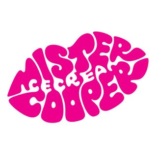
How do you brand an ice cream aimed specifically at adults? Briefed to design a distinctive logo for alcoholic ice cream startup Mr Cooper, johnson banks made sophisticated use of positive and negative space to develop this eye-catching logo.
Playing with different approaches, the agency settled on the idea of a typographic lipstick mark, senior designer Kath Tudball explains. "This concept really suited our client, expressing the hedonistic nature of the product in an appropriate form. The logo could be rubber stamped directly onto white paper cups and napkins as if a cheeky kiss had recently been planted." Find out more about how the design was created here.
07. WWF
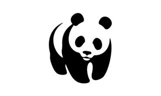
Sometimes negative space is so cleverly done, you don't even know it's negative space. This logo for the WWF (World Wildlife Fund) makes clever use of negative space to create the form of the panda's head and back.
The original WWF panda, drawn in 1961 by co-founder Sir Peter Scott, was based on Chi-Chi: a giant panda that had arrived at the London Zoo that year. The negative space version was created in 1986 at the San Francisco office of Landor, and it's since become emblematic not just of the WWF but the conservation movement as a whole. You can see Pentagram partner Angus Hyland talking about the WWF logo (and Penguin's) in this video.
08. Le Mans
This visual identity for the world-famous Le Mans sports car race was created up by sport-oriented design agency Leroy Tremblot. While it attracted some criticism from fans for being 'cold' and not incorporating a sense of the race's heritage (it's been running since 1923), we can all agree the use of negative space to combine the '2' and the '4' is brilliantly executed.
09. Toblerone
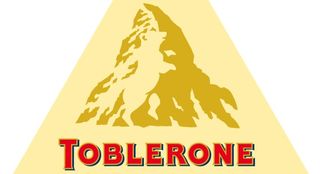
The Toblerone chocolate company hails from Bern, Switzerland, which is known for high mountain, and Bern is also called "The City Of Bears". That's a lot of imagery to get into one simple emblem. But by hiding the silhouette of a bear in the mountain illustration, this classic logo design neatly portrays the heritage of the brand, in a colour that makes you think of the chocolate too.
10. FedEx Logo
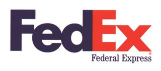
The granddaddy of negative space logos, this iconic logo was designed by Lindon Leader while at Landor (try saying that when you're tipsy). The designer cleverly manipulated Univers 67 (Bold Condensed) and Futura Bold letterforms to create a white arrow between the E and the X. The use of negative space in this logo, which has won numerous design awards, perfectly portrays the notion of a 'forward moving company', in both senses of the word.

Thank you for reading 5 articles this month* Join now for unlimited access
Enjoy your first month for just £1 / $1 / €1
*Read 5 free articles per month without a subscription

Join now for unlimited access
Try first month for just £1 / $1 / €1
Tom May is an award-winning journalist and editor specialising in design, photography and technology. Author of the Amazon #1 bestseller Great TED Talks: Creativity, published by Pavilion Books, Tom was previously editor of Professional Photography magazine, associate editor at Creative Bloq, and deputy editor at net magazine. Today, he is a regular contributor to Creative Bloq and its sister sites Digital Camera World, T3.com and Tech Radar. He also writes for Creative Boom and works on content marketing projects.

