If you look at the most creative packaging on retail shelves today, it's usually graphics-led. When photography is used, it's usually standard product or lifestyle shots that add little visual flair to a design.
But for precisely that reason, photography can be a great weapon in your armory for getting your packaging designs noticed. In this post, we share 10 examples where designers have gone the extra mile, and combined photography with clever design to create something special.
Have you spotted other examples out in the wild? We love to see them: share your photos or links in the comments below!
01. Sprout baby food
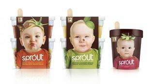
The baby food market is a crowded and competitive one, so creating a packaging design that will really stands out is a tall order. But that's exactly what London agency Springetts Design Consultants achieved with this design for Sprout, a fresh, chilled range of part-prepared baby food that allows parents to make their 'own' baby food easily and quickly. The freshness of the food is conveyed brilliantly with this gardening-inspired design, which won in the Packaging Design category of the A'Design Awards 2013.
02. Petrocoll putty
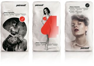
It's not often you see a multi-award-winning packaging design for spatula putty. But times change and even construction workers want to be marketed to these days, it seems. Greek agency Mouse Graphics describe these photography-led designs as a "friendly wink" to that constituency, with each image relating the product characteristic (the degree of putty overlap) with the respective garment. It's an eccentric but effective response to the original brief from Petrocoll, which apparently was a simple: "We need a new pack for our products".
03. Matsu organic wine
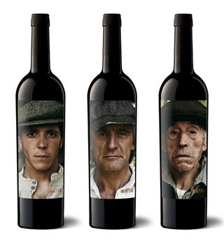
Spanish graphic design studio Moruba created this arresting packaging for Matsu, an organic winery from the Toro region. It's squarely aimed at conveying the people-centric philosophy of the company, which aims to create a sustainable, high quality viticulture. The designs represent Matsu's wine trilogy of El Pícaro, El Recio and El Viejo, using portraits showing three generations who've devoted their lives to the field. Shot by photographers Bèla Adler and Salvador Fresneda, each of these three personalities embodies the characteristics of the wine that gets its name.
04. Coco Juice
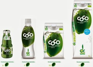
Brazilian company Coco Juice claims to have perfected a revolutionary new way of extracting coconut juice so that it can be packaged for the mass market in a way that's healthier and travels better. Award-winning brand and packaging design agency Blue Marlin created this evocative packaging for the brand, using effervescent imagery that instantly conveys the nutritional and taste benefits of this premium soft drink.
Get the Creative Bloq Newsletter
Daily design news, reviews, how-tos and more, as picked by the editors.
05. '1300 on Filmore' speciality foods
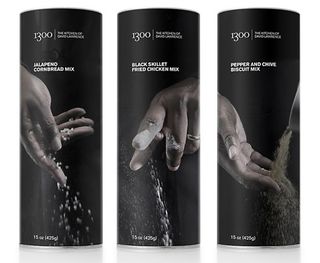
When renowned San Francisco restaurant 1300 on Fillmore launched a speciality foods range, it brought in global branding agency Landor to design the high-end packaging. They in turn brought chef David Lawrence, co-owner of the restaurant, to the fore in these classy photography-led designs. The monochrome images put a focus on the artisanal nature of his craft, and pay homage to where it all happens. This beautiful packaging shows how powerful photography can be in conveying a sensual experience.
06. Innocent Drinks smoothies
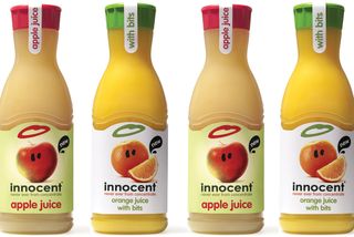
Launched in 1998, Innocent Drinks has become a byword for branding excellence, and this range of 'not-from-concentrate' juices is no exception. Designed by packaging agency Family (and friends), with graphics developed by B&B Studios, the designs combine photography, cartoonish doodles and distinctive typography with artful humour, imbuing the brand with a sense of both healthiness and fun.
07. Sigtuna beer
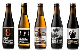
Sigtuna is a micro brewery in the city of Sigtuna, near Stockholm, that had won numerous awards for its beer. But it was having trouble getting sold in restaurants because of its amateur packaging. These cool, photography-based label designs were created by Swedish agency Morkmen Reklambyra to highlight the products' premium image, and they worked a treat. Sigtuna's beer is now sold in Sweden's finest restaurants as well as Systembolaget, the only retail chain allowed to sell alcohol in the country.
08. Darling Spuds potato chips
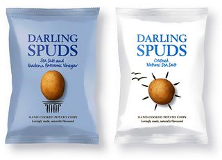
The potato chips market is nothing if not overcrowded, so it takes a lot to stand out on the supermarket shelf. Graphic design consultancy Davies Leslie Smith was commissioned by Salty Dog Brands to design the packaging for its new range of hand-cooked, gluten-free crisps, and they came up trumps with these ultra-clean designs. The unusual combination of a single photograph of a potato with fun graphical elements really catches the eye, and clearly conveys the natural goodness of the product inside.
09. Petcurean pet food
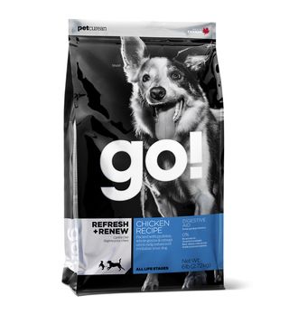
This pet food range combines arty, monochrome photography and bold use of typography to make a serious impact. It was designed by Canadian agency Subplot for Petcurean Pet Nutrition, a company aiming to produce pet food that, in nutrition and taste, replicates what families enjoy at home every day. The confident design gives this unique company a unique visual presence on the shelves.
10. Hatziyiannakis Pebbles
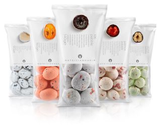
Hatziyiannakis Pebbles are Greek sweets that look like pebbles. As the saying goes, "The first bite is with the eye", so it was crucial that Mouse Graphics' packaging was as visually enticing as the product itself. These beautiful designs, using sensual photography to show the sumptuous insides, does the job perfectly.

Thank you for reading 5 articles this month* Join now for unlimited access
Enjoy your first month for just £1 / $1 / €1
*Read 5 free articles per month without a subscription

Join now for unlimited access
Try first month for just £1 / $1 / €1
Tom May is an award-winning journalist and editor specialising in design, photography and technology. Author of the Amazon #1 bestseller Great TED Talks: Creativity, published by Pavilion Books, Tom was previously editor of Professional Photography magazine, associate editor at Creative Bloq, and deputy editor at net magazine. Today, he is a regular contributor to Creative Bloq and its sister sites Digital Camera World, T3.com and Tech Radar. He also writes for Creative Boom and works on content marketing projects.
