35 incredible dataviz tools
Take the hard work out of creating charts and infographics with these tools.
18. jpGraph
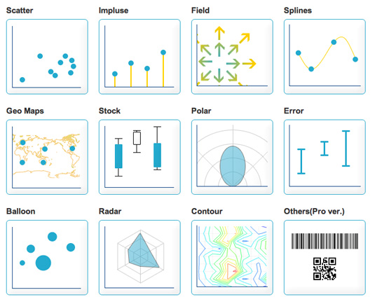
If you need to generate charts and graphs server-side, jpGraph offers a PHP-based solution with a wide range of chart types. It's free for non-commercial use, and features extensive documentation. By rendering on the server, you're guaranteed a consistent visual output, albeit at the expense of interactivity and accessibility.
19. Highcharts
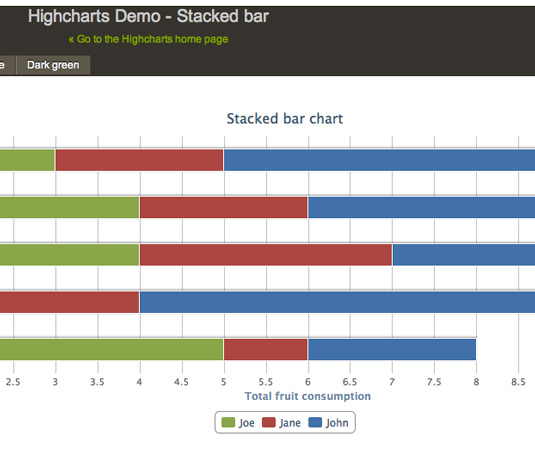
Highcharts is a JavaScript charting library with a huge range of chart options available. The output is rendered using SVG in modern browsers and VML in Internet Explorer. The charts are beautifully animated into view automatically, and the framework also supports live data streams. It's free to download and use non-commercially (and licensable for commercial use). You can also play with the extensive demos using JSFiddle.
20. Google Charts
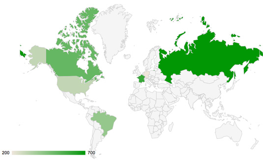
The seminal charting solution for much of the web, Google Charts is highly flexible and has an excellent set of developer tools behind it. It's an especially useful tool for specialist visualisations such as geocharts and gauges, and it also includes built-in animation and user interaction controls.
21. Excel
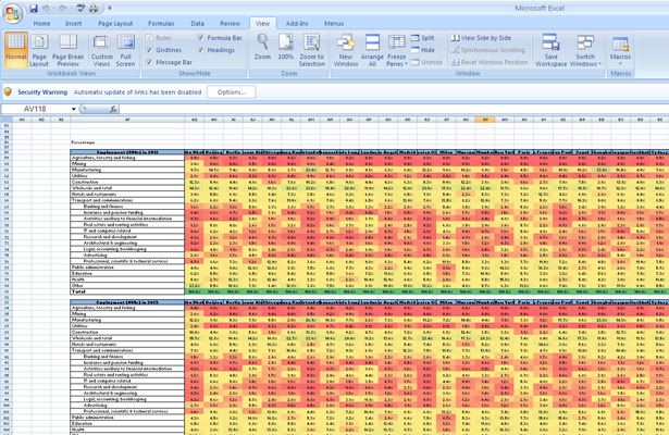
You can actually do some pretty complex things with Excel, from 'heat maps' of cells to scatter plots. As an entry-level tool, it can be a good way of quickly exploring data, or creating visualisations for internal use, but the limited default set of colours, lines and styles make it difficult to create graphics that would be usable in a professional publication or website. Nevertheless, as a means of rapidly communicating ideas, Excel should be part of your toolbox.
Excel comes as part of the commercial Microsoft Office suite, so if you don't have access to it, Google's spreadsheets – part of Google Docs and Google Drive – can do many of the same things. Google 'eats its own dog food', so the spreadsheet can generate the same charts as the Google Chart API. This will get your familiar with what is possible before stepping off and using the API directly for your own projects.
22. CSV/JSON

CSV (Comma-Separated Values) and JSON (JavaScript Object Notation) aren't actual visualization tools, but they are common formats for data. You'll need to understand their structures and how to get data in or out of them.
23. Crossfilter
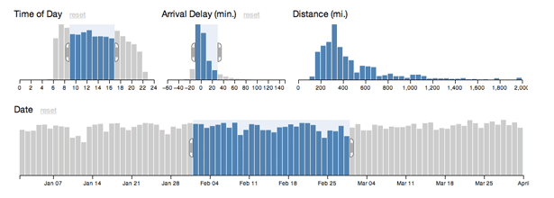
As we build more complex tools to enable clients to wade through their data, we are starting to create graphs and charts that double as interactive GUI widgets. JavaScript library Crossfilter can be both of these. It displays data, but at the same time, you can restrict the range of that data and see other linked charts react.
Get the Creative Bloq Newsletter
Daily design news, reviews, how-tos and more, as picked by the editors.
24. Tangle
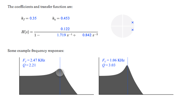
The line between content and control blurs even further with Tangle. When you are trying to describe a complex interaction or equation, letting the reader tweak the input values and see the outcome for themselves provides both a sense of control and a powerful way to explore data. JavaScript library Tangle is a set of tools to do just this.
Dragging on variables enables you to increase or decrease their values and see an accompanying chart update automatically. The results are only just short of magical.
25. Polymaps
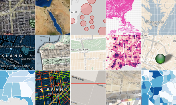
Polymaps is a mapping library that is aimed squarely at a data visualisation audience. Offering a unique approach to styling the the maps it creates, analogous to CSS selectors, it's a great resource to know about.
26. OpenLayers
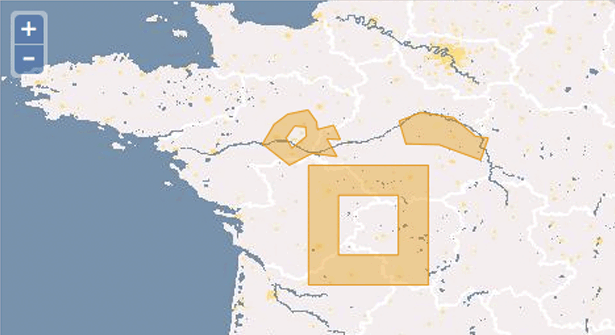
OpenLayers is probably the most robust of these mapping libraries. The documentation isn't great and the learning curve is steep, but for certain tasks nothing else can compete. When you need a very specific tool no other library provides, OpenLayers is always there.
27. Kartograph
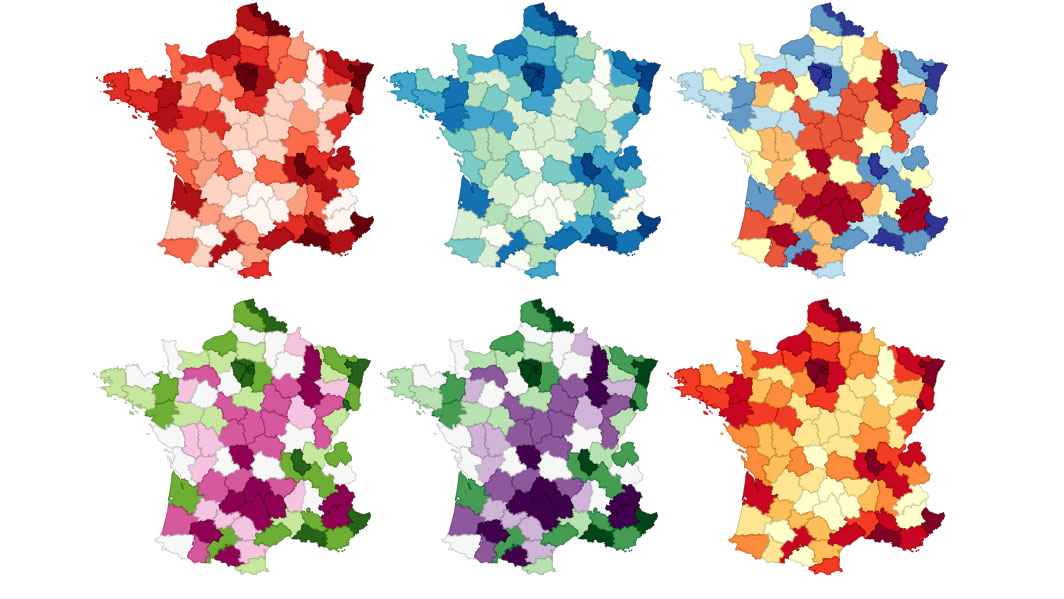
Kartograph's tag line is 'rethink mapping' and that is exactly what its developers are doing. We're all used to the Mercator projection, but Kartograph brings far more choices to the table. If you aren't working with worldwide data, and can place your map in a defined box, Kartograph has the options you need to stand out from the crowd.
28. Carto
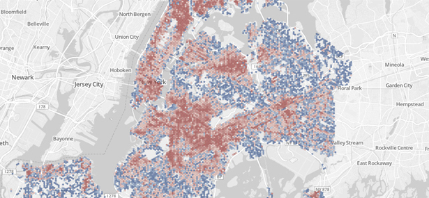
Carto is a must-know site. The ease with which you can combine tabular data with maps is second to none. For example, you can feed in a CSV file of address strings and it will convert them to latitudes and longitudes and plot them on a map, but there are many other users. It's free for students; for everyone else, there are various monthly pricing plans.
29. Processing
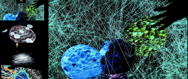
Processing has become the poster child for interactive visualizations. It enables you to write much simpler code which is in turn compiled into Java.
There is also a Processing.js project to make it easier for websites to use Processing without Java applets, plus a port to Objective-C so you can use it on iOS. It is a desktop application, but can be run on all platforms, and given that it is now several years old, there are plenty of examples and code from the community.
30. NodeBox
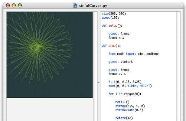
NodeBox is an OS X application for creating 2D graphics and visualizations. You need to know and understand Python code, but beyond that it's a quick and easy way to tweak variables and see results instantly. It's similar to Processing, but without all the interactivity.
31. R
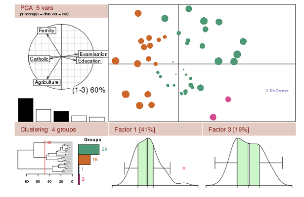
How many other pieces of software have an entire search engine dedicated to them? A statistical package used to parse large data sets, R is a very complex tool, and one that takes a while to understand, but has a strong community and package library, with more and more being produced.
The learning curve is one of the steepest of any of these tools listed here, but you must be comfortable using it if you want to get to this level.
32. Weka
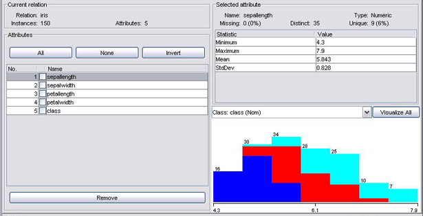
When you get deeper into being a data scientist, you will need to expand your capabilities from just creating visualisations to data mining. Weka is a good tool for classifying and clustering data based on various attributes – both powerful ways to explore data – but it also has the ability to generate simple plots.
33. Gephi
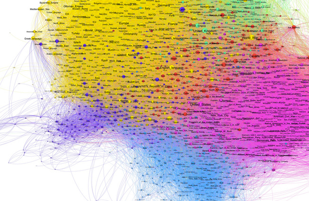
When people talk about relatedness, social graphs and co-relations, they are really talking about how two nodes are related to one another relative to the other nodes in a network. The nodes in question could be people in a company, words in a document or passes in a football game, but the maths is the same.
Gephi, a graph-based visualiser and data explorer, can not only crunch large data sets and produce beautiful visualisations, but also allows you to clean and sort the data. It's a very niche use case and a complex piece of software, but it puts you ahead of anyone else in the field who doesn't know about this gem.
34. iCharts
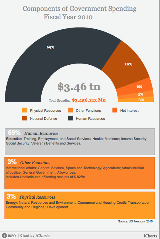
The iCharts service provides a hosted solution for creating and presenting compelling charts for inclusion on your website. There are many different chart types available, and each is fully customisable to suit the subject matter and colour scheme of your site.
Charts can have interactive elements, and can pull data from Google Docs, Excel spreadsheets and other sources. The free account lets you create basic charts, while you can pay to upgrade for additional features and branding-free options.
35. Flot
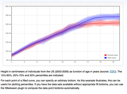
Flot is a specialised plotting library for jQuery, but it has many handy features and crucially works across all common browsers including Internet Explorer 6. Data can be animated and, because it's a jQuery plugin, you can fully control all the aspects of animation, presentation and user interaction. This does mean that you need to be familiar with (and comfortable with) jQuery, but if that's the case, this makes a great option for including interactive charts on your website.
Related articles:

Thank you for reading 5 articles this month* Join now for unlimited access
Enjoy your first month for just £1 / $1 / €1
*Read 5 free articles per month without a subscription

Join now for unlimited access
Try first month for just £1 / $1 / €1
