Design a mixed media portrait in Photoshop and Illustrator
Anthony Neil Dart reveals how to produce creative portraiture with a mixed-media approach
- Software Photoshop and Illustrator CS3 or later
- Time needed 4-5 hours
- Skills-Utilise your digital camera and scanner-Introduce a Smart Object and Smart Filter workflow-Use Illustrator’s Warp tools
By taking a different approach to your regular digital portraiture, it’s possible to produce some fascinating results. Over the following steps, we’ll compile a mixed-media portrait in Photoshop, utilising Illustrator for the generation of the artwork.
I’ll also introduce a non-destructive workflow between the two programs, in which we’ll copy and paste Smart Objects from Illustrator into Photoshop, and use vector masking (or quick masks) and Smart Filters to edit those objects non-destructively. This essentially means that any transformations or effects you create are not final: you will have the flexibility to go back at any time and make adjustments – which can be really beneficial for last minute changes and maintaining resolution in your files.
I’m using a Canon 7D but any decent camera around the 10MP range will do. And because this is an experiment, a point-and-shoot approach will suffice.
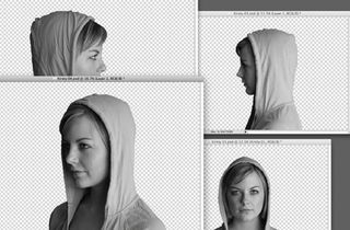
01 Shoot your subject on a clear and flat background so you get a neater edge when you cut them out. Consider the light source: keep it consistent because we will be using more then one angle – this will make your lighting more convincing in the final composition. Now choose the three angles you like best: I’ve left out the frontal shot. Use the Pen tool in Photoshop to cut out your model. Stay within the edge of the silhouette but don’t be too precious. We want to go for a collage type of aesthetic so it’s good to have slightly imperfect edges.
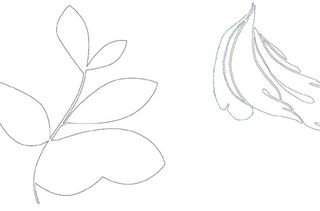
02 Draw some organic shapes in Illustrator. I’ve gone for natural, leafy shapes. Get creative, and place leaves, petals and flowers on a flatbed scanner to find interesting shapes. Next, choose the Wrinkle tool, select a small area and drag it over your clean edges to give a worn and imperfect look to your curves. If you hold Alt/ Opt as you drag horizontally and vertically, you can alter the size and shape of the affected region. When we copy these as Smart Objects into Photoshop, aim for a mix between cleaner lines and worn edges.
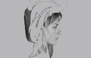
03 In Photoshop make a new A4 document at 300dpi and set Preset to International Paper, with a neutral grey background colour, for now. Place the three faces as you desire, and paste a shape (in my case, the worn edges one) over the central face, rotating and scaling it into your position of choice – remember to keep your Smart Object for a non-destructive workflow.
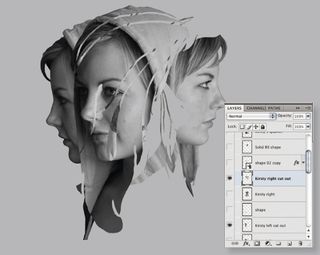
04 Duplicate the face and Alt/Opt-select the shape. Now select the duplicated face and use the Add Vector Mask feature from the Layers panel: this will use the shape as a non-destructive mask. Extend the shape in Illustrator and repeat the vector masking technique for the other faces. This will create an interesting spatial ambiguity in the piece. Don’t forget to double-click on your Smart Object shapes when you manipulate them in Illustrator. Hit Save to update the shapes in Photoshop.
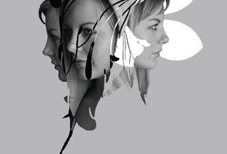
05 Make a new layer called ‘Solid Fill Shape’ and draw a shape around the head area with the Lasso tool, filled with solid black. This will simplify the mask effect and make things look more cohesive. Make another new layer to finish up the lower part of the face on the bottom-left (remember to be loose and flat, for the collage feel). Paste the smoother leaf shape from Illustrator as a Smart Object and position it towards the back of the right-hand face. Double-click the layer, select Color Overlay and make it white to punch out the face.
Get the Creative Bloq Newsletter
Daily design news, reviews, how-tos and more, as picked by the editors.

Thank you for reading 5 articles this month* Join now for unlimited access
Enjoy your first month for just £1 / $1 / €1
*Read 5 free articles per month without a subscription

Join now for unlimited access
Try first month for just £1 / $1 / €1
The Creative Bloq team is made up of a group of design fans, and has changed and evolved since Creative Bloq began back in 2012. The current website team consists of eight full-time members of staff: Editor Georgia Coggan, Deputy Editor Rosie Hilder, Ecommerce Editor Beren Neale, Senior News Editor Daniel Piper, Editor, Digital Art and 3D Ian Dean, Tech Reviews Editor Erlingur Einarsson, Ecommerce Writer Beth Nicholls and Staff Writer Natalie Fear, as well as a roster of freelancers from around the world. The ImagineFX magazine team also pitch in, ensuring that content from leading digital art publication ImagineFX is represented on Creative Bloq.
