Design a headline typeface
Tom Muller explains how to create a bespoke headline typeface
- Software Illustrator CS4 or later
- Time needed 4-8 hours
- Skills-Transfer ideas from sketch to digital-Define letterforms-Set a baseline grid and x-height-Build glyphs
Whether it’s for an ad campaign, product, publication or identity, a unique typeface can help define a brand, message and tone of voice – giving the client something unique. in this tutorial we’ll look at the creative process of designing a new display typeface – in this case, an imaginary rebranding of Computer Arts.
Many typefaces that i design, including my Nagasaki font, start off as a one-off bespoke logotype or masthead design – but the process stays the same. Starting from the all-important concept sketches, i’ll guide you through how to fine-tune your ideas into defined letterforms, before transforming the glyphs from geometric shapes in illustrator into the final headline type.
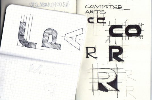
01 The first stage of developing a typeface is nailing the overall look and style of the type you’re setting out to design. We’re doing a bold sans-serif headline design here, all set in upper case. Use your initial ideas to explore the rough geometry and thickness of your proposed letterforms.
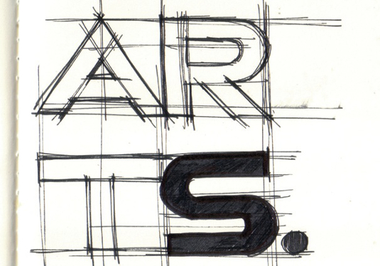
02 As your sketches progress, your typeface design will start to take shape. Roughly indicate the x-height and baseline grid. Once you have enough information, it’s time to transfer your design into Illustrator.
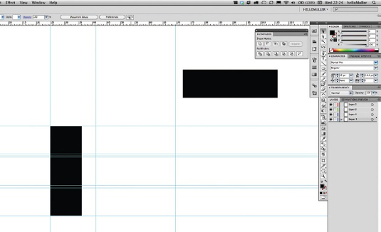
03 The first thing to do is to create all the guides you’ll need. Mine are based on the simplest building block: a black rectangle, which defines the x-height and thickness or stroke width of the letters I’m going to build. This typeface will be monoline, meaning that all strokes are of equal width.
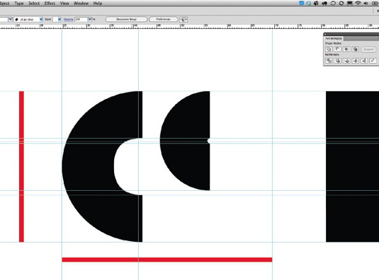
04 The red bars indicate the height and width of the individual glyphs. Since I’ve already determined my main strokes, I’ve created the curved elements out of circles so that I can build the letters C, O, P and R later.
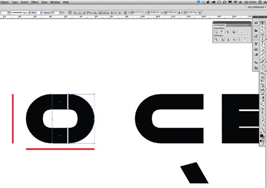
05 Keep all your letters on the same baseline grid, and shift them back and forth, using the individual stroke and curve elements to assemble the type within your grid guides. I manually tweaked the curves of the C and O so that they’re not 100 per cent perfect but have a subtle compressed ‘dent’ to give them a slightly softer-feeling treatment.
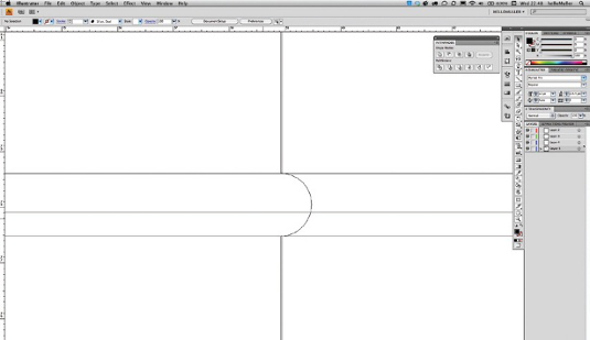
06 When I’m designing I constantly switch between the Preview and Outline mode (Ctrl/Cmd+Y) to make sure all the individual parts lock together correctly. This is important later on when we merge them together. Attention to detail is key here, and I usually work at maximum magnification and set my keyboard increments to 0.001mm to have greater control over the movement of elements. You can change those in your preferences (Ctrl/Cmd+K)
Get the Creative Bloq Newsletter
Daily design news, reviews, how-tos and more, as picked by the editors.

07 I’ve now constructed most of the glyphs, and they all fit perfectly within the grid I set up. I decided to make the M and A wider than the rest of the glyphs so there’s a visual balance. If they were of equal width they’d look too thin in comparison with the other letters.
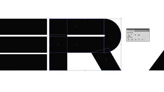
08 Once you’ve created the letters you need for your headline, start to merge the individual shapes that form each letter. Before you do, duplicate all the type (always keep the source files so you can come back and do edits later if needed) and then select each individual letter. In the Pathfinder dialog window click the Unite option under Shape Modes.
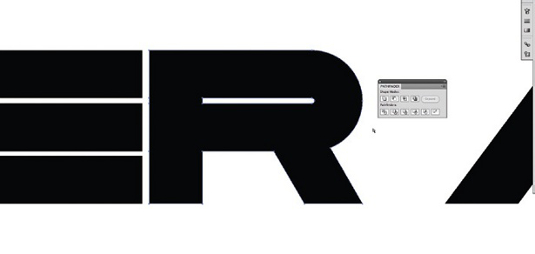
09 If all the individual elements of the letter have been aligned correctly, with the right amount of overlap merging the shapes, create your monoline letter. Now you can start adding outline strokes to the type if you wish to do so. Inspect each merged letter to check there aren’t any gaps or surplus anchor points that can be deleted. If you see elements that aren’t properly merged, it’s usually because the objects are misaligned or not overlapping enough. Once all the letters have been merged, you can start assembling the headline.
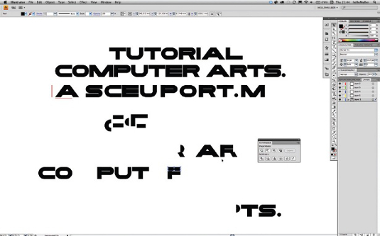
10 Manually position and kern your letters to create the desired result for your headline, and experiment with colour. This is only the first step though: now that the building blocks have been created, there’s nothing stopping you from designing the remaining letters of the alphabet and transforming this into a fully fledged font.

Tom Muller
Belgian graphic designer Muller runs multi-disciplinary design studio helloMuller, creating everything from brand identities, websites and logos to book covers, typefaces and much more.
www.hellomuller.com

Thank you for reading 5 articles this month* Join now for unlimited access
Enjoy your first month for just £1 / $1 / €1
*Read 5 free articles per month without a subscription

Join now for unlimited access
Try first month for just £1 / $1 / €1

The Creative Bloq team is made up of a group of art and design enthusiasts, and has changed and evolved since Creative Bloq began back in 2012. The current website team consists of eight full-time members of staff: Editor Georgia Coggan, Deputy Editor Rosie Hilder, Ecommerce Editor Beren Neale, Senior News Editor Daniel Piper, Editor, Digital Art and 3D Ian Dean, Tech Reviews Editor Erlingur Einarsson, Ecommerce Writer Beth Nicholls and Staff Writer Natalie Fear, as well as a roster of freelancers from around the world. The ImagineFX magazine team also pitch in, ensuring that content from leading digital art publication ImagineFX is represented on Creative Bloq.
