Design an experimental typeface
Sorin Bechira reveals how to use the Liquify tool to create a unique typeface
- Software Photoshop CS3 or later
- Time needed 5 hours
- Skills-Use the Liquify tool creatively-Combine stock imagery with custom marks-Create an illustration from type
In this tutorial I’ll explain how to design an experimental typeface like Trisec Organic, featured here, which I created as part of the official OFFF 2011 identity. We’ll combine some basic stock imagery with custom marks, and use Photoshop to produce a complex result that has the wow factor.
Don’t be afraid to break the rules to achieve unexpected results, and feel free to combine as many different textures and objects as you like. Minimalism can be very effective, but sometimes it’s good to create complex, abstract shapes for that added touch of surrealism.
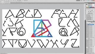
01 First create your basic letter structure. Trisec, shown here, is a ‘ping-pong’ style collaboration between myself and designer Stefan Romanu. He started by making the basic typeface (Trisec Basic), which is largely composed of different sections of overlapping triangles and circles. I then used this as a frame for the Organic version: the structure is a great support for the steps that follow.
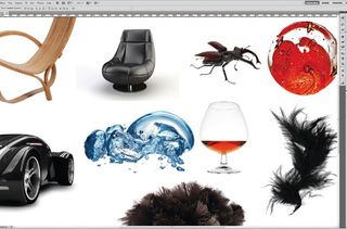
02 Start gathering some resources. Check your image libraries and look for stock imagery: you want organic objects with a good variation in shape and texture. We’ll unify everything later with some colour and tone techniques, but for now we’ll work in black and white so we can focus on the shape and merge the elements faster. You might decide to only use one part of an object, so isolate these using the Magic Wand and basic selection tools. For more complex elements, I use specific channels with toning techniques.
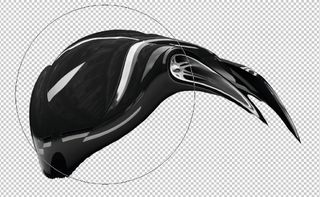
03 Now for some fun. Select the Liquify tool and make some variations in form. Take your time and experiment as much as you like with different settings and brush sizes. It can be hard to imitate a certain hand gesture twice, so I often make different iterations of effects. Also, try to make short, easy hand gestures, otherwise the form will distort too much.
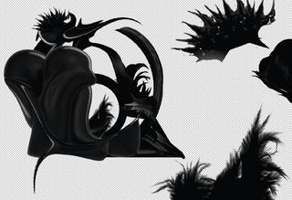
04 Start combining some of your liquified shapes and begin building up a sense of flow and rhythm by alternating their weight, shape and texture. You can duplicate some of the shapes to help achieve a sense of consistency across different elements.
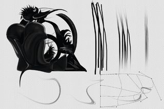
05 Now you have the main shapes, start making thin, subtle elements using the Brush tool to contrast and balance the heavier shapes. Play with the brush settings in the Brush panel to make swirls and a variety of different lines. The Warp tool can be used to add variation and flow into your shapes.
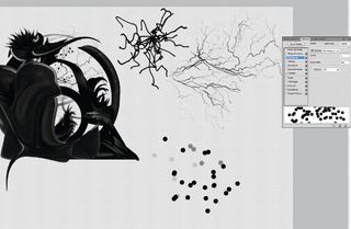
06 Now create some even smaller elements, such as dots and thin lines. The dots can be made by setting up a brush with no flow and a big scatter, while a basic hard, rounded brush is good for the thin lines. We’ve made our linework imitate lightning to enhance the organic look of the piece and to add a slightly alien feel for increased interest.
Get the Creative Bloq Newsletter
Daily design news, reviews, how-tos and more, as picked by the editors.
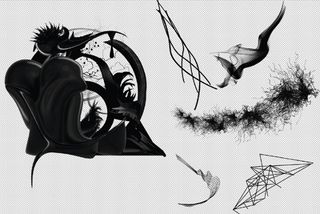
07 Experiment with the different elements until you are happy with the overall look and feel. The final shapes must have a lot of personality so that they are eye-catching, but your typeface must remain readable when the shapes are added to the letterforms.
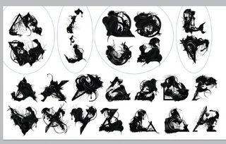
08 Focus on the different letter shapes, dividing them into categories: wide (W, M); narrow (I, J); round (O, S); with diagonals (A, V) and with verticals (L, T), for example. Establish some rules stating similarities and differences between the letters in each category, and then begin adding your shapes to each letterform, adjusting them accordingly.
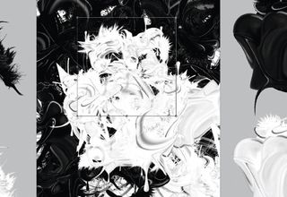
09 Once you’ve made your typeface you don’t have to stop there. You can make complex illustrations by duplicating, transforming and inverting different letters.
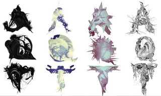
10 You can also try more options using different kinds of resources – maybe some basic 3D renders or some hand-drawn elements. Here are some examples from our VisualFreaks typefaces, which you can now buy online from YouWorkForThem.

Sorin Bechira
Graphic and multimedia designer Sorin experiments in every field of visual communication, combining different techniques to obtain unique, spectacular imagery. He’s gallery director at Slashthree art group, creative director at X3 studio and also a member of The KDU.
www.bechira.com

Thank you for reading 5 articles this month* Join now for unlimited access
Enjoy your first month for just £1 / $1 / €1
*Read 5 free articles per month without a subscription

Join now for unlimited access
Try first month for just £1 / $1 / €1
The Creative Bloq team is made up of a group of design fans, and has changed and evolved since Creative Bloq began back in 2012. The current website team consists of eight full-time members of staff: Editor Georgia Coggan, Deputy Editor Rosie Hilder, Ecommerce Editor Beren Neale, Senior News Editor Daniel Piper, Editor, Digital Art and 3D Ian Dean, Tech Reviews Editor Erlingur Einarsson, Ecommerce Writer Beth Nicholls and Staff Writer Natalie Fear, as well as a roster of freelancers from around the world. The ImagineFX magazine team also pitch in, ensuring that content from leading digital art publication ImagineFX is represented on Creative Bloq.
