Top 20 web design trends for 2013
Predicting the future is tough, but with the fast-moving nature of the web, it’s good to know what lies ahead. Craig Grannell talks to top industry figures about the web design trends you should be mindful of over the coming 12 months.
Sign up to Creative Bloq's daily newsletter, which brings you the latest news and inspiration from the worlds of art, design and technology.
You are now subscribed
Your newsletter sign-up was successful
Want to add more newsletters?
In 2012 we suggested the year would be one of ongoing economic hardship and attempted internet censorship, and guessed web design and development would also be turbulent. Such predictions proved accurate, with the web industry battling censorship, native apps, and fragmented, rapidly evolving technology.
2013 won’t be any quieter. Our industry figures predict a year of design shifts, evolving device usage, and web consumption adjustments, all of which will impact on designers and developers. However, there’s also potential for an exciting year as RWD utterly takes hold, standards evolution brings more scope for layout and type, and tools wrench themselves free of print.
All these things and more are explored in our 20 must-know web design trends for 2013 (also see our guide to the best design events in 2013.
01. Baked-in responsive web design
RWD took hold in 2012, but Flash games developer Iain Lobb reckons it’ll go mainstream in 2013. “If you’re designing a website and not thinking about the user experience on mobile and tablets, you’re going to disappoint a lot of users,” he warns. Designer Tom Muller thinks big brands getting on board will lead to agencies “increasingly using responsive design as a major selling point, persuading clients to future-proof digital marketing communications”.

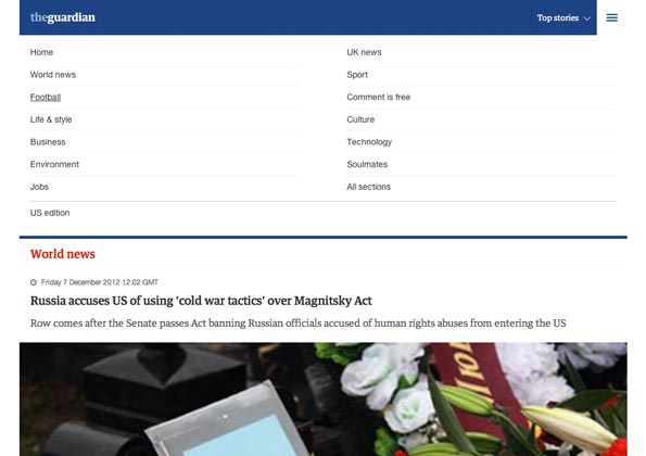
As major sites get RWD overhauls, clients will need less convincing
Article continues belowWhen doing so, Clearleft founder Andy Budd believes we’ll see an end to retrofitting RWD into existing products: “Instead, RWD will be a key element for a company’s mobile strategy, baked in from the start.” Because of this, Budd predicts standalone mobile-optimised sites and native apps will go into decline: “This will reduce the number of mobile apps that are website clones, and force companies to design unique mobile experiences targeted towards specific customers and behaviours.”
02. Multi-device design
Designer Laura Kalbag thinks 2013 will see “the abandoning of device-specific web design”. She explains that as more devices arrive with varied viewports, “pixel precision and Apple-specific breakpoints will die out, the idea of control will be relinquished, and web design will be more about system design than static mockups”.
Developer Remy Sharp agrees: “It’s sunk in that we need to test on mobile, but with IE arriving on Xbox, Jason Grigsby’s TV browsers talk, and Anna Debenham’s excellent state of games browsers, it broadens our deployment targets even further and challenges designers and developers to work in ever more diverse landscapes.” As consultant and author Eric Meyer says, it’s “not just desktop vs mobile any more”, but “desktop and mobile and couch and TV and more”.
03. Flash shifts again
“Last year, I said Flash was here to stay, especially for creating rich, immersive online content in the entertainment sector,” admits Muller, “but the unstoppable rise of tablets and the uptake of standards means Flash is being pushed to the side in favour of fast(er) loading HTML-only sites that deliver future-proof yet equally rich experiences.”
Sign up to Creative Bloq's daily newsletter, which brings you the latest news and inspiration from the worlds of art, design and technology.
However, Lobb notes Flash isn’t quite done: “It still has strongholds: specialist video players, banner-ads, Facebook modules, and games. In web games, some predict HTML5 will take over, but on the desktop I see little evidence for that. Until Internet Explorer adds WebGL support, Flash will remain the go-to technology for web 3D.”
04. Leaner, performance-focused websites
During 2012, the average site size crept over a megabyte, which designer/developer Mat Marquis describes as “pretty gross”, but he reckons there’s a trend towards “leaner, faster, more efficient websites” – and hopes it sticks. He adds: “Loosing a gigantic website onto the web isn’t much different from building a site that requires browser ‘X’: it’s putting the onus on users, for our own sakes.”
It’s a sentiment that chimes with many. Chris Mills of Opera/W3C hopes 2013 will see “more responsible usage of libraries”, and notes that there’s too much reliance on them for trivial functionality; he reckons “people will become sensitive to this as they work on more projects that require good support for TV and mobile”. Designer and writer Stephanie Rieger reckons that although people now know “web design isn’t print,” they’ve “forgotten it’s actually software, and performance is therefore a critical UX factor”.
05. Device and design resource-pooling
We’re familiar with people pooling code, but 2013 will see sharing widen, according to Meyer and designer Geri Coady. Meyer reckons that instead of studios each maintaining dozens of devices for testing, we’ll see community device labs, and Coady believes the year will bring more participation in open source design. “I love the idea of donating a little design talent to open-source projects that you use or community groups that you support,” she explains.

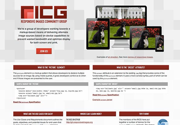
Code is often open, but not design. Sites like RICG show this doesn’t have to be
“Open source developers often spend so much time working on the technical side of things that the visual side can end up being neglected. But this past year has seen great work from the W3C’s Responsive Images Community Group, which now has a well-designed home on the web that strengthens its image as well as its mission.”
06. Modular design
2013 will see more people taking advantage of design process building blocks. Muller thinks that through RWD, grid-based, modular GUI design is “now stronger than ever,” and that we’ll see more very structured page layouts over the coming year.
Mo Morgan, head of technology at Kitcatt Nohr Digitas, notes that “Amazon Web Services and others prove infrastructure and platforms can be commoditised”, and “the plethora of available frameworks show it’s no longer necessary for developers to keep reinventing the wheel”. Such building blocks remove pain and expense, he explains, “allowing the masses to make things that would have previously been too arduous or expensive”.
Designer/developer Paul Mist hopes such changes will “speed up workflows, so we can spend more time making the web beautiful”, but Morgan worries there’s a possibility 2013 will see people start to “lose touch with core technologies that underpin all of these things, to the point where if the commoditised offering can’t meet a specific requirement, it effectively can’t be done”.
07. Standards involvement
For Marquis, 2013’s key trend will be more developers taking an active role in the web standards process. “It feels like there have been separate silos in play – developers doing client work, and browser representatives working full-time within the standards bodies,” he says.
The hope is more crossover: “Today, you see ‘developer preference” cited in a mailing list thread, but rarely do full-time web developers chime in with opinions. There’s a disconnect, and that impacts both groups negatively – standards bodies get blamed for standardising features developers dislike or don’t understand intuitively, and developers get blamed for ignoring features or using them incorrectly.
"I hope people look at the work being done by members of the Responsive Images Community Group and others, and see it as a call to join the discussion. The only way we’re going to be fully represented is by showing up and working together.”
08. Industry education
2012 was a good year for web education, and Sharp thinks this trend will continue: “I’m talking about educating kids, the ‘yoof’ of today.”
He admits the government may not be pushing as hard as the industry would like, but says organisations are filling the gap: “Efforts like Code Club are starting to really land, and I’m seeing an increase in events aimed at teens and youngsters, in web programming and hacking.”
09. New tools for web design and management
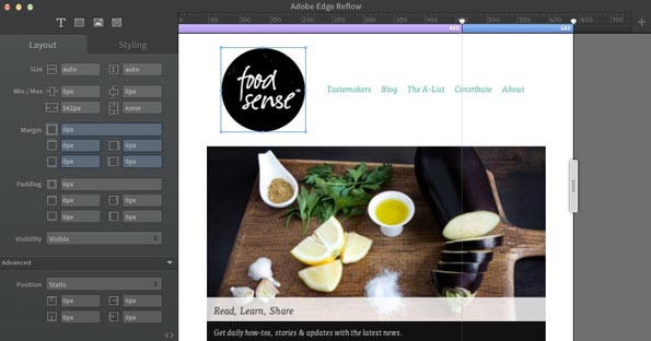
With the explosion in RWD, developer Sally Jenkinson believes 2013 will be the year processes and tools evolve. “We’ve seen a move towards designing in the browser, but vendors like Adobe aiming to introduce offerings such as Edge Reflow will impact on existing wireframe and design methodologies.” She thinks lines between mockups and prototypes will blur, and static representations will no longer “accurately reflect the variety of permutations in terms of device renderings”.

Adobe’s new Edge suite shifts web design tools from their print-oriented predecessors
Redweb head of development Wayne Rowley adds that improved mobile tools are also likely: “CMS vendors are already seeing the need to provide mobile support when creating and managing content, and the next step is to optimise CMS software interfaces, empowering content editors with true flexibility and location-independent content management capabilities”.
10. More video
According to designer Ayesha Garrett, barriers to entry regarding video continue to fall, and 2013 will find a lot more of it online: “Internet speeds, including for mobile devices, are rising. Also, people with subscriptions to Adobe Creative Suite have suddenly found themselves with extra ‘free’ software, and are playing around with video packages and experimenting with After Effects.”
She adds that some video trends will perhaps be less welcome: “We’ll see ongoing heavy use of the DSLR look – narrow depth of field and shake – and slow motion, because more cameras are incorporating that.”
11. Storytelling and personality
Bluegg studio manager Rob Mills reckons 2013 will see a “further step in the direction of storytelling and personality on the web, achieved through a greater focus on content and an increase in the use of illustration”.
He says content strategy has always been important, but we’ve nonetheless of late seen a renewed focus on content. “Agencies and individuals are therefore going to have to work better with clients on content-creation and management, which can only be a positive thing for user experiences.”
12. Making a profit
We’re used to seeing venture capitalists fling money at half-baked ideas, and major players open bulging wallets to pay absurd money for existing services (witness Facebook’s $1billion purchase of Instagram).
Developer, speaker and writer Rachel Andrew hopes the coming year will see this change. “From a business perspective, I’m hoping 2013 will see more celebration of profitable businesses," she says, "rather than glorifying successful funding rounds.”
13. Tablet thinking goes beyond the iPad
Publication designer Roger Black says publishers will in 2013 “continue to push out native iOS apps” as they realise “the iPad is not the magic pony they’d been looking for”. Android and Microsoft tablet sales, combined with apps not being linkable outside of each platform, will result in more “impressive, hand-built responsive HTML apps that play everywhere”.
However, Black adds iOS wrappers for responsive publication templates will “allow publishers to have their app and eat it too, enabling developers to stick to new OS revisions and publishers to stick to content.”

The iPad – no longer the apple of publishing’s eye in 2013?
Mobile platform strategist Peter-Paul Koch also thinks we should watch out for Tizen: “It’s an HTML5-based mobile OS created by Samsung and Intel, and initial devices are expected in Q2 2013. If Samsung pushes Tizen devices, you’ll know it’s going to be a big deal.” On Firefox OS, Koch is less optimistic: “It will fail, because they can’t produce cheap enough phones that compete with cheap Androids and run a decent browser.”
14. The app backlash
Apps remain big business, but some publishers continue to edge to HTML5. Redweb head of innovation David Burton reckons a larger backlash is brewing: “The gold rush is over, and there’s unrest in that apps aren’t all they promised to be. We now live in a just-in-time culture, where Google can answer anything at the drop of a hat, and we no longer need to know the answers.
"The app model works the old way. Do we need apps for every brand we interact with? Will we even have iPhones in five years’ time? Who knows? But one thing is certain – the internet will remain, and the clever money is on making web apps that work across all platforms, present and future.”
15. A mobile design explosion
Designer/developer Dan Eden says that with “more companies focussing web efforts on mobile,” designers will feel the pressure to brush up on the subject, to the point that in 2013, “designing for desktop might be considered legacy support”.
Rowley agrees projects will increasingly “focus on mobile-first regarding design, form, usability and functionality”, and Chris Lake, Econsultancy director of product development, explains this will impact on interaction, with web designers exploring natural user interface design (fingers, not cursors) and utilising gestures.
16. Experimental and iterative design
Product designer Faruk Ateş predicts 2013 will see “the rise of new approaches to design and development”. Rem units, CSS grids support, pre-processors, and a better, wider understanding of RWD will “lead to more people exploring different ways to get the job done, and result in more experimental approaches than we’ve seen so far in real-world situations”.
A big shift, reckons Burton, will be more live iteration: “We’re increasingly comfortable using products that aren’t finished. It’s become acceptable to launch a work-in-progress, which is faster to market and simpler to build – and then improve it, add features, and keep people’s attention. It’s a model that works well, especially during recession. As we head into 2013, this beta model of releasing and publicly tweaking could become increasingly prevalent.“
17. Better page layout
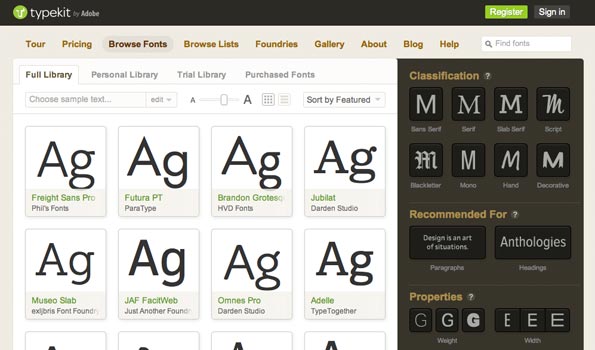
Recent years have seen a lot of focus on technology, but many designers see a swing towards design in 2013. Eden is looking forward to typography improvements and was “incredibly excited to hear about Monotype’s acquisition of Typecast and Typekit’s ongoing negotiations with Linotype”.

Online type is changing fast, providing more options for designers
Meyer points at CSS “finally getting strong layout mechanisms it’s lacked since its inception”, through the likes of Flexible Box Layout and Grid Layout. And Lake reckons there’ll be a trend towards ‘nano design’: “The detail matters, and can be the difference between a good experience and a great experience.” Garrett adds we’ll also see a “trend towards not looking CMS-like”, through clients demanding a site run a specific CMS but that it not look like other sites using the system.
18. Scalable web design
According to Nick Pettit, teaching team lead at Treehouse, scalable web design will be big in 2013: “SWD is a methodology for designing websites capable of being displayed on screens with both low and high pixel densities.
Like RWD, it’s a collection of ideas, techniques, and web standards.” The SWD approach ditches rasters for vectors, utilising SVGs “capable of scaling in size without a loss in detail or sharpness”, and Pettit reckons it was only IE’s lack of SVG support holding designers back; now SWD and SVG are viable.
19. Behaviour-driven discoverability
With so much information now being produced, digital technology strategist James Gardner thinks 2013 will see a trend towards dealing with discoverability: “Current solutions are clunky and inaccurate, and rely on plenty of input from the user. New solutions will be behaviour-driven and built on more sensitive algorithms working with diverse data sets, such as location and social.”
This, he believes, will take the onus off of search and be more proactive in providing related information: “I see this as a race between established companies – Google and Facebook – and startups who focus on niche discovery.”
20. Rise of the hybrid designer
Budd thinks the switch to RWD will bring more collaboration in agency teams: “We’ll see fewer designs being thrown over the fence to developers, and a rise in cross-functional pairing.” But Mist believes we’ll in reality see more hybrid designers emerge: “Take a brief that requires a responsive design. Give it to a designer who knows how to code and then to one who doesn’t. You’ll get a more effective, fluently designed site from the former.
"Throw in frameworks, new standards, and massive improvements in capabilities for designing in-browser and the latter will fall further behind. Those who already code have an astonishing playground to create with. Those who don’t need to learn – fast.”
Liked this? Read these!
- Brilliant Wordpress tutorial selection
- Free Photoshop actions to create stunning effects
- Create a perfect mood board with these pro tips
- The best Photoshop plugins
- Discover what's next for Augmented Reality

The Creative Bloq team is made up of a group of art and design enthusiasts, and has changed and evolved since Creative Bloq began back in 2012. The current website team consists of eight full-time members of staff: Editor Georgia Coggan, Deputy Editor Rosie Hilder, Ecommerce Editor Beren Neale, Senior News Editor Daniel Piper, Editor, Digital Art and 3D Ian Dean, Tech Reviews Editor Erlingur Einarsson, Ecommerce Writer Beth Nicholls and Staff Writer Natalie Fear, as well as a roster of freelancers from around the world. The ImagineFX magazine team also pitch in, ensuring that content from leading digital art publication ImagineFX is represented on Creative Bloq.
