Understanding CSS and the modern web
In the first chapter of his book, CSS3 Foundations, Ian Lunn explains what the modern web is and why CSS is so important to it
This is an edited excerpt from Chapter 1 of CSS3 Foundations published by Treehouse
What is the modern web?
Most importantly, the web today is what it has always been—accessible information. Unlike the early days of the web, though—when it was just a collection of text files—the modern web has grown to support many differing media formats and now, more than ever, many differing ways to access information.
No longer do you just sit at a desktop computer to “log on.” Nowadays, you sit on a beach reading the news on a tablet device, you go to a coffee shop with laptop in hand to chat with friends in different countries, and you try to refrain from laughing at pictures of cats playing keyboards while viewing a smart phone on a train journey. The information on the web is practically infinite (more content is created than you could ever consume), and the way in which you access that information continues to grow.
The modern web is an exciting media to be a part of. It is continuously growing and so too are the technologies behind it.
What is CSS?
Cascading Style Sheets (CSS) is a simple language defining styles that can be applied to HTML. Where HTML describes the structure of a web page, CSS describes its presentation.
An international community called the World Wide Web Consortium (W3C) writes and maintains the CSS specifications that define and standardize the way in which people should write the CSS language and browser vendors (the people who make web browsers) should implement it. Because the CSS specification has grown since its introduction in 1996, the latest version, CSS3, has been broken up into modules so that each defines a part of CSS, making the overall specification easier to maintain.
You can find the CSS specifications at www.w3.org/Style/CSS/. Because these specifications are very much technical and in depth, you may find them off-putting. I know I do! Although they are useful to refer to from time to time, by no means do you need to read them. CSS3 Foundations takes a much more simple and friendly approach to your understanding of CSS3.
Before you take a closer look at what CSS can offer, you should first understand the current state of CSS. You may have noticed I referred to both CSS and CSS3. What’s the difference?
Get the Creative Bloq Newsletter
Daily design news, reviews, how-tos and more, as picked by the editors.
CSS refers to all three levels of the specification: CSS Level 1 (CSS1), CSS Level 2 (CSS2), and CSS Level 3 (CSS3). Each level of CSS builds on its predecessor. CSS2 had a shaky start and many issues came to light, leading to a revision of this specification and the release of CSS2.1. So, CSS3 contains aspects of its predecessor CSS2.1, and CSS2.1 contains aspects of CSS2 and CSS1.
Although each CSS level builds on its predecessor, where relevant, a level recommends a particular feature from its predecessor no longer be used and thus deprecated. This means that when referring to CSS3, one is actually referring to all the features made available throughout CSS, except those that have been deprecated.
In CSS3 Foundations, you learn CSS3, which includes not just the newest of features, but also those from the previous CSS levels that experienced designers and developers have relied on for years.
The Role of CSS
The main purpose of CSS is to separate structure (HTML) from presentation (CSS). Figure 1-1 shows a web page that consists only of HTML, without any CSS.
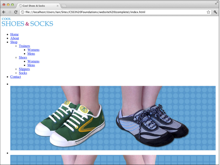
Figure 1-2 shows the same web page with CSS applied to it—a huge difference, one that makes the page much more attractive.
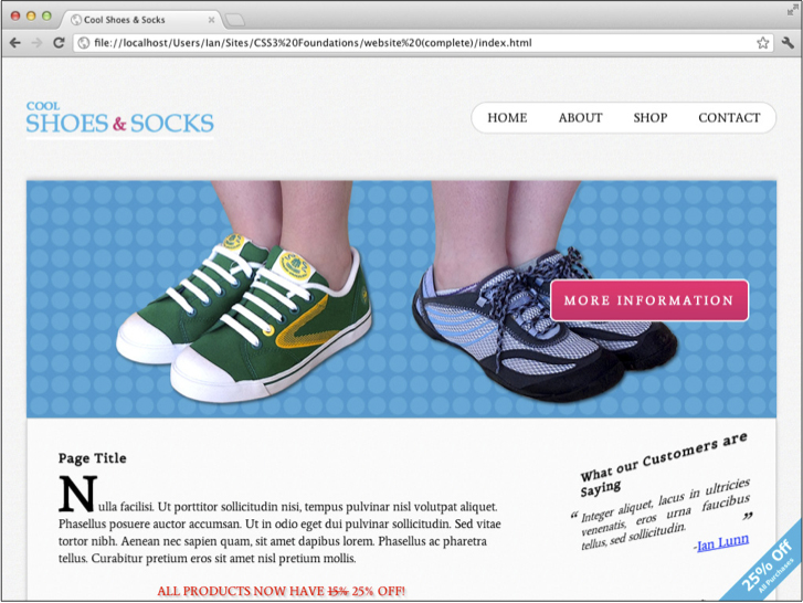
In the early days of styling web pages, structure and presentation were mixed together. Presentation was directly applied to structure, meaning that maintaining pages became an arduous task. If, for example, somebody decided that the main title on each page of a website should be changed from black to blue and that site consisted of 10 pages, you had to change the style for that title 10 times.
By separating structure and presentation, you gain numerous advantages:
- A Cascading Style Sheet can be shared across multiple web pages.
- Sites are easier to maintain and become more flexible.
- The styles applied to a web page can be tailored to suit multiple devices/environments.
In the modern web, the role of CSS is more important than ever. As technology has advanced and the ways in which you access the web are more diverse, CSS must evolve to accommodate both users wanting to access information over the web and developers wanting to present that information in a particular way. I say developers, but really I mean anyone. The web is not just for the technically minded. Open information is for everyone, and CSS aims to be as easy and open to use as possible, allowing anyone to style information.
The most important aspect of CSS is backward compatibility. Because each new level of the specification builds on the last, CSS remains backward compatible. Although features may become deprecated, they still work in existing browsers because new levels only add new functionality or refine existing definitions. By working backward first, the specification then has the opportunity to pave a solid path into the future.
CSS3 offers many new features to push the web forward and help improve the accessibility and presentation of information. With the emergence of multiple ways to access the web, one of CSS3’s most important features is the Media Queries module, which builds on media types.
When CSS2 was developed, it became apparent there was a need to serve different styles based on how web pages were being accessed, so media types were introduced. These media types allowed for specifying different styles for particular devices, such as screen (intended for color computer displays), print (intended for printers and printed documents), and hand-held (intended for small screen devices with limited bandwidth).
With such a varied range of handheld devices on the market today, defining those devices within the handheld category certainly isn’t descriptive enough. Likewise, desktop displays differ greatly in features too.
CSS3’s Media Queries module builds on media types, allowing a developer to query particular aspects (such as width and height) of the device and environment on which a web page is being viewed and specify styles to be applied only when certain conditions are met.
The specification also adds new presentational features such as gradients and rounded corners to make easier some of the tasks developers have been doing for years, more ways to select the elements to be styled (called Selectors), and web fonts, which sees the number of fonts you can safely use go from tens to thousands—if not tens of thousands!
Working Draft and the CSS process
At the time of writing, the overall CSS3 specification is incomplete. To make reading and implementing it easier, the specification is broken up into modules. While some of these modules are complete, others are still being written or tested. Modules go through varying stages to determine how far from being complete they are and also serve as an indication of whether you should use them:
- Working Draft—A module that is incomplete and still being worked on.
- Last Call—A module that is considered to be complete. This module will move
- toward Candidate Recommendation unless significant issues arise.
- Candidate Recommendation—All known issues are resolved and the features of the module are ready to be implemented into web browsers.
- Proposed Recommendation—Features of the module are implemented in at least two web browsers and the module is reviewed by W3C Members one last time.
- Recommendation—The module is complete.
When implementing features from modules that are Working Draft or Last Call, those features should be used with a vendor prefix; this ensures you are using experimental features in a way that prevents incompatibilities should there be changes to modules in the future.
You’ll learn exactly what a vendor prefix is and how to use them in Chapter 5.
More information about the CSS process can be found at www.w3.org/Style/2011/
CSS-process#rectrack.
All in all, CSS3 makes creating web pages easier and more exciting than ever. So, at the time of writing, as the specification is in Working Draft status, can you use it yet?
Absolutely! Modern browsers already have great support for CSS3 because the sooner you start using it, the sooner you can provide feedback and improve the future of CSS. The W3C consists not only of member organizations and its full-time staff but the public, too. By using CSS3 today, you can have your say in its future. Just by using a feature of CSS3 is giving your stamp of approval to it.
Throughout CSS3 Foundations, you learn to use CSS3 in a safe way that is compatible with both existing browsers that have some or no CSS3 support and future browsers, in the case of features being redefined prior to the specification reaching its Recommendation status.
Modern Browsers
A web browser is, at its core, an engine that renders HTML, CSS, and other technologies, turning them into a functional web page. Browsers also offer features such as bookmarking, history management, developer tools and many others, including support for add-ons that allow for extending a browser’s capabilities.
So, which browser should you use to create your website? All of them! Okay, you don’t need to download them all right now, but it is important to test the websites you build in a range of browsers (and devices).
Today’s major browsers
Five major browsers are available today. These browsers are created by organizations—often referred to as browser vendors or vendors for short—and are made free to download and use.
- Google Chrome
- Apple Safari
- Mozilla Firefox
- Opera (both browser and vendor are referred to as Opera)
- Microsoft Internet Explorer
I personally like to create websites using Chrome. I feel its web developer tools are the most useful for the way I work, and it is often ahead of the rest when implementing the latest CSS features.
Throughout the book, I use Chrome as my main browser (and test other browsers in Chapter 15). I recommend avoiding Microsoft Internet Explorer versions 7–9 as a browser to use while creating a web page because its features aren’t as consistent as the others listed, but if you’d like to use Safari, Firefox, or Opera, feel free. The development tools, which I use and refer to, are similar between browsers, and I don’t use a feature if it doesn’t exist in another browser.
At the time of writing, Microsoft Internet Explorer 10 is available as a preview but hasn’t officially been released.
Browser engines (layout engines)
Knowing which engine these browsers support is also useful:
- WebKit—Both Google Chrome and Apple Safari use this open source engine. Although these browsers use the same engine, they may have implemented it in a slightly different way, so you shouldn’t expect one to render the page exactly the same as the other. Always test in both to make sure. That said, in most cases, consistency between these browsers is very good. Android Browser also uses WebKit, which together with Safari (used on Apple’s iPhone, iPad, and iPod products) makes it the most-used browser engine on mobile devices.
- Gecko—Mozilla Firefox uses Gecko, another open source project.
- Presto—Available only as a part of Opera products.
- Trident—Available only as a part of Microsoft’s products.
These engines are used not only by desktop and mobile browsers but also by other products such as e-mail clients and word editing software.
Browser usage statistics
Although browsers are free to download and use, the web browser market is very much a competitive place. As mentioned, vendors are all trying to push the web forward, but they also stand to gain a lot from people using their particular browser. Some vendors have other products that they want to profit from. The bigger their share of the market, the more they are able to push these products and services.
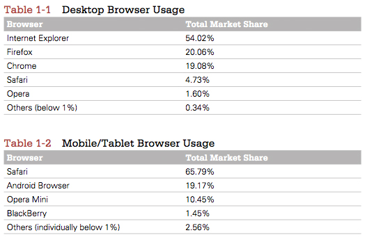
Tables 1-1 and 1-2 present the usage statistics provided by www.netmarketshare.com in July 2012 (the time of writing).
Older browsers on the modern web
Unfortunately, the modern web—with all its fancy new features—comes with excess baggage in the form of older web browsers that are still in use today. Although the W3C, browser vendors, and the web community/industry are working to push the web forward, there are many web users who are either unaware of or unable to embrace this change.
Before looking at which of the browsers still in use today could be deemed as being old, Table 1-3 shows the breakdown of market share into individual version numbers.
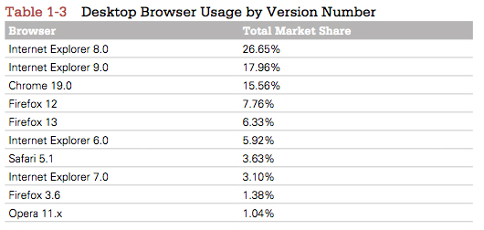
Like me, you may find these statistics to be surprising. Internet Explorer 8 has the biggest market share, over 25%? There are a few reasons for this. Internet Explorer comes packaged with Microsoft Windows, which is the most-used operating system. Many people access the web via Internet Explorer unaware that other browsers even exist. They also don’t upgrade their browser because either they don’t know that option is available or the technology they have is too outdated to do so. You should note that Internet Explorer 9 is available only to users of Windows Vista and Windows 7. Many users are still using Windows XP, which is restricted to Internet Explorer 8. This may explain why it is the number one web browser, despite Internet Explorer 9 being on the market since 2011.
Here’s where I drop the bomb: Internet Explorer 6, 7, and 8 are old browsers, despite all having significant market share. Although each is superior to the next, their support of standardized CSS is poor. Versions 6 and 7 implement CSS 2.1 but not particularly well. Version 8 has good support for CSS 2.1 but little for CSS3.
There is light ahead though. Although Internet Explorer 6 has around a 6% share according to these statistics, many of its users are Asian based, so if your website is not targeting that audience, you may find those statistics greatly drop. Internet Explorer 6 is such an old browser, and so troublesome to the future of the web that even Microsoft is trying to make its users aware that they can upgrade, with the site www.ie6countdown.com. This site also confirms that Asia (in particular, China, with a 22.4% share) greatly contributes to that 7% global statistic.
Aside from Internet Explorer versions 6, 7, and 8, the only other old browser with a share greater than 1% is Mozilla Firefox 3.6. It has good support for CSS2.1 and CSS3 and is not a problem browser by any means, but at the time of writing, Firefox is in the double figures, at version 14. You would be forgiven for thinking you didn’t have to test in 3.6 then because it’s so outdated, but testing in Firefox 3.6 is something I highly recommend due to its having a market share higher than 1% (generally a browser with a market share less than 1% is deemed as being redundant), and you do just that toward the end of CSS3 Foundations.
So how do you deal with older browsers because they are still very much a part of the modern web?
It is important to remember that the web is open information and it is the person’s job that is making that information available as accessible to as many as possible. You shouldn’t ignore users of old web browsers, but it’s unrealistic to provide them the same levels of features you would provide somebody using a modern web browser. You would still like them to be able to see the beauty of the page you’ve created, just at the level their browser can support.
Say you’ve used some of CSS3’s features such as rounded corners and background gradients. An older browser doesn’t understand these features, so it can’t display them. Instead, that browser just shows square corners and a solid background, as shown in Figure 1-3 and Figure 1-4.


This is known as graceful degradation. In a browser that doesn’t support CSS3, it simply falls back to what it does support. The user of that browser still sees a nicely styled web page and is none the wiser to the fact that in a modern browser, he could be seeing a few extra niceties. Nothing appears broken to him, and the way in which he is interacting with your web page isn’t affected.
There is also another technique similar to this known as progressive enhancement, but what’s the difference? Although graceful degradation starts with modern browsers in mind first and then provides workarounds for older browsers later, progressive enhancement does the opposite: it starts with an older browser and then later adds new features for modern browsers.
Which approach should you use? With all the work being done to push the web forward, it would be a shame for that to go to waste. By using graceful degradation, you are putting the future of the web first but making sure there is support for the part of the web that is yet to catch up, too.
In the case of Internet Explorer 6, you may decide to just ignore it completely, simply because it’s such an old and troublesome browser to provide fixes for. Rather than spending x number of hours fixing it, in Chapter 15, you’ll apply basic CSS to Internet Explorer 6, which still makes the content of the web page perfectly accessible, it just won’t be styled as much. This saves you work (and if you’re creating a web page for a client, it saves money), but the user can still see all the information on the page because, after all, CSS is just presentation.
Of course, if you’re creating web pages for a paying client, now or in the future, you would need to discuss browser support. By analyzing the latest usage statistics for browsers, as well as the client’s existing statistics on their own website (should they already have one), you can determine what browsers your client’s users are using to view the site and aim to support those browsers with the site you’re creating.
Throughout CSS3 Foundations, I advise you when a feature isn’t available in an older browser, and you learn to test and examine alternatives for these browsers in Chapter 15.
Tools for building and styling the modern web
As the web has grown, so too has the number of tools available to build it. You can easily become overwhelmed by choice, but you should remember that, at its core, the web is just text. To start building a web page, you need only a web browser and a text editor.
Tools range in price anywhere from completely free to several hundred dollars, but by no means are the most expensive ones necessarily the best. You can get started with some great tools having spent no money whatsoever.
Web developer tools
Each of the latest web browsers has its own version of web developer tools that make creating websites easier and more efficient.
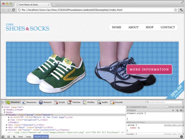
Web developer tools allow you to quickly look at HTML elements and the CSS applied to them. You can also make live alterations to CSS within a browser’s web developer tools, often a quicker way to experiment with styles. Figure 1-5 shows Google Chrome’s web developer tools.
You use these tools later in the book, but for now, you might want to familiarize yourself with opening them in your chosen browser.
Opening web developer tools in desktop browsers
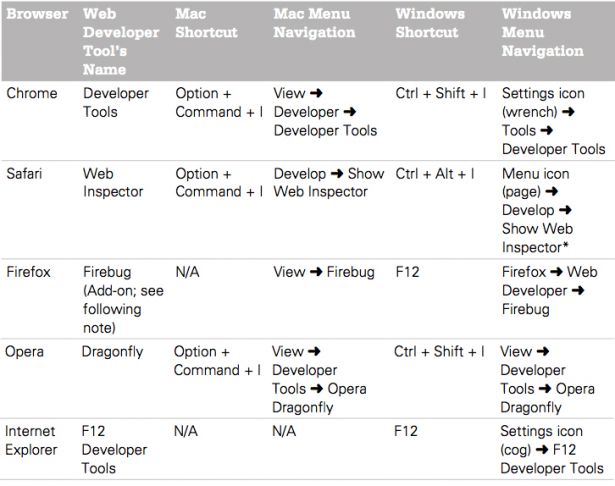
*Safari’s Develop menu must first be switched on under Preferences Advanced.
Prior to version 10, Firefox didn’t come with built-in developer tools. I highly recommend an add-on called Firebug both in the absence of tools prior to version 10 and in place of the built-in tools available from version 10 onward. Firebug has more features than the built-in tools and is more consistent with those available in other browsers.
To install Firebug, in Firefox, click Tools Add-Ons to open the Add-Ons Manager. Search for Firebug and then click the Install button. After it is downloaded, click Restart Now (or close and reopen Firefox manually) to complete the installation.
Text editors
A text editor is the tool used to write CSS. Text editors also allow for writing HTML, JavaScript, and many other languages that make up the web.
Text editors allow you to do just that—edit text. You would expect them all to be quite similar, but actually, text editors come with many differing features. Most come with features that speed up your writing of CSS (and other web technologies). Some come with File Transfer Protocol (FTP) clients and What You See Is What You Get (WYSIWYG) editors.
A WYSIWYG editor allows you to build a website without your having any knowledge of code. Although this idea sounds great, in reality, it’s not! When you are using these tools—dragging elements into the positions you want—the editor is given the responsibility of generating the code for you. These types of editors are rarely up to date with the latest coding standards and can never do as good a job of coding a website as you or I. Generated code is almost always bloated (more code than needed) and doesn’t exercise the best practices you learn in this book, leading to a poor experience for the visitors to your website. Should your text editor also come with a WYSIWYG editor (such as Adobe Dreamweaver), that’s fine; just choose to ignore it and make use of the text editor feature instead.
If you don’t already have one, I recommend using a basic text editor to begin with. TextEdit (for Mac users) or Notepad (for Windows users) already come installed on your computer and are perfectly acceptable to use. They don’t offer any features beyond editing your text, but that’s all you need to start.
Throughout CSS3 Foundations, I use a text editor for Mac called Espresso.
Summary
The web could exist without CSS, but it would never be as accessible or pretty as it is today. Its importance—in particular the new features introduced in CSS3—grows significantly as the ways in which people access the web change. CSS continues to advance, with many exciting features being introduced. Now is a great time to jump in and start learning how to use it.
With the necessary tools to begin creating CSS and web pages, in the next chapter you will get started with the project files built on throughout CSS3 Foundations. You’ll take the page seen in Figure 1-1, and turn it into the styled page seen in Figure 1-2.

Thank you for reading 5 articles this month* Join now for unlimited access
Enjoy your first month for just £1 / $1 / €1
*Read 5 free articles per month without a subscription

Join now for unlimited access
Try first month for just £1 / $1 / €1

The Creative Bloq team is made up of a group of design fans, and has changed and evolved since Creative Bloq began back in 2012. The current website team consists of eight full-time members of staff: Editor Georgia Coggan, Deputy Editor Rosie Hilder, Ecommerce Editor Beren Neale, Senior News Editor Daniel Piper, Editor, Digital Art and 3D Ian Dean, Tech Reviews Editor Erlingur Einarsson, Ecommerce Writer Beth Nicholls and Staff Writer Natalie Fear, as well as a roster of freelancers from around the world. The ImagineFX magazine team also pitch in, ensuring that content from leading digital art publication ImagineFX is represented on Creative Bloq.
