Take advantage of the CSS background-size property
Front-end developer Stephanie (Sullivan) Rewis, owner of W3Conversions, takes you through a variety of innovative uses for the new CSS3 background-size property. More control than you've ever had before!
- Knowledge needed: Basic HTML and CSS
- Requires: HTML/CSS editor, modern browser
- Project Time: 30 minutes - 1 hour
The changes brought by the various CSS3 modules are pretty exciting for designers and front-end developers. Decreases in bandwidth and HTTP requests, faster maintenance and using real fonts instead of images are all big pluses on the SEO and accessibility fronts. But one area that seems a bit neglected is the new background properties. Oh sure, gradients are all the rage — and rightly so — but there are some super-handy bits you may not have investigated thoroughly. Maybe they seem more utilitarian and don't have the swagger of box-shadow and border-radius, but in this tutorial I intend to change your mind. One of my favourites is background-size. Let's see what some of the possibilities are.
The background-size property does exactly what you would expect — it allows you to specify the size of a background image on both the X-axis (horizontally) and the Y-axis (vertically). Possible values for the background-size property include:
- pixel value
- percentage - related to the background positioning area
- auto - the default or actual size of the image
- cover - completely cover the background positioning area while retaining its aspect ratio. Clipping may occur.
- contain - scale the background image up so that it can be completely contained within the background positioning area. You may see a space between the background image and a side of its container since there will be no clipping.
01. Percentage values give us flexibility
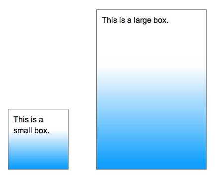
Don't stress out about the odd-sounding cover and contain just yet — we'll look at some good demonstrations of those later. Let's begin by examining the percentage value. There's a large variety of uses for sizing a background image with per cents — especially in the realm of responsive design. One example would be a consistent design style with subtle gradients behind many of the elements. You could make a single gradient and size it to work in any container. I've used blue in this example to be sure it's seen on all monitors, but it will likely be much more subtle in your page. The image itself is blue at the bottom, gradually changing to white at the top — 10px wide by 35px tall. The code is as follows:
Article continues belowdiv {
background-image: url(gradient.jpg);
background-position: left bottom;
background-size: 100% 70%;
background-repeat: no-repeat;
}

I've set the image to begin at the bottom of each box, to expand 100 per cent across, but to only be 70 per cent high so that the rest can fade to white (I could just as easily have set it to 20 per cent or 100 per cent high). The no-repeat must be used since the image would start over again at the 70 per cent mark. This technique, since it allows you to reuse a single image repeatedly, can save you HTTP requests and bandwidth and is a great one for your arsenal.
02. Even more flexible, accessible uses
Per cent values have even more exciting uses. Anything I can do to make my pages more flexible and indestructible — and especially accessible — the more excited I am. Yeah, I know. It doesn't take much for a geek. Recently I was building a site for a designer where the front page was extremely graphical in nature.

I semantically broke the little farmer's market stand down like this. Curtains/stage/clouds were all decorative images. But the stand itself, on this page, is the logo. I would not want to use a background image for this since I want the alt attribute to indicate what it is. The baskets of produce on the stand are the site's navigation and before you say, "Well, just make them into images and be done with it," you should know that we were using real text with @font-face for the navigation and interior headings. So that's out. The code for the main portion of the page is contained in a div that has the blue gradient background and is very simple:
Sign up to Creative Bloq's daily newsletter, which brings you the latest news and inspiration from the worlds of art, design and technology.
<div class="freshest">
<ul class="cf navMain">
<li class="main-cred"><a href="credentials.html">Credentials</a></li>
<li class="main-creat"><a href="creative.html">Creative</a></li>
<li class="main-client"><a href="clients.html">Clients</a></li>
<li class="main-cont"><a href="contact.html">Contact</a></li>
</ul>
<img src="assets/img/home-logo.png" class="homeLogo" alt="Fresh Picked Design">
</div>
The "freshest" div holds the navigation and logo image. It also has the awning as its background image. Each basket image was exported without the text and each link was positioned inside its respective list item. Finally, the logo was placed in the page with its alt attribute. Looks great, no issues. Or might there be?
03. Disintegrating design
Usually when you hear the word accessibility, your mind envisions some kind of screen reader or assistive technology. But there's another segment of the population, growing all the time, and that's low-vision users. You know — your mum, dad, grandpa and grandma — maybe even you. These users require larger text sizes and you probably imagine that their surfing habits go like this: they arrive at your site, see 10px text, find it impossible to read so use their browser's controls to increase the text size. And, of course, they're using a 'modern browser', so the entire page zooms — images increase equally with the text size. Right? Maybe. Maybe not.
Another scenario goes like this. The low-vision user finds most (or all) text on the web difficult to read. They have no desire to go through the process of increasing the text on every site they visit. So instead, they go to their browser preferences and change the base font size. The normal base font size for browsers is 16px. But maybe this user decides they can read the web better at 24px, 32px or even 52px. When they surf into your site with their new personalised setting, their text is large, but the images on your site don't zoom. And the results can be horrific — and many times completely illegible.

04. Growing with the text
What if the images could grow along with the text size, whether they adjusted it on the page or surfed in with their own settings? This is where being married to a fellow developer comes in handy. As I complained over the dinner table about my image-heavy page and whined about repercussions of increased text size, my ever creative husband asked, "What about background-size?" Bingo! Though I've been in love with the magical em unit for years (my own site is built with em-sizing), I hadn't yet considered combining it with the new background-size property. What a stupendous way to make the page more legible and accessible. For those whose heads did a full spin when I used the term "em unit" let me give you a quick explanation (the rest of you skip the next paragraph).
The size of an em unit is based on the base font size of an element. So if you set the font size on the body to be 100 per cent, the base font size (unless changed) is 16px. This means 1em = 16px. If we set an element to be 6em-wide, it would be (16px * 6) or 96px-wide. However, if the user has changed their browser's font size to 32px, 1em = 32px. So the same 6em-wide element is now (32px * 6) or 192px-wide. You can quickly see how this would be very useful for maintaining the ratio of text size to element size. (There are many fine points of using ems for development, but this is not the place for it. Google is your friend.)
05. The little tweakies
It really only takes a couple quick adjustments to our page to make it withstand the whims of our user's inherent font sizing. First, all sizing must be changed from pixels to em units. The .freshest div holding the awning was changed from 534px-wide, to 33.375em. But that doesn't make the awning background image itself increase in size. It only increases the size of the div holding it. Enter background-size!
.freshest {
width: 33.375em;
background-size: 100% auto;
}
This allows the awning background image to scale on the X-axis and get wider with larger text sizes, but to retain its inherent height so that it doesn't overlap the veggie baskets. The navigation was simple as well. Once the sizes of all the navigation elements were changed to their equivalent em units, the basket background images on the list items were sized to 100 per cent in both directions.
.navMain li {
background-size: 100% 100%;
}
Finally, that pesky veggie stand base image. Since that image is directly in the HTML, it isn't a background image, we can't size it with background-size. But don't lose faith, there's a solution here too. By removing the width and height from the HTML and placing it into the CSS as em units, I was able to size it relatively to the text. Well, I thought I was. But alas, when I increased my text size, everything else zoomed beautifully, but the base of my veggie stand remained small and lonely. Hmmm. And then, while dropping off to sleep that night (you know, the time when your brain won't shut up and finally figures things out?), I realised it wasn't sizing up because, being an image, it had no text size to begin with. Epiphany!
.homeLogo {
width: 33.75em;
height: 18.75em;
font-size: 1em;
-ms-interpolation-mode: bicubic;
}
Adding font-size: 1em gave me just the effect I was looking for. Though there's no text in, or related to the image. It believes it should size itself based on a 1em font size. The eagle-eyed reader has probably noticed another odd property — -ms-interpolation-mode. Internet Explorer (IE) has issues when increasing image sizes. It can look pixely and unattractive. This property helps IE to play nice when scaling up, so we use it. When IE is happy, everyone's happy. And now, visiting our page with larger text, we see this:

If you compare the original image to this one, you'll notice that the clouds don't grow along with the other images. That's because they remain in pixel sizes. Since they're not required for legibility, I didn't change their values, but you could if you like. Now that we've looked at some great uses for per cent background sizing, let's look at the weird new values.
06. When you want to cover the whole area
It's not uncommon for designers to give me PSDs (or Fireworks PNGs — my favourite) to code with large backgrounds. Large, non-repeating backgrounds to be exact. Sometimes the designer is web-savvy enough to know the background has to either repeat, fade out to a solid colour, or end gracefully in another way. Sometimes they're not. But I now have a tool at my disposal that keeps me from having to run back to them for tweaks about 80 per cent of the time. The first option is that funny cover value. This causes the background image to completely cover the background positioning area (meaning the element you've placed it in) while retaining its aspect ratio. This means that you have to be okay with the clipping that may occur at various resolutions. Let's face it, there's no reliable way to anticipate what kind of device or resolution — small, medium, large and even extra large — our sites will be viewed at these days.
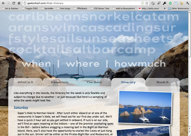
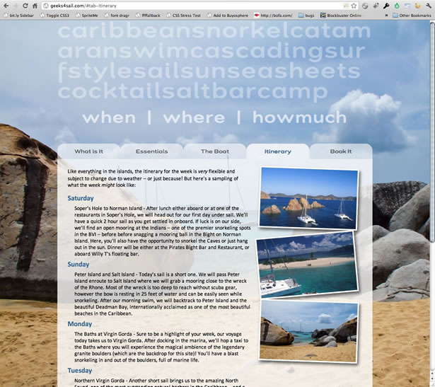
A recent site my husband built for our upcoming sailing charter is a perfect example of the cover value at work. Having recently returned from the Virgin Islands, he wanted to use an image of The Baths at Virgin Gorda as the background of the site. But since it's an outdoor picture, clipping isn't a problem.

The code he used to make sure this photo covers the entire background of the site is:
body {
background-image:url(../images/baths.jpg);
background-size: cover;
background-attachment: fixed;
}
Notice the additional property of background-attachment? The fixed value means that the image is fixed to the viewport of the browser. So as you scroll through the site, the photo doesn't move. Snazzy!

No matter how you view it, the image covers the entire body.

Though the viewport the user may be experiencing your site on varies, it's never unattractive.
07. When it's best to contain the image
The cover value is great for images you don't mind getting clipped. But that's not always the case. In another personal project, this time for my husband's demo materials and using more of our vacation photos (hey, they're free), we didn't want to lose the beautiful traditional blue roof from the Greek island of Santorini.

Using cover, in some resolutions, the roof would go off the right side and never be seen. That was unacceptable. Using contain means the entire picture will always be there in its entirety, but what do you do with a long page and the image just ends? See that beautiful even blue sky in the image above? Familiar with Photoshop? You got it, the most beautiful photo may need a little perfecting to have a seamless experience. Greg took the colour of the sky and made it an even blue all the way across. By positioning the Santorini image at the bottom of the page, he was able to use a blue background colour (the same one the photo ends on) as the background of the entire page. That means the page could get long and the sky could go on forever.

If you're paying close attention, you probably noticed the sky isn't an even blue all the way to the top. Fact is, that would look rather unnatural. Since we can now use multiple background images on elements, Greg used a gradient at the top of the page — going from a matching blue to a transparent white at the very top. (In the code below, for reasons of space, I am only showing the -moz prefix. Remember you'll need to include -webkit, -ms, -o and end with the regular CSS3 properties.)
body {
background-color: rgb(96,147,201);
background-image: url(../images/santorini.jpg), -moz-linear-gradient(top, rgba(255, 255, 255, .8), rgb(96,147,201) 250px);
background-repeat: no-repeat, repeat-x;
background-position: center bottom, left top;
-moz-background-size: contain, 250px;
background-size: contain, 250px;
}
If you're unfamiliar with multiple backgrounds, I'll quickly interpret the above. He's first added the background-color, which will cover the entire background area (yes, it could be written in hex just as easily). Next he's included the two background images — separated by a comma. You can add as many as you like. Just remember that the first one listed is on top and they descend visually from there. Since a CSS gradient is considered a background-image, it's the second image included in the list. When using each prefixed version of the gradient, you'll need to list the entire background-image property (list of images/gradients) all over again for each prefix.
The background-repeat, background-position and background-size properties also have two values separated by a comma. The browser will match the first image with the first value in each of those properties and then move on and do the same to the second value. If you don't have an evenly matched list of values for one of the properties, the browser will start again at the first one listed. You probably noticed the photograph was set to the bottom of the body with the contain value and the gradient was given a 250px value. So that adds pixels to our per cent/cover/contain value spectrum.

08. A tool and a tip
If cover and contain are still a little foggy and you'd like to have a play, you can use this nifty tool Greg built. He placed a dashed border around the body element so you can envision what's actually happening. The initial value is auto, which shows you the photo at it's actual size. Click cover and contain and increase/decrease your browser size. It should all become crystal clear.
And a quick tip! If there's a chance you may have pages with little content. Meaning, they may not fill the height of your user's browser — like a "thank you for filling out our form", etc — be sure to add 100 per cent height to your HTML element. This will ensure that the photo goes all the way to the bottom of the page.
html {
height: 100%;
}
Hope you enjoyed it. I'd love to hear some uses you've found for background-size! Twitter them at me at @stefsull. Happy coding!
Stephanie (Sullivan) Rewis is a front-end developer who creates impeccable HTML5/CSS3 web pages for agencies and start-ups. She enjoys teaching others to do the same through training, speaking and writing. She can captain a chartered catamaran — legally — and still loves 80's new wave.

The Creative Bloq team is made up of a group of art and design enthusiasts, and has changed and evolved since Creative Bloq began back in 2012. The current website team consists of eight full-time members of staff: Editor Georgia Coggan, Deputy Editor Rosie Hilder, Ecommerce Editor Beren Neale, Senior News Editor Daniel Piper, Editor, Digital Art and 3D Ian Dean, Tech Reviews Editor Erlingur Einarsson, Ecommerce Writer Beth Nicholls and Staff Writer Natalie Fear, as well as a roster of freelancers from around the world. The ImagineFX magazine team also pitch in, ensuring that content from leading digital art publication ImagineFX is represented on Creative Bloq.
