Royal subjects! Add Union Jack bunting to your site
Cast out cynical thoughts, and join the royal wedding celebrations by adding festive flair to your pages
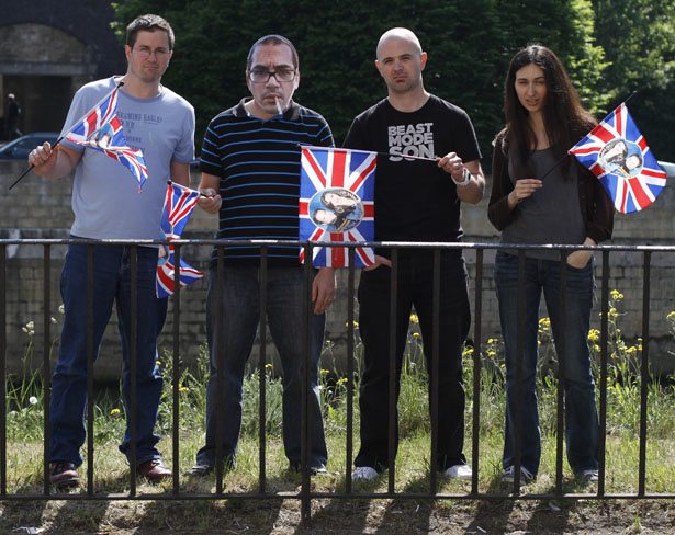
Editor-in-chief Dan Oliver writes: "Lords, Ladies, esteemed members of the Commonwealth, and assorted others (that's probably you), we are delighted to present a most excellent gift from the team at .net magazine.
"The 29th of April sees our very own Prince William getting hitched to the poster-girl of the working classes, Kate Middleton. To mark this special day, which pundits believe will be the biggest celebration since everyone in the UK discovered the 29th April was a national holiday, we have teamed up with CSS3 and animation ninja Anthony Calzadilla. Together we bring you what we believe is the best (only) animated, CSS3, Union Jack bunting you will find anywhere on the internet. (And we know it's technically supposed to be called the 'Union Flag', but that sounds rubbish!)
"So, add some bunting to your site, and join with us in celebrating this day of pomp and ceremony, as we wish Kate and Wills a marriage free of stress, press intrusion and sting operations. Let the bunting slowly sway, as Anthony Calzadilla explains all..."

The HTML
We start with the phrase “Celebrating the Royal Wedding” because we want this banner to have some semantic value. Then we wrap the phrase in an h1 tag because hey, it's royalty we’re talking about!
In order to make this snippet of code portable we’ve wrapped it in a div element with an ID of “union-jack-bunting”. We want to display 11 flags (there is no significance to the number 11, it was just the amount of flags that looked best in my opinion).
Now we have to mess up our clean HTML. We wrap the first 11 characters in our “Celebrating the Royal Wedding” phrase with span tags. We’ll use these span tags to display our 11 flag images. We then wrap the remaining elements in our “Celebrating the Royal Wedding” phrase in one span tag. We’ll set these final span tags to display none, so only the first 11 span tags with the flag image elements will be visible.
PLEASE NOTE: You can use whatever phrase you like as long as you wrap the first 11 characters in span tags and the remaining characters in one span tag.
Get the Creative Bloq Newsletter
Daily design news, reviews, how-tos and more, as picked by the editors.
<div id="union-jack-bunting"> <h1> <span>C</span> <span>e</span> <span>l</span> <span>e</span> <span>b</span> <span>r</span> <span>a</span> <span>t</span> <span>i</span> <span>n</span> <span>g</span> <span>The Royal Wedding</span> </h1> </div>The CSS
We begin by adding a PNG image of the string that holds the flags to the div with the id of "union-jack-bunting". Now we want to hide the “Celebrating the Royal Wedding” message from human eyeballs, so we set the text indent to -9999px and the h1 tag to ‘position:absolute’ to remove the h1 tag from the ‘flow’ of the document. Now we won’t have to deal with any cross-browser positioning issues when we place our flags.
Next we set the spans to ‘display:block’, we add the flag image to the background of all our span tags within the royal wedding message, and we set the transform origin of the flags to the top/centre of each span. This will allow our flags to skew slightly from that middle point, making the effect pretty believable.
Using the ‘:nth-child’ property allows to target the first 11 spans individually and place each one exactly where we want it on the screen without adding class names to each span (which would have made our code REALLY ugly).
Using the same ‘:nth-child’ property we can tell the last span to ‘display:none’ and we’re done! We have a nice Union Jack bunting at the top of the website.
Now let's add some animation. Again we use the ‘:nth-child(even)’ property to apply the animation to all the even span tags. Then we create a slightly different animation and we use ‘:nth-child(odd)’ property to apply the animation to all the odd span elements. This gives a soft variation between each flag, which makes the movement seem more natural.
The animation can be seen by any WebKit users and any users that have the Firefox 5 Beta, which supports CSS3 animation (WOO!)
#union-jack-bunting { background: url("img/string.png") no-repeat scroll left top transparent; height: 12px; margin: 0; padding: 0; top: -3px; width: 995px; position:relative}#union-jack-bunting h1 { position: absolute; text-indent: -9999px;}#union-jack-bunting h1 span { background: url("img/union-jack.png") no-repeat scroll left top transparent; display: block; height: 30px; left: 0; margin: 0; padding: 0; position: absolute; width: 30px; -moz-transform-origin :50% 0; -webkit-transform-origin :50% 0;}#union-jack-bunting h1 span:nth-child(1) { -moz-transform: rotate(5deg); -webkit-transform: rotate(5deg); top: 3px; left: 0; } #union-jack-bunting h1 span:nth-child(2) { -moz-transform: rotate(2deg); -webkit-transform: rotate(2deg); left: 80px; top: 6px; } #union-jack-bunting h1 span:nth-child(3) { -moz-transform: rotate(2deg); -webkit-transform: rotate(2deg); left: 160px; top: 8px } #union-jack-bunting h1 span:nth-child(4) { -moz-transform: rotate(-2deg); -webkit-transform: rotate(-2deg); left: 240px; top: 9px; } #union-jack-bunting h1 span:nth-child(5) { -moz-transform: rotate(-2deg); -webkit-transform: rotate(-2deg); left: 320px; top: 8px; } #union-jack-bunting h1 span:nth-child(6) { -moz-transform: rotate(-3deg); -webkit-transform: rotate(-3deg); left: 400px; top: 6px; } #union-jack-bunting h1 span:nth-child(7) { -moz-transform: rotate(0deg); -webkit-transform: rotate(0deg); top: 3px;left:480px; } #union-jack-bunting h1 span:nth-child(8) { -moz-transform: rotate(0deg); -webkit-transform: rotate(0deg); left: 560px; top: 6px; } #union-jack-bunting h1 span:nth-child(9) { -moz-transform: rotate(1deg); -webkit-transform: rotate(1deg); left: 640px; top: 8px; } #union-jack-bunting h1 span:nth-child(10) { -moz-transform: rotate(-1deg); -webkit-transform: rotate(-1deg); left: 720px; top: 9px; } #union-jack-bunting h1 span:nth-child(11) { -moz-transform: rotate(-2deg); -webkit-transform: rotate(-2deg); left: 800px; top: 8px; }#union-jack-bunting h1 span:nth-child(12),#union-jack-bunting h1 span:nth-child(13),#union-jack-bunting h1 span:nth-child(14),#union-jack-bunting h1 span:nth-child(15),#union-jack-bunting h1 span:nth-child(16),#union-jack-bunting h1 span:nth-child(17),#union-jack-bunting h1 span:nth-child(18),#union-jack-bunting h1 span:nth-child(19),#union-jack-bunting h1 span:nth-child(20) { display:none; }/**/#union-jack-bunting h1 span:nth-child(odd) {-webkit-animation : breeze-01 7s infinite; -webkit-animation-fill-mode : both; -moz-animation : breeze-01 7s infinite; -moz-animation-fill-mode : both; }#union-jack-bunting h1 span:nth-child(even) {-webkit-animation : breeze-02 7s infinite; -webkit-animation-fill-mode : both; -moz-animation : breeze-02 7s infinite; -moz-animation-fill-mode : both; }@-webkit-keyframes breeze-01 { 0% {-webkit-transform : skew(0deg,0deg);-webkit-animation-timing-function : ease-out; } 30% {-webkit-transform : skew(10deg,0deg);-webkit-animation-timing-function : ease-in; } 60% {-webkit-transform : skew(-5deg,0deg);-webkit-animation-timing-function : ease-out; } 100% {-webkit-transform : skew(0deg,0deg);-webkit-animation-timing-function : ease-in; } }@-webkit-keyframes breeze-02 { 0% {-webkit-transform : skew(0deg,0deg); } 10% {-webkit-transform : skew(0deg,0deg);-webkit-animation-timing-function : ease-out; } 40% {-webkit-transform : skew(15deg,0deg);-webkit-animation-timing-function : ease-in; } 70% {-webkit-transform : skew(-4deg,0deg);-webkit-animation-timing-function : ease-out; } 100% {-webkit-transform : skew(0deg,0deg);-webkit-animation-timing-function : ease-in; } }@-moz-keyframes breeze-01 { 0% {-moz-transform : skew(0deg,0deg);-moz-animation-timing-function : ease-out; } 30% {-moz-transform : skew(10deg,0deg);-moz-animation-timing-function : ease-in; } 60% {-moz-transform : skew(-5deg,0deg);-moz-animation-timing-function : ease-out; } 100% {-moz-transform : skew(0deg,0deg);-moz-animation-timing-function : ease-in; } }@-moz-keyframes breeze-02 { 0% {-moz-transform : skew(0deg,0deg); } 10% {-moz-transform : skew(0deg,0deg);-moz-animation-timing-function : ease-out; } 40% {-moz-transform : skew(15deg,0deg);-moz-animation-timing-function : ease-in; } 70% {-moz-transform : skew(-4deg,0deg);-moz-animation-timing-function : ease-out; } 100% {-moz-transform : skew(0deg,0deg);-moz-animation-timing-function : ease-in; } }
Thank you for reading 5 articles this month* Join now for unlimited access
Enjoy your first month for just £1 / $1 / €1
*Read 5 free articles per month without a subscription

Join now for unlimited access
Try first month for just £1 / $1 / €1

The Creative Bloq team is made up of a group of art and design enthusiasts, and has changed and evolved since Creative Bloq began back in 2012. The current website team consists of eight full-time members of staff: Editor Georgia Coggan, Deputy Editor Rosie Hilder, Ecommerce Editor Beren Neale, Senior News Editor Daniel Piper, Editor, Digital Art and 3D Ian Dean, Tech Reviews Editor Erlingur Einarsson, Ecommerce Writer Beth Nicholls and Staff Writer Natalie Fear, as well as a roster of freelancers from around the world. The ImagineFX magazine team also pitch in, ensuring that content from leading digital art publication ImagineFX is represented on Creative Bloq.
