Master CSS pixels for Retina displays
As screens get smaller and more detailed, web pages will have to change to cope. Sean B Palmer examines the past, and the future, of CSS resolution independence.
- Knowledge needed: Basic HTML5 and CSS
- Requires: Text editor, image processor, HD smartphone or tablet
- Project Time: 1 hour
Above is a screenshot of an entire Windows 98 desktop, circa 1999, on a contemporary 24in iMac running OS X Lion; it looks like a postage stamp. Changes in screen resolution effect changes in web design. Designers can now deploy a barrage of techniques unheard of in the 90s. We use well-hinted TFT-compatible fonts and vertical rhythms for typography, and craft grid layouts against duodecimal metrics for clean organisation. Well-balancedback grounds and stunning logos spring from our 24-bit colour-wheel based palettes and increasingly complex gradient techniques.
Resolutions are increasing as screen sizes, in many places, shrink. Ultra-high pixel density displays, smartphones and tablets provide a new environment in which to foster fresh techniques. But the principles pixel density techniques are based on are older than many contemporary web developers may realise.
Go back 16 years – a bunch of great designers sat down to hatch a revolutionary plan. CSS was a new technology in 1996, not the tried and trusted standard for styling web pages that it is today. The plan of the CSS authors was to separate style instructions from dependence on devices. As well as enabling CSS to style webpages on a screen, for example, they wanted to be able to style printed webpages too. To that bold end, they inserted the following clause into their definition of a pixel:
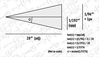
“If the pixel density of the output device is very different from that of a typical computer display, the UA should rescale pixel values. The suggested reference pixel is the visual angle of one pixel on a device with a pixel density of 90dpi and a distance from the reader of an arm’s length. For a nominal arm’s length of 28 inches, the visual angle is about 0.0227 degrees.”
This means that a ‘px’ in CSS has never meant a device pixel. Nor is it a unit of length. The CSS px is defined as an angular measurement.
This surprises some developers, who naturally assume that a CSS pixel is just a device pixel. In practice this can be true, but the details are more complex.

01. The nitty gritty
The original plan for CSS was to support printers as well as monitors, but it soon became clear that monitors would also change in their capabilities. If CSS pixels were merely device pixels, everything would be displayed smaller and smaller over time as screen resolutions increased. The angular measurement design fitted well not just with printing, but with the idea of resolution independence. This explains why subsequent versions of CSS, including the contemporary CSS3 in development by vendors, defined the px as an angular measurement. (The only change has been to increase the reference pixel density from 90dpi to 96dpi, making the CSS reference pixel a slightly acuter angle, 0.0213 degrees.)
As px are non-linear angles, anything with an angular measurement less than 180 degrees can be measured in CSS px. Jeremy Clarkson is 6ft 5in tall. From a safe distance of 100 yards, he appears to be 57.5px in height. The earth’s moon is 24.3px wide when full – roughly half a Clarkson. Because the unit is non-linear, things don’t always scale as you might expect them to. 1000px is 21.075 degrees, for example, but 2000px is 40.813 degrees, slightly less than double.
The conversions are performed using the magic figure 5376 and some simple trigonometry. The magic figure comes from multiplying the following values:
- The reference pixel density, 96ppi. Dots per inch can and often are also called ppi, pixels per inch, for screen resolution purposes.
- The distance between the user and the display, 28in. This distance was once called a Flemish ell, inne þe oldyn steill mysurementes. An ell is the distance that a person can reach.
- The dimensionless quantity, or unitless number, 2. We throw this in for good measure: the trigonometry involved uses a doubled angle and we have to halve the pixel distance before doubling the angle.
Since the units, where used, are in old imperial inches, they cancel out in the formulæ, whose angles are measured in radians rather than degrees:
angle = arctan(px / 5376) × 2
px = 5376 × tan(angle / 2)
02. Packing in the pixels
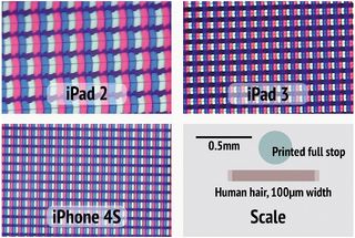
CSS 2.1 made 96ppi the new reference resolution. Displays did not, however, stay at 96ppi. The iMac screenshot at the beginning of this article was taken on a display that uses around 109ppi. If the reference pixel was being adhered to on this device, then 1.1354 (109ppi / 96ppi) device pixels would be needed in order to display the reference pixel at the same apparent angular dimensions as 1px on a 96ppi device. Since this is not physically possible, because the pixel is the smallest indivisible unit of display, it would have to be anti-aliased. For most applications, this would result in a blurry and unappealing rendering.
Because of this, CSS 2.1 – which only became a W3C recommendation in June 2011, but was in draft for many years beforehand – introduced some text that made it clear the reference pixel was intended to be used only as an anchor on which to base the actual value. It recommends that the px unit refer to “the whole number of device pixels that best approximates the reference pixel”. In other words, when a device to be used at a distance from the user of 28in exceeds 144ppi (96ppi × 1.5), then it should scale a CSS px to mean two device pixels. When it exceeds 240ppi (96ppi × 2.5), then it should scale a CSS px to mean three device pixels; and so on, et sequentia.
In practice this had been moot anyway, since no displays of adequate resolution existed to make the lack of pixel scaling a problem for vendors. This meant that, outside of vector graphics at least, the reference pixel was taken as being isomorphic with a device pixel.
The common (mis)conception of a CSS px as a device pixel was challenged in June 2010, when the iPhone 4 was released with a 326ppi screen. Apple’s marketing spiel branded it as ‘resolutionary’. Obviously an iPhone is rarely used at the CSS standard 28in away from the user, and closer usage means that pixels appear larger and the perceived pixel density goes down. CSS 2.1 recommended an upscale threshold of 144ppi at 28in. For the iPhone 4’s 326ppi, this same apparent perceived pixel density is reached at 12.368in (28in × 144ppi / 326ppi) distance and beyond – very close to distance in actual usage. So the upscale threshold was reached.
Despite Apple claiming, moreover, to reach the highest perceivable level of pixel density with its iPhone 4 screen at 326ppi, manufacturers are still continuing to increase their densities. The HTC Rezound (Nov 2011) for example has a 342ppi display, and even RIM has developed a Blackberry with a 356ppi screen. On mobile devices where power is at a premium, it’s surprising RIM didn’t drop those extra 30ppi to extend battery life. Previously it was the camera manufacturers that had a resolution war: perhaps mobile manufacturers are now finding resolution to be a new saleable form factor.
Whatever the reason, pixel densities and resolutions continue to increase. With the CSS 2.1 upscale threshold reached, upscaling had to happen. How vendors did this varied. Apple decided to upscale images on the web for the third generation iPad, for example, at a simple 2x ratio. A single pixel image (1×1) would display on that device using four (2×2) physical device pixels. Others, such as those using Android, upscale using different ratios, often around 1.5x or 1.6x. Users can also scale pages on some devices by zooming in to custom levels. On any of these devices, because of these factors, pictures can appear blurry.
Get the Creative Bloq Newsletter
Daily design news, reviews, how-tos and more, as picked by the editors.
03. Designing with style
One solution is to use CSS. Here we would like to return full circle to the idea inherent in the original design of the CSS px as a resolution-independent unit. But because the angular measurement characteristic of CSS px is now tempered by the upscale anchor, the capability to handle resolution had to be shoehorned in elsewhere. The most reasonable place to deal with it was as a new media query. A media query is a condition that allows certain stylesheet rules to be used only if the condition is met by the rendering user agent.
Since browser vendors these days have a steadfast habit of innovating in entirely different directions to one another, to put it politely, there are at least four different @media solutions. Developers may need to use even more than that just to be safe. One is used by WebKit, another by Mozilla and a third by Opera. There does not yet appear to be a published solution for IE10. The other solution is the one given in the CSS3 specification, which is close to being a W3C recommendation. The CSS3 spec uses a different scheme from Mozilla – despite being edited by a Mozilla employee!
@media (-webkit-min-device-pixel-ratio: 1.5) { /* WebKit */ }
@media (min--moz-device-pixel-ratio: 1.5) { /* Mozilla */ }
@media (-o-min-device-pixel-ratio: 3/2) { /* Opera */ }
@media (min-resolution: 1.5dppx) { /* CSS3 */ }
The Mozilla variant is not -moz-min-device-pixel-ratio as might be expected. For maximum cross-browser compatibility, you’d have to use something like this:
header {
background: url(image@1x.png);
}
@media only screen and (-webkit-min-device-pixel-ratio: 2),
only screen and (-moz-min-device-pixel-ratio: 2),
only screen and (-o-min-device-pixel-ratio: 2/1),
only screen and (min-device-pixel-ratio: 2),
only screen and (min-resolution: 2dppx) {
header {
background: url(image@2x.png);
background-size: 50%;
}
}
This example would set the background image of a header element to use one device pixel on 1dppx and 2dppx screens, but would still cause potentially blurry resample-based upscaling on devices using a pixel density between those values. We have to use min-device-pixel-ratio too in case CSS3 settles on that instead of, or as well as, the present min-resolution. When a browser has more pixels available to it than could usually be rendered with a four dots per pixel-area, then it simply uses one dot per pixel-area, or it resamples the image. This solution only targets modern browsers that support these features, but we expect to find modern browsers on modern high density pixel devices anyway.
Rescaling has been done by setting the size of the image to 50%. For standard images, you can also set height and width attributes appropriately to scale the content. The HTML5 specification warns against this technique, saying “dimension attributes are not intended to be used to stretch the image”, but the practice is common. In CSS3, you could still use yet another technique instead.
04. Setting the resolution
In conjunction with the @media technique, CSS3 introduces a new property called image-resolution, which can change the resolution of specific images. It can be thought of as a kind of custom scaling of the image. Unfortunately for developers who now have to target devices at and between 1–2dppx, the image-resolution property is not simply adaptive: it does nothing in proportion to device pixel upscaling. This means this technique still has to be used inside media queries. Since image-resolution applies properly to background images as well as primary content, this is how the header rule part specifically from the media query example above could be written using the new property:
header {
background: url(image@2x.png);
image-resolution: 2dppx;
}
We could also have used 192dpi instead of 2dppx: they’re at a fixed ratio because of CSS’s 96dpi reference pixel density stipulation. But as one of the main advantages of this syntax is to make it clear what is being aimed at by developers, the use of 2dppx is a more reasonable best practice in this case.
Since image-resolution is only a projected feature of CSS3, it’s unlikely to have wide browser support in the short term, and vendors may choose to implement myriad alternative syntaxes anyway as they did with the min-resolution property.
Using CSS is not the only way to accommodate new pixel densities. There are myriad client- and server-side solutions, shims and polyfills to achieve the same goal. Some use JavaScript and inspect window.devicePixelRatio to perform their wizardry. But this problem was foreseen in CSS to some extent back in 1996. Specification and implementation-based innovation has heated up in light of challenges posed by more recent display technologies, but CSS remains a viable if not optimally elegant solution for resolution independence.
This article first appeared in issue 230 of .net magazine.
Sean B. Palmer inamidst.com is an early modern historian, with a computer science background. He’s been editor of the W3C’s EARL 1.0 and XML Accessibility Guidelines specifications, and has contributed to books on HTML, JavaScript and the semantic web.
Liked this? Read these!
- Free graphic design software available to you right now!
- Brilliant Wordpress tutorial selection
- Create a perfect mood board with these pro tips

Thank you for reading 5 articles this month* Join now for unlimited access
Enjoy your first month for just £1 / $1 / €1
*Read 5 free articles per month without a subscription

Join now for unlimited access
Try first month for just £1 / $1 / €1
The Creative Bloq team is made up of a group of design fans, and has changed and evolved since Creative Bloq began back in 2012. The current website team consists of eight full-time members of staff: Editor Georgia Coggan, Deputy Editor Rosie Hilder, Ecommerce Editor Beren Neale, Senior News Editor Daniel Piper, Editor, Digital Art and 3D Ian Dean, Tech Reviews Editor Erlingur Einarsson and Ecommerce Writer Beth Nicholls and Staff Writer Natalie Fear, as well as a roster of freelancers from around the world. The 3D World and ImagineFX magazine teams also pitch in, ensuring that content from 3D World and ImagineFX is represented on Creative Bloq.

