7 tips to manage colour better on the web
Control your colours and create a consistent site design.
Amongst the multitude of problems frontend developers encounter during site creation, managing colours is definitely towards the very end of the list. Nevertheless, if you want a clean and consistent website layout, good colour management is important.
Not only will this prevent your site from looking like a rainbow, but it also means you won't end up with multiple shades of the same colour appearing (which has happened to me quite a few times). This article will go through some top tips and tools I use regularly to manage colours on my web-based projects.
01. Put all your colours in a style guide
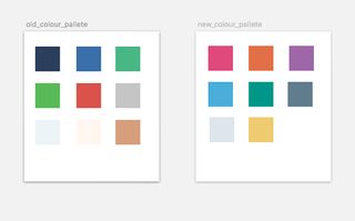
First things first, before you create a site you should have a basic design style guide or colour palette that contains all the colours you plan to use. This doesn't mean you can't add colours to the site as you develop it, but it will help you keep track of colours you already have so they are not repeated with slightly different shades.
Excluding black, grey and white, it's best to have no more than five different colours on your website. Of course, this is a general rule and there can be some exceptions. Need some more guidance? Take a look at our article on how to choose the perfect colour palette for your website.
02. Use one file just for colours
One of the benefits of using CSS preprocessors such as Sass is the ability to separate styles into many different files and combine them to output CSS to one file. With that in mind I believe it's best to use one file for the main colours of your site, as well as any variations of them. This not only makes it easier to locate colour variables, but can also be a regular reminder of what and how many colours are being used.
03. Name up your colour variables
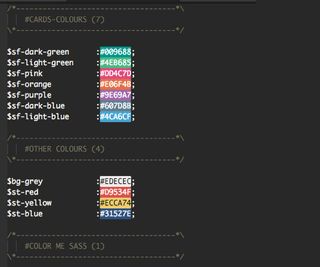
It's best to give the main colours of your site variable names that correspond to the colours they actually are or what they look like, (also with custom namespacing, if you're that way inclined).
So the yellow for a McDonald's site will have the variable name $mc-yellow. HTML colour names like AliceBlue and DeepPink (and the other 140 colours) don't require custom variable names, as they are already easy to remember. If you are using a library for colours that already contains variable names (such as Colour me Sass), you could make your custom variable equal the library variable, so $mc-yellow = $yellowGold.
04. Use Sass maps for colours
This tip is optional, as it is dependant on the way you write CSS. Sass maps make it easier to assign class names to different colours and their relevant CSS property – very similar to looping in most programming languages.
For example, if you would like a background colour class for all of the colours that are used on your site, this is the best and cleanest way to do it:
$theme-colors: (
  coral: $color-coral,
  orange: $color-orange,
  yellow: $color-yellow,
  green: $color-green,
  teal: $color-teal,
  blue: $color-blue,
  purple: $color-purple,
  gray: $color-gray,
  black: $color-black
);

@each $theme-color, $color in $theme-colors {
  .bg-#{$theme-color} {
    background-color: $color;
  }
  .#{$theme-color} {
    color: $color;
  }
}
This method is especially helpful for those who write Atomic CSS.
05. Use Sass for opacity, lightness and darkness
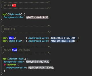
For slight variations in the lightness, darkness or opacity of your main website colours, instead of specifying another string of HEX values it's best to use the functions that come built into Sass, along with your custom colour variable. For opacity use rgba, for lightness and darkness use their respective functions.
I am fully aware that Sass also contains functions to mix colours as well as adjust hue and saturation, you are more than welcome to use these but I am yet to find a reason for them on my projects. Of course I recommend you give your colour variations custom variables to make it easy to remember them.
$cool_purple:  mix($red, $blue, 50%);

body{
  background-color: $cool_purple;
}

body{
  background-color: desaturate($amberDull, 14%);
}

body{
  background-color: saturate($greenSea, 39%);
}
06. Use the custom palettes in developer tools
The Chrome DevTools come with a great Eyedropper tool for picking colours. However, for experimenting with colours on background, borders, text and so on, I've found it incredibly useful to place the main site colours from my theme into a DevTools custom colour palette, which enables you to update your colours at the click of a button.
07. Try Pigments for Atom
Last but not least is this fantastic package for Atom. Pigments simply highlights a colour string, hex or otherwise, with the actual colour it's representing. This sounds very basic, but Pigments becomes really useful when it's used with Sass.
The plugin also highlights Sass colour variables with its respective colour wherever it is placed in the code, even in different files. It also changes colours instantly based on the opacity, or whatever Sass function that is applied to it.
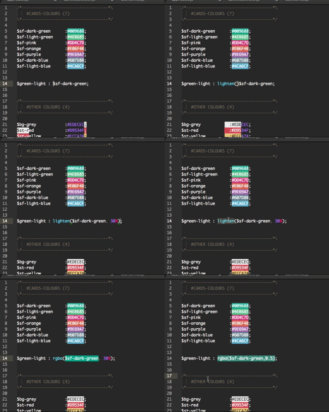
I can't begin to describe how helpful it is to have instant visual feedback of colour changes being made in the code. If you ignore all my other colour tips and just do this one I will consider this article a success.
Related articles:

Thank you for reading 5 articles this month* Join now for unlimited access
Enjoy your first month for just £1 / $1 / €1
*Read 5 free articles per month without a subscription

Join now for unlimited access
Try first month for just £1 / $1 / €1
Get the Creative Bloq Newsletter
Daily design news, reviews, how-tos and more, as picked by the editors.
Richard Bray is a 20-something designer of web products, event organiser, speaker, open source contributor. Currently making private aviation more accessible @Stratajet. Contact him with CSS related questions, to speak at your event, or just to say 'hi'.


