Improve your CSS with the Sass @extend directive
The Sass extend directive can improve your workflow. Nick Walsh explains how to implement the CSS preprocessor component without bloat.
Watching a CSS veteran discover Sass for the first time is always entertaining. Concepts like nesting, variables and mixins seem so natural and, once the syntax is committed to memory, it's difficult to remember a time before their availability. Relief is the most common emotion: a recognition that the days of manually prefixing and copying hexadecimal values have passed.
Of the core concepts found in the preprocessor @extend stands out for three reasons: it has the highest potential to drastically change your workflow; misuse is dangerous to the health of your stylesheet; and newcomers struggle with it far more than other Sass functionality. Follow the accompanying patterns to start safely utilising @extend.
- Download the source code for this tutorial
Adding extend
When two selectors share styles in standard CSS, the relationship is represented in a list separated by commas:
.sidebar,
.notice {
  margin: 20px; }
}
Sass combines selectors with the @extend directive:
.sidebar {
  margin: 20px;
}
.notice {
  @extend .sidebar; }
}
It may appear inefficient on a small scale, but the magic lies in the ability to create these relationships from anywhere within your stylesheet. Any number (or type) of selector could extend the styles found in .sidebar. This creates a single place to update properties without forcing you to manually combine the selectors. Let's take a look at a more common pattern. This very simple example shows how to create a common button class and add additional classes to modify the base properties:
.btn {
  font-weight: bold;
}
.btn-error {
  background: red;
}
.btn-next {
  background: green;
}
Rather than including classes of .btn and .btn-error in our HTML, whenever a red button is required, extend the main button styles into the error state:
.btn-error {
  @extend .btn;
  background: red;
}
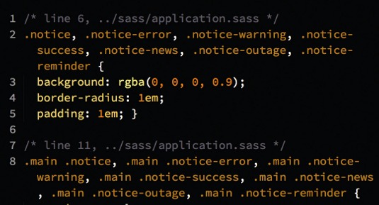
Now, when our Sass compiles, the .btn selector becomes .btn, .btn-error. The list is automatically maintained, and simply adding .btn-error to an element applies all necessary styling.
Get the Creative Bloq Newsletter
Daily design news, reviews, how-tos and more, as picked by the editors.

Extend pitfalls
Like nesting, the @extend directive can cause issues if used irresponsibly or without understanding the resulting connections.
Continuing with the buttons example, let us pretend we have extended .btn inside .btn-next like we did with .btn-error. Eventually, we will need to tweak the base button when it appears inside a form:
form .btn {
  border-radius: 5px;
}
Normally, this is a valid style tweak. However, other selectors extending .btn are brought into the equation whenever .btn appears:
form .btn, form .btn-error, form .btn-next {
  border-radius: 5px;
}
In some cases, you'll want everything that extends .btn to be included here, which isn't a big deal on a small scale. However, if a dozen classes extended the base button, and we didn't need the resulting scoped chain, we're faced with bloat. In medium to large applications, extends gone awry can easily tack an additional 30% or more to your file size. This can become a serious issue when combined with poor nesting.

Placeholder selectors
Placeholder selectors were introduced in Sass 3.2 and offer an extend hook that won't compile to a selector on its own. Employ a placeholder selector to tackle groups of unnecessary @extend selectors:
%sidebar {
  margin: 20px;
}
.notice {
  @extend %sidebar;
}
A % symbol denotes a placeholder selector and only alters compiled styles when something extends it. Looking back at our button example, try removing the original extends and use a placeholder selector instead:
.btn,
%btn {
  font-weight: bold;
}
.btn-error {
  @extend %btn;
  background: red;
}
.btn-next {
  @extend %btn;
  background: green;
}
With the addition of the placeholder selector our two modifier classes extend the placeholder instead of the .btn selector. This allows reuse (and scoping) of .btn attributes without bloat. If we didn't need to use a .btn selector on its own, the placeholder alone could be used here.
form .btn {
  border-radius: 5px;
}
Now, the nested change to .btn compiles down simply to form .btn - and we've removed the potential bloat threat.
Always check compiled stylesheets for long selector chains and extends that have gone amiss. That being said, try experimenting with @extend, nesting and placeholder selectors. It will take some trial and error to completely grasp, but allows for some truly remarkable structuring.
Words: Nick Walsh
This article originally appeared in net magazine issue 239

Thank you for reading 5 articles this month* Join now for unlimited access
Enjoy your first month for just £1 / $1 / €1
*Read 5 free articles per month without a subscription

Join now for unlimited access
Try first month for just £1 / $1 / €1

The Creative Bloq team is made up of a group of art and design enthusiasts, and has changed and evolved since Creative Bloq began back in 2012. The current website team consists of eight full-time members of staff: Editor Georgia Coggan, Deputy Editor Rosie Hilder, Ecommerce Editor Beren Neale, Senior News Editor Daniel Piper, Editor, Digital Art and 3D Ian Dean, Tech Reviews Editor Erlingur Einarsson, Ecommerce Writer Beth Nicholls and Staff Writer Natalie Fear, as well as a roster of freelancers from around the world. The ImagineFX magazine team also pitch in, ensuring that content from leading digital art publication ImagineFX is represented on Creative Bloq.
