How SAS built the BT Report
BT wanted a corporate reporting suite. Andy Goode, Tom Digby, Michael Dowell and Adam Holloway of SAS took on the task of creating an engaging corporate site.
Let's start with an easy one. Why don't you introduce SAS?
Adam Holloway: We are a communications agency that's had the pleasure of helping our clients to make sense of digital communications for over 16 years. New technologies now give us the opportunity to engage and connect with people, through multiple channels and voices, in a way that has not been possible before. Our integrated approach allows us to think beyond the website and understand how ideas and messages fit with other channels so we can create experiences that are both memorable and believable. In the end, it's about human beings rather than 'users'.
For the BT project, what was the thinking and brief behind the site?
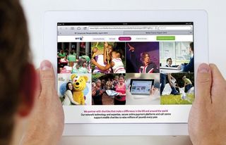
Michael Dowell: This is our second year working on BT's corporate reporting suite. Last year our focus was on improving the reports from a best practice perspective and revamping the visual toolkit to better reflect and represent their brand. Using this as a solid foundation, this year we focused our time and attention on making the reports work harder online. While the printed report is still an important part of the suite, the online space offers us a much more flexible and engaging platform to use to bring the report to life. Users need to be able to access essential information quickly and easily, so our solution in this case was to design two standalone one-pagers, focusing on an engaging summary of the top-level strategy and financial results for the Annual Report and the most compelling stories in for the Better Future Report.

From a technical perspective, what are the site's defining features?
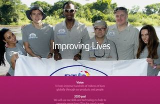
Tom Digby: We wanted to provide an exciting and unexpected experience. On entry, you're presented with an engaging looping video using a HTML5 video tag and a simple animated title using jQuery. Both degrade gracefully on tablets and mobiles. When you interact with the content you notice the subtle use of parallax. We also used activation points throughout the page to trigger animated content. This was perfect for telling the story of the three pillars of the Better Future strategy.
From where did you draw your inspiration?
Andy Goode: There are so many good one-page websites around, which work so effectively when telling a story. We wanted to tell a compelling story for our client and felt this one-page format suited BT's brand and goals. However, a lot of the inspiration we found tended to be quite complex and one thing we didn't want to do was create an experience that detracted from the core messages. We focused on clarity of content and elegant functionality. The combination of this alongside full-width immersive photography reflected the brand.

Which web technologies are used most?
TD: The website's interactivity was created with a mixture of HTML5, CSS3 and jQuery. To help visually define each section we used full-screen images with a parallax effect applied using CSS3.
The intro video was more complex, requiring jQuery to animate the intro text on page load. The staggered effect was created with a repeating function that delayed each part of the animation. The looping video in the background was implemented with a HTML5 video tag with a fallback to a static image for older browsers. BT's custom typeface was hosted locally and called through the @font-face rule.
What has feedback been like?
AH: So far, so good. We have been featured on several design blogs. It's a huge step forward for BT within this area of the business. Client feedback has been really positive.
If you could have another crack at the project, what would you change?
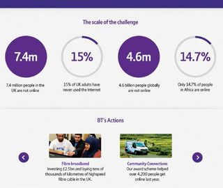
AG: On reflection a responsive layout could have been an improvement. We went a long way in simplifying what could have been rather complex infographics. These could have been enhanced further using animation and interactivity.

What's the biggest lesson you learned?
MD: Sometimes you forget just how much of a leap clients have to make between static designs and the finished article. A fully working prototype enabled us to bridge that gap and get the client really excited about the project.
This article originally appeared in net magazine issue 247.
Liked this? Read these!
- Discover the top 20 jQuery plugins
- Our favourite web fonts - and they don't cost a penny
- Brilliant Wordpress tutorial selection
Seen an exciting corporate site? Tell us in the comments!

Thank you for reading 5 articles this month* Join now for unlimited access
Enjoy your first month for just £1 / $1 / €1
*Read 5 free articles per month without a subscription

Join now for unlimited access
Try first month for just £1 / $1 / €1
Get the Creative Bloq Newsletter
Daily design news, reviews, how-tos and more, as picked by the editors.
The Creative Bloq team is made up of a group of design fans, and has changed and evolved since Creative Bloq began back in 2012. The current website team consists of eight full-time members of staff: Editor Georgia Coggan, Deputy Editor Rosie Hilder, Ecommerce Editor Beren Neale, Senior News Editor Daniel Piper, Editor, Digital Art and 3D Ian Dean, Tech Reviews Editor Erlingur Einarsson, Ecommerce Writer Beth Nicholls and Staff Writer Natalie Fear, as well as a roster of freelancers from around the world. The ImagineFX magazine team also pitch in, ensuring that content from leading digital art publication ImagineFX is represented on Creative Bloq.
