How to create a pyramid layout with CSS Shapes
Take advantage of the clip-path property and CSS Shapes to develop more creative layouts.
This is one of the greatest times for CSS. There is no longer any need for us to stick to rectangle-based websites; we now own the necessary tools to play with layout, and enjoy great levels of browser support at the same time. Not keen on CSS? Pick a website builder to better suit.
In this article, I will shed some light on the world of the clip-path property and CSS Shapes. To do this, I will show you how to create and animate a food pyramid. The demo is divided into two: there's a pyramid on the left and some lines of Potter Ipsum text on the right, which wrap around the pyramid's side using CSS Shapes.
The important thing to note is that our pyramid is divided into four parts: a triangle on top and three trapezoids below it. These sections are independent from one another, enabling us to freely animate each part of the pyramid.
The Markup
In order for this demo to work it is important to keep our HTML clean, since that will be the base for all our CSS.
<div class="wrapper">
   <div class="pyramid">
      <div class="zone">Triangle</div>
      <div class="zone">Trapezoid</div>
      <div class="zone">Trapezoid</div>
      <div class="zone">Trapezoid</div>
   </div><!-- Closes .pyramid -->
   <h1>Title</h1>
   <p>Paragraph 1</p>
   <p>Paragraph 2</p>
   <p>Paragraph 3</p>
   <p>Paragraph 4</p>
</div><!-- Closes .wrapper -->
The .wrapper element has a top margin of 5vh and an auto-value on the sides to keep all the elements centred. In this example, .pyramid floats to the left (this is a requirement for the shape-outside property we will be adding later).
Our four .zone elements will have a padding of 40px on the top and the bottom. The width, background images and animation delay will be different on each one. For this reason, we will be using the :nth-child() selector to apply these styles independently.
The food pyramid consists of one triangle on the top and three trapezoids below it. Each part is defined by a .zone element, and each will have a different width. The triangle on top (.zone:nth-child(1)) will have a width of 25 per cent, the trapezoid that sits below 50 per cent, 75 per cent for the third element and a full 100 per cent width for the base of the pyramid.
Now, we should have a square and three rectangles below it. It's time to apply clip-path.
The Clip-Path Property
The clip-path property is a wonderful tool for hiding parts of an element (images, paragraphs and even divs) instead of showing the whole block. Clip-path provides a few basic shapes, such as inset, circle, ellipse and polygon. However, we can also use SVG to create more complex shapes and fallbacks.
Thanks to clip-path, we can be more creative with our layouts and include non-rectangular shapes in our designs. The property was born from a now-deprecated clip property that used to require an absolute or fixed positioning.
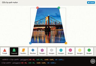
Although the clip-path property is not yet supported in every browser, we can reach an almost full support with an SVG fallback and the -webkit- prefix. The only major browser that currently does not provide support for it is Edge.
In order to create our pyramid, we need to apply clip-path to our four .zones. We will use a polygon shape and define the coordinates of each point with X and Y values in percentages, using :nth-child to select each element independently.
.zone:nth-child(1) {

clip-path: polygon(50% 0, 100% 100%, 0% 100%);
}
.zone:nth-child(2) {
   clip-path: polygon(25% 0, 75% 0, 100% 100%, 0 100%);
}
.zone:nth-child(3) {

   clip-path: polygon(16.5% 0, 83% 0, 100% 100%, 0 100%);
}
.zone:nth-child(4) {
   clip-path: polygon(12.5% 0, 87.5% 0, 100% 100%, 0 100%);
}
Getting coordinates in the right place through our code editor can seem impossible. If we wish to avoid trying to randomly guessing the coordinates, I highly recommend adding the -webkit- prefix and editing the code in the browser itself. Chrome DevTools will let us see the code in action while we write it, making it easier to draw our shapes.
The Shape-Outside Property
Now our pyramid is built it's time to get the text flowing around it. The best way to get text to wrap around an element is using the shape-outside property. Although the browser support is not good (it is only supported in Webkit and Blink browsers with the -webkit- prefix) there is a polyfill available that will help us reach the remaining browsers.
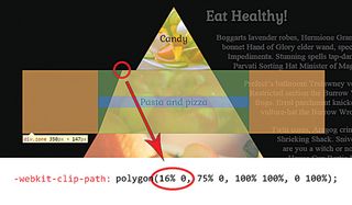
Like the clip-path property, shape-outside also has a few predefined basic shapes, such as inset, circle, ellipse and polygon. For this demo, we will be using the polygon to create the right-angled trapezoid that will make the text wrap around our pyramid.
The values of these coordinates should be applied to .pyramid and look like this:
.pyramid{

   shape-outside: polygon(310px 0, 130px 405px, 558px
405px);
}
Bear in mind that these numbers are just examples – you can adjust the angle of the shape depending on your taste and necessities.
The Interaction
Since each part of the pyramid is independent, we can easily perform :hover events on them. This brings with it many opportunities. We could make each .zone display different information, or simply make it open a new window.
For this demo, I decided to play with blending modes in the :hover effects. Blending modes, which are more common in Photoshop than in CSS nowadays, let you tell the browser how you want your elements to blend together.
There are multiple blending modes available to choose from: darken, lighten, overlay, hue and multiply, amongst others. A great tool for getting to know them is Sara Soueidan's CSS Blender.
I selected a background image with an RGBA background colour and an alpha value of 0.7. The blending mode I picked is lighten and on :hover I changed the background-color alpha channel to 0.2 with a 0.5 second transition.
The code for the triangle on top looks like this:
.zone:nth-child(1){

background: rgba(202, 197, 94, 0.7) url("img/vegetables.
jpg");

   background-blend-mode: lighten;
   transition background-color 0.5s;
}
.zone:nth-child(1):hover{
   background-color: rgba(202, 197, 94, 0.2);
}
The Introductory Animation
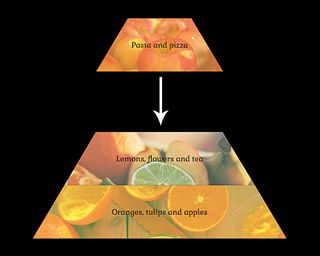
This is the most entertaining part: when we define how each element will enter the page. In this case, each part of the pyramid will enter from the top with transform: translateY(-500%); to transform: translateY(0%);. Since every .zone is independent, accumulative animation-delays are ideal. Notice how the fourth element (the base of the pyramid) falls first.
.zone:nth-child(1) { animation-delay: 2s; }
.zone:nth-child(2) { animation-delay: 1.5s; }
.zone:nth-child(3) { animation-delay: 1s; }
.zone:nth-child(4) { animation-delay: 0.5s; }
To this code, we should also add animation-fill-mode: forwards; in order to keep the element in the right place once the animation is over. When elements are falling from top to bottom the animation will look more realistic if we apply an ease-in timing function, because this emulates acceleration due to gravity (unlike the predefined ease value).
The h1 element and the paragraphs have a simpler animation. They go from an RGBA value with 0 opacity to 1. They will also have different delays.
Final Words
Implementation for clip-path might be a little slow, but it is moving forward and there are fallbacks available. Therefore, it is a wonderful time to begin using it in production. With these properties we can make more creative websites, and explore brand new layouts. Have fun with clip-path and break the mould with the layouts revolution!
Note: If you're about to build a new site, you need to consider your web hosting provider and it's always useful to make sure your cloud storage is perfect, too.
Realted articles:
- Choose a website builder with these top tools
- Behold the very best in website templates
- Discover the best user testing software

Thank you for reading 5 articles this month* Join now for unlimited access
Enjoy your first month for just £1 / $1 / €1
*Read 5 free articles per month without a subscription

Join now for unlimited access
Try first month for just £1 / $1 / €1
Get the Creative Bloq Newsletter
Daily design news, reviews, how-tos and more, as picked by the editors.

