How to create dynamic buttons with CSS 3D
Developer Leon de Wit explains how to use CSS 3D properties to render shapes in 3D space.
Last year we developed the new Orangina website with Achtung, with the aim of creating something that felt organic and playful. However, one simple feature turned out to be quite challenging: the buttons.
The unorthodox shapes we were after can be tedious to create using CSS. Often the easiest option is to resort to using images – however, this is not always ideal as it makes everything far less flexible.
You can create a lot of shapes with CSS using 2D transforms and CSS-generated content, but that didn't cut it for this particular shape. The solution: CSS 3D.
Our button is actually a shape rendered in 3D space, but since it is only one colour, the 'depth' becomes unnoticeable, creating the illusion of sloping edges. This allowed us to animate the shape of the button on hover by changing the element's position in 3D space.
What is CSS 3D?

CSS 3D was introduced in Safari on the first iPhone (iOS 2). The new CSS properties enabled users to position elements on the page in 3D space. Since then, these properties have been standardised into a W3C specification, and by now they've been adopted by all the major browsers.
When I talk about CSS 3D, I'm talking about both the perspective property and 3D transforms. The perspective property is used to define a 3D environment and to set the depth of this environment.
After the 3D environment is defined, all the nested elements will be located in this 3D space, where transforms can be used to position them. So, for example:
HTML
<div id="stage">
<div class="element"></div>
</div>
CSS
#stage {

-webkit-perspective: 300px;
perspective: 300px;
}
.element {
-webkit-transform: translateZ(-300px);
transform: translateZ(-300px);
}
As you can see, the perspective property is defined in pixels. This value determines the distance from the drawing plane to the assumed position of the viewer's eye.
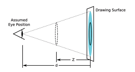
After the perspective has been set, the nested elements can be moved on the Z-axis to make them appear either closer or further away.
The scaling used to simulate this effect is calculated using the equation S=d/(d-Z) , where d is the value of the perspective property, and Z is the value of translateZ.
In the previous example, the element will be scaled to half its original size. In addition, the perspective- origin property can be used to determine the position of the vanishing point. The default value for the perspective origin is '50% 50%', placing the position of the vanishing point in the centre.
When you combine different transform properties – for example a scale and a rotation – you can create some interesting results.
.element {

-webkit-transform: translateZ(-300px) rotateY(20deg);
transform: translateZ(-300px) rotateY(20deg);
}
In this example, the element will be scaled due to its position on the Z-axis, and will also be rotated 20 degrees along its Y-axis.
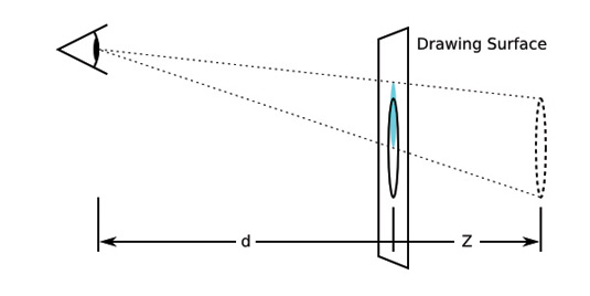
For a more detailed explanation of how your 3D elements are being rendered, click here.
Bear in mind the order of transformations is important – they are applied from left to right. If you changed the order in the above example, putting the rotation first, the element would be positioned differently.
The order of transformations can mean the difference between rotating around the origin of an element and rotating around the origin of its parent.
Putting it into Practice
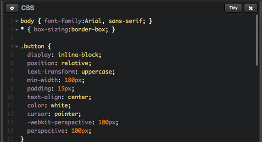
We used the following CSS for our button:
.button {

-webkit-perspective: 100px; perspective: 100px;
}
.button:after {
-webkit-transform: rotateY(-6deg) rotateX(-5deg) translateX(-4%);
transform: rotateY(-6deg) rotateX(-5deg) translateX(-4%);
}
The Result
To see the finished button, visit netm.ag/CSScode-266. By using the :after pseudo element as the background of the button, we are able to set the perspective on the button element itself, and use the transform property on the :after element. This also allows us to transform the background separately from the text.
Using a negative Z-index on the :after element places it behind the text. Also, using the :after pseudo class saves us from using an extra HTML element (you could achieve the same effect using a wrapper div).
By adding a transition to the element, you can create some neat animated effects – for example when you hover over the button. The following code will cause the background of the button to animate to a mirrored state.
.button:after {

-webkit-transition: -webkit-transform .3s ease-out; transition: transform .3s ease-out;
}
.button:hover:after {
-webkit-transform: rotateY(6deg) rotateX(5deg)
translateX(4%);

transform: rotateY(6deg) rotateX(5deg) translateX(4%);
}
Things to keep in mind
There are some things to remember with CSS 3D:
- 3D transforms and perspective aren't supported by some browsers, most notably IE9 and lower. Both IE10 and IE11 do not support the transform-style: preserve-3d property, which isn't covered in this article, but can be a useful feature for certain situations. For a full browser support table have a look at caniuse. com/#feat=transforms3d
- At this moment the -webkit- prefix is still needed for both the transform and the perspective properties in Safari and most Android browsers
- 3D transform can cause jagged edges in Firefox. We worked around this here by adding: outline: 1px solid transparent;
- Putting a 3D transform on an element will trigger hardware acceleration. This has several benefits, such as smoother animations. One issue to be aware of is that in WebKit browsers, enabling hardware acceleration can cause blurry images and text
Using CSS 3D is pretty cool, and I hope this article has given you some inspiration on how to use it in your projects.
Words: Leon de Wit
Leon de Wit is a front-end developer for Egotribe, his areas of expertise are HTML, CSS and JavaScript. This article was originally published in net magazine issue 266.
Liked this? Read these!

Thank you for reading 5 articles this month* Join now for unlimited access
Enjoy your first month for just £1 / $1 / €1
*Read 5 free articles per month without a subscription

Join now for unlimited access
Try first month for just £1 / $1 / €1
Get the Creative Bloq Newsletter
Daily design news, reviews, how-tos and more, as picked by the editors.

The Creative Bloq team is made up of a group of design fans, and has changed and evolved since Creative Bloq began back in 2012. The current website team consists of eight full-time members of staff: Editor Georgia Coggan, Deputy Editor Rosie Hilder, Ecommerce Editor Beren Neale, Senior News Editor Daniel Piper, Editor, Digital Art and 3D Ian Dean, Tech Reviews Editor Erlingur Einarsson, Ecommerce Writer Beth Nicholls and Staff Writer Natalie Fear, as well as a roster of freelancers from around the world. The ImagineFX magazine team also pitch in, ensuring that content from leading digital art publication ImagineFX is represented on Creative Bloq.
