How to make your typography responsive
You've got your layout and images scaling, but you need to have your type following along as well. One size of type does not fit all line lengths or screen widths!
- Knowledge needed: Basic CSS and HTML knowledge. Familiarity with typography
- Requires: Your favourite text editor and a browser
- Project time: About 30 minutes
We're used to thinking about sizing type relatively to a base font size by using ems or percentages. With responsive web design, we write a lot of rules and select breakpoints to make sure our layout fits many screen sizes. Type is wonderful fluid, but it's not one size fits all. We'll look at some quick tips for getting your typography to fit your layout nicely no matter what the device or screen width happens to be.
Of course, there's way more to this than can be covered in one tutorial. So there's plenty of helpful resources listed below as well.
01. Getting typography to scale
Ah, responsive web design! Wonderfully fluid grids and media queries making our designs fit screens of any size. Lucky for us, type scales nearly endlessly and reflows into any sized container we give it. Hardly need to give it a second thought for our responsive layouts … or do we? Ideally, when our overall layouts scale, so should our type, and here's one way to do it.
02. Our sample page
For the purposes of this example, I've prepared a very simple page to use for demonstration using the first few paragraphs of Alice's Adventures in Wonderland as the content. Your site will hopefully have a bit more to it, but the simplicity fits our needs for this demo perfectly and the same technique can be applied to more complex pages.
Let's take a look at our source to see what we have under the hood. An H1 for our title and a few paragraphs wrapped in a containing div, conveniently assigned the class of wrap. We'll use this container to help manage our line lengths in this example. For your own work, the width of this container will be determined by your grid and its responsive behaviours but the same ideas apply.
A quick dip into the CSS shows we've set our body font size at 100% (about 16px for reference). And each text element is sized in ems. Nice and relative! We're off to a good start:
body {
font-size: 100%;
line-height: 1.6875;
font-family:Georgia;
}
We've got our basic typography scale all set up, so now let's see how this holds up at various screen sizes.
03. Checking the smallest screen first
Let's start looking at our layout at a very small screen width, say something around 320 pixels wide. Likely what you'd see on of those popular mobile device things.
Initially at this narrow width, our line lengths are a bit shorter than the generally accepted optimal length of 45 and 75 characters. Or, if you aren't a fan of counting characters, you might notice the lines feel short and make it harder to follow the text. Personally, I tend to go with reading feel more times than not.
To get a little more room for a comfortable line length we could bring the overall size of the type down, or we could make our container a bit bigger. Since this is a tutorial on sizing type, I'm going to go with the former, but the latter would be a completely acceptable option too.
To take care of this, let's write a media query for a max-width of 400 pixels. Yes, that's not exactly 320 pixels, but I prefer to set breakpoints based on where the design shows a need for them, not on particular device measurements.
The easiest way to change the size of all the type, is to change the size assigned to our <body>'s font-size property:
Get the Creative Bloq Newsletter
Daily design news, reviews, how-tos and more, as picked by the editors.
@media only screen and (max-width: 400px) {
body { font-size:90%;}
}
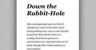
Thanks to the fact that we've sized all our type with ems initially, we can make this change across the board with just one line. Yay, for relative type sizing!
04. Moving on up
If we do as web designers do and continue to resize our browser window large, our relatively size container keeps getting bigger and our text reflows as we go. Just what you'd expect. But keep an eye on the line length. When does it start looking and feeling too long?
At around 800 pixels wide (of the overall browser window size) the line lengths start looking uncomfortably long. Looks like a good time to add another breakpoint for our type.
@media only screen and (max-width: 800px) {
body { font-size:100%;}
}
@media only screen and (max-width: 1100px) {
body { font-size:120%;}
}
Here's what our page looks like now at any window width between 800 and 1100 pixels wide. We've got a little more room to work with and now our type fills it a little more nicely:
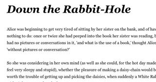
This time around we're writing two media queries. One with a max-width of 800 pixel with the body font size set to 100% which covers everything between a 500 pixel window width and a 800 pixel window width.Then a second for when our window width is above 800 pixels so we can increase our base font size.
I've increased the base font size to 120% once we move past 800 pixels in width to get the line length a little more where I like it. This is a bit subjective of course, and also dependent on the content itself and surrounding content. Pick breakpoints and sizing changes that make sense to you and your design. Comfortable reading and balanced layouts are the goal here. Testing your layouts on more than just a resized desktop browser will help you arrive at the best places for these as well.
05. Up up and away!
You can guess what's coming next, I'm going to keep making my browser window wider and see what happens. Unsurprisingly as the line lengths getting longer and they start approaching unbearable lengths again around 1,100 pixels. Time for another breakpoint? We could just keep going on and on like this indefinitely, but that wouldn't seem so smart, this is starting to seem endless!
Technically, your type can continue to scale endlessly. However, chances are your layout and your images cannot. At some point we have to put on the breaks. And for this simple demo, I've decided that point is 1,100 pixels.
One final type-related media query remains to be written. I want something that will stop our line lengths from growing so we can freeze things at this point where we have acceptable line lengths. The easiest way to make that happen is to put a maximum width on the div containing our text.
First we have to determine the approximate width of our containing div in pixels. If our browser window is 1,100 pixels wide and our wrap div has a width of 70%, a tiny bit of math tells us our div is about 770 pixels wide. (1,100 *.7x).
Armed with that, we'll edit our last media query like so:
@media only screen and (min-width: 1100px) {
body { font-size:120%;}
.wrap {max-width:770px;}
}
Our demo's type as big as we've decided it's allowed to get:
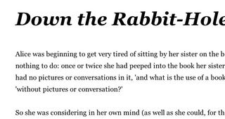
There we have it. A simple technique for keeping your type nice and comfortable to read over a variety of screen sizes.
06. To sum it all up
Even from this simple example you're probably starting to see that you could be a whole lot more detailed about where you add breakpoints for your type to control line length. Then what about leading and hierarchy? These are also affected when your container and type sizes change. There's so much to consider!
Keep and eye on your type and then make adjustments where it makes sense for your layout and your project. It's not about how many media queries or breakpoints you add. It's about making your design solid for you and anyone using it.
07. Further reading
This simple demo is just the tip of the iceberg. If typography for responsive web design is something you want to read more about, here is some recommended reading:
- Tim Brown does a wonderful job collecting up techniques and things to think about on nice web type.
- There are more than just percentages and ems when it comes to our options for sizing type on the web. Ethan Marcotte explains it all on the Typekit blog.
- It's hard to talk type without running into chatter about establishing a vertical rhythm. This classic 24 ways article is a great into to the idea.
Val Head is a designer and consultant who likes to see the internet stay as awesome as possible. She runs Web Design Day, writes for CreativeJS and blogs at valhead.com.
Liked this? Read these!
- What is typography?
- Download the best free fonts
- Free graffiti font selection
- Free tattoo fonts for designers
- The best free web fonts for designers

Thank you for reading 5 articles this month* Join now for unlimited access
Enjoy your first month for just £1 / $1 / €1
*Read 5 free articles per month without a subscription

Join now for unlimited access
Try first month for just £1 / $1 / €1
The Creative Bloq team is made up of a group of design fans, and has changed and evolved since Creative Bloq began back in 2012. The current website team consists of eight full-time members of staff: Editor Georgia Coggan, Deputy Editor Rosie Hilder, Ecommerce Editor Beren Neale, Senior News Editor Daniel Piper, Editor, Digital Art and 3D Ian Dean, Tech Reviews Editor Erlingur Einarsson and Ecommerce Writer Beth Nicholls and Staff Writer Natalie Fear, as well as a roster of freelancers from around the world. The 3D World and ImagineFX magazine teams also pitch in, ensuring that content from 3D World and ImagineFX is represented on Creative Bloq.
