Create fantastic visual effects with the CSS filter property
The new CSS filter property provides new, exciting possibilities for web design and, says Bennett Feely, enables devs to do what was formerly impossible with CSS
When asked about the most exciting upcoming CSS feature, Lea Verou of the W3C answered: "Filter effects for sure". The new filter property, which makes up CSS filter effects, is an ambitious and long awaited addition that in time, could revolutionise the look of websites and interfaces.
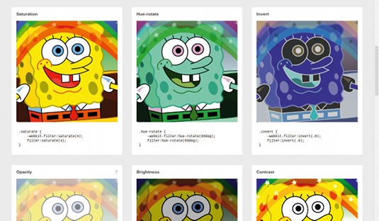
Filter effects now make it possible to blur, greyscale, saturate, and even change the rendered shapes of HTML elements. Previously, it was impossible to do this with CSS alone, instead it was achieved using Flash, Photoshop, or both. However, the new CSS filter property offers better performance, can be fully transitioned and animated - and can be quickly applied to any HTML content elements.
Here's how the CSS3 filter property works:
filter: grayscale(100%);Simple, right? With this line of CSS, we have greyscaled an HTML element. The filter property can be applied to any HTML content element, not just images. Videos, text, iframes, or the entire body of websites can be filtered.

With the filter property come 10 standard or shorthand effects: greyscale, sepia, saturate, hue-rotate, invert, opacity, brightness, contrast, blur, drop-shadow and custom. In addition to these shorthand effects, it is also fairly easy to mimic a 'tint' effect using a combination of sepia and then hue-rotate. For example, the following will give elements a blue tint. The hue-rotate() effect accepts any CSS angle units, most commonly degrees (deg).
-webkit-filter: sepia(1) hue-rotate(180deg);
filter: sepia(1) hue-rotate(180deg);
An important little tip to remember when working with multiple filters is that effects are applied from left to right. From the example above, switching hue-rotate to be first followed by sepia will not produce the desired result. C learing up confusion
Some may remember using a charming little snippet of CSS to mimic the unsupported opacity property in Internet Explorer 5-8. It goes something like this:
Get the Creative Bloq Newsletter
Daily design news, reviews, how-tos and more, as picked by the editors.
-ms-filter: "progid:DXImageTransform.Microsoft.Alpha(Opacity=50)";
filter: alpha(opacity=50);
opacity: .5;
Wait, was that the filter property? The sad answer is 'no'. Microsoft's old implementation of the filter property has since been deprecated, and is not to be confused with filter effects and the latest and greatest CSS3 filter property. We're moving on.
Let's make a gallery
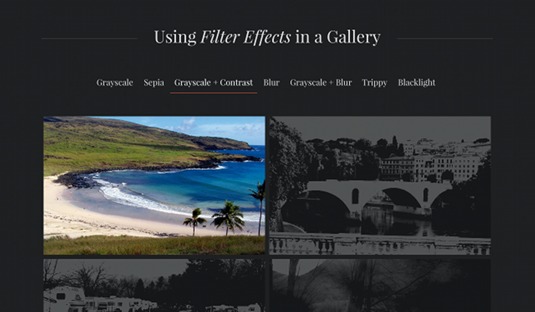
We can put filter effects to use in the real world today in a practical example that adds a unique touch to an otherwise boring photo gallery. Below is the important code doing the filtering effect when hovering over the images:
img {
  -webkit-transition: -webkit-filter .2s;
  transition: filter .2s;
}
.gallery:hover img {
  -webkit-filter: grayscale(1) contrast(10) opacity(.2);
  filter: grayscale(1) contrast(10) opacity(.2);
}
.gallery:hover img:hover {
  -webkit-filter: none;
  filter: none;
}
First, we apply a nice transition for the filter property to the images. When we are hovering over the gallery of images, we apply filter effects to each image. However, we then tell the browser to override those filters for the single image being hovered. This is an age-old CSS trick, for styling elements on 'everything but', or styling elements not being hovered.

For this example, we are using three filter effects at the same time, grayscale, contrast and opacity. You may be wondering what the difference is between the opacity property and opacity filter effect. They both get the job done, but the filter is hardware accelerated and will offer better performance, albeit with less support at this time.
The filter property does not have very strong browser support at this time; however, it is a great candidate for using to progressively enhance your website. In this gallery, users of browsers not supporting the filter property won't see the neat effects, but will still have a full experience with the gallery.
Shadowing, the better way
The drop-shadow filter effect is very much similar to the text-shadow and box-shadow properties, which have good support and are now used everywhere on the web. However, the drop-shadow filter works differently - and is, in many ways, much better.
-webkit-filter: drop-shadow(8px 8px 10px red);
filter: drop-shadow(
8px 8px 10px red);
The syntax for filter: drop-shadow is the same as box-shadow and text-shadow (unfortunately though, it only can render one shadow at a time). Unlike the box-shadow and text-shadow properties, the drop-shadow filter effect is hardware-accelerated in browsers.
Hardware acceleration is used to supercharge many graphics-intensive CSS techniques such as animations and 3D transforms - and it means better rendering performance.
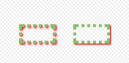
In addition to hardware acceleration, in most cases you will find filter: drop-shadow() to be more useful than box-shadow. While box-shadow renders a shadow following the outside edges of an element, drop-shadow goes a bit further and smarter, drawing a shadow following the shape of an element's contents.

Browser support and polyfills
Along with many of the newest CSS features, browser support for CSS filter effects is still limited. The majority of Google Chrome users already can experience the powers of the filter property today: the browser was the first to support with the -webkit- prefix. Safari 6 on desktop and iOS also support filter effects. In addition, Opera will likely support CSS filters soon as it switches to WebKit. Unfortunately, as of spring 2013, that is where the support comes to halt.
While we may have to wait for Firefox and Internet Explorer to catch up and support the filter property, hope is not lost. Vestiges of similar, often proprietary, filter effects are supported in browsers as early as Internet Explorer 6 and in Firefox. Christian Schaefer has made a very helpful CSS filters polyfill, which greatly expands support for most filter effects in most web browsers, even Internet Explorer 6.
Conclusion
If web browsers continue the ongoing trend of embracing web standards and support new features such as CSS filter effects, almost unlimited possibilities for web developers will open up. When used responsibly, the result is a more interactive and beautiful web.
Words: Bennett Feely
This article originally appeared in net magazine issue 241.
Liked this? Read these!
- Our favourite web fonts - and they don't cost a penny
- Stunning examples of CSS3 animation
- Create a perfect mood board with these pro tips
Any questions? Ask away in the comments!

Thank you for reading 5 articles this month* Join now for unlimited access
Enjoy your first month for just £1 / $1 / €1
*Read 5 free articles per month without a subscription

Join now for unlimited access
Try first month for just £1 / $1 / €1

The Creative Bloq team is made up of a group of art and design enthusiasts, and has changed and evolved since Creative Bloq began back in 2012. The current website team consists of eight full-time members of staff: Editor Georgia Coggan, Deputy Editor Rosie Hilder, Ecommerce Editor Beren Neale, Senior News Editor Daniel Piper, Editor, Digital Art and 3D Ian Dean, Tech Reviews Editor Erlingur Einarsson, Ecommerce Writer Beth Nicholls and Staff Writer Natalie Fear, as well as a roster of freelancers from around the world. The ImagineFX magazine team also pitch in, ensuring that content from leading digital art publication ImagineFX is represented on Creative Bloq.
