Create a zoomable user interface
David DeSandro reveals how to use CSS transforms to create a zoomable user interface similar to that of 2011.beercamp.com. In this tutorial, you’ll also learn how to use JavaScript to hijack scrolling to manipulate the zoom
This article first appeared in issue 216 of .net magazine - the world's best-selling magazine for web designers and developers.
With CSS3 transforms now supported in most major browsers, we have the delightful opportunity to create innovative layouts and interfaces. No longer are we shackled in our one-dimensional prisons, bound to the tyranny of vertically-scrolling sites.
With the site for BeerCamp at SXSW 2011, we at nclud recognised an ideal opportunity to bend some rules and try something new. I got the idea to leverage CSS transforms for the layout. Instead of the typical vertical scrolling site, where you traversed it downwards, this would could be traversed inwards. This is sort of design pattern has been categorised as a zoomable user interface or ZUI.

The BeerCamp at SXSW 2011 was an experiment in using CSS transforms to create a new interface design pattern. In this tutorial, we’ll build a zoomable user interface into a simple page. You’ll learn how to use CSS transforms to create a zoomable layout. You’ll also learn how to use JavaScript to hijack scrolling to manipulate the zoom.
Our example page lists the services of a web development shop. The services listed range from the broad to the specific. This content is well suited for a zoomable layout, as the subsequent sections are smaller segments of the previous sections. By placing one visual element inside another, you’re visually communicating the relationship between pieces of content.
Basic layout
Prior to the ZUI layout, the basic layout is designed for browsers that don’t support CSS transforms or have JavaScript disabled. The markup looks like this:
<div id="wrap"> <div id="container"> <ul id="nav"> <li><a href="#web-dev">Web development</a></li> <li><a href="#front-end">Front-end development</a></li> <li><a href="#css">CSS</a></li> <li><a href="#css3">CSS3</a></li> <li><a href="#transforms">Transforms</a></li> </ul> <div id="content"> <section id="web-dev">...</section> <section id="front-end">...</section> <section id="css">...</section> <section id="css3">...</section> <section id="transforms">...</section> </div> <!-- #content --> </div> <!-- #container --></div> <!-- #wrap -->The first draft of the site has the content laid out in the typical vertical pattern. This version is necessary as this layout will be used by browsers that do not support CSS transforms or have JavaScript disabled. The rest of the effects will be built with progressive enhancement.
Get the Creative Bloq Newsletter
Daily design news, reviews, how-tos and more, as picked by the editors.
For the zoomable layout, we need to consider how each section fits inside one another. I’ve chosen a ratio of 3:1 for the proportion between the current section and its subsequent section. This means the parent will have enough room for content, and the child container will still be visible.
Each section will be 900px x 540px so it fits within most browser windows. Subsequent sections will appear to be one-third the full size, 300px x 180px. You’ll notice this space in the centre of each section has been reserved for the subsequent sections to fit inside once CSS transforms are put in place. (See Demo 1: Basic layout.)
Now we can start adding CSS transforms. First let’s add Modernizr so we have more control over how browsers will inherit their styles. I’ve opted to use a custom build from the Modernizr 2.0 beta preview that only tests for CSS 2D transforms and CSS transitions. After adding the Modernizr code to our scripts, we can target browsers that support transforms with .csstransforms in our CSS. To scale each section inside one another, they first need to occupy the same space. This can be done with absolute positioning.
/* absolute positioning */.csstransforms #container { position: relative; }.csstransforms #content { position: absolute; }.csstransforms section { position: absolute; }Each section needs its own scale set. As the proportion we’re using is 3:1, each section will be one-third the size of the previous. This can be calculated as the inverse ratio to the exponent of the level’s zero-based index:
zoomScale = inverse ratio ^ zero-based-levelCSS3 is the principal technology that enables the ZUI for this page. We are leveraging scale transforms. The scale of the first level, #web-dev, is (1/3) ^ 0 or just 1, so we don’t need to set that superfluous style. The scale of the second level, #front-end, is (1/3) ^ 1 or 1/3 or in decimal 0.3333. The scale of the third level, #css, is (1/3) ^ 2 or 1/9 or in decimal 0.1111. We’ll apply this value to the various vendor-prefix transform CSS properties for all four of our subsequent sections. For the sake of brevity, the code example below only lists the unprefixed transform property, but in your actual code, remember to add all the vendor prefixed versions (-webkit-transform, -moz-transform, etc).
/* level index 1: (1/3) ^ 1 = 1/3 = 0.3333 */.csstransforms #front-end { -webkit-transform: scale(0.3333); -moz-transform: scale(0.3333); -o-transform: scale(0.3333); transform: scale(0.3333);} /* level index 2: (1/3) ^ 2 ) = 1/9 = 0.1111 */.csstransforms #css { -webkit-transform: scale(0.1111); -moz-transform: scale(0.1111); -o-transform: scale(0.1111); transform: scale(0.1111);}/* level index 3: (1/3) ^ 3 = 1/27 = 0.0370 */.csstransforms #css3 { -webkit-transform: scale(0.037); -moz-transform: scale(0.037); -o-transform: scale(0.037); transform: scale(0.037);}/* level index 4: (1/3) ^ 4 = 1/81 = 0.0123456 */.csstransforms #transforms { -webkit-transform: scale(0.0123456); -moz-transform: scale(0.0123456); -o-transform: scale(0.0123456); transform: scale(0.0123456);}Awesome! The sections have been transformed to fit inside one another, like Russian nesting dolls. (See Demo 2 – Scaled sections.)
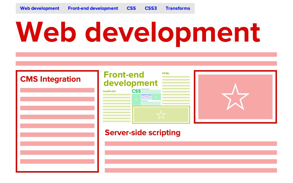
Each section is positioned inside one another using CSS scale transforms. You can see the second section within the first and the others deeper within. Now we need to build a mechanism to let the user zoom in.
To zoom in to a section, we only need to apply its reciprocal scale to the sections’ parent #content. All child sections will scale up accordingly. The scale is equal to the ratio to the exponent of level’s zero-base index. The second section #front-end has a scale of 1/3, so it needs to be scaled 3x to bring it to 100% size.
zoomScale = ratio ^ zero-based-levelThe scale to view the third level would be 3 ^ 2 = 9. For the fourth level, the scale would be 3 ^ 3 = 27.
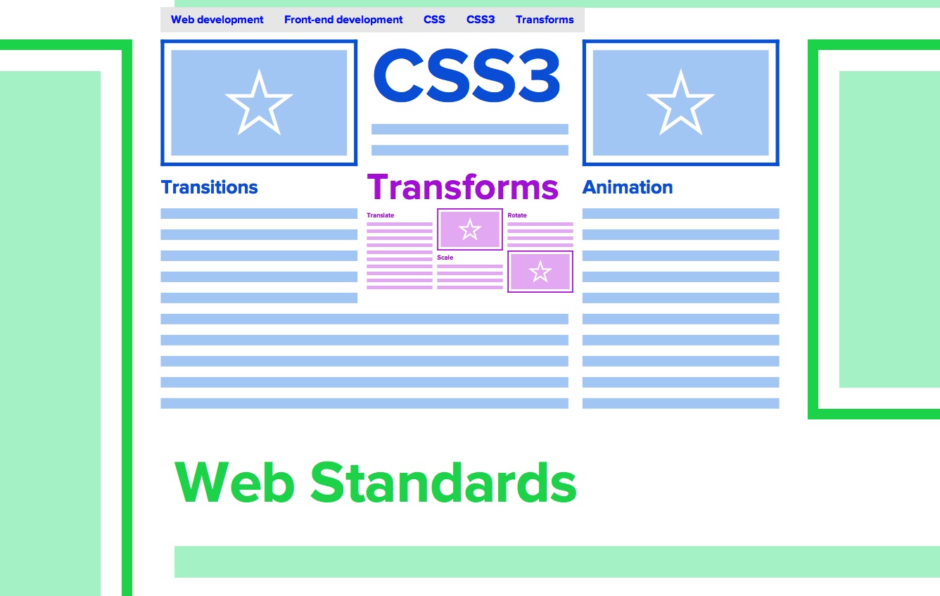
/* view #css3, level index 3 = 3 ^ 3 = 27 */.csstransforms #content { -webkit-transform: scale(27); -moz-transform: scale(27); -o-transform: scale(27); transform: scale(27);}(See Demo 3 – Fixed zoom.) Applying a scale that increases the size of container will zoom in on its content.
Scroll
Leveraging window scrolling is a natural convenient interaction to hook zooming into. Along side clicking and pointing, scrolling is a natural interaction that anyone with a mouse or keyboard uses. Currently there isn’t anything to scroll, since the entire page is self-contained in that 900 x 540 area. But we can fake it by adding an empty element that has height, which will serve as our proxy. The markup will be added after #wrap.
</div> <!-- #wrap --><div id="scroller"></div>In the CSS, set an arbitrary height on #scroller. 4000px works as an approximate height of the page before we add the scale transforms.
.csstransforms #scroller { height: 4000px; }But we don’t want the content to scroll with the rest of the page, so we can use fixed positioning to fix the actual content in its same place.
/* prevent content from scrolling */#wrap { position: fixed; width: 100%;}The page scrolls, but the content remains static. Now the fun begins as we jump into scripting.
JavaScript
The basic idea is that we are going to hijack the scroll event and do something with it.
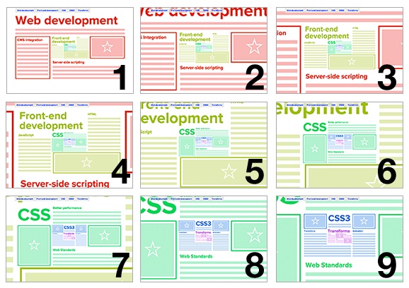
As all this script will only need to run if the browser supports CSS transforms, we can encapsulate our entire script in a self-executing function, which will only proceed if CSS transforms are supported.
(function(){ // only proceed if CSS transforms are supported if ( !Modernizr.csstransforms ) { return; } // CSS transforms supported, continue...})();I’m using a constructor design pattern, Zoomer, to do all the work. The Zoomer constructor requires a DOM node, specifically the content container, which will be passed in later. It holds properties like scrolled, which will be the vertical scroll position, levels, which is the zero-based number of sections, and the height of the page in docHeight. Most importantly, we pass it in as an event listener to the window’s scroll event.
// the constructor that will do all the workfunction Zoomer( content ) { // keep track of DOM this.content = content; // position of vertical scroll this.scrolled = 0; // zero-based number of sections this.levels = 4; // height of document this.docHeight = document.documentElement.offsetHeight; // bind Zoomer to scroll event window.addEventListener( 'scroll', this, false);}The handleEvent method allows the constructor to be used as an event listener, so we can properly use this in window.addEventListener( 'scroll', this, false). If a method matches the event’s type, that method will be called. So we can bind Zoomer.prototype.scroll to the window’s scroll event.
// enables constructor to be used within event listener// like obj.addEventListener( eventName, this, false )Zoomer.prototype.handleEvent = function( event ) { if ( this[event.type] ) { this[event.type](event); }};Zoomer.prototype.scroll is where the magic will be happening. We first need to calculate the current position of the scroll, relative to the height of the page.
this.scrolled is a normalised decimal value, from 0 to 1, that represents the position of the scrolled page.
// triggered every time window scrollsZoomer.prototype.scroll = function( event ) { // normalize scroll value from 0 to 1 this.scrolled = window.scrollY / ( this.docHeight - window.innerHeight );};We can take that scrolled value and use it for our scale value to zoom into the content. We can use the same maths we applied with the CSS above, except we’re now using a percentage.
Its value goes from 0 to 1, so we need to multiply it by the zero-based number of sections.
<code>zoomScale = ratio ^ ( percentage * levels )</code>This value can be applied as a CSS transform. We need to set all the vendor-specific CSS properties for transform with the transformValue.
// triggered every time window scrollsZoomer.prototype.scroll = function( event ) { // normalize scroll value from 0 to 1 this.scrolled = window.scrollY / ( this.docHeight - window.innerHeight ); var scale = Math.pow( 3, this.scrolled * this.levels ), transformValue = 'scale('+scale+')'; this.content.style.WebkitTransform = transformValue; this.content.style.MozTransform = transformValue; this.content.style.OTransform = transformValue; this.content.style.transform = transformValue;};All that’s left is to initialise a new Zoomer instance, pass in the #content DOM node, and start it up on:
function init() { var content = document.getElementById('content'), // init Zoomer constructor ZUI = new Zoomer( content );}window.addEventListener( 'DOMContentLoaded', init, false );Now the content zooms when you scroll. And everybody goes “Whooaaaaaaaaa." (See Demo 4 – Scroll to zoom.)
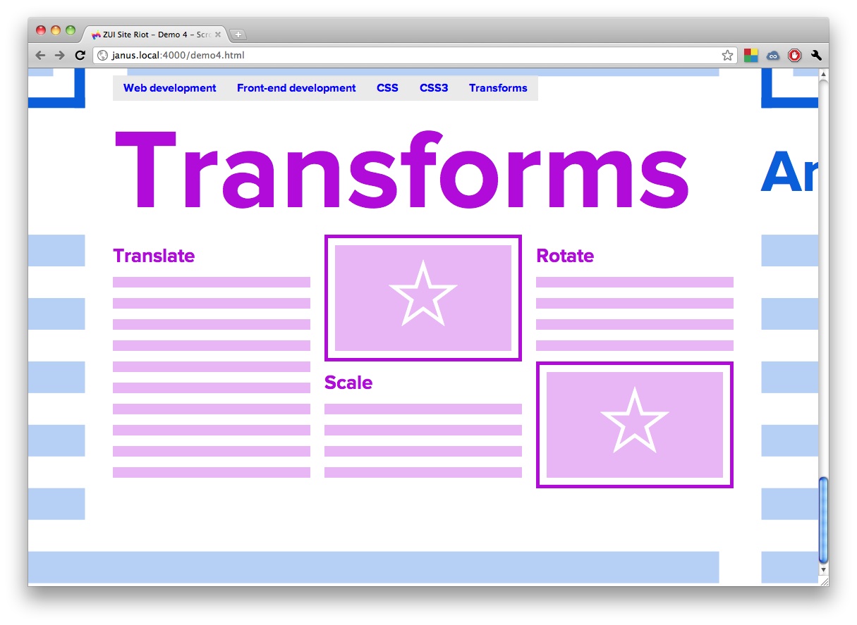
If done correctly, when you scroll to the bottom of the page, you’ll zoom in perfectly to the last section.
Completion
Behold what you have accomplished! Not only have you produced a pioneer in the realm of web interface development, but you have built it in such a way that it will be fun to use and engaging to interact with. Well done!
For more on the page navigation and CSS transitions, check out David's write-up at desandro.github.com/zui-site-riot/.

Thank you for reading 5 articles this month* Join now for unlimited access
Enjoy your first month for just £1 / $1 / €1
*Read 5 free articles per month without a subscription

Join now for unlimited access
Try first month for just £1 / $1 / €1

The Creative Bloq team is made up of a group of art and design enthusiasts, and has changed and evolved since Creative Bloq began back in 2012. The current website team consists of eight full-time members of staff: Editor Georgia Coggan, Deputy Editor Rosie Hilder, Ecommerce Editor Beren Neale, Senior News Editor Daniel Piper, Editor, Digital Art and 3D Ian Dean, Tech Reviews Editor Erlingur Einarsson, Ecommerce Writer Beth Nicholls and Staff Writer Natalie Fear, as well as a roster of freelancers from around the world. The ImagineFX magazine team also pitch in, ensuring that content from leading digital art publication ImagineFX is represented on Creative Bloq.
