Create slick animations with Adobe Edge
David Nibley, creative director at Rain, guides you through the basics of creating an animation in Adobe Edge and is pleasantly surprised about its ease of use and familiarity of the process.
- Knowledge needed: Basic timeline-based animation familiarity
- Requires: Adobe Edge Preview 3
- Project Time: Three to five hours
- Support file
Adobe's new tool Edge enables you to design animated web content using standards such as HTML5, CSS3 and JavaScript. It's not just about simple transitions, it's about filling standards-based animations with detail and personality like never before. It's about a UI that's familiar and comfortable for designers and animators. And it's about new features that actually advance the usability and flexibility of a timeline-based environment. And the obvious bonus: because it uses web standards, your work will perform beautifully on iOS devices.
As a test of Edge’s capabilities, I created an animation in about five hours. You can download the asset files above. Even though Edge is still an early pre-release and lacking many standard features, after the hour it took to round the learning curve I was pleasantly surprised by how easy it was to create a subtle, nuanced animation. There was a sense of familiarity about the process, but many capabilities will also be new to those used to other timeline-based animation tools. I consider many of them to be improvements overall.
Click here to launch the animation.
This tutorial will cursorily cover how to build this animation. For a more in-depth look at how it’s done, as well as a brief primer on Edge animation that may be helpful before you dive into something more sophisticated like this animation, please review this video tutorial. Keep in mind that the tutorial was based on a previous build of Edge, which had less refined capabilities.
Step 01. Getting started
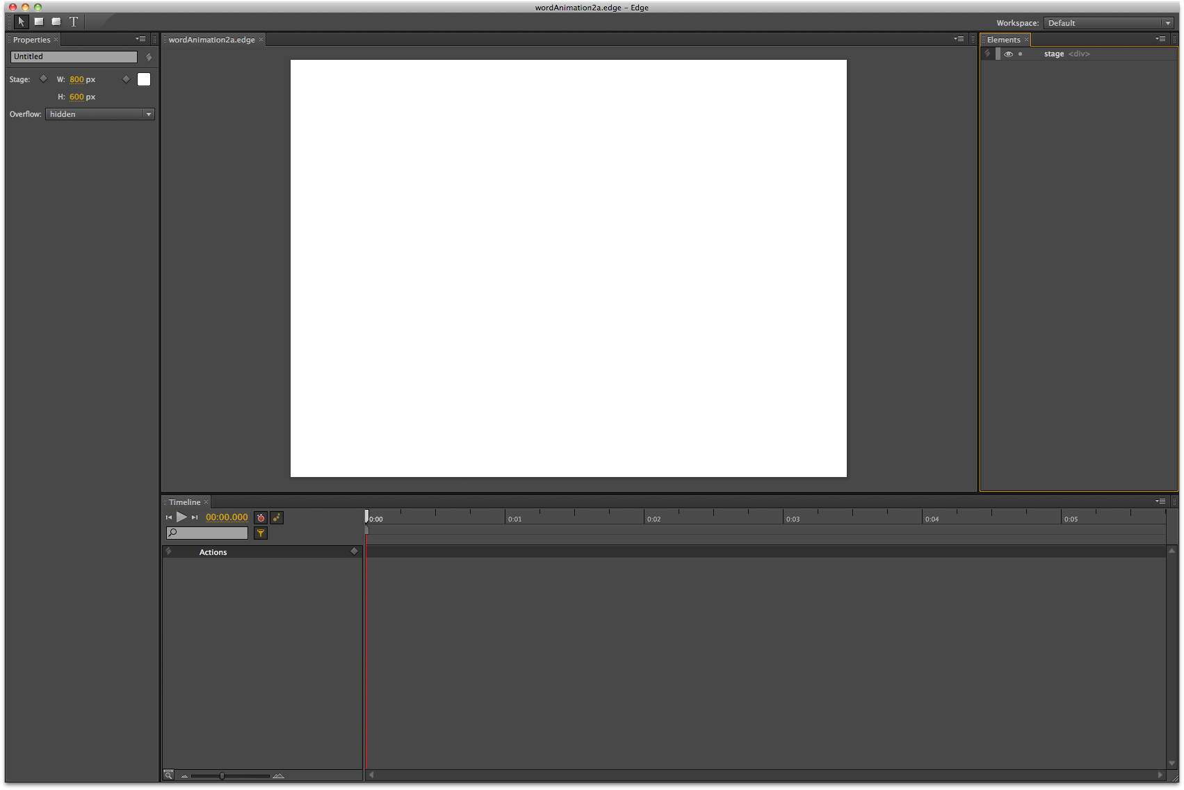
Open the wordAnimation2a.edge file from the Asset Files folder.
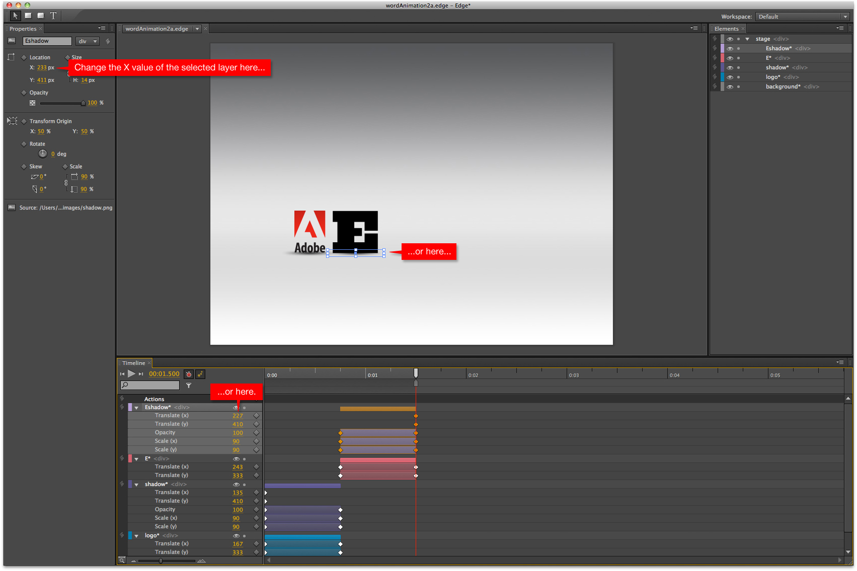
Let’s review the Edge environment. The main UI elements we’ll be working with are the Stage, the Properties Panel, the Elements panel, and the Timeline. This environment will look familiar to AfterEffects users from a design and layout standpoint. But it does have numerous differences as well, namely:
- the “mark” — an element associated with the playhead that allows for fast transition creation
- the Elements panel, which is where layer order can be adjusted
- the way asset attributes are adjusted using the Properties panel
- the way that transitions can be easily manipulated on the Timeline
- copying and pasting of transitions between layers
Step 02. File importing
With our stage set at a size of 800 x 600 pixels, we’ll begin importing our assets. Edge recognises .PNG, .JPG, .GIF, and .SVG file types. The assets for this animation were all created in Photoshop and exported as .PNG files with transparency.
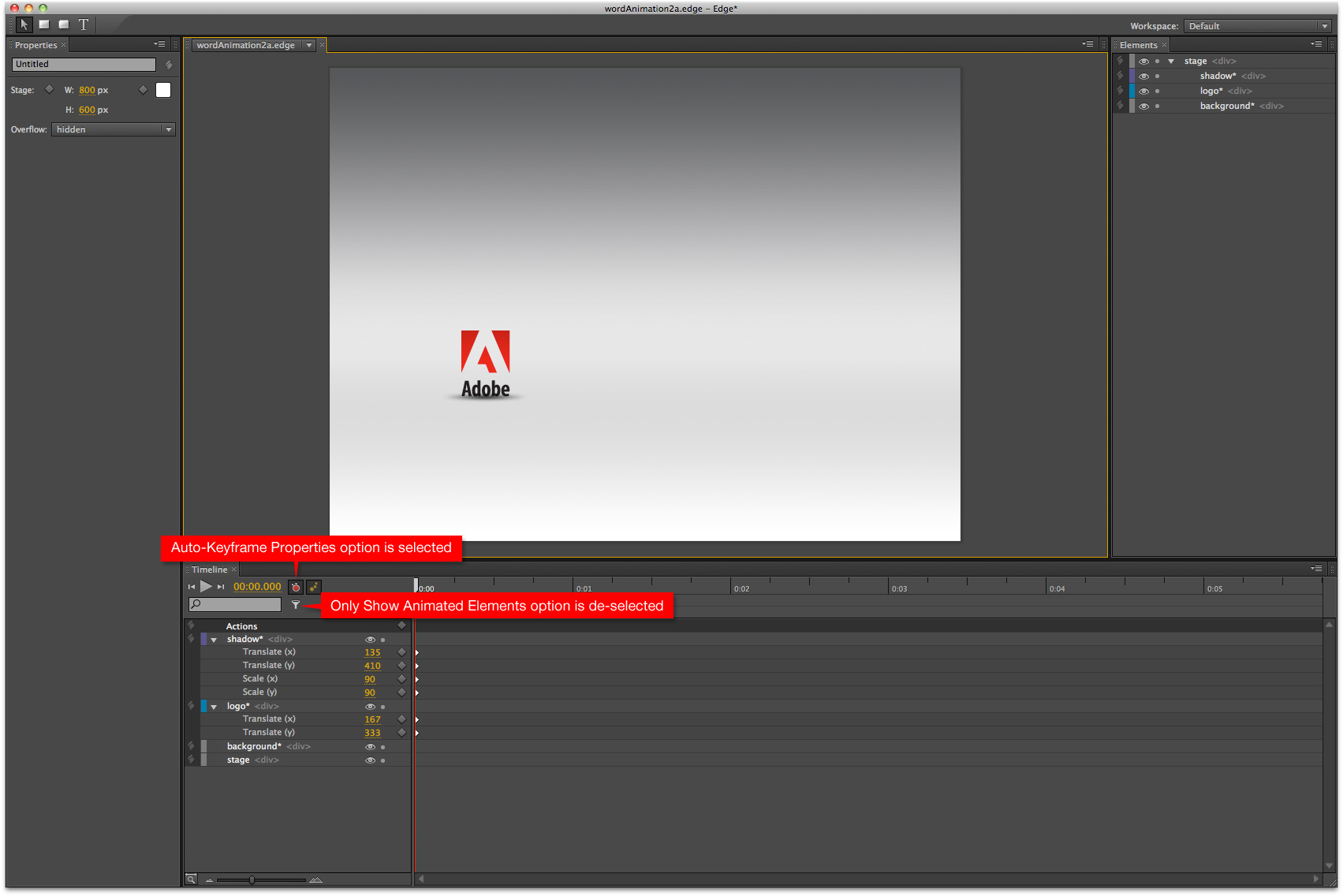
Import the background.png file using the Import command from the File menu, or by hitting command-R on our Mac keyboard (or control-K if you’re on a Windows machine), finding the Assets folder that came with the asset files, choosing the background.jpg file, and clicking Open. Imported files appear oriented to the top-left corner of the stage, and can be seen in the Elements panel as well. They also appear as a layer on the Timeline, but by default are not visible until animated in some way, or unless the Only Show Animated Elements button is de-selected.
Now import the logo.png and shadow.png files and place them on the stage as shown. This is where we want these elements to end up. You’ll notice that keyframes are automatically set on the timeline as you move the elements on the stage. You can turn this functionality off by de-selecting the Auto-Keyframe Properties option as indicated. The shadow initially is a bit big and heavy for the logo, so with it selected on the stage, we’ll move over to the Properties panel and adjust the Scale to 90% and set the Opacity to 50%.
Step 03. Animating with the "Mark"
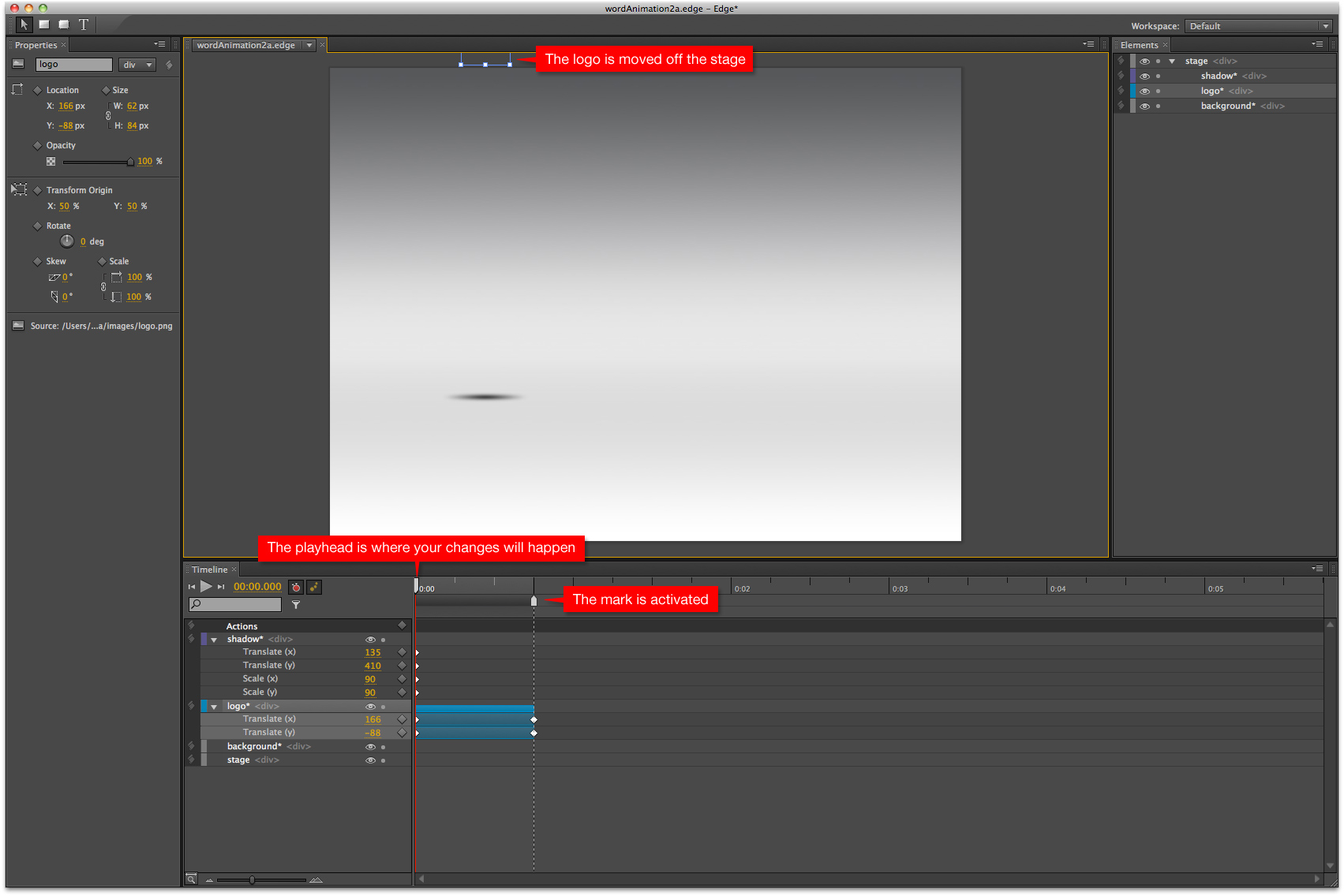
With our logo and shadow in place, we’ll create the transition that brings them onto the stage. We’ll use the aforementioned “mark” to do this. The mark is the gray upward-pointing marker just below the playhead. Before activation, the mark is attached to the playhead, and moves with it with no effect on the timeline. Once activated, by choosing Toggle Mark from the Timeline menu at the top of the screen or by hitting command-K on the Mac, the mark turns white like the playhead. (The same menu item or macro will de-activate the mark as well.) Now as you drag the playhead forward or backward along the timeline, the mark stays pinned in place. The key to using the mark to create a transition is to remember that the timeline will record all attribute changes that happen to your asset, and set keyframes that define those changes, where the playhead is positioned. Wherever the mark is, the asset attributes remain unchanged and keyframes are automatically set. Edge automatically creates an animated tween for each attribute between those two sets of keyframes. Let’s move our logo asset so we can see how this works.
First, because we want the logo to finish the transition placed where it is currently, we’ll hit command-K to set the mark at .75 seconds and work backward from there. Once the mark is set, move the playhead back to 0 seconds, then move the logo straight up and off the stage completely. We can do this by clicking and dragging it, or by nudging it with the up arrow key. (The familiar Adobe standard of holding down the shift key while hitting the up arrow will nudge the logo 10 pixels at a time.) Once you move the logo, you’ll notice that a transition for the Y value of the asset is created on the timeline. The keyframe at .75 seconds — where the mark is — defines the final position of the asset. At 0 seconds, the playhead recorded the starting position of the transition. Hit the spacebar to preview the animation, and you’ll see how the transition progresses.
Now deactivate the mark by hitting command-K.
Get the Creative Bloq Newsletter
Daily design news, reviews, how-tos and more, as picked by the editors.
Step 04. Easing presets
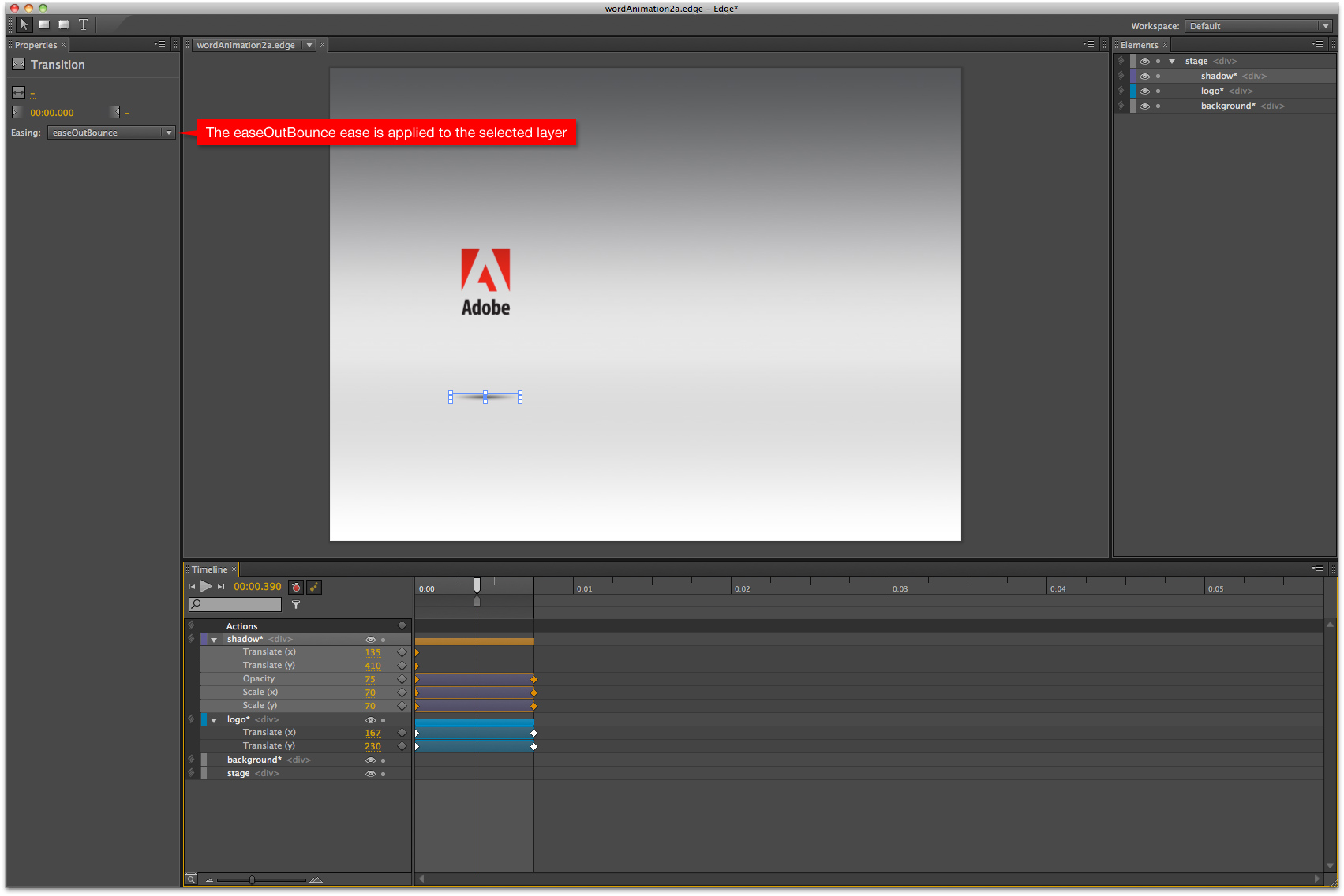
The logo’s basic movement is there, but it’s missing something. Let’s add some physics to the motion using Edge’s collection of easing presets. These are located on the Properties panel, and are visible when a layer or individual transition is selected. Click the drop-down Easing menu to see the full list. Currently, Edge does not provide a way to manually define or adjust easing as you can in After Effects or Flash, and there’s also no way to preview what these presets look like within the application itself (although I understand those capabilities are coming). For now, a workaround preview is available here from the developer of the original ActionScript easing equations, Robert Penner.
We’ll apply a bounce to our logo motion by selecting the logo layer, and choosing easeOutBounce from the Easing drop-down list. Preview the animation to see how the logo now appears to have a much more realistic relationship with gravity as it drops into place.
The logo’s shadow, however, does not interact realistically with the logo, so let’s add some coordination between the shadow and the logo. Move the playhead back to .75 seconds, set the mark (command-K), move the playhead back to 0 seconds, and with the shadow selected on the stage, adjust its Opacity to 0 and its Scale to 10%. Now click on the transition that was just created on the logo layer on the timeline, and add the same easeOutBounce preset from the Easing drop-down. Preview the animation again to watch the shadow shrink, grow, lighten, and darken in concert with the logo’s proximity.
Step 05. Copying and pasting transitions and layers
Now let’s build our stack of letters to the right of the logo. Import the E (command-R or Import from the File menu) and as we did with the logo, position it where we want the transition to end.
Since the dropping motion of the E will be identical to the logo’s, we’ll take advantage of Edge’s handy ability to copy and paste transitions from one layer to another. By selecting the “roll-up” — the solid colour bar at the top of the transition on the logo layer — and choosing Copy from the Edit menu (or command-C), we’ve captured all of the layer’s keyframes and transitions. Now select the E layer and choose Paste from the Edit menu (command-V). Previewing the animation now shows that we’ve quickly applied the same transition we originally created for the logo, easing and all, to the E. Note that Edge takes into account the E’s position and transfers the logo’s motion and easing relative to that position, so even though we copied and pasted all layer attributes, including X and Y position, the layer’s original position didn’t change, and no further adjustment is necessary. Easy.
Now we’ll add in the shadow of the E. There are two ways to do this. If we select the shadow on the stage, copy it and then paste it, we’ll end up with a new first layer (that won’t be visible if the Only Show Animated Elements option is selected) that shares the same position and name (with Copy added to it) as the copied layer, but none of its transitions. Alternatively, if we click the layer name on the timeline, then paste, a new first layer appears complete with the transitions from the copied layer. This option works best for us in this situation since the E shadow will be behaving exactly the same as the logo shadow, although it will be positioned under the E. To reposition the E shadow, you’ve got a few options. Make sure you position the playhead on the X value keyframe of the layer, then either click and drag the shadow into place directly on the stage, or click and drag on the X value of the layer itself (located under the layer name), or click on the layer name to activate the Properties panel and then click and drag on the X value located there. It’s also probably best to rename the layer to Eshadow so there’s no confusion later on.
Now repeat the steps above to build the stack of letters all the way up to the top. If you’d rather skip ahead quickly and continue with the tutorial, open the wordAnimation2b.edge file, where you’ll find the animation built out to the point at which the logo knocks the top E off the stack.
Step 06. Manipulating transition length and timeline position
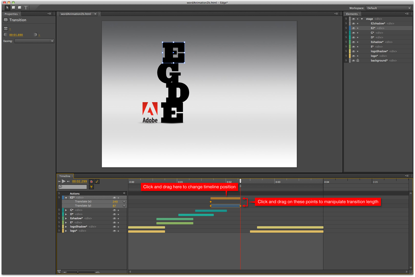
Depending on where your playhead was when you pasted the new layers, you may have to move the transitions to properly align them on the timeline. Edge makes this very easy. Hovering over a roll-up at the top of the layer’s transitions will turn your mouse into a hand icon. Then simply click and drag the transition backwards or forwards into place. Also, if you hover over either end of a transition, your mouse will become a dual-arrow icon allowing you to click and drag forwards or backwards, which instantly lengthens or shortens the transition. These adjustments can also be made on individual transitions within a layer (ie scale, opacity, location, etc.) for real fine-grain control of the way the transitions interact with each other. Let’s explore that further.
Step 07. Manipulating individual transitions
Now we’ll animate the E2 layer being knocked off the stack by the logo. In a tool like Flash or After Effects, we’d most likely make this happen using a motion path to define a nice arc that E2 would follow on its journey to the ground. As of this writing, Edge does not support motion paths, so we’ll have to do it another way.
We’ll start by moving the playhead out to 00:03.150, right where the logo makes contact with the top E. Now set the mark (command-K) and move the playhead out 1 second to 00:04.150. Remember, the changes will be made at the playhead, and keyframes defining the current state will be set at the mark. Now move E2 to the location at which it will finish this move. In the asset files, this location is X:542, Y:333. You’ll see that an X and Y transition are created. Previewing the animation shows E2 descending in a very boring, unrealistic motion. To fix this, we’ll manipulate only the Y transition. Move the playhead out to 00:03:325, then click and drag the keyframe at the start of the Y transition you just created to the playhead location. This will allow E2 to move out initially only on the X axis, then gravity will appear to kick in at the point at which the Y transition now begins. Now move the playhead out to 00:03:0900, then move the ending keyframe of the Y transition back to the playhead. Previewing shows that we’re looking better, but still not all that realistic. So let’s add in some targeted easing to complete the effect. Select the X transition only, and choose the easeOutCubic preset from the Easing drop-down. Now select the Y transition, and apply the easeOutBounce preset. Previewing now shows that the combination of these eases on the individual axis creates a realistic falling/bouncing/sliding motion. Not too difficult, and pretty quick and effective.

Now let’s animate E2’s shadow to match the movement we just created. In the asset files, the E2Shadow layer is already imported and placed, but you may need to deselect the Only Show Animated Elements option as indicated to view it in its non-animated state. With the E2Shadow layer selected, move the playhead to the start of the E2 transition we just created, or 00:03.150. Set the mark, then move the playhead to the end of E2’s transition. Now adjust both the scale and opacity of the layer to 100%, and move X value out to align the shadow right under E2 (X:520). Previewing reveals that the shadow moves into place and grows from beginning to end of the transition, but does not match the movement and proximity of E2. So let’s add easing similar to what we applied to the E2 layer. First, click and drag over the Scale and Opacity transitions of the E2Shadow layer to select them all simultaneously, then move the beginning and end those transitions so that they align with the timing of the Y transition from the E2 layer. Then apply an easeOutBounce ease to those layers. Finally, select the E2Shadow X transition, apply an easeOutCubic ease, and preview. You’ll see that the shadow now interacts realistically with the bouncing, sliding E2.
From here, it’s a matter of using the methods you’ve learned in this tutorial, playing around and experimenting, and you can create the rest of the animation. Or, if you prefer, you can open the wordAnimation2c.edge file and see how it all came together.
As a designer, animator, and director, David Nibley has delivered creative solutions across the digital spectrum for over 15 years. He has been a key partner in building the design side of two successful agencies, and currently leads the innovative creative team at Rain. A few awards from industry notables like Communication Arts, FWA, and the Tellies proudly occupy a special place on a dusty shelf in Dave's memory. www.mediarain.com/
Liked this? Read these!
- Free graphic design software available to you right now!
- Download the best free fonts
- Brilliant Wordpress tutorial selection

Thank you for reading 5 articles this month* Join now for unlimited access
Enjoy your first month for just £1 / $1 / €1
*Read 5 free articles per month without a subscription

Join now for unlimited access
Try first month for just £1 / $1 / €1

The Creative Bloq team is made up of a group of art and design enthusiasts, and has changed and evolved since Creative Bloq began back in 2012. The current website team consists of eight full-time members of staff: Editor Georgia Coggan, Deputy Editor Rosie Hilder, Ecommerce Editor Beren Neale, Senior News Editor Daniel Piper, Editor, Digital Art and 3D Ian Dean, Tech Reviews Editor Erlingur Einarsson, Ecommerce Writer Beth Nicholls and Staff Writer Natalie Fear, as well as a roster of freelancers from around the world. The ImagineFX magazine team also pitch in, ensuring that content from leading digital art publication ImagineFX is represented on Creative Bloq.
