Create a page turn effect
Joe Lambert walks you through creating a stunning page turn effect to enhance a portfolio image gallery
This article first appeared in issue 223 of .net magazine – the world's best-selling magazine for web designers and developers.
CSS transitions and transforms are still relatively new and the syntax may change before becoming a standard. We can still start to use these properties now, though: we just need to make sure we use the vendor prefixed versions. In order to provide support for users of all browsers it's important to include all of the vendor prefixed versions. This, however, does not make for especially concise code, so in the interest of clarity I’ll just be using the -webkit prefix throughout this tutorial.
Introduction to CSS transitions
CSS transitions are a new feature of CSS3 that give you the ability to animate elements just by changing CSS properties. Using transitions you tell the browser what properties should be animated, how long they ought to take and what easing function should be used. Here is an example of how an element could be automatically faded out just by adding a class:
div#test{-webkit-transition-property: opacity;-webkit-transition-duration: 500ms;-webkit-transition-timing-function: ease;opacity: 1.0;}div#test.hidden{opacity: 0.0;}Introduction to CSS transforms
CSS transforms are also new to CSS3 and let you perform 2D and 3D manipulation on elements such as scaling, translating and rotating. Here is an example of how you can use a transform to rotate some text:
p#test{-webkit-transform: rotate(45deg);}Using CSS transitions and transforms together is an easy way to create really compelling animations for your website or web app. Transitions can also be hardware accelerated so they work much better on mobile devices than the traditional timer based JavaScript animations.

Creating a flip gallery jQuery widget
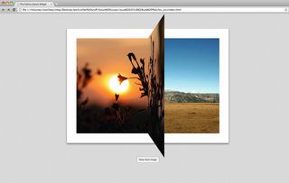
To demonstrate the power of combining CSS3 transforms with transitions let’s create a gallery widget for jQuery that mimics a page turning effect. Most modern browsers now support CSS transitions, but not all support 3D transforms just yet. As we’re creating a 3D effect we’ll just be targeting WebKit browsers such as Safari, Chrome and iOS.
HTML markup
To start with we need to set out our markup so that the widget will have something to work with:
Get the Creative Bloq Newsletter
Daily design news, reviews, how-tos and more, as picked by the editors.
<div class="gallery"><img src="images/photo1.jpg" alt="Photo 1" /><img src="images/photo2.jpg" alt="Photo 2" style="display:none"/><img src="images/photo3.jpg" alt="Photo 3" style="display:none" /></div>To do this we create a simple structure with a series of image elements inside a containing div. We’ll also give this element a class so that access via jQuery is easier. It’s important to set the display property to none for all but the first image: this way the rendering will degrade better if, for some reason, the client’s browser doesn’t support JavaScript.
Create the widget
Now that we have our markup we need to create the jQuery widget (jQuery widgets are part of the jQuery UI library). In a separate file, create the following basic widget template:
(function($) {$.widget("ui.flipGallery", {options: {},_create: function() {// Setup widget}}});We’ll use the widgets constructor (_create()) to set up the DOM so that it’s ready for the flip effects. We also need to add some code to the main HTML document to create the gallery on load. To do this, add the following to your HTML page:
<script type="text/javascript" charset="utf-8">jQuery(document).ready(function($){$('div.gallery').flipGallery();});</script>So the first thing we need to do is some general setup. Add the following to your widgets _create() function:
var that = this;// Find all the images for the gallerythat.images = that.element.find('img');// If we only have one image then don't proceedif(that.images.length <= 1)return;that.currentImageIndex = 0;// Get image dimensionsthat.height = that.images.first().height();that.width = that.images.first().width();// Make sure the gallery element remains this sizethat.element.width(that.width).height(that.height);// Allow sub elements to be absolutely positioned within the gallerythat.element.css('position', 'relative');// Setup the element to support perspectivethat.element.css({'-webkit-perspective': 1100,'-webkit-perspective-origin': '50% 50%'})The above code gets a list of all the images we specified in markup and ensures that the container element is correctly sized. It also creates an instance variable to keep track of the index number of the image being displayed. We’ll use this a bit later on to progress through the sequence of images.
The final part of this code sets up perspective on the gallery element. As we’re creating a 3D effect, we need to tell the element to have perspective otherwise the page won’t appear to come out of the screen when we run the transition. The smaller the number used for -webkit-perspective, the more pronounced the perspective is. For this effect I found that values around 1,100 look best.

Add dynamic markup
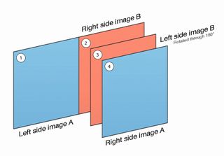
We’re now ready to make the widget do something. First we need to work out what elements we’re going to need for the desired effect. As we’re creating a page flip, we need to think about what happens when you turn a page in a book.
- We want to start by seeing the first image in its entirety.
- We then want to see the right-hand side of this first image rotate around the centre, revealing the right-hand side of the second image.
- After the rotated element is perpendicular to the screen we want to carry on rotating, but display the left-hand side of the second image instead.
To achieve this we’re going to want to create a DOM element structure that reflects the diagram above.
Now let’s create some DOM elements to match the desired layering. Because we need to be able to show only certain parts of the images, instead of rendering <img/> elements we’re going to apply the images to the background of elements. This will essentially allow us to dynamically crop (or clip) the images at will. To create layers one and two we need to add the following code:
// Create an element to show the left hand slide of image Athat.imageLeftA = $('<div/>', { 'class': 'imageLeftA'}).css({width: '100%',height: '100%',position: 'relative'});// Create an element to show the right hand side of image Bthat.imageRightB = $('<div/>', { 'class': 'imageRightB'}).css({// Full height, half widthwidth: '50%',height: '100%',// Cover the right hand part of imageLeftAposition: 'absolute',top: '0px',right: '0px',// Right align the background imagebackgroundPosition: 'right top'}).appendTo(this.imageLeftA);// Add to the DOMthat.imageLeftA.appendTo(that.element);Next we’ll add the elements that will represent the page that will turn. This will contain layers three and four:
// Now create the 'page' that will flip overthat.page = $('<div/>', { 'class': 'page' }).css({// Full height, half widthwidth: '50%',height: '100%',// Cover the right hand part of the imagesposition: 'absolute',top: '0px',right: '0px',// We need to tell this element to preserve the orientation of sub elementsas it is transformed'-webkit-transform-style': 'preserve-3d'});that.imageRightA = $('<div/>', { 'class': 'imageRightA'}).css({// Fill the container (which is full height, half width)width: '100%',height: '100%',// Right align the background imagebackgroundPosition: 'right top',// Make sure the element starts at the top left of the pageposition: 'absolute',top: '0px',left: '0px',// We don't want to see the image when its facing away from us'-webkit-backface-visibility': 'hidden'}).appendTo(that.page);that.imageLeftB = $('<div/>', { 'class': 'imageLeftB'}).css({// Fill the container (which is full height, half width)width: '100%',height: '100%',// Make sure the element starts at the top left of the pageposition: 'absolute',top: '0px',left: '0px',// We need to rotate this panel as it should start with its back facing out ofthe screen'-webkit-transform': 'rotateY(180deg)',// We don't want to see the image when its facing away from us'-webkit-backface-visibility': 'hidden'}).appendTo(that.page);that.page.appendTo(that.element);The important thing to note in the above code is that the left-hand side of the element representing image B is rotated by 180° so that when it starts it’s facing away from the screen. It’s also important that we tell both of the layers inside the page element to only show their front face. This is accomplished by using the CSS3 property '-webkit-backface-visibility':
'hidden' and means that any part of the element that isn’t facing the screen can’t be seen by the user. By preventing the back face of the elements showing, we create the impression that the two sub elements are either side of the page.
We’ve also used another new CSS3 property '-webkit-transform-style': 'preserve-3d' on the page element that contains the two layers. This property forces the transformations on sub elements to be calculated relative to this element. This is a little confusing, but for this example it means when the page element is rotated, the two child elements will rotate with it. Without it you will get some unexpected behaviour.

Animate
At this point we’ve set up all our DOM elements, so we need to remove the original images from the container and paint the correct images onto our various layers. To finish the _create() function add the following two lines of code:
// Remove the images from the DOMthat.images.remove();that._setupImages();As we’re now calling a new function, we’ll then need to define what the _setupImages() function does. Add the following code to your widget:
_setupImages: function() {var that = this;var nextImageIndex = that.currentImageIndex + 1;// Range check the next image indexif(nextImageIndex >= this.images.length)nextImageIndex = 0;// Setup the placeholder elements with the correct backgroundsthat.element.add(that.imageLeftA).add(that.imageRightA).css('background-image', 'url('+ $( that.images.get(that.currentImageIndex) ).attr('src') + ')');that.imageRightB.add(that.imageLeftB).css('background-image', 'url('+ $(that.images.get(nextImageIndex) ).attr('src') + ')');}We now have everything in place to be able to initialise the gallery, but at this point all we’ll see in the browser is the first image. Now let’s add a function to actually perform the page flip.
First we need a way to trigger the effect. You can do this by adding a button to your HTML file:
<button class="next" type="button">Show Next Image</button>We also need to modify our jQuery.ready code to attach a listener to the button. Change the function to look like this:
jQuery(document).ready(function($){$('div.gallery').flipGallery();$('button.next').click(function(event){event.preventDefault();// Trigger a page flip$('div.gallery').flipGallery('turn');});});When the button is pressed it will now trigger the turn function on our widget. Now let’s implement this function so that it creates the page turn effect. Add the following code:
turn: function() {var that = this;// Setup the transitionthat.page.css({'-webkit-transition-property': '-webkit-transform','-webkit-transition-duration': '1000ms','-webkit-transition-timing-function': 'ease',// Make sure the rotation pivots around the left hand edge'-webkit-transform-origin': 'left'});// Use setTimeout() to ensure the above settings have taken effect beforeproceedingsetTimeout(function() {that.page.css({// Flip from left to right around the Y axis'-webkit-transform': 'rotateY(-180deg)'});}, 50);}So what does the above code do? First, we give our page element some CSS to tell it which property to animate and how we’d like the animation to appear. In this case we want any changes to the -webkit-transform property to be animated over a 1,000ms duration, and we’d like to use the ease timing function. We also specify that we would like to perform transformations around the left-hand side of the element. This will ensure that when we rotate the page element (which represents the right-hand side of the image) it will turn around the centre of the image.
The second part of code then applies to the rotation, setting the new position we want the page element to be in. Because we’ve said that all -webkit-transform property changes should be animated, instead of switching immediately to the new rotation position, the page element will smoothly animate, giving the desired page turn effect.
It may seem like we’ve finished, but how do we set up for the next image so that we can cycle through any arbitrary number of images? Luckily, when a transition is completed the browser will trigger an event, which we can listen for in the same way we could a click or a keypress. Let’s modify our turn() function by adding an event listener to reset for the next transition. Replace the first line of the turn() function with the following new code:
var that = this;// Setup a function to trigger when the transition has finishedvar transitionEnd = function(event) {// Stop listening for transition eventsthat.page.unbind('webkitTransitionEnd', transitionEnd);that.currentImageIndex++;// Range check the new image indexif(that.currentImageIndex >= that.images.length)that.currentImageIndex = 0;// Set the background of the gallery to the new imagethat.element.css('background-image', that.imageLeftB.css('background-image'));// Hide the created DOM elements to reveal the gallery backgroundvar elements = that.imageLeftA.add(that.page).hide();// Stop changes to the page from being animatedthat.page.css({'-webkit-transition-property': 'none'});setTimeout(function() {// Reset the elements for the next turnthat.page.css('-webkit-transform', 'none');that._setupImages();elements.show();}, 50);}// Listen for when the transition has finishedthat.page.bind('webkitTransitionEnd', transitionEnd);Now when a transition completes we’re performing the following steps to reset for the next page turn:
- Increment the current image index.
- Set the gallery elements background to be the new image.
- Hide our custom layers.
- Disable transitions and reset the rotation on our page element.
- Call _setupImages() to paint the current images onto our layers for the current and next images in the sequence.
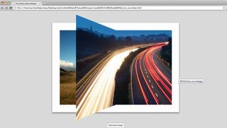
And after all that hard work we have our finished product – a reusable jQuery widget that can produce stunning page flip effects that will look great for a portfolio gallery.

Thank you for reading 5 articles this month* Join now for unlimited access
Enjoy your first month for just £1 / $1 / €1
*Read 5 free articles per month without a subscription

Join now for unlimited access
Try first month for just £1 / $1 / €1
The Creative Bloq team is made up of a group of design fans, and has changed and evolved since Creative Bloq began back in 2012. The current website team consists of eight full-time members of staff: Editor Georgia Coggan, Deputy Editor Rosie Hilder, Ecommerce Editor Beren Neale, Senior News Editor Daniel Piper, Editor, Digital Art and 3D Ian Dean, Tech Reviews Editor Erlingur Einarsson and Ecommerce Writer Beth Nicholls and Staff Writer Natalie Fear, as well as a roster of freelancers from around the world. The 3D World and ImagineFX magazine teams also pitch in, ensuring that content from 3D World and ImagineFX is represented on Creative Bloq.
