Building fast and responsive websites
In this exclusive excerpt from his HTML5 Mobile Development Cookbook web developer Shi Chuan, co-creator of the HTML5 Boilerplate, explains how to build pages with semantic markup, use dynamic loading, make buttons with instant response and more
This excerpt is Chapter 4 of the HTML5 Mobile Development Cookbook by Shi Chuan, out at Packt Publishing.
On mobile devices, bandwidth is not always as good as on a desktop computer. If you are on a slow 3G network, things can get loaded much slower than on a Wi-Fi hotspot. Even for Wi-Fi connections, many mobile browsers process slower than desktop computers. So when we create mobile sites, they have to be fast and responsive.
From this chapter onwards, we will also start to introduce HTML5 features. HTML5 is a set of technologies consisting of semantics, new CSS rules and properties, and new JavaScript APIs which could be used to build better structured web pages and powerful web applications. The following are the eight main HTML5 features:
- Semantics
- Offline and storage
- Device access
- Connectivity
- Multimedia
- 3D, graphics, and effects
- Performance and integration
- CSS3
Not all of these features are mobile exclusive; some are related more to mobile web, while some are more general for both mobile and desktop web. We will talk about each of these features and see how best they could help with our mobile development.
Based on the examples created using the new semantic tags and CSS3, we will discuss many ways to fully leverage what the mobile browser is offering and how to build a website using these unique features.
Building pages using HTML5 semantics
Target device: cross-browser
HTML5 introduced a richer set of tags; these tags give meaning to structure. Semantics is a fundamental aspect of HTML5.
Get the Creative Bloq Newsletter
Daily design news, reviews, how-tos and more, as picked by the editors.
We won't be going through all the tags here, but will cover some of the most commonly used ones.
Getting ready
First, let's create a new HTML file, and name it ch04r01.html. Let's create a fictional site about music.
How to do it...
In our HTML document, type in the following code:
<!doctype html> <html> <head> <title>first.fm</title> <meta charset="utf-8"> <meta name="viewport" content="width=device-width,initial-scale=1.0"> <style> </style> </head> <body> <header> <h1>first.fm</h1> </header> <div id="main"> <h2>Pages</h2> <nav> <ul> <li class="list"><a href="music.html">Music</a></li> <li><a href="radio.html">Radio</a></li> <li><a href="events.html">Events</a></li> <li><a href="charts.html">Charts</a></li> <li><a href="community.html">Community</a></li> <li><a href="help.html">Help</a></li> <li><a href="about.html">About</a></li> </ul> </nav> </div> <footer> <small>© 2011 first.fm</small> </footer> </body> </html>How it works...
The header element is often used for h1 to h6 elements; it could appear as the head of the entire page or the head of any block-level element. It often contains a title, subtitle, or tagline.
<header> element:
<header></header>The nav element represents navigation for a document. The nav element is a section containing links to other documents or to parts within the current document.
Not all groups of links on a page need to be in a nav element. It's only groups of primary or secondary navigation links. In particular, it is common for footers to have a list of links to various key parts of a site, but the footer element is more appropriate in such cases.
<nav> element:
<nav> <ul class="list"> <li class="list"><a href="music.html">Music</a></li> </ul></nav>The footer element represents the 'footer' of a document or section of a document. The footer element typically contains metadata about its enclosing section, such as who wrote it, links to related documents, copyright data, and so on. Contact information for the section given in a footer should be marked up using the address element.
<footer> element:
<footer> <small>© 2011 first.fm</small></footer>The small element can be used for small print. It is not intended to present the main focus of the page. The small element should not be used for lengthy paragraphs or sections of text. It is only intended for short text such as copyright information.
<small> element:
<small>© 2011 first.fm</small>There's more...
Semantics is more than just a richer set of tags. What we need is more than just more meaningful tags. To extend beyond tags, we could also add extra semantics that are machine-readable; data that browsers, scripts, or robots can understand, enabling a more useful, data-driven web for both programs and your users. These semantics are: RDFa (Resource Description Framework – in – attributes), Microdata, and Microformats.
RDFa
RDFa provides a set of machine-readable HTML attributes. By using RDFa, authors could turn existing human-readable information into machine-readable data without repeating content. The latest spec can be found at: w3.org/TR/rdfa-in-html.
Microdata
Microdata uses attributes to define groups of name-value pairs of data. You could learn more about it at: html5doctor.com/microdata.
You can dig deeper into microdata by reading the W3C Working Draft at: w3.org/TR/microdata.
You can also read the W3C Editor's Draft at: dev.w3.org/html5/md. Microformats
Microformats are designed for human's first and machine's second. There are currently 34 microformats specs, some are published, and some are drafts. You can learn more about them at: html5doctor.com/microformats.
Using CSS3 features for progressive enhancement
Target device: cross-browser
CSS3 enhances web applications and websites using a wide range of styles and effects. With CSS3, one can create a set of rich UI that is imageless. On mobile, fewer images means faster loading, which is one way to boost performance. With the wide support of CSS3 on most modern smartphone browsers and polyfills for fallback (polyfills are used as fallback to make HTML5 features work on browsers that don't support HTML5 natively), it's not just safe but necessary to start using CSS3!
Getting ready
Let's style the page created in the previous example. First copy ch04r01.html and rename it as ch04r02.html.
How to do it...
Add in the following style rules:
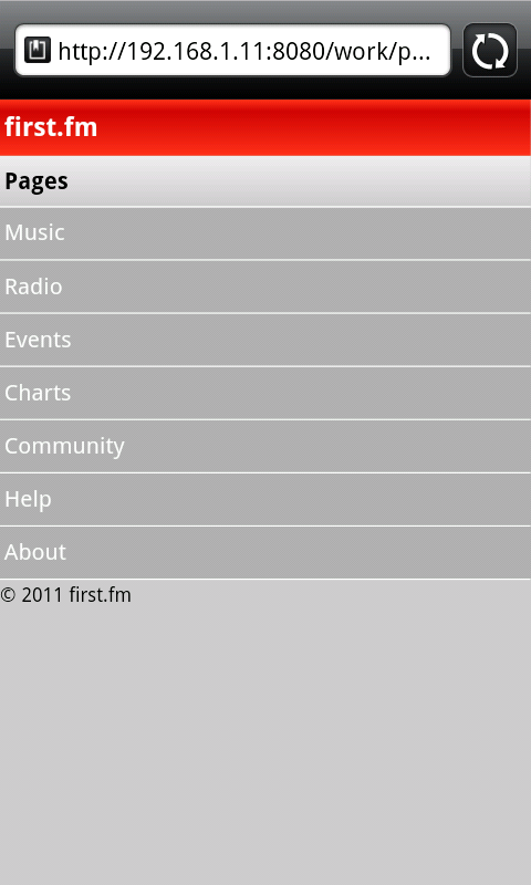
<style> body { margin:0; padding:0; font-family: Arial; background:#ccc; } header { text-shadow: 0 1px #000; background: #ff3019; /* Old browsers */ background: -moz-linear-gradient(top, #ff3019 0%, #cf0404 20%,#ff3019 100%); /* FF3.6+ */ background: -webkit-gradient(linear, left top, leftbottom, color-stop(0%,#ff3019), color-stop(20%,#cf0404), color- stop(100%,#ff3019)); /* Chrome,Safari4+ */ background: -webkit-linear-gradient(top, #ff3019 0%,#cf0404 20%,#ff3019 100%); /* Chrome10+,Safari5.1+ */ background: -o-linear-gradient(top, #ff3019 0%,#cf0404 20%,#ff3019 100%); /* Opera11.10+ */ background: -ms-linear-gradient(top, #ff3019 0%,#cf0404 20%,#ff3019 100%); /* IE10+ */ filter: progid:DXImageTransform.Microsoft.gradient( startColorstr='#ff3019', endColorstr='#ff3019',GradientType=0 ); /* IE6-9 */ background: linear-gradient(top, #ff3019 0%,#cf0404 20%,#ff3019 100%); /* W3C */ } h1 { padding:0.5em 0.2em; margin:0; font-size: 18px; color:white; } h2 { text-shadow: 0 1px #FFFFFF; background: #eeeeee; /* Old browsers */ background: -moz-linear-gradient(top, #eeeeee 0%, #cccccc 100%);/* FF3.6+ */ background: -webkit-gradient(linear, left top, left bottom,color-stop(0%,#eeeeee), color-stop(100%,#cccccc)); /* Chrome,Safari4+ */ background: -webkit-linear-gradient(top, #eeeeee 0%,#cccccc 100%); /* Chrome10+,Safari5.1+ */ background: -o-linear-gradient(top, #eeeeee 0%,#cccccc 100%); /* Opera11.10+ */ background: -ms-linear-gradient(top, #eeeeee 0%,#cccccc 100%); /* IE10+ */ filter: progid:DXImageTransform.Microsoft.gradient( startColorstr='#eeeeee', endColorstr='#cccccc',GradientType=0 ); /* IE6-9 */ background: linear-gradient(top, #eeeeee 0%,#cccccc 100%); /* W3C */ padding:0.5em 0.2em; margin:0; font-size: 16px; color:#000; } nav ul { border-top:1px solid #fff; list-style-type: none; padding:0; margin:0; } nav li { padding:0.5em 0.2em; margin:0; background:#AFAFAF; border-bottom:1px solid #fff; } nav li a { height:20px; display:block; text-decoration:none; color:white; } </style>By running this code in the browser, here is what we can see:
How it works...
In this example, we used CSS3 gradients to style the header element. Traditionally, to create a gradient like the previous example, one would have to use Photoshop or Illustrator, but now you can create it using purely CSS!
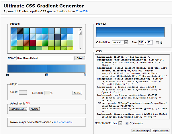
background: #eeeeee; /* Old browsers */ background: -moz-linear-gradient(top, #eeeeee 0%, #cccccc 100%);/* FF3.6+ */ background: -webkit-gradient(linear, left top, left bottom,color-stop(0%,#eeeeee), color-stop(100%,#cccccc)); /* Chrome,Safari4+ */ background: -webkit-linear-gradient(top, #eeeeee 0%,#cccccc 100%); /* Chrome10+,Safari5.1+ */ background: -o-linear-gradient(top, #eeeeee 0%,#cccccc 100%); /* Opera11.10+ */ background: -ms-linear-gradient(top, #eeeeee 0%,#cccccc 100%); /* IE10+ */ filter: progid:DXImageTransform.Microsoft.gradient( startColorstr='#eeeeee', endColorstr='#cccccc',GradientType=0 ); /* IE6-9 */ background: linear-gradient(top, #eeeeee 0%,#cccccc 100%); /* W3C */By looking at each aforementioned rule, we can see that different browsers use different CSS rules for gradients. There are six different variations just to make sure it's cross-browser compatible. You must be thinking: 'Oh, man, it's pretty time consuming to take care of each browser'. Don't worry, this rule isn't typed out manually. The Ultimate CSS Gradient Generator comes to the rescue! A powerful Photoshop-like CSS gradient editor from ColorZilla can help you make it painless to create CSS3 gradients:
colorzilla.com/gradient-editor
There's more...
If you take IE9 and below into consideration, CSS3 PIE can be used for support.
After downloading PIE.htc, include it in your CSS using:
-pie-background: linear-gradient(top, #eeeeee 0%,#cccccc 100%); /*PIE*/ behavior: url(PIE.htc);Supported features include:
- border-radius
- box-shadow
- border-image
- CSS3 backgrounds (-pie-background)
- Gradients
- RGBA color value
- PIE custom properties
Understanding CSS3 gradients
Jeffrey Way, editor at nettuts, has an excellent article about CSS3 gradients. You can view it at: net.tutsplus.com/tutorials/html-css-techniques/quick-tip-understanding-css3-gradients.
CSS3, please!
CSS3 Please!, by Paul Irish, has the latest syntax on gradients and many other CSS3 features at: css3please.com.
Applying responsive design
Target device: cross-browser
Responsive design is one of the most important concepts in recent mobile development. It emphasises the concept that the browser should respond to the screen/browser resize to render differently. A mobile first responsive design could make pages degrade gracefully on desktop browsers.
So why do we need responsive web design?
When we apply fixed layout on a desktop web page, there are often whitespaces on the left or right of the screen depending on the browser screen size. Mobile browsers also come with different sizes, and with limited viewport space, every pixel is vital, so it's important to utilise every pixel available on the screen. To eliminate unnecessary whitespaces on the left or right of the page, responsive design is used.
How could media queries help with responsive design?
Media queries are used to style content based on the screen size update, so for the same HTML element, there could be two separate rules applied. Which one is rendered depends on the size of the browser viewport.
Getting ready
In this example, we will use an HTML5 polyfill named respond.js. It is created by Scott Jehl (from the jQuery Mobile team). It's located at ch04_code/js in the source code.
How to do it...
First, let's create an HTML document named ch04r03.html. Enter the following code in HTML:
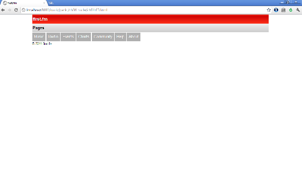
<!doctype html> <html> <head> <title>first.fm</title> <meta charset="utf-8"> <meta name="viewport" content="width=device-width, initial-scale=1.0"> <link rel="stylesheet" href="css/style.css?v=1"> <script>Modernizr.mq('(min-width:0)') || document.write("<scriptsrc='js/respond.min.js'>\x3C/script>")</script> </head> <body> <header> <h1>first.fm</h1> </header> <div id="main"> <h2>Pages</h2> <nav> <ul class="list clearfix"> <li class="list"><a href="music.html">Music</a></li> <li class="list"><a href="radio.html">Radio</a></li> <li class="list"><a href="events.html">Events</a></li> <li class="list"><a href="charts.html">Charts</a></li> <li class="list"><a href="community.html">Community</a></li> <li class="list"><a href="help.html">Help</a></li> <li class="list"><a href="about.html">About</a></li> </ul> </nav> </div> <footer> <small>© 2011 first.fm</small> </footer> </body></html>If you render the page on a mobile device, this page will look exactly the same as the previous recipe. But if you render it in a desktop browser, it will look similar to the following:
How it works...
At the top of the file, we used Modernizr to first detect if Media Queries are supported by the current browser. If not, we will load respond.min.js:
<script>Modernizr.mq('(min-width:0)') || document.write("<script src='js/respond.min.js'>\x3C/script>")</script>At the time of writing, you need to have the /*/mediaquery*/ comment at the end of the rule for it to work. This might be improved in future versions of respond.js:
@media only screen and (min-width: 800px) { }/*/mediaquery*/There's more...
On the Mobile Boilerplate site, I have explained further about Media Queries, and you can find the slides at: html5boilerplate.com/mobile.
Andy Clarke created 320 and Up, which is also based on the idea of responsive design. You can download it at: stuffandnonsense.co.uk/projects/320andup.
Optimising polyfills script loading
Target device: cross-browser
Script loading is important to any browser, but more so for mobile devices because of the low bandwidth. Modernizr comes with a dynamic loading solution.
Getting ready
First, let's create an HTML document and name it ch03r04.html.
How to do it...
Enter the following code in your code editor, and run it.
<!doctype html> <html> <head> <title>first.fm</title> <meta charset="utf-8"> <meta name="viewport" content="width=device-width,initial-scale=1.0"> <script src="js/modernizr.custom.54685.js"></script> <style> </style> </head> <body> <header> <h1>Your Location</h1> </header> <div id="main"> Your Geo Location is: <span id="geo"></span> </div> <script src="//ajax.googleapis.com/ajax/libs/jquery/1.5.2/jquery. js"></script> <script> yepnope({ test : Modernizr.geolocation, nope : ['js/geolocation.js'], complete: function () { navigator.geolocation.getCurrentPosition(function(position) { document.getElementById('geo').innerHTML = position.coords.latitude+", "+position.coords.longitude; }); } }); </script> </body></html>How it works...
At the time of writing, Modernizr 2.0 Preview was in Beta 1. In this beta release, there are two great new features. One is that you can choose to customise the features that you want to detect. The other great feature is that you can have yepnope.js (also known as Modernizr.load by Alex Sexton and Ralph Holzmann). Yepnope.js provides a dynamic JavaScript loader, and you can learn more about it in the There's more section of this chapter.
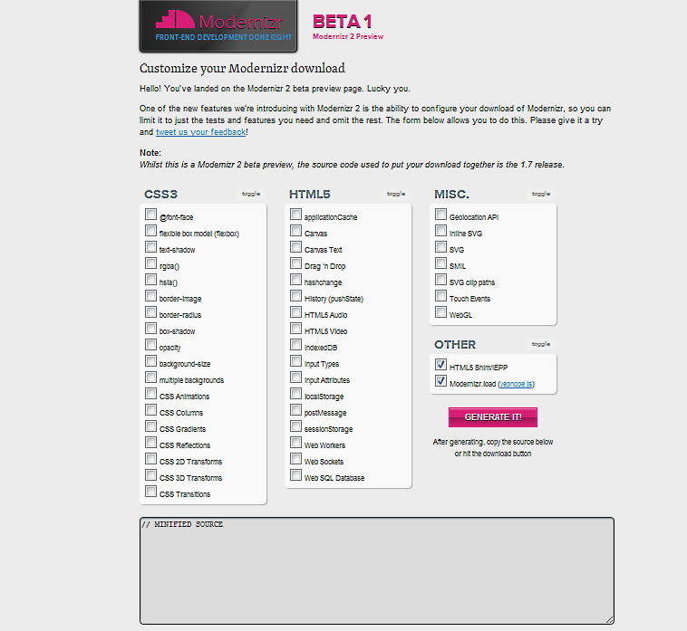
With Modernizr, we could first detect if a feature already exists or not in the current user agent:
test : Modernizr.geolocationIf it doesn't exist, we will load the shim geolocation.js using yepnope. And on
completion, we could append the latitude and longitude:
yepnope({ test : Modernizr.geolocation, nope : ['js/geolocation.js'], complete: function () { ...});There's more...
There are a couple of optional resources that will be helpful to developers. Modernizr test suite is one of them. It is useful in helping developers know at a glance what features are supported on a certain device. You can find out more at:
modernizr.github.com/Modernizr/test/index.html
yepnope
yepnope is an asynchronous conditional resource loader that's super-fast and enables you to load only the scripts that your users need. To find out more about it, go to:
Applying user agent detection
Target device: cross-browser
When developing a mobile site, it's good to have user agent detection. This could help you with redirection script or help you to determine if you want to load/not to load something based on user agent.
Getting ready
First, let's see how you could tell if a user could redirect from one site to another based on user agent detection. There are a couple of ways to do this: You could do this in the server config, in your server-side programming language, or use it from the frontend JavaScript.
How to do it...
You can download the redirection script from: detectmobilebrowser.com. It comes with many different versions. In this example, let's use the Apache config .htaccess.
How it works...
Once you download the file and open it, you will see script as follows:
RewriteEngine On RewriteBase /RewriteCond %{HTTP_USER_AGENT} android|avantgo|blackberry|blazer|comp al|.... |up\.(browser|link)|vodafone|wap|windows\ (ce|phone)|xda|xiino [NC,OR] RewriteCond %{HTTP_USER_AGENT} ^(1207|6310|6590|.... |your|zeto|zte\-) [NC] RewriteRule ^$ http://example.com/mobile [R,L]To redirect a desktop site to a mobile site, one could change the http://example.com/mobile to your site address.
There's more...
User agent detection is not only useful for redirecting sites, it's also useful when you are trying to determine if something should be loaded in the first place, based on the user agent.
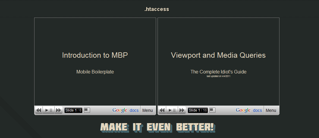
When building the Mobile Boilerplate site, I used the JavaScript version of the detection script to determine if the site should render the embedded content based on the user agent (mobile or desktop):
if(!jQuery.browser.mobile) { ...}With this script for desktop browsers, the slides are loaded and displayed as follows:
On the mobile version, it is not displayed:
Methods of mobile browser detection
An article on mobile tuts explains different methods of mobile browser detection:
mobile.tutsplus.com/tutorials/mobile-web-apps/mobile-browser-detection.
Adding mobile bookmark bubble to the home page
Target device: iOS
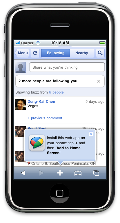
In the previous chapters, we have talked about the ability to bookmark your site on certain mobile devices. Although this is a pretty cool feature to bring web apps a step closer to native apps, there is one issue with it: there isn't an API you can use to call the bookmark action, so many users simply are not aware of such a feature on their phone. To tackle this issue, a couple of frameworks provide a bookmark bubble using CSS and JavaScript. The script adds a promo bubble to the bottom of your web app page, asking users to bookmark the web app to their device's home screen.
Getting ready
As mentioned, many frameworks provide this feature, but for simplicity's sake, let's use one that is standalone. Google released an open source library named The Mobile Bookmark Bubble for this task. First, let's download it at: code.google.com/p/mobile-bookmark-bubble.
How to do it...
The library comes with a sample.js. Just include both bookmark_bubble.js and the sample.js in any webpage created; you would then see something as follows:
How it works...
The library uses HTML5 local storage to track whether the promo has already been displayed, to avoid constantly nagging users. The current implementation of this library specifically targets Mobile Safari, the web browser used on iPhone and iPad devices.
Building Contact page with textarea and autogrow forms
Target device: cross-browser
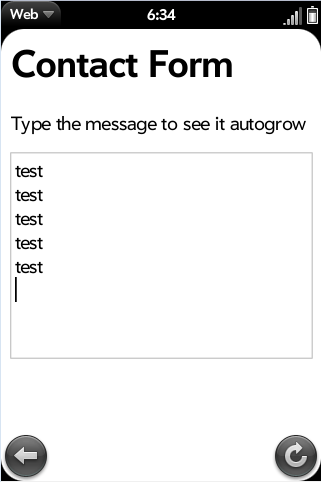
On native apps such as SMS, the text area grows automatically. On mobile web, if you create a textarea, you will realize it is a fixed size. When the lines of text you type exceed the textarea height, it becomes very hard to see the text. In this example, we will see how we could create a textarea that autogrows when you are typing in more lines.
Getting ready
First, let's create an HTML document and name it ch04r05.html. In this example, we will use helper.js in Mobile Boilerplate: https://github.com/h5bp/mobile-boilerplate
How to do it...
Enter this code in the file:
<!doctype html> <html> <head> <title>first.fm</title> <meta charset="utf-8"> <meta name="viewport" content="width=device-width, initial-scale=1.0"> <style> #contact {width:220px; height:40px;} </style> </head> <body> <header> <h1>Contact Form</h1> </header> <div id="main"> <p>Type the message to see it autogrow</p> <textarea id="contact"> </textarea> </div> <script src="//ajax.googleapis.com/ajax/libs/jquery/1.5.2/jquery. js"></script> <script src="//github.com/shichuan/mobile-html5-boilerplate/raw/ master/js/mylibs/helper.js"></script> <script> var contact = document.getElementById("contact"); MBP.autogrow(contact); </script> </body></html>The following is a screenshot of how it renders in Palm webOS:
How it works...
In the script, we have key-up event listener. This will detect if the textarea height has changed. We measure the height of the content and if it's changed, we will change the CSS style of the textarea to increase the height.
There's more...
The original concept is from Google's Code blog. You can read more about it at:
googlecode.blogspot.com/2009/07/gmail-for-mobile-html5-series.html.
Making buttons with instant response
Target device: iOS, Android
On a mobile device browser, button response can be slightly slower than on a native application. On mobile browsers, there is a touchstart event. By detecting this event instead of the click event, it will make the clicking faster.
Getting ready
In this example, we will use a function in Mobile Boilerplate. Create a file called ch04r06.html.
How to do it...
The following code will create a form with a submit button:
<!doctype html> <html> <head> <title>first.fm</title> <meta charset="utf-8"> <meta name="viewport" content="width=device-width,initial-scale=1.0"> <style> #contact { width:220px; height:40px; } </style> </head> <body> <header> <h1>Contact Form</h1> </header> <div id="main"> <textarea id="contact"></textarea><br /> <button id="btn">INSTANT button!!!</button><br /> <span id="result"></span> </div> <footer> <small>© 2011 first.fm</small> </footer> <script src="//ajax.googleapis.com/ajax/libs/jquery/1.5.1/jquery. js"></script> <script src="//github.com/shichuan/mobile-html5-boilerplate/raw/ master/js/mylibs/helper.js"></script> <script> var btn = document.getElementById("btn"); MBP.fastButton(btn,showForm); function showForm() { $("#result").html("Thank you for submitting, we will get back to you shortly!"); } </script> </body> </html>How it works...
The following is the excerpt of the fast button function, and here we will see how the function works.
At the top, we have the main function defined. This is only used if addEventListener is supported, where it listens to touchstart and click events:
MBP.fastButton = function (element, handler) { this.element = element; this.handler = handler; if (element.addEventListener) { element.addEventListener('touchstart', this, false); element.addEventListener('click', this, false); }};MBP.fastButton.prototype.handleEvent = function(event) { switch (event.type) { case 'touchstart': this.onTouchStart(event); break; case 'touchmove': this.onTouchMove(event); break; case 'touchend': this.onClick(event); break; case 'click': this.onClick(event); break; }};The onTouchStart method is used to listen to touchmove and touchend events. stopPropagation is used to stop the propagation of the event in the listeners, so that it stops bubbling up:
MBP.fastButton.prototype.onTouchStart = function(event) { event.stopPropagation(); this.element.addEventListener('touchend', this, false); document.body.addEventListener('touchmove', this, false); this.startX = event.touches[0].clientX; this.startY = event.touches[0].clientY; this.element.style.backgroundColor = "rgba(0,0,0,.7)";};touchmove is used to test if the user is dragging. If users drag past 10 px, we will reset it:
MBP.fastButton.prototype.onTouchMove = function(event) { if(Math.abs(event.touches[0].clientX - this.startX) > 10 || Math.abs(event.touches[0].clientY - this.startY) > 10) { this.reset(); }};The following code prevents ghost clicks and invokes the actual click handler:
MBP.fastButton.prototype.onClick = function(event) { event.stopPropagation(); this.reset(); this.handler(event); if(event.type == 'touchend') { MBP.preventGhostClick(this.startX, this.startY); } this.element.style.backgroundColor = "";};MBP.fastButton.prototype.reset = function() { this.element.removeEventListener('touchend', this, false); document.body.removeEventListener('touchmove', this, false); this.element.style.backgroundColor = "";};There's more...
You can read more about fast button at Google's blog. It explains in detail the background and theory behind the idea at: code.google.com/mobile/articles/fast_buttons.html.
Hiding WebKit chrome
Target device: iOS, Android
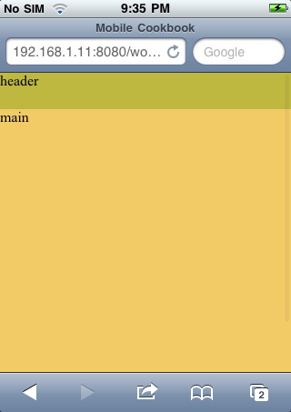
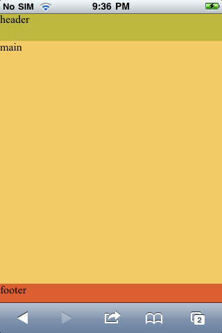
The URL bar at the top of mobile Safari on iOS and Android uses a large space. Many developers will hide it on page load as mobile real estate is limited. Every pixel is important and, by hiding the URL bar, it helps you to leverage every pixel on the screen to maximise the display area.
Getting ready
First, let's create an HTML document and name it ch04r07.html.
How to do it...
Enter this code:
<!doctype html> <html> <head> <title>Mobile Cookbook</title> <meta charset="utf-8"> <meta name="viewport" content="width=device-width,initial-scale=1.0"> <style> html,body,header,footer{ padding:0; margin:0; } header{ height:40px; background:#BFB840; display:block; } #main{ height:350px; background:#F2CB67; } footer{ height:40px; background:#DB5E31; display:block; } </style> </head> <body> <header> header </header> <div id="main"> main </div> <footer> footer </footer> <script src="//ajax.googleapis.com/ajax/libs/jquery/1.5.1/jquery. js"></script> <script src="//github.com/shichuan/mobile-html5-boilerplate/raw/ master/js/mylibs/helper.js"></script> <script> //MBP.hideUrlBar(); </script> </body></html>Now if you render it in the browser, it will look like this:
Now uncomment the following line:
MBP.hideUrlBar();Render the content again and you can see the chrome is now hidden, allowing the footer to display:
How it works...
The following is the script inside Boilerplate:
MBP.hideUrlBar = function () { var win = window, doc = win.document;// If there's a hash, or addEventListener is undefined, stop hereif( !location.hash || !win.addEventListener ){ //scroll to 1 window.scrollTo( 0, 1 ); var scrollTop = 1,//reset to 0 on bodyready, if needed bodycheck = setInterval(function(){ if( doc.body ){ clearInterval( bodycheck ); scrollTop = "scrollTop" in doc.body ? doc.body.scrollTop : 1; win.scrollTo( 0, scrollTop === 1 ? 0 : 1 ); } }, 15 ); win.addEventListener( "load", function(){ setTimeout(function(){ //reset to hide addr bar at onload win.scrollTo( 0, scrollTop === 1 ? 0 : 1 ); }, 0); }, false ); }};It detects if there is any hash in the URL. If there is, we will stop running the script because it means there is an inline anchor. If there isn't any hash, we will wait for a second and if there isn't scrolling, Android uses 1 px y pos for hiding, while it's 0 in iOS. The script normalises the two. It's made by Scott Jehl at: gist.github.com/1183357.
Building a mobile sitemap
Target device: cross-browser
Many developers are familiar with Google Sitemap. As the biggest search engine, making sure it gets our content is very important. For mobile SEO purposes, Google came up with Mobile Sitemap. Google recommends that people update their mobile sitemaps to the format described next.
Getting ready
First, let's create an XML document and name it sitemap.xml.
How to do it...
We can add the following code to the XML document. For the particular site you have, the URL should be the URL of your pages:
<?xml version="1.0" encoding="UTF-8" ?> <urlset xmlns="http://www.sitemaps.org/schemas/sitemap/0.9" xmlns:mobile="http://www.google.com/schemas/sitemap-mobile/1.0"> <url> <loc>http://mobile.example.com/article100.html</loc> <mobile:mobile/> </url> </urlset>All the URLs are enclosed inside <loc></loc>.
Make sure you have included <mobile:mobile/>. Otherwise, sites will not be properly crawled.
How it works...
Sitemaps follow a particular schema; the aforementioned XML schema is used to tell Google search engine the location of the mobile web page. Normally, if a site is built using a CMS system, there should be a way to auto-generate the URLs, and they should all be listed within <loc></loc>.
There's more...
Mobile sitemap cannot contain desktop-only URLs. However, it can contain content for both desktop and mobile.
For websites with dedicated mobile content and a dedicated URL, you may direct users from example.com to m.example.com. In this case, use a 301 redirect for both users and Googlebot-Mobile.
If you serve all types of content from example.com, this is not considered cloaking by Google.
Google and mobile-friendly site building
On the Google Webmaster site, there is a blog post about how to make websites mobile friendly: googlewebmastercentral.blogspot.com/2011/02/making-websites-mobile-friendly.html.
Google and mobile site indexing
There is another blog on Google Webmaster site, which talks about how to help Google index your mobile site: googlewebmastercentral.blogspot.com/2009/11/help-google-index-your-mobile-site.html.

Thank you for reading 5 articles this month* Join now for unlimited access
Enjoy your first month for just £1 / $1 / €1
*Read 5 free articles per month without a subscription

Join now for unlimited access
Try first month for just £1 / $1 / €1

The Creative Bloq team is made up of a group of art and design enthusiasts, and has changed and evolved since Creative Bloq began back in 2012. The current website team consists of eight full-time members of staff: Editor Georgia Coggan, Deputy Editor Rosie Hilder, Ecommerce Editor Beren Neale, Senior News Editor Daniel Piper, Editor, Digital Art and 3D Ian Dean, Tech Reviews Editor Erlingur Einarsson, Ecommerce Writer Beth Nicholls and Staff Writer Natalie Fear, as well as a roster of freelancers from around the world. The ImagineFX magazine team also pitch in, ensuring that content from leading digital art publication ImagineFX is represented on Creative Bloq.
