Build a CSS dropdown menu
Aaron Gustafson explains how to build a progressively-enhanced, CSS-based dropdown that works as part of a responsive design.
- Knowledge needed: Basic HTML, intermediate CSS
- Requires: Text editor, devices and/or emulators at your discretion
- Project time: 30 minutes
- Support file
Figuring out the best way to optimise navigation for mobile devices is downright challenging. Our community has come up with a ton of different approaches for addressing this issue, each with its own set of pros and cons.
In the past, I’ve frequently advocated for converting traditional list-based navigation into a select for mobile (see example below). It’s a simple concept that is easy to implement and I love the elegance of the approach, but the fact that you need to rely on JavaScript to make it usable never really sat well with me. Being an ardent advocate of progressive enhancement, I knew there had to be a better way.

I have always been enamoured of pure CSS dropdown menus, but they have traditionally relied on :hover. And hover, as you know, is irrelevant in touch-based scenarios, so that seemed like a dead end. But then it dawned on me: :target was the answer to my prayers.
As you probably know, the target pseudo-class selector (:target) allows you to apply styles to elements referenced in the fragment identifier of a URL. For example:
http://website.tld/my-page/#content
In this URL, the fragment identifier is “content”, which will make the browser scroll to bring an element with an id of “content” into view. Easy-peasy. We can then apply styles to that element when it is targeted, using :target:
:target {
background: #F6FD86;
}
Get the Creative Bloq Newsletter
Daily design news, reviews, how-tos and more, as picked by the editors.
When Nichols College approached my company about redesigning their prospective student microsite, the project presented the perfect opportunity to test out my theory about :target.
01. The design
The microsite is really only two pages – a form for collecting information about a prospective student and a thank you page that assembles relevant information about Nichols College’s programs based on her responses – but it includes a plethora of navigation links to help her do things like schedule a visit, begin the application process, or get directions to the school. In addition to those critical navigation pieces, the site also features a collection of navigation links that provide access to more of what I’d call “flavour” about the school.
It was a lot to juggle, but we started with the content, naturally, organising the page so users had immediate access to the stuff they were actually there to read and/or engage with before presenting them with any navigation:
- Site Banner
- Content
- Calls to action
- Contact mechanisms
- Links to specific school pages
- Social networks
- Search
- Copyright, etc.
This approach fits in perfectly with Luke Wroblewski’s “mobile first” mantra and the idea of presenting content up front and then allowing a user to pivot from there. This content-first approach led to our media query-less baseline layout, directed at feature phones.
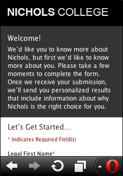
As we’re all too aware, on small-screen devices, real estate is at a premium, so we were constantly looking for opportunities to streamline the experience for our users. Being that smartphones tend to have better CSS support than feature phones, we decided to tuck the less important links behind a menu icon, exposing them only when it was clicked, very much like the old CSS dropdown menus. It’s a common design pattern on the mobile web, but every implementation I’d seen so far required JavaScript. I wanted to see if I could craft an equivalent experience using only CSS (and without resorting to hacks involving a hidden form control).
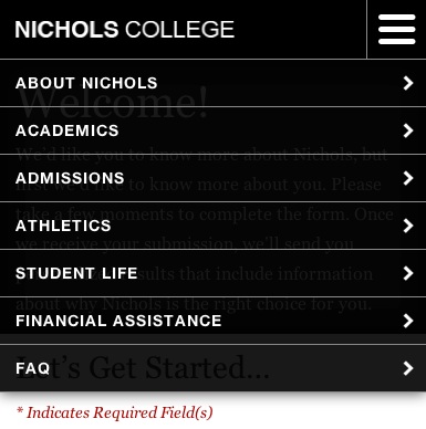
I’ll walk through the CSS, but first I should note that the following styles were placed in a style sheet aimed at medium-width devices, starting at 19.375ems. The majority of these rules were tucked within an additional media query inside that style sheet which limited their application to widths of less than 46ems (which was wide enough to support an alternate layout for this particular nav). This isolation technique ensures the rules don’t “bleed out” unnecessarily into alternate layouts.
<link rel="stylesheet" href="/c/medium.css" media="screen and (min-width:19.375em)"/>
@media screen and (max-width:46em) {
/* Rules go here */
}
02. Let’s dig in
The first step was applying the styles to reposition the nav to the top of the page:
#nav {
margin: 0;
position: absolute;
top: 0;
right: 0;
left: 0;
z-index: 1000;
}
Note: I’ve removed irrelevant styles so you can focus on the important pieces.
I then set up the links to appear collapsed, except in the event that the nav was the current target:
#nav a {
border-bottom-width: 0;
overflow: hidden;
height: 0;
line-height: 0;
padding: 0 1em;
}
#nav:target a {
border-bottom-width: 1px;
line-height: 3em;
height: 3em;
}
With those rules in place, I could manually manipulate the URL to toggle the menu open and closed, but that isn’t a reasonable requirement in a real-world scenario. I needed to create a link that would target the navigation list, but I wanted to do so without adding extra cruft to the document. After all, there’s no point in an element being on the page if it's only useful in one scenario. Thankfully, an old standby was perfectly suited to the task.
03. “Skip to” the rescue
In the early days of the web, we often employed “skip to content” links as a means of allowing our users to skip over the site navigation and get to the meat of the page. With a content-first approach, a “skip to navigation” link is equally useful for giving users direct access to navigation without having to put it all at the top of the page. The great thing about “skip to” links is that they work by manipulating the fragment identifier of the URL and, thereby, allow us to use :target. Voila!
First, I added a “skip to” link near the top of the page:
<header>
<-- Logo -->
<a id="jump" href="#nav">Site Navigation</a>
</header>
Then I styled it to look like the little menu button in the upper right hand corner of our design:
#jump {
background: #000 url(/c/i/nav.png) 50% 50% no-repeat;
border: 1px solid #8b8b8b;
border-width: 0 0 1px 1px;
cursor: pointer;
display: block;
padding: 0;
height: 53px;
width: 53px;
text-indent: -999em;
position: absolute;
right: 0;
top: 0;
}
It’s worth noting that this link is even useful for feature phones as it allows them to jump right down to the navigation. (You can see this simple approach employed by Contents Magazine and Bagcheck. For the pros and cons, consult Brad Frost’s mobile navigation scheme roundup.)
With the toggle button in place, I had a nifty way of making the nav appear, but no way to make it disappear again.
After pondering that problem for a while the ridiculously simple solution dawned on me: include a “back to content” link at the end of the navigation list. Clicking that link would make #nav no longer the target, and the list would collapse.
<ul id="nav" tabindex="0">
<!-- Nav items -->
<li id="back"><a href="#top">Back to top</a></li>
</ul>
Easy enough, but that only solved part of the problem. We don’t want a user to have to hunt through a list to find a link that lets them close the dropdown menu; instead we want it to behave as a user would expect: tapping or clicking outside the dropdown menu area should collapse the nav again. Thankfully, with a little z-index juggling and a touch of clever positioning it’s possible to place the link beneath the other nav items and expand it to fill the remainder of the screen (invisibly, of course). Here’s a sampling of the relevant style rules:
#jump {
/* make sure the menu button is on top */
z-index: 1001;
}
#nav {
/* the nav sits behind the menu button */
z-index: 1000;
}
#nav:target {
/* unless it’s showing */
z-index: 1001;
}
#nav:target a {
/* make nav links sit up a level */
position: relative;
z-index: 1;
}
#back {
/* establish a positioning context for the closer */
position: relative;
}
#back a {
/* turn the link into a ghost */
background: transparent;
border: 0;
text-indent: -999em;
/* make it fill the screen */
position: absolute;
top: -101em;
bottom: -101em;
left: 0;
right: 0;
/* ensure it sits behind the other links */
z-index: 0;
}
With that in place, the menu was fully-functional. It just needed a little refinement.
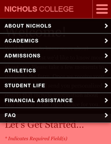
04. Housekeeping
In order to spiff up the appearance of the interface, I opted to add a simple transition to the links, allowing them to grow vertically when the nav is targeted:
#nav:target a {
-moz-transition: height .25s, line-height .25s;
-ms-transition: height .25s, line-height .25s;
-o-transition: height .25s, line-height .25s;
-webkit-transition: height .25s, line-height .25s;
transition: height .25s, line-height .25s;
}
With the addition of that little transition, the nav performed beautifully, but I was still a little concerned about potential style bleed. Sure, if a browser supports media queries, it probably supports :target, but just in case, I opted to preface every relevant style rule with body:not(:target) (which would only be matched if the browser supported target selection). Here’s an example:
body:not(:target) #nav {
/* these styles are only applied if :target and :not are
understood (and the body is not targeted, of course) */
}
And there you have it: a simple progressively-enhanced, CSS dropdown menu that works wonderfully as part of a responsive design. I hope you find this approach as handy as I do.
Aaron Gustafson is the founder and principal consultant of Easy! Designs, a web development consultancy. He is also group manager of the Web Standards Project (WaSP), an invited expert to the W3C’s Open Web Education Alliance, a speaker, and an author.
Like this? Read these!
- Illustrator tutorials: amazing ideas to try today!
- Great examples of doodle art
- Brilliant Wordpress tutorial selection
What do you think about dropdown menus - good idea or needless clutter? Let us know in the comments below!

Thank you for reading 5 articles this month* Join now for unlimited access
Enjoy your first month for just £1 / $1 / €1
*Read 5 free articles per month without a subscription

Join now for unlimited access
Try first month for just £1 / $1 / €1

The Creative Bloq team is made up of a group of design fans, and has changed and evolved since Creative Bloq began back in 2012. The current website team consists of eight full-time members of staff: Editor Georgia Coggan, Deputy Editor Rosie Hilder, Ecommerce Editor Beren Neale, Senior News Editor Daniel Piper, Editor, Digital Art and 3D Ian Dean, Tech Reviews Editor Erlingur Einarsson, Ecommerce Writer Beth Nicholls and Staff Writer Natalie Fear, as well as a roster of freelancers from around the world. The ImagineFX magazine team also pitch in, ensuring that content from leading digital art publication ImagineFX is represented on Creative Bloq.
