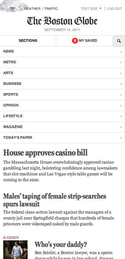
Behind Boston Globe's responsive layout
Filament Group takes us behind the scenes of Boston Globe's new site, built with responsive web design
Boston Globe has launched a snazzy new website, in an attempt to create a more immersive news-reading experience, on a platform that appropriately features long-format journalism and better promotes a subscription-based business model. That's all lovely for readers, but the site also has a modern, adaptive design that will make many web designers swoon (or go green with envy).
Load up the site and drag the window about; note how the newspapery and readable design effortlessly reworks its columns, and how the navigation works in its narrowest form. Lovely. We wanted to find out more, so quizzed some of the people behind the build: Filament Group's partner Patty Toland and two designer/developers, Scott Jehl and Mat Marquis.
"The visual design direction was established by Globe design director Miranda Mulligan, along with the design team at Boston-based firm Upstatement, led by Tito Bottitta," says Toland. "Their primary goals were to support and extend the established Globe brand, and to create a layout that lets the news content, images and multimedia take the lead." The clean, relatively ad-free layout arrived from the Globe's decision to "embrace a new subscription business model, with light and selective advertising", further enabling the content to take centre stage, for a better reading experience.
Adaptive design

The challenge for Filament was to take this visual direction and apply a responsive framework that interpreted that direction appropriately for target devices. "The adaptive, or responsive, approach is an extension of the thinking introduced in Ethan Marcotte's article, Responsive Web Design," explains Jehl. "Throughout the Globe site, each portion of the layouts was approached responsively, which meant adapting not only the visual layout, but the behaviour of the components, so the interaction felt intuitive and natural within each breakpoint."
Jehl says this involved collapsing content vertically, such as the global navigation, enabling touch-based features for photo galleries and carousels. The team also worked hard to layer additional accessibility features: keyboard navigation and a meaningful audible interface for users with disabilities, such as blindness.
The benefits of the approach reached wider than expected. "One of my favourite things about the project was hearing that on a Nintendo DS, which we never tested against, the site runs great! Because we check against screen size for layout changes and the existence of individual features to determine what functionality we serve up, we were able to deliver a tailored experience to a device we never specifically accounted for. This proved the design could withstand even edge-case unknowns," enthuses Marquis. "The downside is that this robbed me of my running joke about testing on a Game Boy. But, small price to pay," he adds.
Design challenges
Creating a responsive design for such a complex, content-rich site naturally presented many obstacles. Jehl said one particularly gruelling example was getting the responsive layout to work properly in browsers that don't understand CSS3 media queries, which include Internet Explorer 6, 7 and 8. The result of the team's work in enabling ageing versions of Microsoft's browser to scale the layout from the mobile-first starting point is open-source project Respond.js, which Jehl calls "a lightweight script that patches CSS3 media query support into browsers".
Get the Creative Bloq Newsletter
Daily design news, reviews, how-tos and more, as picked by the editors.
Responsible asset loading was also critical, the site serving the least JavaScript possible upfront, then 'lazily' loading the rest while the content was available for use. "We built a small framework to manage asset loading, and every browser and device receives a different package of assets depending on its capabilities and constraints," explains Jehl.
Images also had to be dealt with intelligently; the site initially delivers a mobile-friendly size, but swaps this out for a larger image when bigger displays are used, also ensuring only one image size is downloaded, to prevent unwanted overhead. Again, the approach has been released open-source, as revealed on the Filament Group blog.
"Lastly, integrating third-party ads and videos was tricky because much of the code is out of our hands, and not particularly clean or lightweight," says Jehl. The team's response to this issue was to ensure readers came first: ads had to load without blocking content, and ad placement was adjusted in each layout, balancing the reader's experience and ad visibility.

Thank you for reading 5 articles this month* Join now for unlimited access
Enjoy your first month for just £1 / $1 / €1
*Read 5 free articles per month without a subscription

Join now for unlimited access
Try first month for just £1 / $1 / €1

The Creative Bloq team is made up of a group of art and design enthusiasts, and has changed and evolved since Creative Bloq began back in 2012. The current website team consists of eight full-time members of staff: Editor Georgia Coggan, Deputy Editor Rosie Hilder, Ecommerce Editor Beren Neale, Senior News Editor Daniel Piper, Editor, Digital Art and 3D Ian Dean, Tech Reviews Editor Erlingur Einarsson, Ecommerce Writer Beth Nicholls and Staff Writer Natalie Fear, as well as a roster of freelancers from around the world. The ImagineFX magazine team also pitch in, ensuring that content from leading digital art publication ImagineFX is represented on Creative Bloq.
