Animated CSS effects with fallbacks
New CSS3 modules enable cool effects, but what about browsers that don’t support them? Opera’s Chris Mills demonstrates a few examples – and styling alternatives via Modernizr.
- Knowledge needed: Intermediate CSS, basic JavaScript, advanced HTML
- Requires: A decent text editor, a modern web browser
- Project Time: As long as you can bear to work on it
- Support file
This article first appeared in issue 232 of .net magazine.
Because I’m generous to a fault, this month I’m going to share with you some material taken from my book – Practical CSS3: Develop and Design – and, more specifically, from the CSS animations chapter. I am a huge fan of CSS transitions, transforms and animations, but up until now I’ve mainly seen them used to create skip intro type stuff.
Being the pragmatic type, I have been exploring them mostly from more of a real-world perspective, thinking about how they can be used to create usable features on web pages. And of course, we need to consider what happens when older browsers that don’t support these features access your pages. Sometimes we can rely on graceful degradation, but sometimes we need to deal with such browser differences in a more intelligent way.
To this end, in this tutorial I’m going to present to you a couple of fun (and hopefully useful) examples that make use of CSS3 transforms, transitions and animations, and use Modernizr to serve alternative styles to older, non-supporting browsers.
01. A 3D rotating business card
To start with, let’s look at a business card that flips over with a 3D transform (with realistic dimensions sized in millimetres!). You can find a finished example in the file two-faced-cheek.html.
The markup is pretty simple:
<div id="wrapper" tabindex="0">
<div id="inner-wrapper">
<div id="front">
</div>
<div id="back">
</div>
</div>
</div>
In this case, the inner wrapper is used for the sizing and positioning, and the whole design work is applied to the two front and back divs for the front and back of the card. The outer wrapper div is there to add hover and other state change effects to.
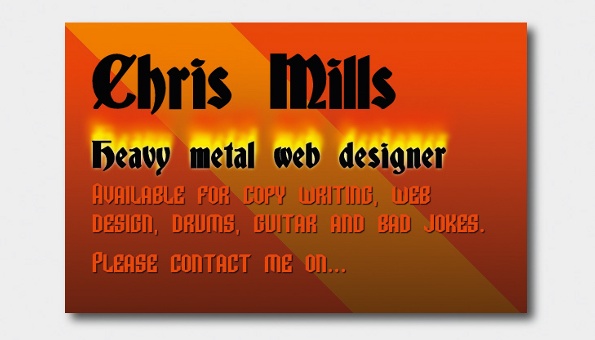
The div contents are unimportant for the purposes of this example, although for a real business card you’d probably want to mark up the contact details in a more useful way – by using an hCard microformat, for example. We’ll first set a transition on the inner wrapper and then tell it to preserve the 3D space:
#inner-wrapper {
...
transition: 1.5s all;
transform-style: preserve-3d;
}
Sign up to Creative Bloq's daily newsletter, which brings you the latest news and inspiration from the worlds of art, design and technology.
Next, set backface-visibility: hidden; on both the front and back <div>:
#front, #back {
...
backface-visibility: hidden;
}
Then set up the default state of the business card:
#front {
transform: rotateX(0deg);
z-index: 2;
}
#back {
transform: rotateX(180deg);
}
The front of the card doesn’t need to be rotated for its default state. However, I’ve applied a rotateX(0deg); transform to it because it seems to solve a problem in Firefox where some of the content on the front of the card is displayed in reverse when the card flip is triggered, even with backface-visibility: hidden; applied. Weird but true.
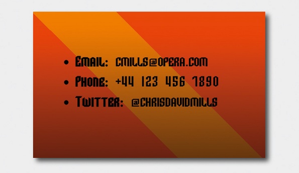
The back of the card is rotated around the X axis by 180 degrees by default, because you’ll want it to be invisible by default (backface-visibility: hidden;) and upside down. We also need z-index on the front to make it appear at the front. By default, it would appear behind the back face because the back face comes later on in the source order.
The last step is to rotate the whole business card by 180 degrees when it is moused over/focused:
#wrapper:hover #inner-wrapper, #wrapper:focus #inner-wrapper {
transform: rotateX(180deg);
}
This produces the result shown in the two images on the opposite page.
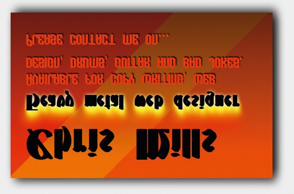
To demonstrate why backface-visibility: hidden; is essential in such situations, try removing the line from the code and reloading. If backfacevisibility: hidden; is not employed, the effect is spoiled, resulting in the content of both sides being visible at all times or something else unexpected happening (see image above).
02. Providing alternative styles
By default, the card flip example relies on a 3D transform in order that sighted viewers are able to see both sides of the card. But this is no good for browsers that don’t support 3D transforms. To provide alternative styles to older browsers, we’ll apply Modernizr to our page (see two-faced-cheek-modernizr.html in the code files).
Non-supporting browsers will get a class of no-csstransforms3d appended to their <head> classes, so you can provide alternative styling as below:
.no-csstransforms3d #wrapper:hover #front, .no-csstransforms3d
#wrapper:focus #front {
transform: rotate(-30deg) translate(-50%,-100%);
transition: 0.8s all ease-in;
}
The descendant selector applies a 2D transform to the front face of the card only when it is a descendant of .no-csstransforms3d (3D rotation supporting browsers will ignore this styling). This alternative styling gives non-supporting browsers access to the back of the card like this (see top right).
But what about older browsers such as IE8 or Camino that won’t support rem units, gradients, transforms or text shadow? Modernizr won’t help with rem units, so the best way to deal with them is to provide a pixel-size fallback just before the rem unit version of your property in the same stylesheet, or better still in an IE-fixes stylesheet hidden inside an IE conditional comment.
margin-top: 5px;
/* the fallback */
margin-top: 0.5rem;
/* the original */
For other CSS features, you’ll need to include at least the following CSS:
.no-csstransforms #wrapper:hover #front,.no-csstransforms #wrapper:focus
#front {
margin-left: -350px;
}
.no-cssgradients #front, .no-cssgradients #back {
background: #FF3500;
}
.no-cssgradients #front p, .no-cssgradients #back p {
/* ideally should be .no-textshadow, but this
didn’t seem to work for me */
color: #000000;
}
The first rule applies an updated :hover/:focus rule to the flip card so that if the browser doesn’t support 2D transforms, hovering or focusing the card will move the front over by 350 pixels to reveal the back. The second provides a solid colour to replace the gradient background in non-supporting browsers. The third rule colours the text black, so it’s readable without the shadows.

03. CSS animations and JavaScript
One of the ways I foresee CSS animations being useful is to declare them inside your CSS then trigger them via JavaScript. To demonstrate this, I created an interesting form example (see animated-form.html and animated-form.css in the code files). Let’s face it, we hate coding forms and are always looking for ways to make them more usable and space efficient! This example also demonstrates how to use the Modernizr JavaScript API.
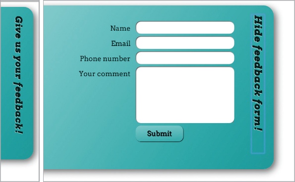
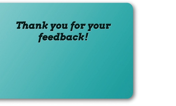
There is nothing remarkable about the HTML for this example. The bulk of it is a very simple, four-input form with a Submit button. But if you look at the code you’ll notice that I’m using a very similar setup to the business card example discussed above. The front face has the form elements in it, whereas the back face has a ‘Thank you for your feedback!’ message in it:
<form id="feedback-form" action="#" class="">
<div id="front">
<h1>Give us your feedback!</h1>
<div>
<label for="name" tabindex="0">…</label>
<input type="text" name="name" id="name">
</div>
</div>
<div id="back">
<h2>Thank you for your feedback!</h2>
</div>
</form>
The difference is that instead of animating it via a transition and triggering it on hover/focus via pseudo-classes, I’ve used a CSS animation, like this:
@keyframes form-rotate {
from {
transform: rotateX(0deg);
}
to {
transform: rotateX(180deg);
}
}
.form-rotate {
animation: form-rotate 1s forwards;
}
The animation keyframes rotate whatever the animation is applied to around the X axis by 180 degrees, and the animation is applied to any element that is given a class of form-rotate. This will be the <form>, and we’ll look at how this is done in a moment.

The other noteworthy aspect is the <h1>, and the fact that the form slides into and out of the screen when the <h1> is clicked (in browsers that support animations). To move the <h1> to its default position, we’ll use a transform:
h1 {
position: absolute;
transform: rotate(90deg) translate(9.5rem,-23rem);
}
In order to make the whole form slide in and slide out, two animations have been set up:
@keyframes form-out {
from {
transform: translateX(0rem);
}
to {
transform: translateX(38rem);
}
}
.form-out {
animation: form-out 1s forwards;
}
@keyframes form-in {
from {
transform: translateX(38rem);
}
to {
transform: translateX(0rem);
}
}
.form-in {
animation: form-in 1s forwards;
}
We haven’t applied the three classes shown above to anything yet – we’ll do this via some simple JavaScript when the Submit button and <h1> are clicked. Let’s go through the JavaScript in detail, starting at the top:
var submit = document.getElementById("submit");
var form = document.querySelector("form");
var back = document.getElementById("back");
var h1 = document.querySelector("h1");
Here, references to elements are stored on the page in the following variables:
- submit: The <input id="submit">
- form: The <form> element
- back: The back face of the form; the <div> with the #back attribute
- h1: The <h1> element
Next, we’ll set up two event listeners:
submit.addEventListener("click", rotateForm, false);
h1.addEventListener("click", formOut, false);
The first line adds an event listener to the submit variable reference, which executes the rotateForm function when the Submit button is clicked. The second line adds an event listener to the h1 variable reference, which executes the formOut function when the <h1> element is clicked.
Please note that querySelector and addEventListener are not supported by IE versions earlier than version 9. Therefore for IE 6–8 support, you’ll need to consider using different code – I’ll leave this as a reader exercise!
Now, let’s get on to the first function:
function formOut() {
if(form.className==="" || form.className==="form-in") {
if(Modernizr.cssanimations) {
form.setAttribute("class","form-out");
} else {
form.setAttribute("class","form-fallback");
form.style.left = "0rem";
}
h1.innerHTML = "Hide feedback form!";
} else {
if(Modernizr.cssanimations) {
form.setAttribute("class","form-in");
} else {
form.setAttribute("class","");
form.style.left = "-38rem";
}
h1.innerHTML = "Give us your feedback!";
}
}
I’ve used an if ... else statement to see whether the form is offscreen, and I want to move it on, or whether it is onscreen and I want to move it off. Essentially, form.className===”” || form.className===”form-in” specifies ‘if the form’s class is empty OR it is set to form-in, then it will be offscreen; therefore, run the first Modernizr test’. Meanwhile modernizr.cssanimations tests whether CSS animations are supported by the current browser. If they are, we set the form’s class value to form-out to trigger the animation that brings it onscreen.
If the Modernizr test returns false then the animation won’t work – so instead we set the left property of the form to 0rem in order to make the form appear on the screen in one go, and set the form class to form-fallback, ensuring that the second part of the function will run when the user tries to hide the form again (if you neglect to do this, the second part of the function will never run because the form class will always be blank). It’s not as nice looking, but at least it works.
The last part of this section of the code (the h1.innerHTML part) changes the text inside the <h1> element to a message telling users they can hide it again if they want to.
If the outer if test returns false, then the form must be onscreen, and the code inside the else block is executed, which runs another modernizr.cssanimations test. If this returns true, the code changes the class value to form-in to animate it offscreen again.
If it returns false, the left property is returned to its original value – to move it offscreen again in a less glamorous manner – and the form class is set to blank again to return it to its original state.
The final part of the else block changes the <h1> text back to what it was originally. Now on to the second function, rotateForm():
function rotateForm() {
if(Modernizr.cssanimations && Modernizr.csstransforms3d) {
form.setAttribute("class","form-rotate");
form.style.left = "0rem";
} else {
back.style.zIndex = "5";
}
}
Here, if Modernizr.cssanimations and Modernizr.csstransforms3d are true, setAttribute will set the <form>’s class attribute to form-rotate. This applies the rotate animation to the form, making it rotate to reveal the ‘Thank you’ message. But setting the <form>’s class to form-rotate will override the class of form-out set earlier, which would cause the form to move offscreen again; therefore, we’ve forced the form to remain onscreen by setting the left property to 0 with form.style.left = “0rem”.
If the Modernizr test isn’t true, the browser doesn’t support CSS Animations and/or 3D transforms. Therefore, I want different styling to occur when the Submit button is clicked.
In order to enable non-supporting browsers to see the ‘Thank you’ message, we’ve used back.style.zIndex = “5”; to set the z-index of the #back div to 5, making it appear above everything else in the stacking order when the Submit button is clicked. You can see how the three states I’m animating in between look in the images above and on the previous page.
Finally, some Modernizr CSS fallbacks are added to enable older browsers to make some use of the form:
.no-cssgradients #front,.no-cssgradients #back {
background-color: #009999;
}
.no-cssanimations form {
left: 0;
}
.no-csstransforms h1 {
position: static;
}
.no-csstransforms .extended-info {
display: none;
}
04. Summary
I’m certainly not expecting you to need to know JavaScript just to use CSS. If you don’t understand the JS code, just pass it to your friendly JavaScript developer and collaborate on it. He or she can probably do a much better job of this than I have.
In any case, it’s worth exploring such techniques because it’s cool to be able to handle the animation with CSS rather than having to write it all in JavaScript. Even if you use jQuery or a similar library, it is it is still a lot of weight to add to the page just for a couple of simple animations.
Discover 101 CSS and Javascript tutorials.

The Creative Bloq team is made up of a group of art and design enthusiasts, and has changed and evolved since Creative Bloq began back in 2012. The current website team consists of eight full-time members of staff: Editor Georgia Coggan, Deputy Editor Rosie Hilder, Ecommerce Editor Beren Neale, Senior News Editor Daniel Piper, Editor, Digital Art and 3D Ian Dean, Tech Reviews Editor Erlingur Einarsson, Ecommerce Writer Beth Nicholls and Staff Writer Natalie Fear, as well as a roster of freelancers from around the world. The ImagineFX magazine team also pitch in, ensuring that content from leading digital art publication ImagineFX is represented on Creative Bloq.

