15 fabulous responsive sites for your inspiration
Antony and Jerome Ribot present 15 of the best responsive sites featured in our mag's Gallery over the last six months.
A few months ago we decided to rename the "Mobile" section in the mag's showcase gallery as "Responsive". Whether you agree with Jakob Nielsen or Josh Clark or are somewhere in the middle, Responsive Web Design is an important concept and more and more businesses are taking the leap. It's a development that's not going to go away and one that deserves more coverage.
Here we compile the best responsive sites that Antony and Jerome Ribot have included in their column over the last six months. They include smaller portfolios and more personal projects alongside high profile client work.
01. Breakingnews
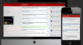
Real-time news has never been so much fun! Breakingnews.com – actually a startup from within msnbc.com – is great, live-aggregating stories from multiple news sources.
It’s broken up into three core sections, of which two are news-consumption views. ‘Popular’ offers nice big images of news stories. The more conventional ‘Latest’ area shows latest stories (‘topics’) coming through. It helps to think of topics as a kind of Twitter hashtag, but with a more human-understandable, sentence-like nature.
It may be missed by most users, but the responsive geeks will appreciate the smooth motion as the layout of the page adapts to the decreasing page width. Not too many sites do that.
02. ChoiceReponse
ChoiceResponse allows you to create one-click reply emails. The service's three-page site was designed and developed by the team over at Atlantis Technology.
In terms of challenges, designer Zhuosho Xie highlights images as the most challenging aspect of the responsive design: “It’s easy for text to rearrange itself at different widths, but to make images scale nicely in relation to the layout was more difficult. And there was also the issue of whether they’d become too small to see.”
Get the Creative Bloq Newsletter
Daily design news, reviews, how-tos and more, as picked by the editors.

03. Create Digital Media
Not all digital service companies are created equal, and Create Digital Media will add further fuel to this statement with their new site, designed by Mike Kus and developed by Ryan Taylor.
The main page has some great CSS3 animations. They look great on desktop, and surprisingly well on higher-end iOS devices too. Some other nice details worth noting are the thinning of the border that appears nice and fat on a wide view, narrowing it down as the screen width does the same, the nice prioritised re-ordering of project info on the Work page in mobile view, and the solid use of typography as the width changes.

04. CSS-Tricks
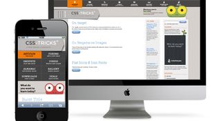
With visual trickery at its core, the new-fangled cross-platform layout for CSS-Tricks doesn’t disappoint. And there are some nice structural simplifications, such as the header navigation changing from a horizontal list-based layout to a very cool grid of options on mobile. Also, the large typographic date and comments pane next to each post gracefully degrades on smaller screen sizes.
There are some nice subtle treats too, such as the prominent adverts for online learning resource Treehouse, which do more than simply change proportions – the associated animal illustration changes too, which is such a great touch. As well as this, header navigation items give off a multi- coloured array animation when selected, making you want to tap again and again! Notably, this works equally well on mobile.
05. Hiut Denim
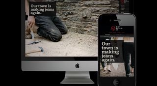
The new site for Hiut Denim is rich on photography, history and emotion. The gorgeous, hi-res photos showing your chosen wears just look fab, and we love how they’re laid out on mobile.
“We really sweated over the interaction design at small sizes to make the responsive version work as well as any dedicated mobile site,” says Alex Morris of Mark Boulton Design, who built and designed the site along with Nick Boulton, with creative direction from Mark Boulton. “The proof of the pudding was when we managed to make an order while walking down the street! Using Mr Clarke’s 320 and up idea we ensured the large images didn’t get served to mobile and larger images got pulled in at the larger media queries.”
06. Lancaster University
Lancaster University’s new site, created by Tom Knowles and the folks
at The Roundhouse, offers up a flexible experience that accounts for the majority of the core site experience. No mean feat given the size of such institutions these days.
What’s commendable, then, is how as the site adapts down to mobile; the essence, branding and structure are all respectfully maintained. “The new IA is very flexible – it’s deliberately designed with evolution in mind,” says Knowles. This site is big on content and structure, but the considered approach really allows it to scale down elegantly.

07. Lanyrd
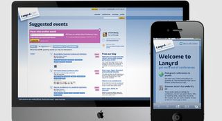
Everyone’s favourite web-tech-couple Natalie Downe and Simon Willison have been working on Lanyrd for quite some time now.
The desktop experience is mostly maintained on mobile: triple and double column views are brought into line, yet the IA and typographic structure feels similar. Tested on an Android mobile, text and selectable elements feel small. Also, the event calendar could make better use of width on desktop – it did, however, feel perfect on mobile.
08. PoetFreak
We love a good haiku: minimal, clean and meaningful. Much like PoetFreak, the responsive site that creations such as these are housed within. The site’s aim is to bring together likeminded wordsmiths and let them express their inner poet.
Made up of two core views – a list of poems, and a detailed view containing the creation, plus any comments or related writings – on both mobile and desktop, the site maintains a calm air of simplicity. On the iPhone, you sometimes get a strong feeling of Readability or Safari’s Reader function, minimalising the on-screen content in an effective way.

09. Reverse Büro
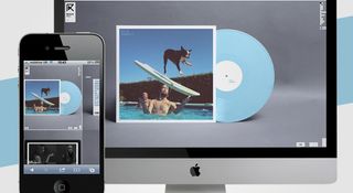
Swiss site Reverse Büro is delectable. Whether you’re on a desktop or mobile, the portfolio of designer Loïc Dupasquier looks fresh, clean and considered. Album artwork, T-shirts, fold-out prints and gorgeous sites shown on 27in Apple displays are interspersed, and it all looks great, despite the varying content types.
The up-down navigation sits nested at the bottom of the screen. Instead of using gestures to scroll down the page, you navigate the projects in vertical fashion, with up and down arrows at the bottom right. A simple content map in the top-right corner shows your position in the portfolio, and you can navigate left and right through the gallery of each project using this.
10. Smashing Magazine
As a continuation of the trend away from simple sites being the sole ambassador of the responsive movement, web design blog Smashing Magazine deals with its structural complexity with grace and elegance. Having no fewer than five display modes, it caters for every palate.
In conventional desktop width, ads are smattered across the right hand-side, but these quickly disappear on tablet and narrower widths. Typography also remains consistently beautiful.

11. Sony
It’s great to see a big brand such as Sony embracing the responsive revolution.
To be clear from the off, in terms of its depth, the responsivity is only knee-deep, being a single page, with resultant page clicks rendering the layout in traditional web conventions.
There are eight responsive components: header, glossy splash, drop-down category chooser with prominent content, along with nested text nav. Below this, there’s a rich grid of relatively superfluous elements (Share Your Story, New Sony Rewards), followed by a typographically strong news calendar, social links and finally a footer.

12. Sphero
Sphero is a fun, robotic ball you can control with your smartphone and play a growing number of games with. Kevin Menzie and the guys at Slice of Lime have created a site that’s minimalist at the offset and offers progressive amounts of information as the user navigates deeper.
“Since this is a first-of-its-kind product, we opted to take up almost the entire real estate on the page with HTML5 video showing Sphero in action,” says Menzie. But there was one particular challenge: “During development, the iPhone and iPad stopped supporting auto-play of the video. To counter this we serve up an animated gif for specific devices instead. We also use that animated gif on the desktop experience if the connection speed is too slow."

13. Starbucks
It’s good to see that Starbucks has a responsive site. In terms of features, it has most things you would expect a modern coffeehouse to have: nice big videos on the homepage, along with news items listed vertically below.
For core navigation, the mobile view condenses the header nicely, consolidating items into a single, now-almost-universal responsive menu icon, which shows and hides vertically when tapped. The richness of the menu items and their descriptions are maintained across the board, which is really good and feels sexier than most responsive menu degradations.

14. Theme Loom
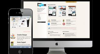
The natural progression for the responsive movement is to open it up to as many people as possible. As an organisation, you shouldn’t have to know how to build responsive sites in order to benefit from them. Theme Loom understands this, and offers responsive themes for WordPress-powered sites.
The site is naturally responsive, and they have a variety of themes on offer, both old and new, that the user can demo out on the site. Both ‘Xi’ and ‘Pure’, which have been built responsively, work like a treat, and look great.
15. Treehouse
Treehouse is an online teaching environment for web and mobile design and development. Responsively, the site performs really well. As the browser width decreases, the subtle background tree branch illustrations that weave their way down the homepage, steering you through the basics of Treehouse, are omitted.
However, Treehouse’s Tyson Rosage highlights that not everything was included on mobile: “The code challenge engine was really the only feature of the site that wasn’t all that practical to get working on mobile devices,” he says. “That’s because those kinds of devices aren’t well suited for writing code since the keyboard isn’t well optimised. Also, the interface for the code challenge engine realistically wouldn’t degrade well into a mobile form factor.”
Antony and Jerome Ribot are co-founders of Ribot, a design lab specialising in small screen interfaces and experiences. Antony studied ants, bees and termites at university, and Jerome heads up design and strategy at the agency. ribot.co.uk

Liked this? Read these!
- Illustrator tutorials: amazing ideas to try today!
- Great examples of doodle art
- Brilliant Wordpress tutorial selection
- Free tattoo fonts for designers
- Our favourite web fonts - and they don't cost a penny
Have you seen an amazing responsive site lately? Or are you working on one yourself? Let us know in the comments!

Thank you for reading 5 articles this month* Join now for unlimited access
Enjoy your first month for just £1 / $1 / €1
*Read 5 free articles per month without a subscription

Join now for unlimited access
Try first month for just £1 / $1 / €1
The Creative Bloq team is made up of a group of design fans, and has changed and evolved since Creative Bloq began back in 2012. The current website team consists of eight full-time members of staff: Editor Georgia Coggan, Deputy Editor Rosie Hilder, Ecommerce Editor Beren Neale, Senior News Editor Daniel Piper, Editor, Digital Art and 3D Ian Dean, Tech Reviews Editor Erlingur Einarsson and Ecommerce Writer Beth Nicholls and Staff Writer Natalie Fear, as well as a roster of freelancers from around the world. The 3D World and ImagineFX magazine teams also pitch in, ensuring that content from 3D World and ImagineFX is represented on Creative Bloq.
