CSS gradient tips
Ever seen a website where you just want to touch everything? Tim Van Damme explains the CSS tips he used in the Gowalla redesign
What do drop shadows, gradients, rounded corners, transformations and animations have in common? Yes, they’re a recipe for the disaster we once called Web 2.0, and have since been taken behind the shed, but they’re also a group of new tricks we can do with CSS. Not all browsers support them yet, but enough do to let us have some fun.
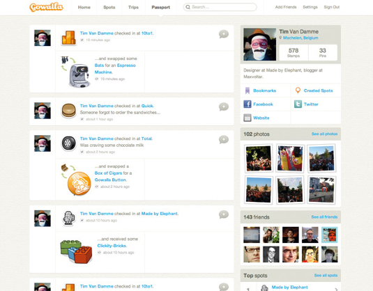
I recently had the honour of redesigning most of the website for location-based social networking service Gowalla with Keegan Jones. Gowalla is a very design-centric company, and it fully understands the power of an interface that’s easy to use but also a pleasure to look at.
In this tutorial, I’ll explain some CSS enhancements we added to the Gowalla website and teach you how to use them in your own projects. A word of caution: they’re to be used as pepper and salt on a dish. If the meal’s already ruined without seasoning, adding it won’t cover up the fact that you can’t cook. Also note that too much salt and pepper can ruin a perfectly good dish on their own.
Let’s start with some simple CSS Transitions. These are easy to implement and the results are surprisingly beautiful.
Good examples are the download links on the Gowalla homepage, to which I added some animation. By default, the opacity of each icon is .75. On hover, that changes to 1, but instead of just switching from .75 to 1, it fades. The CSS for this is simple:
- a {
- opacity: .75;
- -webkit-transition: opacity .25s ease-in;
- -moz-transition: opacity .25s ease-in;
- -o-transition: opacity .25s ease-in;
- transition: opacity .25s ease-in;
- }
- a:focus,
- a:hover {
- opacity: 1;
- }
I chose to make the animation last .25 seconds. One thing you should always test is that an animation isn’t too slow, as this will frustrate and confuse website visitors. If you’re not sure, it’s better to make it snappier.
On the left of the regular download links is the one for the Gowalla iPad client. Because this app is newly available, we decided to make the link to it more prominent, and used a picture of an iPad with a screenshot of the software. If you hover over it, the image slides up by five pixels. The CSS needed for this is similar to that in the previous example:
Get the Creative Bloq Newsletter
Daily design news, reviews, how-tos and more, as picked by the editors.
- a.image {
- position: absolute;
- top: 0;
- -webkit-transition: top .25s ease-in;
- -moz-transition: top .25s ease-in;
- -o-transition: top .25s ease-in;
- transition: top .25s ease-in;
- }
- a.image:focus,
- a.image:hover {
- top: -5px;
- }
Styling
For some reason, people either love or hate styling form elements, with the hate camp being the largest. Personally, I enjoy doing it because it involves so much interaction. Applying styles to form elements used to be pretty inconsistent, but again, we live in a time where it’s hard to find a bad browser, and all is well in our garden of web design.
I like to be in full control of everything I style, so I add CSS to clear the page from any default settings used by browsers. It usually looks a bit like this:
- * {
- margin: 0;
- padding: 0;
- list-style: none;
- font-weight: normal;
- font-style: normal;
- border: 0;
- font-size: 1em;
- text-decoration: none;
- outline: none;
- }
Perfect – I am now the dictator of the site’s design. One problem, though. I need to manually reapply a lot of styles that are there for usability, and form elements (especially text inputs) are a great way to demonstrate this. Here’s the CSS I used to style the initial state of my text input. I used [type=text] to only select text inputs:
- input[type=text] {
- border: 1px solid #ccc;
- -webkit-border-radius: 3px;
- -moz-border-radius: 3px;
- -o-border-radius: 3px;
- border-radius: 3px;
- -webkit-transition: all 0.1s linear;
- -moz-transition: all 0.1s linear;
- -o-transition: all 0.1s linear;
- transition: all 0.1s linear;
- }

If you use the HTML5 placeholder property in your HTML (for example, <input type="text" placeholder="Search..." />), you can style it (WebKit only for now) with this piece of nifty CSS:
- input[type=text]::-webkit-input-placeholder {
- color: #ccc;
- }
Be wary, though; the browser vendors are still discussing the correct implementation of this property. You can play with it, but don’t be surprised
if it breaks at some point in the near future.
So that’s the initial state of our input. Next, we need to style the :hover. In this case, I’m just going to change the colour of the border a tad:
- input[type=text]:hover {
- border-color: #999;
- }
The next state we’ll style is the one you see when you place your mouse cursor inside the text input. It’s a state a lot of people forget to design, which creates a big usability issue for people who tab through a page. The focus style for inputs used on gowalla.com is inspired by how Twitter handles it, so kudos for this go to Doug Bowman, Vitor Lourenço, Mark Otto and the rest of their team.
- input[type=text]:focus {
- border-color: #39b2e5;
- -webkit-box-shadow: #b5dff1 0 0 5px;
- -moz-box-shadow: #b5dff1 0 0 5px;
- -o-box-shadow: #b5dff1 0 0 5px;
- box-shadow: #b5dff1 0 0 5px;
- }
So what happens here? We’re (ab)using the box-shadow property to fake a blue glow around the edges. Because we defined a CSS transition for the original state of the input that applies to all changes, the border changes from grey to blue smoothly, and the box glows beautifully.
Still with me? Good. Another element that’s often poorly designed is the submit button. A button should look like a button, feel like a button and, if technology allowed it, smell like a button. If I click one, it needs to feel as though I’m actually poking a squishy rectangular object. I’m a firm believer in the idea that if virtual buttons were real, they wouldn’t have a flat surface. Instead, they would physically resemble a doorbell. These come in many shapes and sizes but all have one shared feature: press them and something happens. I’m not talking about the sound they trigger; I mean the button responds to you pressing it. Depending on whether it’s made of metal, hard plastic or rubber, it’ll react differently to your touch. Remember that the next time you need some button-designing inspiration.
But let’s get to the juicy part. How do you style a realistic-looking button using nothing but CSS? Gradients are often used to suggest that an element is 3D. No, don’t be scared, they’re good. If applied with care, subtle ones can really make a layout shine. Now let me teach you how to add bulletproof gradients to your CSS.
Gradients can be the most difficult part of CSS to grasp, especially when you move beyond the easy linear gradient we’ll be using. You can add linear gradients (with or without stops), radial gradients, semi-transparent gradients, multiple gradients ... the list goes on.
If you want to know about all the latest CSS techniques available today, I suggest you pre-order a copy of Hardboiled Web Design by Andy Clarke. It’s filled with everything you could ever want to know. Andy’s a great writer, and you’ll fly through the book.
Here’s the CSS for the button without a gradient background. I took the liberty of adding everything we’ve talked about in this tutorial, such as rounded corners and a subtle drop shadow. I also added a drop shadow to the text to emphasise the 3D effect.
- .button {
- color: #fff;
- text-shadow: #de6e00 0 -1px 0;
- border: 1px solid #ff920d;
- -webkit-border-radius: 15px;
- -moz-border-radius: 15px;
- -o-border-radius: 15px;
- border-radius: 15px;
- -webkit-box-shadow: rgba(0, 0, 0, .25) 0 1px 1px;
- -moz-box-shadow: rgba(0, 0, 0, .25) 0 1px 1px;
- -o-box-shadow: rgba(0, 0, 0, .25) 0 1px 1px;
- box-shadow: rgba(0, 0, 0, .25) 0 1px 1px;
- background: #ff920d;
- }
To spice the button up with a gradient while using a solid background colour as a fallback for older browsers, use the following CSS:
- .button {
- background: #ff920d;
- background: -webkit-gradient(linear, left top, left bottom, from(#ffc039), to(#ff920d));
- background: -moz-linear-gradient(top, #ffc039, #ff920d);
- background: -o-linear-gradient(top, #ffc039, #ff920d);
- background: linear-gradient(top, #ffc039, #ff920d);
- }
This starts by declaring a solid background colour for older browser. If a browser doesn’t support the following lines, it will stick to that shade and every user will see a partially styled button. If a browser does support linear gradients, it will pick out one of the three lines with the vendor prefix. If the browser maker has implemented CSS gradients, it will choose the last line.
As you can see, the CSS aimed at WebKit browsers such as Safari and Google Chrome is different to the others. This is why they use vendor prefixes: when they start implementing new features, they can’t know for sure how they’ll be declared in the future.
But a button doesn’t just have one state. People interact with buttons, and we need to style every step of that for them. Here’s the hover state, which changes border colour using same faux-glow effect we used for text inputs:
- .button:hover,
- .button:focus {
- border-color: #de6e00;
- -webkit-box-shadow: #ffc039 0 0 5px;
- -moz-box-shadow: #ffc039 0 0 5px;
- -o-box-shadow: #ffc039 0 0 5px;
- box-shadow: #ffc039 0 0 5px;
- }
And now for the final state; the actual click:
- :active {
- background: #de6e00;
- background: -webkit-gradient(linear, left top, left bottom, from(#ff920d), to(#de6e00));
- background: -moz-linear-gradient(top, #ff920d, #de6e00);
- background: -o-linear-gradient(top, #ff920d, #de6e00);
- background: linear-gradient(top, #ff920d, #de6e00);
- }
Et voilà! One sexy, 3D-like button that’s just asking to be pushed.
A grid of polaroids
I might be biased, but there’s nothing like seeing people share quick snapshots of where they’ve been. At multiple places around the Gowalla site, you’ll see mini-grids of photos that people have posted, or of photos that were all taken at a certain spot.
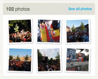
To style a bunch of images that look like polaroids scattered on a table, we’ll have to combine all the tricks we’ve used so far and add even more CSS. We’ll need a drop shadow on every picture to make it look as though it’s lying on the table instead of being printed on it.
There should also be a slight gradient, because no Polaroid comes out of the camera flat – it’s always a bit curved.
We’ll also need some very subtle rounded corners, to make the picture feel more human.
First, the drop shadow. Again, we’re going to combine box-shadow with alpha transparency:
- ul.photos li a img {
- -webkit-box-shadow: rgba(0, 0, 0, .25) 0 1px 3px;
- -moz-box-shadow: rgba(0, 0, 0, .25) 0 1px 3px;
- -o-box-shadow: rgba(0, 0, 0, .25) 0 1px 3px;
- box-shadow: rgba(0, 0, 0, .25) 0 1px 3px;
- }
Next, add the gradient, as well as some padding around the image:
- ul.photos li a img {
- ...
- padding: 5px;
- background: #fff;
- background: -webkit-gradient(linear, 0% 0%, 0% 100%, from(#fff), to(#eee));
- background: -moz-linear-gradient(top, #fff, #eee);
- background: -o-linear-gradient(top, #fff, #eee);
- background: linear-gradient(top, #fff, #eee);
- }
Finally, we want subtle rounded corners:
- ul.photos li a img {
- ...
- -webkit-border-radius: 2px;
- -moz-border-radius: 2px;
- -o-border-radius: 2px;
- border-radius: 2px;
- }

Luckily, rotation is very easy to do with CSS, so we can make the photos look scattered rather than parallel:
- ul.photos li a img {
- ...
- -webkit-transform: rotate(-2deg);
- -moz-transform: rotate(-2deg);
- -o-transform: rotate(-2deg);
- transform: rotate(-2deg);
- }
However, the images are all pointing in the same direction, which doesn’t look natural. We could add classes to every other li and set different angles, but I’m lazy. Yet again, CSS has a great way of solving the problem:
- ul.photos li:nth-child(even) a img {
- -webkit-transform: rotate(2deg);
- -moz-transform: rotate(2deg);
- -o-transform: rotate(2deg);
- transform: rotate(2deg);
- }
We now need to add the different states for the link. Since we’re doing some crazy stuff anyway, why not crank up the notch a bit further?
- ul.photos li a:hover img,
- ul.photos li a:focus img {
- -webkit-box-shadow: rgba(0, 0, 0, .5) 0 1px 3px;
- -moz-box-shadow: rgba(0, 0, 0, .5) 0 1px 3px;
- -o-box-shadow: rgba(0, 0, 0, .5) 0 1px 3px;
- box-shadow: rgba(0, 0, 0, .5) 0 1px 3px;
- position: relative;
- top: -1px;
- -webkit-transform: scale(1.05) rotate(-2deg);
- -moz-transform: scale(1.05) rotate(-2deg);
- -o-transform: scale(1.05) rotate(-2deg);
- transform: scale(1.05) rotate(-2deg);
- }
This makes the shadow a bit more prominent and moves the photo up by one pixel, giving the illusion that the photos are floating. Finally, enlarge the photo with transform and scale.
In a sense, the polaroids on the table are the default state, and they float up in the hover state. To design the active state, imagine what would happen if you tapped one of the photos with your index finger. It would be pressed against the table and would bend differently. To create this effect, use this CSS:
- ul.photos li a:active img {
- top: 0;
- -webkit-box-shadow: rgba(0, 0, 0, .25) 0 1px 3px;
- -moz-box-shadow: rgba(0, 0, 0, .25) 0 1px 3px;
- -o-box-shadow: rgba(0, 0, 0, .25) 0 1px 3px;
- box-shadow: rgba(0, 0, 0, .25) 0 1px 3px;
- background: #eee;
- background: -webkit-gradient(linear, 0% 0%, 0% 100%, from(#eee), to(#fff));
- background: -moz-linear-gradient(top, #eee, #fff);
- background: -o-linear-gradient(top, #eee, #fff);
- background: linear-gradient(top, #eee, #fff);
- -webkit-transform: scale(1) rotate(-2deg);
- -moz-transform: scale(1) rotate(-2deg);
- -o-transform: scale(1) rotate(-2deg);
- transform: scale(1) rotate(-2deg);
- }
And there you have it. Livening up your layout with some advanced CSS is fun, but always remember how physical objects behave. And don’t go nuts. A pinch of salt and pepper is all it takes to make a site shine.

Thank you for reading 5 articles this month* Join now for unlimited access
Enjoy your first month for just £1 / $1 / €1
*Read 5 free articles per month without a subscription

Join now for unlimited access
Try first month for just £1 / $1 / €1

The Creative Bloq team is made up of a group of design fans, and has changed and evolved since Creative Bloq began back in 2012. The current website team consists of eight full-time members of staff: Editor Georgia Coggan, Deputy Editor Rosie Hilder, Ecommerce Editor Beren Neale, Senior News Editor Daniel Piper, Editor, Digital Art and 3D Ian Dean, Tech Reviews Editor Erlingur Einarsson, Ecommerce Writer Beth Nicholls and Staff Writer Natalie Fear, as well as a roster of freelancers from around the world. The ImagineFX magazine team also pitch in, ensuring that content from leading digital art publication ImagineFX is represented on Creative Bloq.
