The perfect web design app… and why it doesn’t exist
Designers and developers share with Craig Grannell their tools for designing websites and demand something more in keeping with modern practices. The perfect tool, it seems, simply doesn't exist yet, as highlighted by the Project Meteor campaign
In theory, all you need to create websites is a laptop and an internet connection: there’s no need to spend money on expensive software. In practice, the convenience and time-saving capabilities of market-leading web design tools means they’re indispensible to the professional web designer with deadlines to meet. But are people satisfied with what’s available? We canvassed the opinions of some of the industry’s leading designers and the consensus was that, while popular apps such as Photoshop, Fireworks and Illustrator might be useful, even essential to their work, they were seen as very far from perfect. In fact it seems that right now, for the web designers we spoke to, the perfect web design app simply does not exist.
Making do
“I currently use Adobe Fireworks for design,” says NineFour managing director Nathan Pitman. Once, he loved the app like a digital brother; now, it’s more like a colleague you have to deal with, all the while hoping someone better arrives as a replacement. “A succession of release cycles with next to zero focus on what web professionals need has left me in a position where I just ‘make do’,” he muses, sadly.
In part, Pitman’s unhappiness with Fireworks stems from the product’s inability to keep up with current trends. He says that it was “born in an era of tables and spacer GIFs, and so much of its workflow, interface and toolset is welded to that point in time”. Fireworks is hardly alone. User interface designer Dan Rose works primarily with Photoshop “due to its flexibility”, but realises it’s “natively a photo editor”; and he’s not a big fan of Adobe’s powerhouse — he’s merely using it “until something better comes out”.
Pitman’s colleague Paul Cripps, a designer and developer, also dislikes many aspects of Photoshop, suggesting that “for web-based layouts, the pixellation and softness it adds makes me want to tear my hair out”; mind you, he’s not a huge fan of Fireworks either, arguing that in spite of its prototyping abilities, layers and states, and support for both vector and bitmap graphics, it’s sorely lacking when it comes to dealing with type, cannot cope with fluid layouts, and has an alarming amount of bloat. “I’d hazard a guess I only use a quarter of its features,” he adds.
Backwards, not forwards
Other designers pick up Pitman’s point about existing design tools from Adobe being rooted in a bygone age. Tom Muller, director of helloMuller Ltd is hugely into typography, which many web designers are finally waking up to. Web fonts now enable websites to include more than a tiny handful of ‘safe’ typefaces, but existing design apps turn type into a minefield. “There’s always that development hurdle — it looks good in Photoshop, but will it translate to code,” complains Muller. “With @font-face, Typekit, Fontdeck, Google Fonts and so on, we have far more flexibility when it comes to type, but there’s a barrier at the graphic design stage: while I can download a Google Font and use it in Photoshop, it’s still different from an in-browser render.”
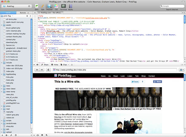
Developer Elliot Lewis, who runs No Two The Same, is harsher in his assessment: in effect, he doesn’t think Fireworks and Photoshop are standing still, but, relatively speaking, are in fact going backwards. “When I started designing websites a decade ago, I used Photoshop — the de-facto tool for graphic designers — and a text editor. You cut up layers and used JavaScript for states,” he begins. “Now, I use Illustrator for layout, Photoshop for image editing and spot effects, and Coda to hand-code mark-up. But with CSS sprites and other modern aspects of web design, the design process no longer translates easily to code.”
Workflow problems
The main problem with existing tools, agrees Lewis, is workflow: “The design has become an approximate visual. There's an in-between step of prepping graphics to be web-ready. Rounded corners, drop shadows and gradients must be recreated in code and differ in appearance between the design tool and browser.” And the problem extends beyond graphic designers, to developers. Morgan Adams of Adams Immersive reckons the Photoshop-to-code model is fine “if the designer and programmer are the same person”; but if not, “a designer using Photoshop may lack vital guidance on how the design becomes code, and what factors make a design reliable and flexible across different browsers”.
Get the Creative Bloq Newsletter
Daily design news, reviews, how-tos and more, as picked by the editors.
DM Logic director Darren Miller concurs with this assessment. He’s regularly provided with Photoshop, Illustrator and Fireworks files to turn into sites, and it’s no longer a smooth process: “I can’t look at styling choices a designer has made and convert them directly to CSS. I must convert to the nearest equivalent and that causes wasted time in up-front discussions or justifying subsequent variations to the designer.”

Tempered Vision Ltd managing director David Dixon, too, finds existing apps waste his time: “Part of my job is all-too-often focused on ‘correcting’ design issues where pixel dimensions aren’t maintained or object anti-aliasing rears its ugly head. Because of this, Photoshop designs become less of a working copy, and more of a collection of objects that must be moved into separate files before exporting.”
Escaping from rigid thinking

Along with hamstringing workflow, Clearleft managing director Andy Budd believes existing tools are limiting the potential of flexible online design: “They work on the assumption of a fixed canvas size and pixel-perfect layout. But websites can be consumed on anything from a small mobile phone screen through to a massive desktop display. The rigid nature of the tools leads to much more rigid thinking.” The best designers, he says, will create multiple documents to test how designs look on a variety of screen sizes, but even that’s a “hack” and “forces developers to make some pretty big assumptions when translating fixed-width designs to the fluid world of the web”.
In the past, there have been arguments for Adobe to merge its tools, rolling the web aspects of Fireworks into Photoshop, but Dan Ruffle, senior graphic designer at Metakinetic, is unconvinced: “You’d be able to illustrate, touch-up, animate, code and deliver to the web in one app, but it would be monstrous and expensive, trying to be all things to all people and failing to do anything really well.”
Instead, most designers are clamouring for something entirely new — for Adobe to recognise the needs of web developers and hugely rework Fireworks, or for a hungry indie developer to step up to the challenge. This isn’t new thinking. In 2009, designer Jon Hicks said he both loved and hated Fireworks, and pondered alternatives; Pitman, too, explained how he’d lost faith in the app; and Jason Santa Maria explored the possibility of a product that would offer “accurate rendering and previews for the way page elements would look, but with some of the WYSIWYG tools desktop design apps have”.
Wanted: extinction event
The latest adventure in this space is Project Meteor, an offshoot of Bracknell-based designers’ meet-up Creative Assembly. “It came into being due to shared issues experienced by our group of designers and developers,” explains Dixon. “We each used a staple — often Adobe — app, but shared a common problem regardless of our choice: an inability to create designs applicable for the web without having to fight against the app’s unnatural workflow.”
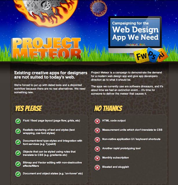
Echoing Jeffrey Zeldman’s arguments in An InDesign for HTML and CSS?, where he says an equivalent of Illustrator and PageMaker for CSS, HTML5 and JavaScript is “impossible”, due to the fact HTML5 “doesn’t know or care what content looks like”, Project Meteor doesn’t advocate mashing graphic design tools into Dreamweaver, nor offering a means to churn out web-ready code. Instead, it demands a flexible layout environment that accurately matches what you’d later see in the browser. “And as the issues we faced were common — not just between us, but also many other notable web designers and developers — we thought it was time someone started speaking out, hopefully providing some kind of visibility to the problems most web designers face on a daily basis,” continues Dixon.
In the short term, Lewis hopes Project Meteor will spark discussion and “gauge whether we’re a small cross-section of the web community having a moan, or if there’s a genuine demand for a decent web design app”, while Miller hopes it will “convince software vendors that investment in this kind of product would pay off”.
Designing the perfect web app
On speaking to the Project Meteor creators and various players elsewhere in the industry, it’s interesting to see the level of wish-list overlap. Budd mirrors aforementioned statements in arguing that we “don’t want another WYSIWYG tool that outputs production HTML/CSS,” but says a developer could nonetheless learn from the likes of Dreamweaver: “That lets you define table cells as fixed-width or flexible — wouldn’t it be great if a design tool enabled you to do the same with columns, images and UI elements? A designer could set the desired behaviour of elements in advance and see how the layout changes under different screen settings.”
Budd adds that it would be useful for the tool to include pre-defined UI elements that accepted user input and could be linked to screens in the design file, which would “enable you to output a prototype from your design comp”.
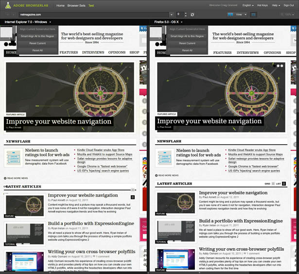
Adams builds on Budd’s earlier thoughts about the cross-device nature of modern web design and argues that a ‘perfect’ app would also assist in this area: “Every platform, browser and version acts and looks different. Ideally, we would be able to view and test every browser in real-time, directly within a design application”. He’d like to see a system were you’d make a change and instantly see how that impacts the design in an iPad, a screen reader, or a corporate PC behind a JavaScript-blocking firewall.” Rose also wants to see elements we’ve “persuaded Photoshop to do” as defaults, including: “sharp pixels, elements that snap and align, and a CSS sprites function”.
A WebKit foundation
For most, though, a means of working on a design that shows more accurately how the final product will look would be the epitome of perfect. “All I want is a simple, lightweight tool that mimics modern browsers,” says Cripps. “Type should render and react as it would on a web page, objects should wrap accordingly, and there should be the ability to construct fluid layouts.”

User experience designer Aral Balkan concurs: “The perfect web design app has to be web native. It would embrace the ‘designing in the browser’ philosophy and extend it with visual tools that designers can use. In this day and age, is there ever a reason to create a bitmap gradient in Photoshop, only to translate it into a CSS gradient later? When I create a gradient visually, it should generate the CSS gradient behind the scenes for me. I should be drawing with HTML, CSS, Canvas, and SVG. I should be animating with CSS animations and jQuery. All while using high-level, visual tools akin to the ones I have in Photoshop.”
That philosophy, thinks Miller, suggests an app that’s “a WebKit canvas surrounded by a native interface of design tools”. Anything added to the canvas, he says, would be rendered as HTML and CSS or as an inserted bitmap image. “I wouldn’t want mark-up exposed to the user, because it would contain extra code the app would need,” he says, “although the ability to inspect an object and use its code as a starting point could be a massive time-saver”.
In a roundabout way, Budd returns to Adobe, the focus of some ire throughout this feature, and notes that few people consider its apps lacking in functionality — just relevance to modern-day web design: “Basically, I think what we need is a design tool that takes the creative features of Photoshop and Fireworks, combines them with the interactive features of various prototyping tools, and displays the result in a flexible, web-like fashion.”

Thank you for reading 5 articles this month* Join now for unlimited access
Enjoy your first month for just £1 / $1 / €1
*Read 5 free articles per month without a subscription

Join now for unlimited access
Try first month for just £1 / $1 / €1
The Creative Bloq team is made up of a group of design fans, and has changed and evolved since Creative Bloq began back in 2012. The current website team consists of eight full-time members of staff: Editor Georgia Coggan, Deputy Editor Rosie Hilder, Ecommerce Editor Beren Neale, Senior News Editor Daniel Piper, Editor, Digital Art and 3D Ian Dean, Tech Reviews Editor Erlingur Einarsson, Ecommerce Writer Beth Nicholls and Staff Writer Natalie Fear, as well as a roster of freelancers from around the world. The ImagineFX magazine team also pitch in, ensuring that content from leading digital art publication ImagineFX is represented on Creative Bloq.
