Minimalist icon designs highlight the beauty of Amsterdam
Simple line drawings showcase the city's hot spots beautifully.
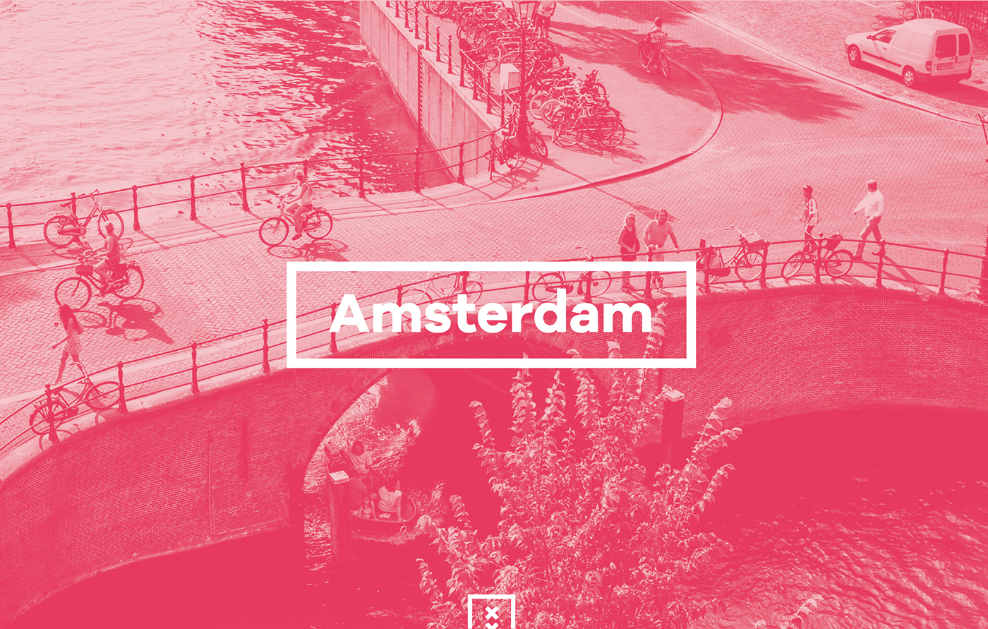
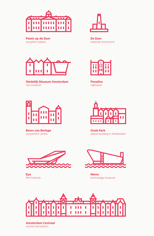
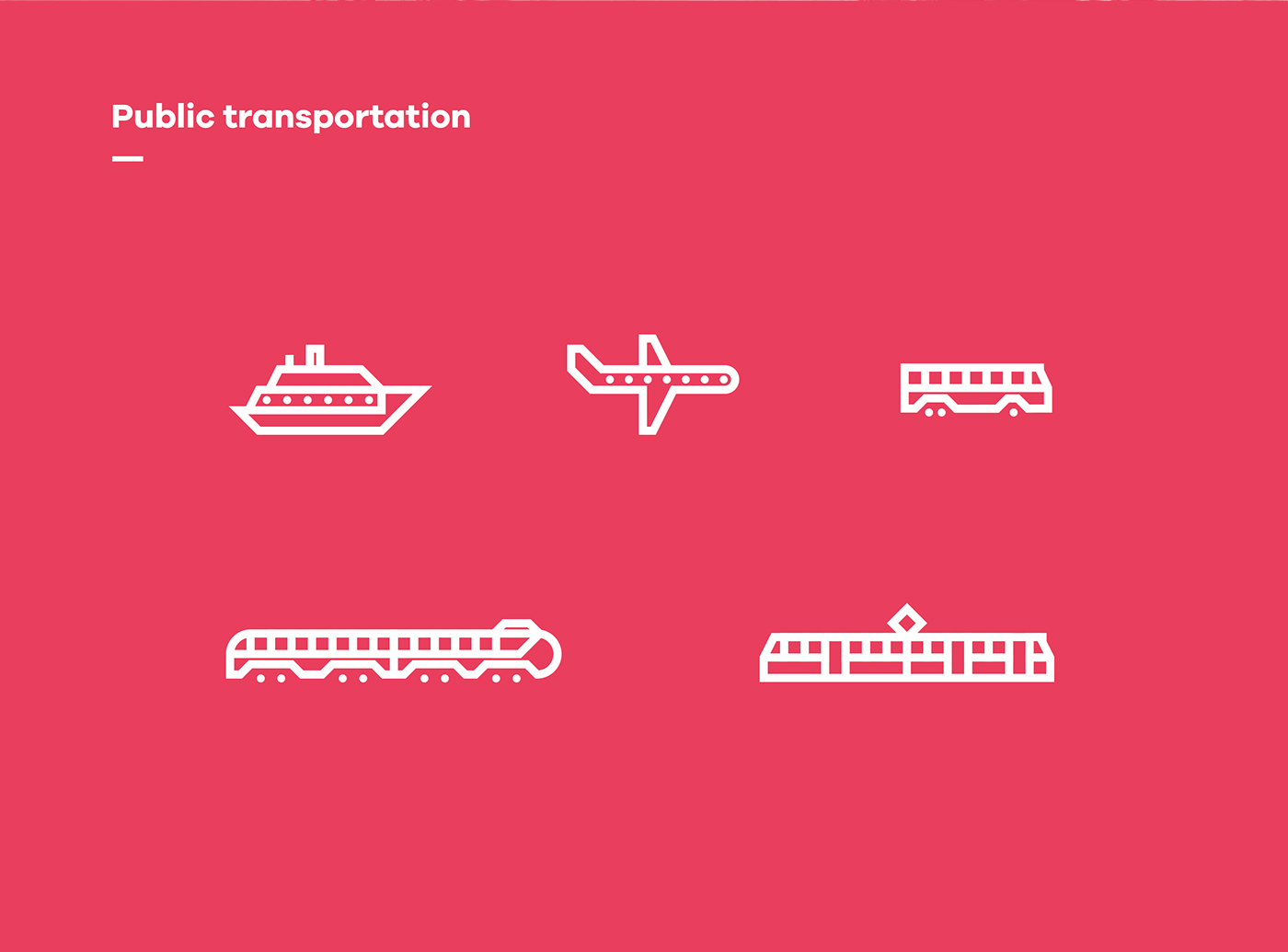
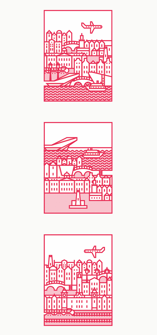
When it comes to icon design, the simpler the better; visability is key. But that doesn't mean you have to be any less creative. Structured line drawing is one way to approach the process, and that's exactly what Netherlands-based illustrator Matthias Wentink has done with his range of Amsterdam icons.
Discover six top tips for using grids in logo design
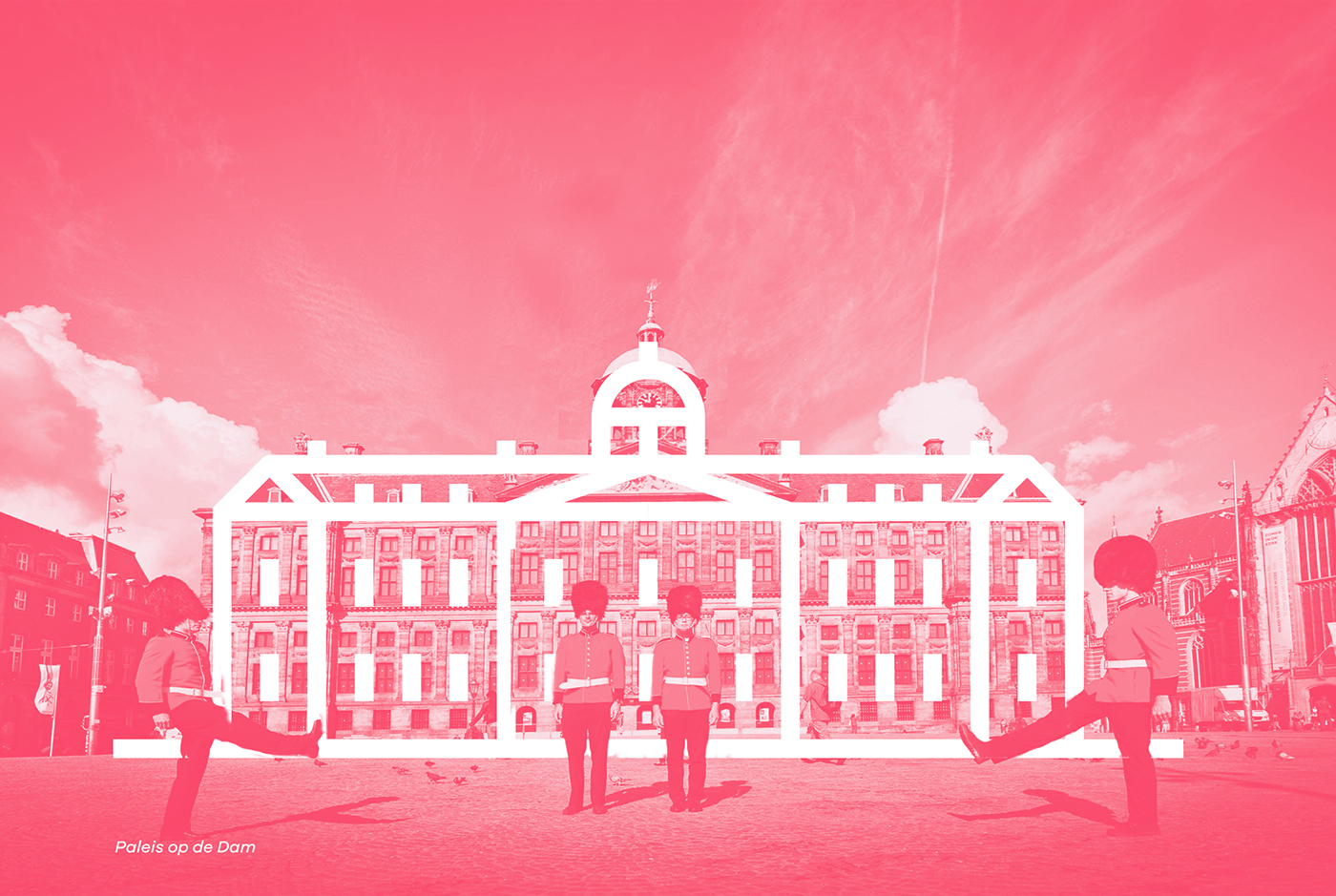
Inspired by the straightline architecture throughout the capital city, Wentink celebrates his country's most beloved spots, with homages to museums, monuments and a range of institutions. As each illustration can be perfectly placed over each spot, the simplicity is inspirational as ever.
Having previously experimented with packaging and logo redesigns, it's clear that Wentink is showcasing some serious creative potential in his early career. Whilst these icon designs were made purely as a personal project, we think his work will be snapped up in no time.

Liked this? Read these!

Thank you for reading 5 articles this month* Join now for unlimited access
Enjoy your first month for just £1 / $1 / €1
*Read 5 free articles per month without a subscription

Join now for unlimited access
Try first month for just £1 / $1 / €1
Get the Creative Bloq Newsletter
Daily design news, reviews, how-tos and more, as picked by the editors.

Sammy Maine was a founding member of the Creative Bloq team way back in the early 2010s, working as a Commissioning Editor. Her interests cover graphic design in music and film, illustration and animation. Since departing, Sammy has written for The Guardian, VICE, The Independent & Metro, and currently co-edits the quarterly music journal Gold Flake Paint.
