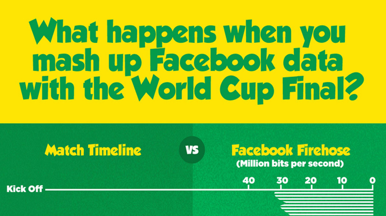
Infographic shows how Facebook reacted to the 2014 World Cup Final
Ever wondered how Facebook plays its part in the World Cup? This infographic charts how it reacted to the World Cup final.

Every picture tells a story, as they say, but sometimes it takes a clever combination of words and pictures to tell a story quickly, concisely and in an entertaining fashion. The best infographics may look like they were simple to create in Photoshop, but designing an effective piece of data visualization is usually anything but.
Last night, the 2014 World Cup final took place. Germany and Argentina battled it out to be crowned the best team in the world right now and as millions of fans sat on the edge of their seat, others were quickly taking to their devices to spout their opinions.
We Make Awesome Sh have access to the Facebook Firehose. "Yes, that's a lot of data!" they explain. "Last night we directly compared the firehose with key events from the World Cup Final, and wrapped it up in this infographic." Take a look for yourself.
Were you part of the Facebook World Cup stats? Let us know in the comments box below!

Thank you for reading 5 articles this month* Join now for unlimited access
Enjoy your first month for just £1 / $1 / €1
*Read 5 free articles per month without a subscription

Join now for unlimited access
Try first month for just £1 / $1 / €1
Get the Creative Bloq Newsletter
Daily design news, reviews, how-tos and more, as picked by the editors.

Sammy Maine was a founding member of the Creative Bloq team way back in the early 2010s, working as a Commissioning Editor. Her interests cover graphic design in music and film, illustration and animation. Since departing, Sammy has written for The Guardian, VICE, The Independent & Metro, and currently co-edits the quarterly music journal Gold Flake Paint.