When you're just starting out, and don't have a lot of time and money to invest in a portfolio site, a cookie cutter solution like Behance can be a great option.
But once you become established in your creative career, it's time to start thinking outside the box, and really show what you're capable of to potential employers and clients.
The portfolio sites from established creatives all move beyond the norm of presenting work online, and really do something different with the format that makes you sit up and take notice. We hope they inspire your own portfolio site redesigns, and if you've spotted other great portfolio sites out there, please let us know in the comments below.
01. Thierry Ambraisse

Thierry Ambraisse is a French art director and designer working in London for brands such as Nike, Dior, Nespresso, Disney, Guerlain, Celine and Chanel. There's a real aesthetic beauty to his super-clean, photograph-based portfolio, which carefully curates just a small selection of his work to brilliant effect. A million miles from a cookie cutter portfolio site, this feels carefully art-directed, encouraging you to hang around and check out as much as possible.
The site was designed by Thierry himself and coded by Jean-Christophe Suzanne, who's added in some delightful page transition tricks to keep you engaged as you navigate around this talented creative's body of work (Suzanne's own portfolio site's pretty amazing too).
02. Alex Pierce
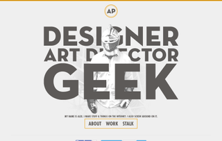
To succeed, a portfolio site needs to have both a visual people and good functionality. But if you can do all that, and inject a sense of your own personality, you're really going the extra mile.
Alex Pierce is a designer, art director and blogger living in Dallas who's worked for brands including American Airlines, Lexmark and American Cancer Society. And you can see from its homepage (shown above), his portfolio is not at all short on personality.
Get the Creative Bloq Newsletter
Daily design news, reviews, how-tos and more, as picked by the editors.
Rather than just a standard bio on his About page, the hero carousel shows you a series of personal photos, giving you a glimpse into Pierce's life and making you feel welcome and included. Design is about making an emotional connection, so doing the same on a portfolio site can be a smart move. And Pierce puts as much personality into his copy (and microcopy) as the visuals, making this portfolio site a joy to peruse.
03. James Tupper
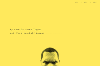
Another portfolio site that's just dripping with personality comes courtesy of Korean-American James Tupper. The designer, filmmaker and animator has worked on everything from employment branding strategy for a global company to filming Vikings in the snowy mountains of Utah, so you'd expect this to be a fascinating site, and Tupper doesn't disappoint: there's a 90s photocopied fanzine feel to this thrillingly low-fi design. Also, some portfolio sites suffer from a lack of context to the visual work presented - but here there are intelligent and engaging descriptions that provide a rounded explanation of who Tupper is and where he's coming from.
04. Jack Freeman (Urban Ape)
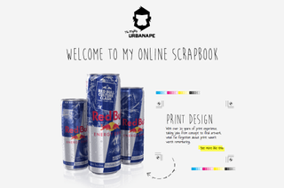
How many handwritten portfolio sites have you seen? Not many, we'd guess, so we'd encourage you to check out the site of Urban Ape, aka London-based creative graphic and digital designer Jack Freeman. He describes himself as an "ideas man, coming up with the concepts, and how things should look and feel is where my passion lies". And he's certainly done that with his own site, which is packed full of visual inventiveness.
In what he calls an 'online scrapbook', Freeman's work doesn't just appear in standard boxes, but is "presented" in a very real sense: art on a canvas, illustrations in a Moleskine, photography emanating from a Polaroid camera. There's a sense of play here that really makes you want to hire this guy - who else would place their contact details on a banana?
05. Leandro Lima
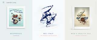
Another portfolio that takes presentation of the work to a new level comes from Barcelona- based illustrator and interactive art director Leandro Lima. Literally framing your illustration work may sound like a cliche, but here the concept is beautifully executed and really works. Click through to each individual project page and things get even more interesting. As you scroll through the art-directed, insightful explanations of how each brief was pursued, there are delightful transitions and effect along the way that makes you just want to keep exploring forever.
06. Melanie Daveid
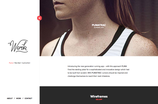
Melanie Daveid is a UX designer and art director from Austria, living in Berlin, whose clients include Puma, Red Bull and myComfort. Visit her portfolio site's homepage and a nifty little animation signs her name by way of introduction: it's a lovely touch that demonstrates her skills without being overly show. And the site as a whole follows the same pattern, carefully and artfully balancing the needs of aesthetics, functionality and fun. In short, it gives you a great idea of just Daveid would be capable of if hired for your project.
07. UI Viking
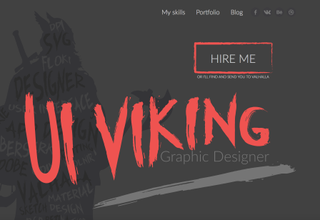
The portfolio site of Sri Lankan graphic designer Alex Borisson, aka UI Viking, stands as proof that you don't need super-amazing web design features or effects to create a compelling portfolio site. His portfolio website is pretty bog standard in terms of its design and functionality. But by taking the central theme of 'viking' and running with it, with a tongue-in-cheek sense of fun, Borisson has created a design that really engages and makes you want to know more.
08. Christopher Lee
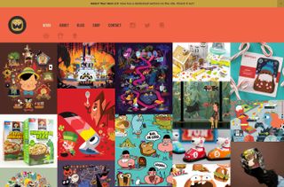
Visit the portfolio site of Californian designer and illustrator Christopher Lee and you'd better bring your sunglasses: you're about to enter a world of vibrant, compelling colour. Watching Saturday morning cartoons as a child made a big impact on Lee, as you can see from his work for big name clients including Coke, Facebook and Adobe. The elegantly efficient style of his portfolio site matches his illustration style and showcases it all wonderfully.

Thank you for reading 5 articles this month* Join now for unlimited access
Enjoy your first month for just £1 / $1 / €1
*Read 5 free articles per month without a subscription

Join now for unlimited access
Try first month for just £1 / $1 / €1
Tom May is an award-winning journalist and editor specialising in design, photography and technology. Author of the Amazon #1 bestseller Great TED Talks: Creativity, published by Pavilion Books, Tom was previously editor of Professional Photography magazine, associate editor at Creative Bloq, and deputy editor at net magazine. Today, he is a regular contributor to Creative Bloq and its sister sites Digital Camera World, T3.com and Tech Radar. He also writes for Creative Boom and works on content marketing projects.
